Following my previous reflective journal, here is the reflective journal for 30th April-4th May 2018.
This reflective journal features educational technology and presenting – two topics I can write books about!
Monday 30th April
With the analytics data from the April 2018 Elebase testing analysed and written up, this week has two main focuses:
- The group presentation which is taking place on Thursday 3rd May. This is a presentation about a common theme that runs though my group’s work and is presented in front of several people from the UX and games industries – namely Katie Fisher (UX researcher at The User Story), Tim Caynes (UX designer at Foolproof) and Ricky Martin (a local games developer).
- The 2,000 word report which I have been writing about for a week now but still needs to be finished! This report is all about how I have designed Elebase with the customer in mind and putting user testing and UX design theories (the latter almost subconsciously) at the forefront of my development process.
And at the end of the week I may possibly implement a few of the more basic changes suggested by user testing into Elebase 4 so that I can hand-in an amended version on May 11th.
Presentation activities
This morning we did some short sessions on presentation skills. We began by each being given a random topic to talk about for 1 minute – the catch being that we had absolutely no time to prepare a presentation at all since we only knew the topic that we would be presenting about just ten seconds before we were due to present. I felt that I did a pretty good presentation on ‘How to become popular and stay popular’ with the audience giving me 9/10 points for engagement and 8/10 points for relevant and interesting content – not bad considering I 100% ‘winged’ this presentation. Without wanting to sound boastful, I found this task fairly easy given that I used present to my Student Digital Leader team on an almost-weekly basis between about December 2014 and July 2017, have always felt confident speaking in classes at school and even did a TEDx presentation about the use of technology in education when I was 18 years old in March 2016. I also presented many assemblies whilst I was a student at school and later a staff member too, presented at Microsoft events in London and Seattle and have done a few more casual presentations at university over the past few months. My presentation style has evolved massively over the past four years or so and is continually improving. Presentations are something that I am passionate about, so I just hope that the others in my group work hard with me to create a great presentation to impress the industry audience!

The next task was find suitable images for a presentation in pairs. Ameer and I were tasked with finding images for a presentation about staying at home with three slides to find images for:
- A slide depicting that ‘people rush around too often’.
- A slide depicting that ‘we should stay at home, not do anything and be content with it’.
- A slide depicting that ‘with inner calm, we can conquer the hectic world.’
We decided that images of people running around cities and train stations were too cliche and generic, so instead we opted for an image of three cheetahs running which depicts a busy lifestyle and rushing about, but instead of using people an animal is used instead which we felt would be more unique and engaging. Generally this image was relatively well-received by the audience. We used an image of a Caribbean island to depict ‘staying at home’ and being relaxed by not doing anything. This image was generally criticised because it didn’t depict ‘being at home’ and the audience failed to see the relaxation and ‘doing nothing’ part of the image that Ameer and I understood. We felt that the serene, still, quiet, person-less scene depicted ‘bliss’ which the audience completely ignored and instead focused on it not looking like ‘home’ to them – but of course for somebody in the Caribbean it could well be home. The third and final image was an image of a silhouetted fisherman and a stray cat against the lights of a big city over a river to depict ‘with inner calm, we can conquer the hectic world’. The silhouetted fisherman was meant to represent the calm and measured approach (fishing isn’t really a sport stressed people do, after all) and the city lights were meant to represent the busy world. The audience loved this image and immediately understood it. Overall, Ameer and I got around 7/10 for relevance and uniqueness in our images but I did feel that some of the other groups did also have fairly generic images and scored higher.


This is the thing with images and presentations. I prefer images in a presentation to text any day of the week, but the thing is that a truly great speaker should never have to use images. They should be able to talk for hours on end and have the audience captivated. The greatest speakers in history very rarely used images or slides. Although history remembers him as an abominable human being, Adolf Hitler was one of the greatest speakers of all time and could keep an audience captivated for hours on end by accentuating his voice like no other human being history has ever seen and using exaggerated hand gestures to bring attention to himself. Hitler’s other weapon was his words – he told people what they wanted to hear and that made them flock to him in the thousands. In hindsight, what Hitler was saying definitely has no place in society today, but as speakers we should use our stage presence to captivate an audience and the most powerful weapon – our tongue – should be the most lethal device in any presentation. The slides on a slideshow should just be a cue for the speaker to remember what to talk about.
The chances are that we will use generic or cliche images in our presentations, hence why I said this to fellow student George Britton who is a great speaker but in my opinion didn’t use the most inspiring images in his slides.
I don’t really give a crap about the images you used because if you were speaking I’d be more focused on listening to what you had to say than on the images. You’re a natural.
That says it all really. It’s 99.99% about the speaker and 0.1% about the images. This isn’t an excuse to use inappropriate or irrelevant images though – if you do that then your audience’s attention will likely gravitate to the slides which can be a bad thing because then they’re not focused on you. You can still deliver a mind-blowing presentation with crappy images as long as they aren’t inappropriate or irrelevant. What people remember are your words and a ‘take-away’ point. In my TEDx presentation, the slide that was photographed the most was the final slide which simply read ‘Don’t be afraid’. This is was relevant to the audience which was mostly full of teachers and educators who were sceptical about using technology in education. They went away from listening to my presentation remembering not to be afraid of technology.

The final task was to work in the pairs again to create a presentation structure for another random topic. Ameer and I were given the task of designing a structure for a presentation titled ‘Is too much junk food bad for you?’ We imaginatively named the presentation ‘Junk food – I’m lovin’ it’ (including the famous McDonald’s slogan) which one member of the audience particularly liked. We felt that the best way to start the presentation would be jump right in and announce that ‘Too much of anything is bad!’ (like the famous Spice Girls song!) and then give some examples of things that were usually perceived as being healthy but actually lethal in excessive amounts such as water. Then we thought we’d give some statistics on how junk food is bad in excessive amounts (citing the movie ‘Supersize Me’ in which a man ate nothing but McDonald’s meals for 30 days and ended up with various health problems) but then concluding with a ‘take-away point’ (get it?) that in moderation junk food, like pretty much anything, is acceptable. Our structure received acclaim from the audience with most rating it 8.5/10 or 9/10 for being useful and engaging.
The presentation tasks were a great refresher in how to present a good presentation and it was also great seeing how other people on my course present and talk – after all I’m going to be working with two of them on a presentation that will be watched by professionals and also count towards part of my BSc1b mark!
Group presentation preparation
I am working with BSc Games Development students Kieran Adams and James Weller on the presentation which will be presented on Thursday. We first had to think about what we were going to present about and that meant finding a common theme amongst our projects. James had made a scientific game aimed at young children about the creation of planets for tablet computers. Kieran had made a tablet-based game called ‘Dark Park’ which is a memory game where you have to draw the route out of a dark car park. I had made a nursery website which was fully responsive and had some elements of children’s design on it. Immediately we decided that the most obvious common link between the three projects was definitely the fact that all three can be used by children and have been designed somewhat with children in mind. However:
- James’ project is the only one aimed purely at children.
- My project is the only one aimed primarily at parents.
- Kieran’s project is the only one aimed primarily at older children, teenagers and young adults with parents being less of a target market.
- My project is the only one designed purely to inform with little entertainment value.
- If each project was going to be used solely by children, each would appeal to a different age range.
We realised that these factors could provide interesting discussion points about how children’s design can be applied to different types of apps and websites aimed at different ages despite some differences between them in terms of interaction and target audience.
Presenting about children’s design is a very smart move for me because:
- I have already researched children’s design being interested in education so we can save time by not needing to do a lot of additional research (again, I’m writing about children and education in my university work! I am NEVER going to get away from e-Learning at this rate!)
- This will help me write my 2,000 word report which is about the same topic.
We decided that the following factors are common across all three of our projects:
- Could be seen to teach.
- All have clean designs.
- All have flat colours.
- All work on/designed for touch-based devices.
- All use sound to inform/entertain.
- All use animations to entertain/engage.
- All can be used by a child even if not directly designed for them.
- None of them have been limited to be useful only for children.
- None of them have any in-app purchases.
- All conform to contemporary mobile design, e.g. back buttons in corners and home button at the bottom (and centre of page) – primary navigation at top or bottom of screen – teaches children how to use apps. Suits how apps look.
- Easy to learn/pick-up.
- Clear calls-to-action/tutorials/instructions.
- Menus are full-screen or very big.
To come to these conclusions, we sat down and listed all of the child-like UI and design features that each of our projects possessed and did some research into what professionals and various UX blogs out there think children’s design should involve. To summarise, they think:
- Designs should be consistent.
- Feedback is completely necessary and must be pretty constant – either in the form of sound or pictures. Rewards are sometimes a good idea.
- Flat designs and illustrations are preferred to photographs.
- Bold colours are a must but they must also be relevant to the application.
- Interaction is generally done on touchscreen devices in this day and age with fewer children now having the fine motor skills to operate a mouse correctly at a young age.
- Profanity and other suggestive language should not be used at all.
- Safety should be paramount with objectionable content filtered or blocked and access to in-app purchases and other purchases (and external links in general) very restricted.
- Children don’t understand language at anywhere near the same level as adults so interfaces must be simple to use and icons and/or simple words are preferred.
- Calls-to-action must be extremely obvious because children don’t understand complex interfaces.
- Menus should generally be full screen.
With the similarities that we made between our work and the ‘gist’ of what UX professionals say about children’s design we were able to design the following structure for our presentation:
Title: Designing for the future generation
Slide 1: Intro
- Can children’s design be applicable to all media?
- Can other age groups comfortably use media designed for children?
- Do you think that children’s design is its own entity?
- Videos of the games/site
- Prototypes running on tablets
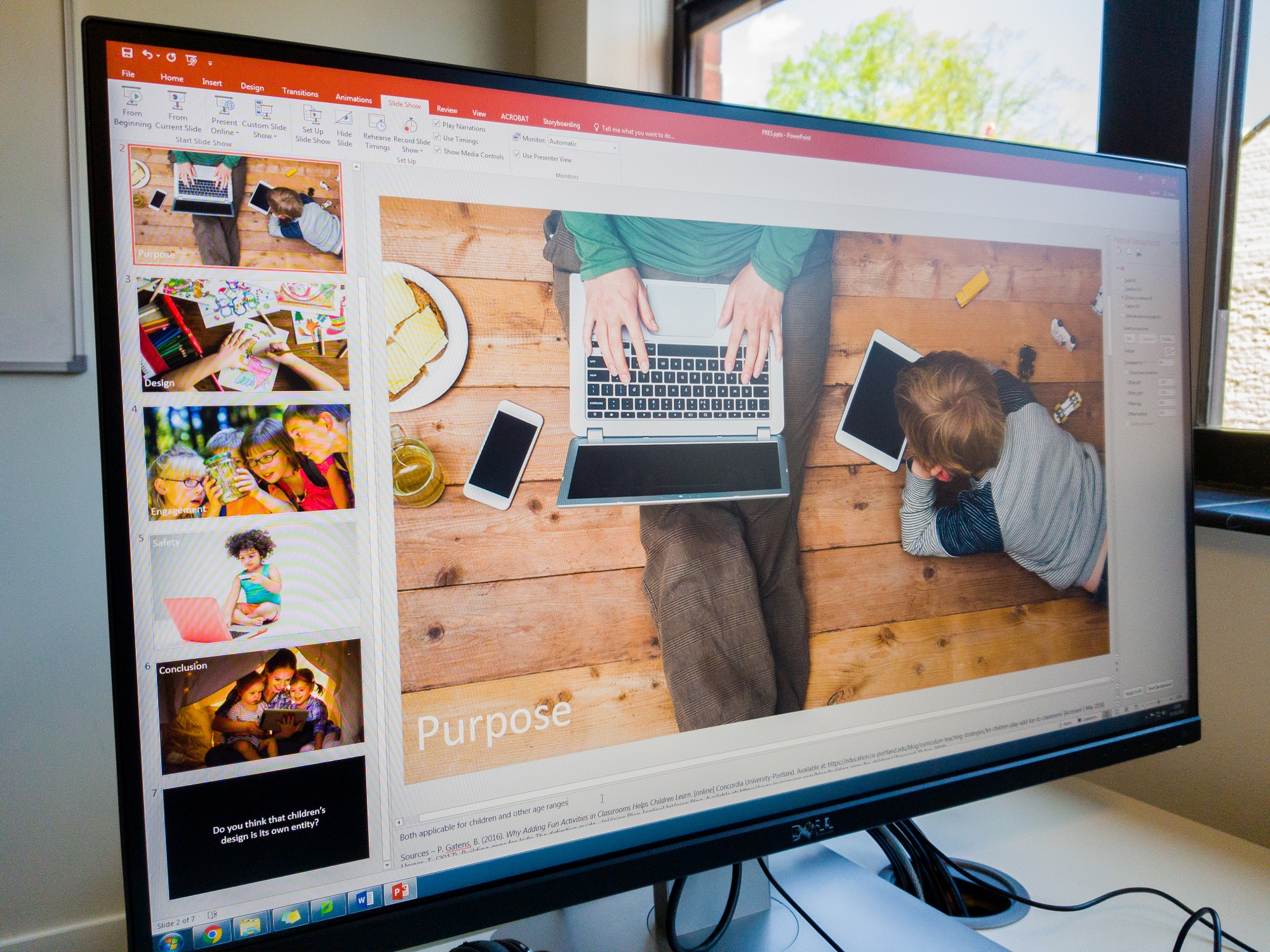
Slide 2: Purpose
- Entertain (games)
- Inform (website)
- Teach (games mainly)
- Both applicable for children and other age ranges
Slide 3: Design
- Simple UI (all)
- Flat colours/illustrations (all)
- Conform to app standards (all)
- Easy to learn and pick-up (all)
Slide 4: Engagement/calls-to-action
- Clear tutorials/instructions/calls-to-action (could even be clear buttons) (Dark Park and website)
- Sound to provide feedback (all)
- Animations to catch attention (all)
- Children need a challenge (in games) to keep them engaged (games)
- Children need constant feedback (games mainly)
Slide 5: Child safety
- No popups/ads/in-app/online purchases (all)
- Simple language, no profanity or suggestive remarks (all)
Slide 6: Conclusion
- All can be used by a child even if not directly designed for them (all)
- None of them have been limited to be useful only for children (all)
- Website for parents but attractive to children
- Dark Park is aimed at all ages and teaches cognitive skills and parents would play with children
- Asteroids for children but will be used to educate. Parents will follow along.
Slide 7: Question
- Do you think that children’s design is its own entity?
The aim of the presentation is to make the professionals question if children’s design is really an entity on its own and for them to see how three different projects can be used for children – and adults – of various age groups. We hope that the use of rhetorical questions at the beginning and the end of the presentation grab their attention and get them interested. During the intro, we’ll give them tablets with the projects on them so that they can see how to interact with the projects and get a better feel for them than just having a video has. The rest of the slides should be fairly self-explanatory.
The next step was to look for images which we did today too. Most of our images featured images of children using technology since that is relevant to the presentation and not too cliche or generic. We are going with my ‘traditional’ large-image-style presentation with minimal text – the only text will be the question on the final slide which is the ‘take-away’ point from this presentation.

Tuesday 1st May
Today was all about building the presentation and refining the information that we were going to present. We decided that the best approach to slides was to use full-screen images as we had learned how to do in the session yesterday and also how I’ve personally been doing presentations for 3-4 years now. To help turn the slides into a cue/prompt, we added just one word to each slide which explained what we were going to talk about on the slide. The idea of this is that even if the image on the slide isn’t enough to prompt us, then hopefully the word does without the need to use presenter notes.
Today we decided that we definitely want the presentation to be completely about children’s design in our projects and how we have tried to conform to children’s design. With that in mind, to get a clear message across we decided that the order of the slides should be:
- Introduction
- Purpose of our projects – who they are for and what they are meant to do
- Design of our projects and how they conform to children’s design
- How our projects engage – we are aware that children’s apps/websites must be very engaging with constant feedback, so how do our projects accomplish this?
- Safety – how our apps are safe for children to use and emphasising the importance of safety
- Conclusion – our apps can all be used by children even if not designed for them
- Question – ask the professionals if they think that children’s design is its own entity
Basically the same structure that we planned out yesterday.
Today we also spent some time adding notes to the slides so that when the presentation is evaluated the examiners can see our thought processes and what we said on each slide without having necessarily watched the presentation. However, that doesn’t mean to say that in the presentation we will simply read the notes – we will instead talk about what is written in the notes.
We decided that on the introductory slide we wanted a silent video of each of our projects, so I used Camtasia Studio on my laptop to record some quick videos of our projects in action that we can use to explain what we have made and why we made them to the professionals.

Wednesday 2nd May
This afternoon my group met up and did more work on refining the presentation, adding further detail to the notes on some of the later slides and we began to rehearse and think about who would say what. We decided that we’d all talk on each slide and talk about how our own work fitted the theme of the slide.
We also decided that we wanted to make our points more valid and also impress the professionals a little bit by having a real-world example of a product that meets the design criteria for children that we were talking about and also to be able to talk about how these real products follow design principles that we have used. We found that Disney’s Club Penguin website puts the safety of children high up the agenda with a dedicated ‘Parents’ page easily accessible from the home page from a button at the top of the website. On the Parents’ page there is plenty of information about e-safety and Disney even give some tips to parents to help keep their children safe online such as ‘never give out your password’ and ‘don’t use your real name’. We also found that the BBC have a strict comments policy on their CBeebies and CBBC website with around 20 rules to keep children safe in the comments. All comments are moderated and any that break any of the rules are not published. Rules range from ‘you must be under 15 years old to comment’ to ‘do not talk about stars’ personal lives in the comments’ and ‘no flirting or dating in the comments’ to the usual ‘no offensive language’.
With the safety aspect covered, we decided to use a screen recording of a child’s web-based game to demonstrate the use of flat, bold graphics and colours, different levels and different maps to keep the challenge and engagement alive and also simple and easy-to-understand controls. We found a game on the CBeebies website called ‘Danger Mouse Run’ in which the user must use the arrow or W,A,S,D keys to move a car being driven by Danger Mouse down a road and avoid the obstacles. We recorded myself playing it and put this video in the presentation after the engagement slide.

Relaunch of Storehouse Online
This evening Storehouse was relaunched. It’s been around two months since the Storehouse Online website went live and it has attracted quite a bit of attention in that time. Tonight’s meeting was one long presentation delivered by the various Storehouse team leaders including myself as a leader of the Online team to an audience of students who want to join Storehouse to make Issue 17. Issue 17 will be released in September and headlining features for the Online team will include a redesigned website featuring possible support for WebVR and augmented reality and the Article Creator software that I wrote in C# at the end of March will be finalised and updated for Issue 17’s code. The Article Creator will likely be translated from a WPF C# Windows app to a JavaScript web app by myself or re-written from scratch using something like Xamarin (which is now part of Visual Studio) so that it is compatible with macOS which is a big requirement given that most people who will want to use this will be using a Mac. Article Creator is going to be a huge part of Issue 17 because it means that more people will be able to submit content for Storehouse Online and it will be easier than ever for them to send us content and easier than ever for us to put the content in. Article Creator generates all of the appropriate CSS, HTML and JavaScript required to turn the text that the user types into the app into a fully-fledged article, so we hope that there is more online content for Issue 17.
Callum and I did a good (but totally ‘winged’!) presentation to the students about what being part of the Storehouse Online team involves and the opportunities that we can offer them. We have split the team into three main sections:
- User Experience Designers: those who do the research and user testing of our products.
- Visual/Interaction Designers: those who design the interfaces and consider interactions.
- Developers: As Lenovo would say, ‘those who DO!’ The ones who code the products.
Callum is heading the User Experience Design team, BSc Interaction Design and close friend of ours Ameer Al Ashhab is heading the Visual/Interaction Design team and I am heading the Developing team.
Article Creator was demonstrated during this presentation and wowed the audience. It was the first public demonstration of the app.
We feel that Storehouse Online now has enough roles to satisfy a lot of talent at university. Our university is mostly made up of design students whom we can offer a new and exciting opportunity to develop a digital product with us and there is a growing number of people who want to learn to code. Those interested in coding websites can help develop the site and those interested in coding an ‘app’ so-to-speak can help develop the Article Creator.
Also announced today by Callum and I was the deprecation of our coding society and the integration of its members into the Storehouse Online team. We feel that neither of us no longer have the time to run a separate coding society especially when Storehouse Online can involve coding too, so it made sense to finally integrate the two teams.
A personal goal for me with Storehouse Issue 17 is to integrate Storebase and Elebase to make a new ‘common framework’, probably called ‘Dragonbase’. My university interview portfolio that was compiled in February 2017 is available to view to this day at pendragon.online. However as I am now approaching the end of Year 1 and looking to create a portfolio featuring work from my studies to send to industry instead of focusing on projects that I completed during my A level days, my portfolio will be updated. It needs updating anyway because it is not mobile compatible and was made using Adobe Muse which is being deprecated by Adobe soon. This was the final website that I made in Muse and these days I feel that I am more than capable of writing a portfolio site from scratch using code. Using elements of the Storebase and Elebase frameworks, I will create a new framework for my updated portfolio called ‘Dragonbase’ and this will become ‘the common framework’.
Thursday 3rd May
Presentation today! The pressure was on this morning as we rehearsed our presentation and added an extra slide at the beginning of the beginning of the presentation which acted as a title slide where we would introduce the presentation topic and then go into more details about our apps on the following slide when the video was playing. We also decided that to make the presentation more fluid and to appear like we knew what each other had made we would take it in turns to present several slides at a time. This meant we each had to talk about another person’s product at least once during the presentation.
Also to improve the fluidity of the presentation, we opted to run the presentation from a laptop and control the slides via a Microsoft app called Office Remote which I have been using on Windows Phones for nearly 4 years now. I’ve used Office Remote in previous university presentations and the great thing about it is that it can be run on a phone and using Bluetooth and the free Microsoft Office Remote add-in for PowerPoint, it allows you to advance the slides in a PowerPoint presentation directly from the app on your phone. It also displays the presentation notes on the phone screen too. Look at the video below that I recorded back in 2014 which gives a nice overview of Office Remote.
The use of a presenter like Office Remote means that nobody has to stand in front of the computer advancing the slides, so we can all be more engaging during the presentation by walking around more and not having to always return back to a computer at the end of each slide.
I brought my (now-disused!) Nokia Lumia 930 into university today with the intention of using Office Remote on that because I thought that the app was only available for Windows Phone. In fact for a little while I even joked how ‘Office Remote was the only exclusive Windows Phone app’, however it seemed that the joke was on me because we decided to run the presentation from James’ laptop (due to the Bluetooth drivers on my ThinkPad T440s being a little unreliable) and he pulled out his Sony Xperia (which runs Android) and immediately searched for and found the exact same Office Remote app in the Google Play Store. What’s funny is that the Android app has some additional features that the Windows Phone app doesn’t have – such as slide previews! Microsoft were keeping the Android app updated and hadn’t touched the Windows app for nearly 4 years! Wow! Admittedly, as the owner of a Samsung Galaxy S8 I should’ve really just looked in the store myself for the app but I never thought to do this. The ever-degrading battery on my tired old Lumia 930 meant that after just one run of the presentation its battery had dropped from about 55% to 45% and we all felt that with James’ Xperia having a massive 6.0″ display (compared to my 930’s 5.0″ display) it had the advantage as a presenter tool because it could display more of our lengthy notes.
Initially we were going to pass the phone around during the presentation to the person who was speaking, but we decided against this in the end and that one person would have the phone and advance the slides. This meant that two people wouldn’t be able to see the notes, but it did mean that we weren’t trying to pass the large phone around or potentially walking in front of each other trying to do that, again making the presentation look more fluid and thought-through.
Although the Office Remote app is available on my S8 and I have installed it, I’ve still ordered a Logitech R400 Wi-Fi presenter for future presentations. It runs on its own Wi-Fi network and comes with a USB dongle that plugs into any PC or Mac (no drivers required) which negates the need to download and install the Office Remote add-in for PowerPoint or having to worry about pairing a phone with a computer – and not all computers have Bluetooth. The presenter hardware themselves obviously don’t display notes but do have forwards, backwards and video play/pause buttons as well as a laser pointer and of course they’re also compatible with other pieces of presentation software such as Apple Keynote and OpenOffice Impress. We used to have a lot of these in the high school I worked at and they worked great. The dodgy Bluetooth on my T440s means that often devices don’t pair properly with it, so using a presenter like this is a must. I could even run presentations from the university desktop computers actually without the need to use my laptop now.
The great thing about Office Remote is that it has a timer. We were told that the presentation needed to be between 10 and 15 minutes, most of our practice ends ended up being around 10 minutes long. On the shorter side, but we felt that we were able to cover everything in the time and it would be pointless to add extra content to the presentation for the sake of just adding an extra few minutes.
Slide transitions were added late. The only transitions we liked were the slide up and slide left and right transitions, as well as the traditional fade ones. The others look a little unprofessional.
Delivering the presentation
The presentation is available below.
We were the first group to present and I felt that overall we did a really good job! I enjoyed presenting my parts and I hoped the others did too. I felt that Kieran and James were more nervous than I and were self-admittedly less experienced presenters, but both did a good job at coming across knowledgeable and spoke clearly during their parts of the presentation. Kieran was a little annoyed at himself for forgetting a few lines at the very beginning and pausing a little, but I reminded him that he recovered himself very quickly and the rest of the presentation was absolutely fine. Kieran also did an excellent job of answering questions from the professionals. James felt that he didn’t talk as much as Kieran and I so to compensate for that went into slightly more detail on his slides and it worked.
We all shared a similar presentation style: making eye contact, using some body language (but not excessively) and speaking clearly and loudly. It was good that our presentation styles were similar, it meant that one didn’t stand out too much from the others and there was nobody clearly ‘leading’ the presentation. We all used the same tone of voice, but accentuating it when required to emphasise certain points and we all used the same language style, for example we didn’t attempt to crack jokes with the audience which can sometimes lead to an icy cold response if they are not interested or the presentation doesn’t call for it. We were presenting to professionals from the industry – we wanted to impress them and show them what we can do and maybe even catch their attention for internships and future employment. Cracking jokes didn’t fit into this remit.
Cracking jokes deliberately sometimes comes across as being unnatural, as does using excessive unnatural body language and accentuating your voice too much to the point where your presentation looks extremely rehearsed. In my opinion this isn’t good because a good speaker should just be able to talk as they normally would and appear confident, interesting and most importantly of all: captivating. I know I said that Adolf Hitler’s excessive body language and tonal accentuation helped to give his speeches impact and make him one of the most convincing public speakers the world has ever seen, but there is a massive difference between speaking to an audience of thousands and trying to get them to vote for you because you want to convince them that voting for you will make your nation a stronger, safer place, and presenting to a group of approximately 10 people about how children’s design can be applied to three university projects. Yes, good body language and accentuation helps to make a speaker more engaging, but context is also extremely important. Somebody using Hitler’s presentation techniques in the presentation scenario we were in would look ridiculous. For a start you’d deafen everybody and the whole purpose of those erratic hand gestures was to be visible from a long distance, so that would serve absolutely no purpose in a small room. Hitler employing our presentation techniques in his political rally speeches of the 1930s might not have got him very far and saved a World War (possibly a good thing, but bear in mind that a lot of the technology that we use today and that I am learning about on my course has come about as a result of World War II and the subsequent Cold War).

Moving on, the technology worked perfectly. It’s always a little risky introducing technology such as videos, sound and of course the user of presenter tools into a presentation because the number of things to go wrong increases, but PowerPoint on James’ laptop ran in harmony with the Office Remote app on his phone and the presentation ran smoothly. I’m trying to imagine how embarrassing it would have been had we tried to run this on my ThinkPad T440s and its Bluetooth just stopped working (like it does) and if the battery on my Lumia 930 had died or the phone had gone into flight mode to try and save battery during the presentation, disabling Bluetooth in the process. That would’ve been disastrous!
The presentation lasted for 10 minutes and 10 seconds which was good given that our practice runs were around the same kind of length and you nearly always complete your talk faster up on stage than you do presenting to a brick wall. Rehearsals for my TEDx presentation were usually over 10 minutes long which was a problem given that the maximum talk time I had was 10 minutes, but it didn’t worry me because I knew that up on stage I’d be about a minute shorter – and I was!
The questions that we received from the professionals were fantastic! For them to ask the questions that they did meant that the presentation got them thinking and able to ask quite complex questions that some people have tried to write scholarships and dissertations about. One question was about calls-to-action and making those obvious which was something that I was supposed to mention on the ‘engagement’ slide but unfortunately omitted. I was happy that this was asked because it gave me the chance to redeem myself and deliver this information. I explained how the use of text (and simple language), simple icons and drop shadows around clickable graphics such as buttons made calls-to-action extremely obvious which is crucial in children’s design. Calls-to-action need to be super simple because children of course don’t have the development or the same level of understanding as an adult does. Another question is quoted below:
You ask us if children’s design is its own entity. Does that mean that you’d apply these principles to everything that you design?
This question was great because it had a seemingly-obvious answer but actually the answer is not as obvious as one might think. All three of us gave really good contributions to answering this questioning and in the end decided that although you should design with a target audience in mind, there are certain elements of what some people think is only applicable to ‘children’s design’ that should be applied to any app or website in order to make using it a positive experience, for example:
- Calls-to-action must be obvious in an app or website targeted for any age group, not just in apps and websites designed for children.
- Colours must be suitable and attractive in an app or website targeted for any age group, not just in apps and websites designed for children.
- Content (images, copy text, videos and any other content) must be suitable in an app or website targeted for any age group, not just in apps and websites designed for children.
- Information and text must be easy to read and find in an app or website targeted for any age group, not just in apps and websites designed for children.
- There must be a clear goal and/or purpose to an app or website targeted for any age group, not just in apps and websites designed for children.
So whilst you wouldn’t likely design a complex app designed for adults with excessively bold languages or excessively simple languages, you should do all your power to make the app as easy to use as possible with clear calls-to-action, suitable content, clear text and have a clear purpose and so on. The only thing you may not do is provide feedback all the time, usually you’d only do this if something goes wrong.
The final question was asked by UX researcher Katie Fisher:
You say that the purpose of a game is to be addictive. Is it ethical to make addictive experiences for children?
This question is a difficult one to answer and with the rise of technology, especially technology used by children, has become one of the most commonly-asked questions relating to technology and children and even parenting in general. The last time I was asked about parenting and technology it was when education journalist Leah K. Stewart asked me about whether or not I thought the fact that libraries were shutting down was a shame. After discussing about libraries, I remember saying this:
I’m not in favour of using technology to replace parenting like some people do, where they give a kid an iPad and just… ‘let them be’ with it. I think if you’re using technology you need to use it constructively with your children – so teach them how to use it, play games on it together, but don’t be stuck to it 24/7.
See the video which this is from below (playing the video will begin the video just before the quote above – 22:38).
When answering Katie’s question, I remembered this small exchange that I had had with Leah and basically reiterated my points above. Kieran and James pointed out that the idea of a game is to be addictive and that could possibly be seen as being OK if the aim is to educate – more learning can surely never be a bad thing? Some parents and educational professionals would argue that too much learning is indeed a bad thing but my argument would be that we are learning all the time. Even if I am just sitting at my PC, I am usually reading a Wikipedia article about something (old ocean liners like the RMS Olympic, RMS Titanic and RMS Mauretania have been my ‘Wikipedia reads’ of late) or watching a video about something and I am learning. Kids are learning all the time too, by playing, by walking, by talking. Learning is something that we do from the second we are born to the second we die, in my opinion. Kieran and James did feel that games which are not primarily designed to educate could be seen as being bad if children were addicted to them, but often games for children are designed with education or improving memory, cognitive or motor skills in mind. We also stressed that games help to teach children how to use technology which is a massive part of our modern world, hence why before I mentioned parenting in the interview with Leah I said:
I do believe that there is a moral obligation to provide students with technology so that they can learn how to use it.
In my mind, a student without access to any technology in their life is like denying a student access to pens and paper which could inhibit them from learning how to read and write. Technology is so ingrained in our culture and society today that we must all know how to use it in order to survive and be successful.
Going back to my thoughts on parenting with technology and how that could help answer Katie’s question, I expanded on the point and said that I feel that when the parents are exposing their children to technology, whether it be a desktop PC or an iPad or something else, it is up to them to monitor the child’s behaviour and their usage of it – as well as find useful and constructive things to do using the technology. Is drawing things all day long on Microsoft Paint or a similar app on an iPad as constructive as learning how to count using a counting game? I’m not sure. If you want your child to learn how to draw with technology then maybe, but most parents would probably say no. From the youngest ages (toddlers) right the way through to around aged 12 or 13, I feel that parents should be the ones calling the shots and making the decisions about technology and their child’s exposure to it, so it is for the parent to not use the technology as a form of parenting or as a ‘babysitter’ (remember the saying ‘the TV is a babysitter’? Change ‘TV’ for ‘iPad’ and you’ve got the 2010 and later version of it) and instead use it as a tool to extend learning outside of the classroom and/or make learning a more fulfilling and enjoyable experience for their children.
Is it ethical to make addictive experiences for children? Designers in general will say that no, it is probably not ‘ethical’ to do it, but it is done anyway because an addictive design is a good design, right? Addictive = keep coming back = more money for us as we make more sales or people click on ads. Talking about e-Learning apps however, since when has learning ever really been ‘addictive’ for children? Never! Or at least not until the advent of technology in the home which has made learning outside of the classroom easier and more stimulating than ever before which in my mind is a good thing.
Interestingly, in the interview with Leah after talking about my views on parenting and technology, I naturally go onto talk about e-Safety and how children are being exposed to technology at much younger ages these days than they were back in 2004 and 2005 when the ‘big social names’ that we know today like Facebook and YouTube were just starting up. Our presentation also encompassed this, so clearly we were right to put a big emphasis on e-Safety.
The good, the bad and the ugly
Luckily there was no ugly! I guess I’m not a huge fan of the appearance and thick bezels of James’ Sony Xperia that we ran Office Remote on but who cares about that?
Let’s focus on the positives:
- It was short enough to keep the audience’s attention, but long enough to get the points across.
- Feedback afterwards said that the theme was very clear and was presently solidly throughout with good real-world examples.
- The theme was relevant to our work and was unique to the three of us. No other group could have chosen the theme we chose because their work didn’t fit.
- The theme that we chose wasn’t the obvious one to choose – the obvious one to choose would have been to focus just on the UI of the three projects and not try and relate it to any specific target audience.
- It was well-targeted to the professional audience with a good mix of UX design, UX research, interaction design and games development content (related to designing for children) in there.
- We were all reasonably-strong presenters and presented in a similar manner using similar body language, voice and language.
- We all participated fairly evenly in the presentation.
- We all answered the questions given to us by the industry professionals.
- The questions from industry were quite complex which meant that they had understood our presentation at a fairly deep level and wanted to ask more than the generic ‘what do bright colours mean for children?’-style questions.
- The presentation came across as being fluid due to the use of the Office Remote app to advance the slides without needing to stand in front of a computer.
- The slide design meant that the audience were treated with an engaging, yet relevant, image and we as presenters were not focused entirely on reading straight off the slides or the presenter notes.
I think we fulfilled the clarity, engagement and structure requirements well. The questions we were asked at the end show that all three were good from the industry’s point of view.
We worked pretty well as a team. There were no major disagreements or arguments and we were all available as we could be for sessions to design and practice this presentation. I’d work with either again. We even went and saw The Avengers: Infinity War the following day together, so it’s brought me closer to these two!
If I were to do this again, I’d probably suggest that we spend more time rehearsing. When I present I tend to be better at just ‘winging it’ and having a basic idea about what I am saying and kind of making it up on the spot whilst I am up there. If I am using slides, the images are my prompt and if there no slides then I really have to improvise! Some people will say that this is a mad strategy but it actually makes me more relaxed and natural whilst presenting because I feel that I am just talking. Who thinks of everything they want to say to a friend or write in an email and then say it or write it word-for-word as you rehearsed it? Nobody! The only presentation in my life that I haven’t ‘winged’ as such is my TEDx presentation which I did have to put more practice into because I had to send the team a script and also remember some key statistics to make my point come across. I only spent three days practising it though and I wasn’t reciting my script all day. I often get a bit worked up when I have a script because I get mad at myself if I forget to mention something in it.
Kieran and James aren’t really into ‘winging’ it, they prefer to have a script and a plan. I should have really accounted more for this and suggested that they have more time to learn a script so that they would feel more confident whilst presenting. I was however really pleased with how they did given that I had the phone with the notes on it and they weren’t able to read from the presenter notes or the slides.
If I could improve one thing about my presentation style on this occasion it would probably be to stand up straighter whilst the others are talking. I’m not used to doing group presentations so I naturally ‘stood easy’ whilst the other two were talking and it probably didn’t look the best. I should have stood up straighter and further away from the board or from the current person speaking so that I could give them more spotlight whilst talking and then make more of an entrance for myself when it was my time to present.
This wasn’t the best presentation I have ever done, but it was far from the worst! There was a presentation that I did at Old Buckenham High School about Microsoft Office 365 for students years and years ago that I had done twice before but on the final day it just didn’t go as well (and everybody who had seen the previous two presentations said so too). This was by far the best group presentation that I have done! I haven’t done a ‘group presentation’ (3 or more people) since about 2015 when I did one at Microsoft E2 in Seattle with some other students, so of course it was better than anything I did back then. My group worked much better together than any ‘group’ that I have worked with before and we all had a stronger work ethic and desire to do well than any previous group I have done presentations did. I used to resent group work at school because I’d end up doing all of the work, but now I am much more open to it though I do prefer to do presentations alone on the whole. But, this was a great experience.
Critiquing other groups
On the whole I felt that everybody did well. The other presentations were longer and more technical, but the technical aspect (the coding and so on) doesn’t apply to our presentation. Most people presented really well and seemed confident and knowledgeable. I didn’t feel that anybody did awfully at all but I did feel that some people tried a bit ‘too hard’ at presenting well and maybe used slightly too much exaggerated body language and tried to engage with an audience that just wanted to listen so sometimes they seemed a little unnatural (especially when other members in their group weren’t doing the same). But on the whole I think everybody did well. Audience engagement is a hard one – I think generally you should try to engage with them (as in get them to speak up and answer questions) once and if they give you an ice-cold silence you know they just want to listen. This is all just my opinion of course.
I think that the professionals were impressed by the level of detail and effort that each of the three groups had put into their presentations as well as the variety of the presentation topics. No two groups did the same topic which was great! We had a presentation about immersion from one group (which like my group’s focused on design elements) and the other team’s was much more technical-based, so the variety was great.
It was interesting that the other teams didn’t choose to have full-sized images on their slides liked we learned about on Monday – instead, both had a lot of text on the slides and with images. Perhaps for the more technical presentations this style of slide worked better? It was interesting seeing other people’s presenting styles and their approach to things like slides.
Networking Hour
Networking Hour is an NUA event hosted every May in the Duke Street building. Professionals from local design, video, animation and now UX companies come to the university to network with students. I went with my friend Emma McIlwaine who I’ve worked on Storehouse Online with and also bumped into Elena Lockyer there too who is another one of my friends. I spent the hour networking with professionals from Foolproof, The User Story and a couple of advertising and design agencies too such as Further (who do marketing but now have a small web design team) and Start-Rite who have been designing children’s shoes in Norwich for over 200 years. The reasons why I wanted to network with Foolproof and The User Story employees should be fairly obvious given my degree choice but having recently gotten into children’s design I spoke to Claire Russell from Start-Rite to see if she could give me any tips on children’s design and what she had to say was very interesting!
Tom Haczewski from The User Story was there and having worked with him and his colleagues on several occasions over the past two months or so I have gotten to know him quite well. I mentioned that the end of the year is fast-approaching and that I want to ‘keep my UX skills up’ during the summer and he said that provided he can get an office move, he may have an opportunity to do a 2 month or so internship over the summer at The User Story. He said that if the opportunity arises I will be the first to know, to which I responded ‘if you send an email offering anything I will reply within a minute with a big yes!’ Hopefully something arises, but if not then I will likely reach out to Foolproof and see if they have anything available. I think it would be fantastic to be able to do an internship with a local company at the end of Year 1 and aim to look to do an internship with a larger company like Microsoft or similar at the end of Year 2. Working with a small-medium sized business at the end of Year 1 and a larger (possibly MNC) corporation at the end of Year 2 will hopefully mean that by the time I start Year 3 I have more of an idea about the kind of company I’d prefer work when I leave university.
It was a fantastic evening and being offered the possibility of an internship with a company that I had my eye on made it even better!

Final refinements to Elebase 4
In amongst all of this presentation and education talk, Elebase seems to have been forgotten! Fear not, tonight I made some small changes to Elebase 4 based on the feedback from the April 2018 user testing. The changes are as follows:
- The paragraph text is now in a font called Proxima Soft rather than Arial. Typography experts at NUA said that the soft font made the site look more friendly and inviting.
- After months of debate and Nellie’s Nursery themselves not liking the heading font, the heading font is now Proxima Soft Semibold instead of a handwriting font. Typography experts feel that this still looks calm and inviting as well as a little playful, but far more legible.
- In response to some users who felt that the text on the mobile view was too close to the edges, the width of the text container on the mobile sites has been reduced from 95% wide to 86% wide so that the text is more centred and there is more white space on the left and right of the page. With the advent of curved displays on some smartphones (such as the Samsung Galaxy S8 and S9), the text will be easier to read on these devices because it will not be on the curved edges.
I also started trying to implement a mute sound button as suggested in user testing.
When or if I can get the mute button working, this will be the version of Elebase that is uploaded to GitHub and submitted as part of my BSc1b submission on May 11th. The build that was tested was Build 4375, compiled on April 20th 2018. This build will be build 4400.

Friday 4th May
‘May the Fourth be with you!’ With the presentation over and done with and Elebase 4 almost ready for submission, today was about beginning to tie the lose ends and preparing to finish Year 1.
Time flies by when you’re having fun!
Firstly, I cannot believe that I am just a week away from completing Year 1. Where has the time gone? It’s amazing that within the blink of an eye I have gone from doing all of those wireframes for Stellardrive to making it to testing it and then doing the same again for Nellie’s Nursery. It’s all gone so quickly and now it’s coming to an end. This seems to happen in life, things come and go very quickly. I remember feeling the same on July 21st 2017 which was my final day of working at Wymondham High. I couldn’t believe how quickly my year of working had gone and it was by far the weirdest day of my life. I remember feeling very ‘bittersweet’ about it all – I was leaving my job that was paying for my car and my life and after being at Wymondham High in some way or another (student and staff) for a total of 8 years I felt that I was also leaving my security behind to venture into the unknown. Although the ‘unknown’ was indeed unknown, I did hope that it would be better than the year I had working. Once I had gotten my head around that, I then drove myself to a camera shop straight after work to purchase my Nikon D500 – the dream camera that I spent the year saving up for. I couldn’t quite believe it – not only had I just left Wymondham High after 8 long years, I was now also the owner of my dream camera (that I honestly thought I’d never own!)
I know that hand-in on May 11th won’t be anywhere as surreal as that day was, but it will be weird feeling that effectively I have completed a third of my degree. I can’t believe that this time last year I was still working in IT support propping up old hardware (sometimes literally!) and revealing cases of cyber-bullying on the school’s internal social network and I hadn’t even handed in my notice and a year later I am preparing to finish my first year at university and looking to intern in the UX industry over the summer. Wow! Isn’t it funny how quickly life changes? I often describe the period between September 2014 and May 2015 when I was most involved with Microsoft and in my first year of sixth form as being my ‘happiest days’ and have often described them as being ‘perfect’, but I have to say that September 2017 to present has surpassed that and Year 1 of university has certainly been the best time of my life so far. I also remember being very happy when I began high school back in 2009 – it seems that every time I start a new chapter in my education I am happiest but this time I want the happiness to continue right to the end of Year 3 and into a great first career.
Each and every reflective journal and version of Elebase and slightly older work needs to be submitted next week, so today I started uploading all of my project work to GitHub and beginning to complete the submission documents.

Promoting BSc courses at NUA
Today I was involved in a visit from Year 9 students from Litcham High School near King’s Lynn. Set 2 maths had come to visit the university to learn about BSc courses. I’m always a little surprised that the university gets students as young as 13 to come and visit given that these students are only just starting to do their GCSE subjects and probably aren’t really thinking about A levels yet, let alone a degree, but anything to get the BSc word out there is good! Jamie delivered two great presentations to the two groups of students about what the BSc courses entail and featured pretty much everybody’s work in the presentation at some point which was great to see and then had the opportunity to look at some of our work on the various devices that we have at university. The students engaged extremely well with our work on the devices and many found the games in particular quite addicting and enjoyable to play. My nursery website was also praised by a student who loved the colours and the animations. I asked her if she’d send her child her if she had one and she said that she would, so I guess that’s a good sign! After this I did a campus tour with each group. I think they liked the fact that university has facilities in different buildings across the city and they were impressed by our media labs and printing facilities. The groups also went into the UX lab to learn about the eye-tracking and user testing facilities that the university has to offer.

Overall it was an interesting experience and it was good to see younger students thinking about their futures, however I feel that we should really be aiming our talks and tours to Year 11 and 12 students who will be able to study here with us in just a year or two and will have more of an interest in what we have to offer.

I’ve talked for over 10,000 words – again. That sums up a very busy week. Next week will be much quieter and will be mainly about finishing the 2,000 word report and submitting my work to conclude Year 1.
2 Comments on “Reflective Journal – 30th April-4th May 2018”
Comments are closed.