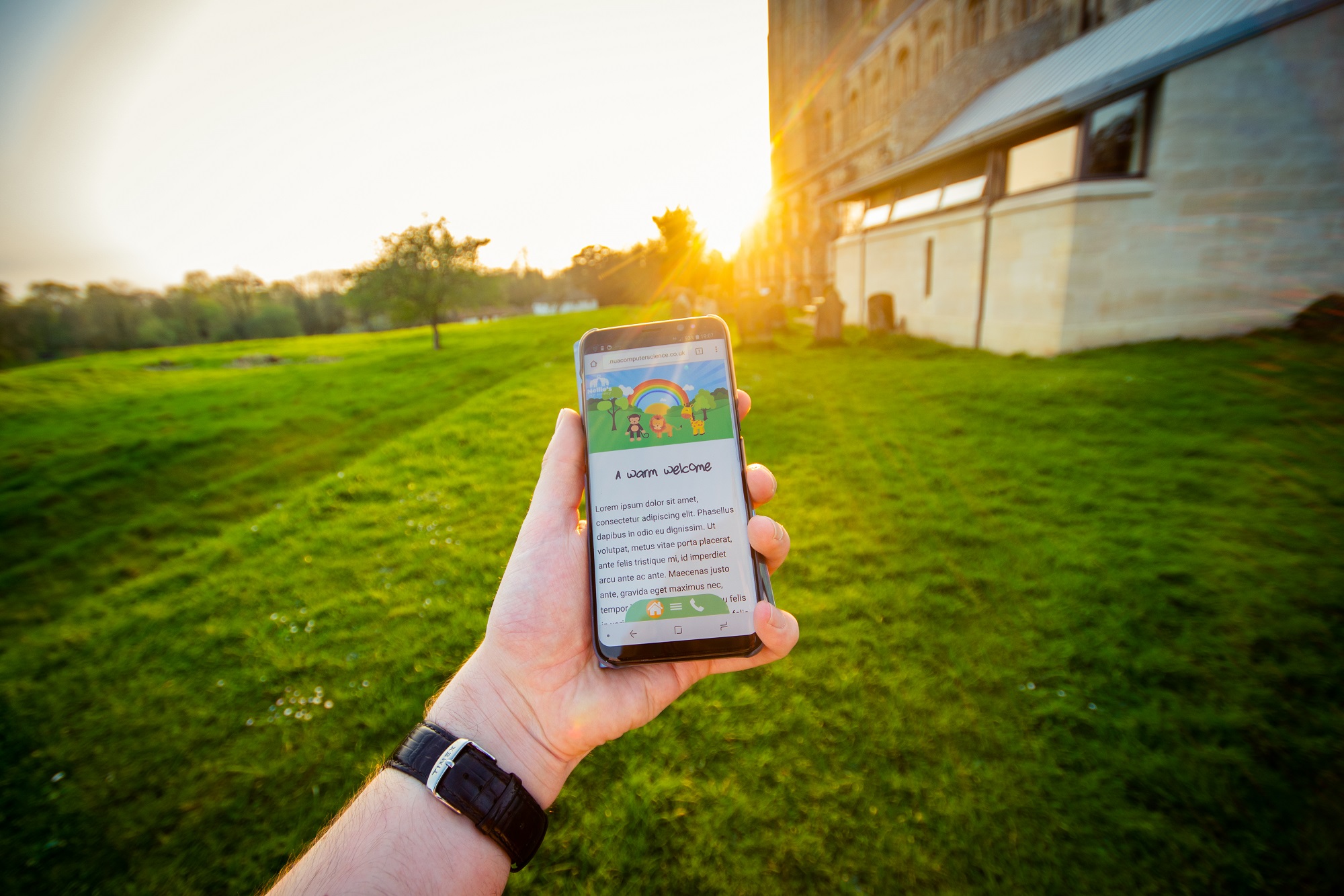
Elebase 4 was tested by random individuals between Sunday April 22nd 2018 and Saturday April 28th 2018. The testing strategy used for this testing was first mentioned in the April 16-20th reflective journal and some early findings were mentioned in the April 23rd-27th reflective journal.
Testing methodology
As predicted after Elebase 3 (March 2018) testing had been completed, the April 2018 testing did not feature any testing in the UX lab using the questions and tasks set in the February and March 2018 testing sessions, rather testing was conducted by monitoring analytics data and then asking users to complete an online survey to find out their thoughts and opinions on various aspects of the prototype. Previous testing had focused mainly on the navigation of the prototypes but this time appearance and other usability factors were also included to get a much rounder idea of what my users really thought about the prototype.
Analytics data collected
The following analytics data is collected without any kind of user input:
User Data
- Device and software information
- Device name and manufacturer
- Device screen resolution
- Device type
- Operating system name and version
- Browser name and version
- System locale and language
- GSM provider (if applicable)
- Tracked events (desktop and mobile)
- Clicking on the ‘Continue’ button to visit the page after having read the beta software terms of use
- Clicking on any of the menu buttons (each is tracked as a separate event)
- Clicking on the collapsible ‘classes’ sections on the groups page (each is tracked as a separate event)
- Clicking on any of the characters in the hero image on the home page (each is tracked as a separate event)
- Tracked events (mobile only)
- Tapping on any of the icons in the fixed menu at the bottom of the page (each is tracked as a separate event)
- The opening and closing of the hamburger menu (open and closed are tracked as separate events)
- Tapping on either the feature image or text container to close the hamburger menu (tapping on the feature image and tapping on the container are tracked as separate events)
Audience Data
Audience data is collected automatically and are statistics and reports built from monitoring the behaviour of visitors on the site.
- Event flows (the order in which pages were visited)
- Acquisition channels (where users came to the site from)
- Bounce rate
- New and returning visitors
- Frequency and recency of visitors
- User engagement
Why use analytics to collect data instead of a session in the UX lab?

There are many good reasons why analytics, at this stage in the prototyping at least, can be used as a good substitute for a user testing session for the following reasons:
- At this stage, many of the initial bugs have been ‘ironed out’ and with Elebase 4 generally being similar to 3, the design itself has been ‘tested and proven now’.
- As a result of this, there is no need to conduct a user testing session as such where I need to directly monitor and control the tasks that the user does and watch their reactions for myself.
- Analytics data tells me exactly what users are clicking/tapping on when they are left at free will to use the prototype exactly how they wish in a calm environment where the user does not feel any pressure at all.
- Analytics data at this stage will provide the same kind of data that I was collecting in the UX lab because after all I was just looking to see what the user did and the order that they did things in.
- Several of the people that participated in this round of testing were also involved in previous testing sessions which means that if I set them the same tasks to do they may remember what they needed to do to do those tasks, thus corrupting the results. Besides at this point I know which tasks were generally completed successfully and which weren’t.
The benefits of using analytics data to test software
- I can get a wider range of people to test my software as I can just send them a link to test the software rather having to invite them to the UX lab.
- Participants can test the software in their own time, whenever suits them.
- Participants can spend as long or as little as they want, providing as much or as little data as they want. This could be also be a disadvantage though because it means that I have less control of how much data I receive.
- Participants have a wide range of devices that they can test the software on. There are lots of devices that I don’t own, but ask enough random people to test the software on a device of their choice and data will be collected from a range of devices.
- Testing in the UX lab takes place on only one or two devices. Those devices may not be the devices that are the most common. By sending the beta software to random testers it will be easy to see which devices are the most popular ‘in the wild’.
- Collecting analytics data produces real quantitative data which can be used to justify design decisions for future prototypes, e.g. if it turns out that the iPhone is the most commonly-used device
The disadvantages of using analytics data to test software
- Without some kind of feedback form, users cannot directly report problems or their feelings during the testing. A feedback form needs to be used to collect this data, but not everybody completes it or fully completes it because it takes longer and more effort to fill in a form with detail than it does to sit in front of a camera and talk to me casually. Users tend to reveal much more when they can just speak it rather than having to go through the effort of writing paragraphs in a text field, especially if they are completing the form from their mobile device. Many users also do not like completing surveys.
- Some users who are concerned about privacy get upset about analytics data tracking so before they go on to use the site it is good practice to write a disclaimer and notify users about what data is being collected and what for. This takes more work and potentially rules some testers out, but most people don’t have a problem with it.
- It’s much harder for me to control data. I can’t control what tasks the users do and the amount of time they spend, so I might get some people look at the site for 10 seconds and others for 10 minutes and without the use of goals (which unfortunately I didn’t set up for this testing) you’ll never really know why people are spending so long or so little on your site. Is it because they found the site easy and quick to use, or difficult to use, or did they just forget to close the session? Using goals would negate this issue and also give testers a task to achieve and using analytics to monitor if they completed it.
- Without knowing the testers beforehand, I’ll never know their background or professions etc from analytics data alone without also getting them to complete a survey, but some people might not feel comfortable giving this data away.
I’ve mentioned the use of an accompanying form a lot to help qualify analytics data, so here are the benefits and disadvantages of using one of those to collect data in conjunction with analytics.
Advantages of using a form in conjunction with analytics
- A form/survey with good and relevant questions can provide a lot of extra insight that analytics data cannot. Analytics data can tell you which button was pressed the most or which device was the most commonly-used, but it won’t tell you if a user felt that the colour scheme was dull or if the button text was too big or if it scaled well on an iPhone SE or not. A form gives the user an opportunity to communicate this data to you. The form essentially replaces the interview that took place after the testing in the February and March 2018 testing sessions.
- Good for the user is that they are optional, so the user can give as much or as little data as they want. I can’t make people fill in a survey, but I can make them talk to me about their experiences after a face-to-face user testing session – even if it’s not recorded at all and is a short conversation.
- The form could potentially give me a similar amount of data that an interview does, but thanks for multiple choice questions and collecting more qualitative data than quantitative means that it will be easier to analyse and interpret as I won’t have to sit through hours of video and listen to long-winded conversations to decipher meaning. Instead, I can look at a graph and the data’s meaning can be driven from that almost instantaneously.
- Another good point for the user is that filling in the form is likely faster than participating in a 15 minute interview so it obviously consumes far less of their time.
- The participant can complete the form at any time, and if they come back and do it later then they may revisit the prototype to remind themselves of what it was like, thus increasing the amount of analytics data that has been recorded giving me more data to work with and increasing the number of returns that I get on my site.
Disadvantages of using a form
I can’t sit down and have a personal face-to-face interview with each tester and I don’t have much time to analyse data, so I have made the survey was quick as possible to answer and using star ratings and ‘scales of 1 to 5’ to give quantitative data that can be graphed and charted easily and easy to compare (theoretically). There are some questions which provide the tester with an opportunity to say a little more and provide some qualitative data too.
The downside of collecting qualitative data by using opinion-based ratings is just that – opinions. What one person might think is a 2/5, another might think is a 5/5. I guess if you collect a lot of data and most results show say a 3/5 then you know it’s about average, but if a lot say 1/5 and a lot say 4/5, you may decide that something is like marmite and/or decide that around 2/5 or 3/5 is the general feeling. For the scale of this project, the lack of objectiveness probably isn’t a massive deal but if I was doing this for industry I’d be more concerned about the accountability of data collected in this way.
That and the fact that the tester does not have to complete the form, thus meaning that potentially I lose data, are the two big disadvantages of this system. As mentioned earlier, some users may also not give as much data as they might have done in an interview where I can keep the conversation going by asking questions and asking for more elaboration from them. The flipside is that less data is easier and quicker to interpret.
Who tested Elebase 4?
Private links to the prototype and form were sent out to approximately 30 people that I know of (both friends and family) on Saturday 22nd April 2018. 27 people viewed the prototype online and thus provided analytics data. However, of those 27 people, it appears that only 9 of them completed the survey which confirms the point raised earlier about the survey being optional.
I couldn’t post a public link because the Memorandum of Understanding signed by NUA and Nellie’s Nursery states that prototype links must be password-protected.
Analysis of analytics data
The following section will review the analytics data collected from Google Analytics.
Audience overview
Stats:
- 27 total users, 21 (77.78%) of which were new users.
- 47 total sessions with 1.74 sessions per user.
- 299 total page views on the prototype.
- 6.36 pages visited per session.
- An average of 10 minutes and 43 seconds spent on the prototype.
- A 23.4% bounce rate (relatively low).
The total number of users is important for working percentages on the following stats and also for knowing the sample size used in this test and the average time on the site indicates that users spent a good amount of time exploring the prototype. Perhaps the prototype interested them as they spent a decent amount of time on it. A bounce rate of 23.4% is fairly low, but would suggest that in theory approximately 6 users looked at the index.html page for a few seconds and then closed the page without looking at the other parts of the site. Does this nullify testing data? Perhaps, but I guess if the bounce rate is higher then it perhaps shows that the index page was not ‘grabbing’ enough to get users to stay and look at more of the site. Some users returned to the site after looking at it once, perhaps they looked at it again to test on a different device or to return to it later to help answer the accompanying form.
System locale information overview
Stats:
- 15 (55.56%) of users using the EN-GB system locale (meaning the device is set up in British English format).
- 12 (44.44%) of users using the EN-US system locale (meaning the device is setup in American English format).
- 27 (100%) of users from the UK.
- 12 (40%) of users visited the site from a Norwich IP address, 9 (30%) from a Southampton address, 4 (13.33%) from a London address, 4 (13.33%) from an Oakham address and 1 (3.33%) from a March address.
All users were from the UK, so those systems set up to use EN-US format must’ve been set to this format either accidentally, by default (and the user hasn’t changed it) or the user prefers the US style time/date and/or keyboard format. It doesn’t really matter as the site will display exactly the same on EN-GB and EN-US systems. What’s more interesting that is combined I had 29.99% of all sessions come from IP addresses that aren’t in the Norwich or Norfolk areas. My university, friends and home are all in Norfolk and Norwich so it’s interesting to see IP addresses from Southampton, Oakham and March used. I don’t know of any friends that I have who are from Southampton or Oakham. I’ve had a couple of friends who have been interning in London recently who might have used the site whilst staying in London on their internships and I have several friends who originally come from Cambridgeshire, but to my knowledge none of them from anywhere near March. Sometimes people use VPNs to access the internet which disguise their true location, but often these route your internet access around multiple countries, not across various locations in one country – so I think VPN usage is unlikely. What’s more likely is that either some testers sent the link to friends they had to also test for me or their IP address location is not representative of where they actually are. I live in a town just south of Norwich, Norfolk, but sometimes my IP address actually traces back to Royal Leamington Spa in Warwickshire or Sheffield in South Yorkshire because this is where my ISP (PlusNet) is based. It wasn’t surprising to see no international visitors given the content of the prototype and the fact that I did not distribute the link publicly.
Browser information overview
Stats:
- Google Chrome was the most popular browser with 12 (42.86%) users using the browser. Those using Chrome also spent an average of 11 minutes and 44 seconds on the site, longer than users of other browsers. 26 (55.32%) of all sessions came from Google Chrome.
- Safari was the secondly most commonly-used browser with 9 (32.14%) users using this browser. 12 (25.53%) of all sessions came from users of Safari.
- Firefox was the third most commonly-used browser with just 3 (10.71%) users this browser. 4 (8.51%) of all sessions came from users of Firefox.
- Other browsers such as Internet Explorer and Edge were only used by 1 or 2 users and Opera wasn’t used at all.
It’s not surprising at all to see that Google Chrome is the most commonly-used browser. It’s the most popular browser in the world on both desktop and mobile devices (it’s the most common browser on Android which holds the most mobile OS market share). Safari, being the default browser on Apple Macs and more importantly, Apple’s mobile devices, is also common especially since the iPhone is the most popular smartphone model in the UK. The share of Firefox and Internet Explorer is dwindling pretty fast and Edge has never really taken off too well especially on platforms that aren’t Windows.


Operating system overview
Stats:
- Windows was the most popular OS with 14 (50%) users using this operating system. Of these 14 users, 4 (28.57%) were using Windows 7 and the remaining 10 (71.43%) were using Windows 10.
- iOS was the second most popular OS with 6 users using this platform. iOS 11.3 was the most commonly-used version with 3 (50%) users using this version and the oldest version used was iOS 10.3.1.
- macOS was the third most popular OS with 5 users (17.86%) of users using this platform. Only two versions of macOS were used: 10.12 Sierra was used by 2 (40%) of the macOS users and 10.13 High Sierra was used by the other 3 (60%) of the users.
- Android was the least popular OS with 3 users using this platform, all 3 of which were using Android 8.0 Oreo which at the time of writing is the latest version of Android.
On desktop computers and laptops, it wasn’t surprising at all to see that Windows (10) held the most share in my tests given that Windows as an entity and Windows 10 in particular has the highest market share in the desktop operating system market. In the mobile world, Android does have the highest market share but most of my users were using iOS which is not too surprising given the popularity of iPhones in the UK. iPhones are the best-selling smartphones in the UK despite iOS having a lower overall market share.

Mobile device overview
Stats:
- The iPhone was the most popular phone used with 5 of the 9 (55.56%) mobile users using an iPhone. Unfortunately, no data is available for the specific models used but I know that the following models were definitely used:
- Two people who tested this prototype have an iPhone SE.
- One person who tested this prototype has an iPhone 6s.
- One person who tested this prototype has an iPhone 8 Plus.
- One person who tested this prototype has an iPhone X.
- The Samsung Galaxy S8 was the second most popular phone used with 3 of the 9 (33.33%) of mobile users using this phone.
- One user (11.11%) used an iPhone 6 Plus.
It’s interesting that the iPhone 6 Plus is listed as its own device – it is the oldest iPhone that was tested so perhaps after the iPhone 6 series iPhones appear just as ‘Apple iPhone’ in Google Analytics? Again, the iPhone is the best-selling smartphone in the UK (see the screenshot below) – interesting that the only Android device used was the S8. Only 9 people actually tested this prototype on their phone so with a larger sample size more devices would be seen.

Screen resolution overview
- 1920×1080 (1080p) was the most common screen resolution used with 10 (35.71%) users using a device with this resolution.
- Interestingly, 1440×900 was a commonly used resolution with 4 (13.29%) users using this resolution.
- 360×740 was the third most commonly-used resolution with 3 (10.71%) users using this resolution.
- 2560×1440 (‘2K’) and 375×667 were also commonly-used with 2 (7.14%) users using these resolutions.
- Other resolutions such as 1280×720, 1280×800, 1536×864, 1680×1050 and 320×568 were only used by 1 (3.57%) user.
A lot of different resolutions were used by my testers. 360×740 is the resolution that the Samsung Galaxy S8 displays webpages at and 375×667 is the resolution used by several iPhone models. The other resolutions are likely desktop resolutions apart from 1536×864 which could potentially be a tablet resolution, though the tablet would have to be running at practically 0% DPI scaling for it to display the site in this resolution. Older resolutions like 1280×720 and 1280×800 were used, again I wonder if these resolutions are from smartphones given that few people own a laptop with a 1280×720 or 1280×800 display these days and very few desktop monitors exist in this resolution. See the graph below to see the change in desktop resolutions used in the UK over the course of six years.

On desktop devices, the most common screen resolution is 1366×768 (‘HD’) which the displays on most 15.6″ mid-range laptops that people own have. 1920×1080 (‘FHD’ or ‘Full HD’) is the second most common screen resolution – this is common on televisions and most 22-27″ monitors have this resolution. At the beginning of the decade 16:10 resolutions such as 1280×800, 1440×900 and 1680×1050 were common on laptop displays and desktop monitors but these days the widescreen aspect ratio is generally now 16:9 so the likes of 1366×768 and 1920×1080 are more common. ‘Square’ 4:3 (1024×768) and 5:4 (1280×1024) displays were also common but are rare now and have been replaced by widescreen monitors.
Performance overview
Stats:
- The average load time for all browsers was 2.37 seconds. This is the average load speed over a range of internet connections that the 27 users used.
I put a lot of time into optimising the site so was happy to see that on average it only takes 2.37 seconds to load. Most of these load times will have been recorded on LAN and Wi-Fi connections, however it is possible that some people used the site on 3G and 4G too.
Event categories overview
Stats:
- The most common event was the playing of an animation. Of 403 total events recorded, 175 (43.42%) of these were playing an animation.
- Pressing or tapping on a button was the second-most common event with 130 (32.26%) of the 403 total events being pressing or tapping on a button.
- Collapsing a section on the groups page was the third-most common event with 68 (16.87%) of all events being this.
- Accepting the beta software agreement interestingly made up for 28 (6.95%) of the events.
- Hiding the mobile hamburger menu by tapping was not a terribly common event with just 2 (0.5%) users using this method of closing the hamburger menu.
Clearly the call-to-action to get users to click or tap on the animations helped and the animations were the most used features of the whole site. More users in the testing actually played the animations than navigated to other pages. Going back to the bounce rate discussion, perhaps some users went onto the home page, tapped the animation characters, liked them, scrolled down the page a bit and then left. It seems that generally calls-to-action are good with users pressing the right buttons to navigate around the prototype, but what perhaps isn’t as obvious is the ability to tap on the feature image or text container to close the hamburger menu. Generally users seemed to expect to close the hamburger menu by pressing on the hamburger button again, but a nice feature on Elebase 4 is the ability to close it by tapping elsewhere on the site.
Event labels overview
Stats:
- The top three assets that were tapped on were the giraffe character (86 recorded events of 403/21.34% of all events), the lion character (53 events/13.15% of all events) and the monkey animation (36 events/8.93% of all events).
- Clicking on the button to accept the beta software agreement accounted for 28 (6.95%) events.
- Opening the Little Lions section on the groups page made for 28 (6.95%) of all events and opening the Mini Monkeys section made for 26 (6.45%) of all events.
- The day-to-day page was a popular one to visit on the desktop site with clicking on the button to access the page accounting for 19 (4.71%) events. On the mobile site, pressing the button made for 14 (3.47%) events.
- Opening the hamburger menu button on a mobile device was fairly popular with pressing that button accounting for 18 (4.47%) events.
It seems that clicking or tapping on one character was an exciting and interesting experience for the user and thus they wanted to tap on the others too to see what they did. It’s interesting to note that generally users did not try to visit pages that hadn’t been constructed yet, perhaps testers from the previous testing sessions remembered that half of the pages haven’t been made yet and the other testers didn’t want to spend the time looking at all pages or they tapped on one of the non-constructed pages, saw that it didn’t work and didn’t try many other pages.
Page flows overview
Stats:
- Of the 47 total sessions, 17 of these dropped off on the first page. 9 of these were the index.html page, 2 of these were the groups.html page, 1 of these was the daytoday.html page and interestingly 2 of these was the notice.html page which is the page containing the beta software acknowledgement meaning that 2 sessions did not make it onto the home page.
- On the first interaction, there were 30 sessions at entry and 23 at exit as 7 sessions dropped off. 27 of these sessions were on the index.html page, 2 on the daytoday.html page and 1 on the groups.html page.
- There were 23 sessions on the second interaction at entry and 18 at exit as 5 sessions dropped off. The daytoday.html page was the most popular second interaction with 14 sessions, the index.html page had 3 sessions, the notice.hml page had 2 sessions and the groups.html page had just one session.
- The third interaction had 18 sessions at entry and 15 at exit as 3 sessions dropped off. The groups.html page had 12 sessions, the index.html page had 4 sessions and the daytoday.html page had 2 sessions.
The general order of the visited pages were:
- notice.html (Beta software acknowledgement)
- index.html (Home page)
- daytoday.html (Day-to-day page)
- groups.html (Groups page)
This is interesting to note because this is the order in which the pages appear on the site menu. Some users revisited pages such as the home page and likely revisited the beta software acknowledge page by accident by pressing the back button on their browser, presumably in an attempt to return to the page that they had been visiting before they visited the prototype.

The fairly low bounce rate is explained by the high number of sessions that went onto to have first, second and third interactions. If the bounce rate was high then there would be few first, second and third interactions because the users would’ve ‘bounced’ (left) on the starting page.
Testers seemed intrigued to view the other pages, hence why there were plenty of further interactions after the site’s entry point. Users perhaps also felt that they needed to see what was the on the other pages in order to provide me with good data or to feel like they had fully tested the site.
Event flows overview
Stats:
- The most common first event is (unsurprisingly) pressing the button to accept the beta software acknowledgement to proceed to the home page. 22 sessions of 32 (68.75%) had this event as the first one and this was the final event for 11 sessions.
- Tapping on the text container to close the hamburger menu and playing the animations on the home page were also common first events, with 7 events being playing an animation and 1 event being closing the menu by tapping on the text container.
- Playing the lion animation was the most common second event, with 6 of 21 (28.57%) second events being this. Playing the monkey animation was the second-most common second event with 5 of 21 (23.8%) of second events being this. Pressing menu buttons for various pages (Day-To-Day and Groups) made for a total of 6 of the 21 events (28.57%) and there were an additional 4 events.
- The most popular third events were again playing animations with playing the giraffe animation being the most common third event – it made for 5 of 20 (25%) of all third events. Playing the lion animation made for 4 of 20 (20%) of all third events and playing the monkey animation made for 2 (10%) of all third events meaning that collectively playing animations made for 55% of all third events.
- Playing animations were also the most common fourth events, with playing each of the three animations collectively accounting for 7 of the 18 (38.89%) fourth events.
Note that in the diagram shown above, the ‘more events’ tend to just be button presses, but usually only a button press for a single page. See the screenshot below.

This data is additional proof that the call-to-action for the animations is clearly a success and users are enjoying watching the animations as they are the most common events – even surpassing visiting other pages in some cases!
Acquisition source data
Stats:
- Unsurprisingly, 19 of the 27 users (70.37%) reached the prototype via a direct link.
- The remaining 8 (29.63%) reached the prototype via a social link.
- The bounce rate for users reaching the prototype via direct link was 25.64% and the bounce rate for users reaching the prototype via a social link was 12.5%, making for an average bounce rate of 19.07%.
On further analysis, it is possible to see that the 8 users who reached the prototype via a social link accessed it from Facebook. I distributed the links via Facebook Messenger so this is likely where this data is coming from (and 9 people answered the accompanying survey – but I know that I emailed the link to one of those people who answered the survey). Of course, strictly speaking only the ‘notice.html’ page will have recorded users coming from a social platform as this is the page that is displayed when you visit the URL. Then, navigating to the other pages on the site obviously comes directly from each other because links to the individual pages are not distributed online.
Analysis of forms data
Below is an embedded version of the form for reference.
The form collected qualitative and quantitative data and aimed to replace the interview section used in prior testing sessions.
Nine people completed the survey between April 22nd and 27th 2018 – which of course is a lot less than the 27 unique users that the site attracted. This problem was mentioned earlier, but some data from the survey is better to work with than none!
Browser information

Google Chrome was the most popular browser as recorded by Google Analytics, however those who answered the survey seemed to be Safari users, no doubt using the browser on an iPhone. Safari was used by 5 of the 9 users meaning that it held a 55.55% share in this data. Google Chrome was used by just two people so held a much smaller 22.22% share and Firefox and Edge each held a small 11.11% share. Once again, Opera was not used by any users.
Device information

The qualitative entry for ‘which device did you use?’ renders slightly more specific information than Google Analytics does, for example Google Analytics seems to group iPhones produced after the 6 series simply as ‘Apple iPhone’ which isn’t particularly helpful if you want to find out which iPhone in particular was used. Does it matter which iPhone was used? Yes! Especially when Apple now makes four different sizes of iPhone whereas with the 6 series and before iPhones generally only came in one or two sizes. The iPhone SE, 6s/7/8, 6s/7/8 Plus and X are all different sizes – the most challenging of which to develop for is the tiny 4.0″ display on the SE and the X offers an 18:9 aspect ratio with a bezelless design so that unlocks new possibilities for design. By asking users which device they were using I was able to get some more detailed information, for example I now know that an iPhone X, SE, 6s and 6 Plus was used. I can then look at the later feedback of these devices gave. Google Analytics also won’t be able to tell you the exact make and model of a computer either, for example it’ll be able to tell you the OS and screen resolution, but it’ll never be able to say ‘Mid-2014 15″ MacBook Pro Retina’.
It was good to see a range of devices was used. This is exactly why I wanted to get users to test this on their own devices. I don’t own an iPhone X or a MacBook Air or actually most of the devices in that list. There appeared to be no single device that was ‘the most used’, but putting my Google Analytics data and this data together it seems that most people tested this prototype on a desktop PC or laptop. I don’t mind that full specs aren’t listed – generally knowing the CPU model, installed system RAM, GPU model and available hard drive space isn’t very important when testing a website unless the website is going to be demanding to run, i.e. a game. For something like this, it doesn’t matter – all I really need to know is OS, browser and screen resolution which Google Analytics can record for me anyway.
User feelings about site content

As also discovered during February and March 2018 testing sessions, 100% of users felt that the menu buttons on the site suggests that the site has all of the relevant content. It seems that no additional pages need to be added and given that users knew what was on each page (they must’ve done in order to be able to answer this question), the page titles don’t need to be changed either.
User feelings on the site display

The vast majority of users felt that the site displayed correctly on their device – 88.89% of users did. One user felt that the site didn’t display correctly and later mentioned on the high-DPI screen on the MacBook, macOS’ scaling makes the text look large and scales the page up too much so that the animal characters are misaligned. This particular user wasn’t the only one to mention this appearance issue on a MacBook.
User preference of prototype

It seems that no matter how pretty, innovative, easy-to-use or attractive I make the mobile version of Elebase, the desktop version will probably always be preferred. It seems that users just enjoy the simplicity and layout of the desktop site. The mobile site was preferred by one person and two people liked both but thankfully nobody disliked both. Only five people answered this question because it was optional – in hindsight I should have probably made it mandatory to get each user to test the site on both a desktop and mobile device.
Some thoughts from the users (qualitative data):
Desktop simply because it filled the space really well, in comparison to my phone where it all felt a little squished.
-An iPhone SE user
I personally found being able to see the large images on the desktop version more appealing and it felt spacious and fitted the format well whereas there was room to scroll to the right on the home menu of the mobile site to blank space and the arrows to photos seemed more squashed in which may seem distracting. Is there a more subtle way to indicate more photos like sliding through them and indicating that there are more through dots underneath.
-An iPhone 6s user
User usability rating

On average, users rated the prototype 4.44/5 (88.8%) for usability which is a very impressive score! Looking at qualitative data, it seems that what stopped most users giving it 5 for usability are mainly to do with the mobile site feeling ‘cramped’ on smaller devices such as the iPhone SE and 6s (the 6s with its 4.7″ display probably is classed as a ‘smaller device’ in this day and age) and animations not always playing correctly – typically the giraffe and monkey animations cannot be played after the lion animation has been unless the page is refreshed.
Site feels clunky in some places and the design elements aren’t as smooth as I would have liked.
-A fellow BSc User Experience Design student (former graphic designer)
The last 3 options on the menu were not available in the prototype, so obviously can’t comment on the content of those!
-A textiles design student
A lot of scrolling needed – maybe reduce amount on each page
-A Graphic Design student
Some of the more positive comments regarding usability:
Very clear to use indeed!
-MD of an IT services company
It’s very straight forward, everything is clearly labelled and easy to navigate.
-A design for publishing student
Very easy to navigate and find what you need. Headings and menu’s were clear and accessible.
-A graphic design student
All the links function correctly, and the color scheme works very well for readability. Everything is well titled and easy to navigate.
-A mathematics student
Generally speaking, the usability was acclaimed.
User prototype appearance rating

The appearance wasn’t rated quite as highly as the usability with the average appearance rating being 4.11/5 (82.2%). This is still a fantastic result given that many of the people testing this prototype were designers from university who can be quite critical about design. Users felt that generally the site’s appearance fitted its audience and purpose, but some criticised the font choices and large text. Throughout the design process I have felt that I have focused far more on usability and ‘the UX’ rather than on the appearance or ‘the UI’ so-to-speak, but with Elebase 4 I tried to make the site look and feel more attractive by adding the animations, using a more saturated version of the home page hero image and by adding more photography.
Below are some of the comments raised with regards to the prototype’s appearance.
Being a design for publishing student, It is hard not to focus on the typography. The typeface for the headers although appropriate thematically can be a little bit difficult to read at times. If you wanted to stick with that typeface I would suggest opening up the kerning ever so slightly just to give some of the letters a bit of space and room to breathe. The paragraph text might also look nice in a slight rounder like ‘Mr Eaves’ or something similar, I feel it might make the pages a lot softer and more inviting.
-A design for publishing student
The rounded edges on the divs help this but they are big and the block colours produce some eye strain.
-A fellow BSc User Experience Design student (former graphic designer)
Looks very neat and modern, fits the nursery theme. Perhaps a bit bright for me.
-A mathematics student
Type is very big, if reduced could allow less scrolling.
-A graphic design student
Some of the more positive comments about the appearance:
Overall, the website is attracting and it stands out well to the audience.
-Facilities worker
Nice and bright and informative!
-MD of an IT services company
I love the green and orange colour scheme, very neutral and easy to look at as well.
-A textiles design student
Relates well to the fact it is for children and looks playful and welcoming.
-A graphic design student
When asking for subjective feedback like this, of course you will get positive and negative feedback and what one person likes, another dislikes. One person liked the orange and green colours because they felt that the colours were neutral and easy to look at, but another disliked the use of block colours as they felt it could cause eyestrain.
User feelings on distractions
Several users voiced their thoughts on distracting elements on the prototype.
Re picture scroll – buttons seem to show there are more slides when there are not (don’t fade) Re animation is there a set number of clicks allowed on the animals?
-MD of an IT services company
The noises the animals make when you click on them. I like the movement of them, but I found the addition of the sound a little bit intrusive as I wasn’t expecting there to be sound.
-A design for publishing student
Underneath Mini Monkeys/Little Lions/Jolly Giraffes sections, add prev and next buttons. After the user has finished reading they won’t have to scroll back up to replace the section. Menu animation doesn’t work from any page that isn’t the Home page. Browser zoom is only applied to text. Animals jump when the mouse is hovered over page destinations in the menu bar. Buttons on the image sliders are misaligned.
-A fellow BSc User Experience Design student (former graphic designer)
The giraffe noise scared me a little when I clicked on him on the opening page as it was quite loud!
-A textiles design student
The arrows to photos seemed more squashed in which may seem distracting. Is there a more subtle way to indicate more photos like sliding through them and indicating that there are more through dots underneath.
-A graphic design student
It wasn’t a massive surprise to me that the noises were unexpected. Some users who have their phones on full volume for media and ringtones may have been a bit surprised by the noises! Perhaps in a future version of Elebase the sounds need to be muted or quieter by default and there be a button to ‘un-mute’ the website. There is currently a bug that prevents the giraffe or monkey animation playing if the lion animation has been played first which one or two users noticed, so this will need to be fixed. Slideshows were also a ‘hot topic’ with several users saying that there is no indication of how many photos are in each slideshow and that the buttons do not scale well on mobile devices, often bleeding off the edge of the photos. The suggestion to have the dots underneath the slideshow to indicate the number of photos in the slideshow and these could be clickable too. This would fully replace the buttons and the user would be expected to swipe the slides on the mobile site. Scaling was mentioned too – on MacBooks quite often the site scales up too far and elements can look enormous. The fixed-position headers and text containers means that these assets do not scale, only the text does, so sometimes the size of the assets looks small but the text huge.
There were fewer distracting elements comments than I had anticipated which I guess is a good thing!
Conclusions
After analysing all of the data that I have collected from Google Analytics and from my survey, I am able to draw the following conclusions about what needs to go forwards with Elebase.
TL;DR
The next version of Elebase will include the following:
- Further improvements to scaling on low resolution and high-DPI devices (like the iPhone SE and most MacBooks)
- A new style of slideshow that utilises swiping rather than buttons
- A slightly narrower text container on mobile devices to create more ‘breathing space’
- New fonts for the paragraph and heading text
- Hopefully the addition of copy, written by my copywriter as explained at the end of this reflective journal
- A fix for the animation bug that means that the giraffe and monkey animations cannot be played after the lion animation
- Muted sounds by default but a button to enable audio as per the user’s discretion
- A page that informs Internet Explorer users that the site is not compatible and that they need to use another browser.
There will also likely be additional features that I haven’t even thought about adding yet!
Audience engagement
Audience engagement was acceptable enough for this prototype. A decent length of time spent on the site and testers visiting each page without any particular cue to do so other than the buttons being present on the site to do that means that the site is probably attractive and has enough calls-to-action to get the users to do what they need. Thus, other than the addition of content, nothing much needs to be done.
Once actual content is on there the aim will be to get the users the information they are requesting in the smallest amount of time possible. That is something that this test hasn’t been able to measure as there hasn’t been anything specific to find and the site is mostly full of Lorem Ipsum. This will be changing soon as I have hired a copywriter to write the copy for the RTM site.
Software and hardware
It’s very clear that the two most commonly-used browsers to access this site are going to be Chrome and Safari. The other browsers just aren’t that popular – even the once-famed Firefox is now losing favour to Google and Apple’s browsers and Microsoft? Forget it! Elebase 4 actually isn’t fully compatible with Internet Explorer 11 anyway due to the fact it uses Siema slideshows and some CSS cannot be properly applied – not that it is a huge issue. My own testing in Chrome, Safari, Firefox and Edge shows that the site works fine in all (as long as they kept updated) but with approximately 75% of all users using Chrome and Safari, these are clearly the browsers to focus on.
Focusing on Safari means that from a mobile device perspective iPhones and iPads need to be taken into consideration. To me it seems that the site scales fine on the iPhone 6/6s/7/8, but one 6s user mentioned that she was able to move the page left on the home page and some elements felt a little squashed to her, so some ‘breathing space’ could be applied to the mobile site. Some users didn’t seem to a big fan of the ‘edge-to-edge’ container design I had gone for which leaves tiny margins on the left and right, so in future builds of Elebase these margins could be made bigger. To me, this would ‘squash’ the content but it seems that some users are looking for a larger margin on mobile devices.
Scaling on the iPhone SE and smaller devices is something that I have been trying to perfect for a while. Unfortunately in Elebase 4, whilst it’s almost there, it’s not quite. In landscape orientation the site is perfectly usable on an iPhone SE or equivalent 4.0″ device (as long as a modern browser is being used) but in portrait mode the hamburger menu buttons are still too small for the text and the giraffe animation goes behind the tree. This should be an easy fix, but once again this is a tale of why testing on real hardware is essential – my Google Chrome emulation of an iPhone 5/SE-sized device does not display the prototype, see the screenshots below.


Very few brand new smartphones today ship with a 4.0″ display, but the iPhone SE does and it is a current-production model that has generally sold well (some sources believe it was the best-selling smartphone of 2016 in the UK) and it is likely that it will remain part of the iPhone line-up for at least another year, possibly for longer. Whilst the SE is a current smartphone, the site needs to be compatible with it. There are no worries about making it work from a software point of view because it runs the latest version of iOS and its associated software, but from a screen resolution point of view it is generally harder to code responsive designs for because the resolution is much lower than of most modern smartphones. Hopefully the next version of Elebase will be fully compatible with it – theoretically by adjusting the size of the button text for low resolution displays the menu problem will be solved and the giraffe animation will require a little more thought.
The most commonly-used screen resolution was 1920×1080 so it is important that the site works on that. Most of the other resolutions in the analytics data are from mobile devices (sometimes Google Analytics reads the actual screen resolution of the device, sometimes it reads what is known as the ‘display resolution’ which is the resolution in which web pages are displayed on the device). Elebase 4 was tested on a variety of resolutions before this testing was conducted in the Google Chrome device emulator – generally it was emulated on modern smartphones such as the iPhone 6/6s/7/8/Plus, iPhone X, Samsung Galaxy S8/S9, Samsung Galaxy S8 Plus/S9 Plus/Note 8 and the Google Pixel 2 XL. Most ‘normal-sized’ smartphones tend to have display widths of 300-400 pixels and most ‘phablets’ have display widths of 400-450 pixels. I’ll keep testing on these resolutions.
Apple MacBook users noticed that the high-DPI scaling built into macOS means that the site tends to look ‘too big’. This is due to most MacBooks having very high resolution displays and so to make text readable, macOS scales the display up by around 150-200% by default. I will look into fixing this problem and somehow making the site scale better on a MacBook with high-DPI scaling enabled, but unfortunately without having direct access to a physical MacBook and the site displaying as it should in my virtual machine of macOS 10.13 High Sierra (probably because macOS doesn’t enable scaling as my monitor is only 1080p and is 24″ wide so it can be read very comfortably at 0% scaling), this will be harder to figure out. I am however going to try my hardest to get it working,

The operating system does not matter as long as it can run the latest version of a supported web browser, so there’s little need to worry too much about it.
Other than fixing scaling on small devices and on high-DPI screens, not a lot needs to be done as there are no major compatibility issues with any of the popular browsers that are being used.
Site performance
On the whole I am happy with loading times, it loaded in an average of 2.37 seconds for all 27 users. That is slower than the 1.05 second UK 4G average which I calculated using data from Ofcom and wrote about in this post, but it is a lot faster than Elebase 3’s loading times. More could possibly be done to improve loading times but given the amount of data that is being downloaded it loads fairly quickly. Improving load performance isn’t a massive priority for the next version of Elebase.
Calls-to-action
It was clearly a great move putting the text ‘Click or tap on the animals!’ onto the feature image on the home page to get the users to play the animations and it worked because playing the animations was the top event! More users played with the animations than they did clicking buttons to browse to the other pages! Perhaps for the purpose of testing the prototype users wanted to see what the animations did, but when the final site goes live with real content users will visit the site with a ‘mission in mind’ meaning that they will likely spend less time playing with animations and more time finding content. As long as the content is easy to find and displayed in a good manner, it’ll be a good experience.
Slideshows were often overlooked in previous versions of Elebase, especially the ability to swipe on mobile devices. As mentioned earlier, users noticed the new buttons in Elebase 4 but unfortunately felt that they didn’t scale well on mobile devices and were misaligned. Some users suggested making more use of swiping on mobile devices and deprecating the buttons. Instagram utilises little dots underneath slideshows and users know to swipe to see the photos in the slideshow, so theoretically it should work for Elebase too. After all, its target audience likely use Instagram or similar mobile apps and websites, so it should come naturally to them.

A nice feature in Elebase 4 is the ability to close the hamburger menu by tapping elsewhere on the site. I got this idea by browsing a lot of blogs/news sites on my phones which constantly popped up ads, cookies warnings and other messages and often tapping elsewhere on the screen would close these messages, even if tapping on a cross on the message didn’t. I thought that it would seem natural to close the hamburger menu by essentially just tapping on your phone’s display rather than reaching down for the hamburger menu button. It seems though that it is not obvious to lots of people but it’s a feature that will be staying since it’s been coded in now and no bad feedback has been received about this feature. I can’t really think of calls-to-action that can be used to get users to tap the page to close the hamburger menu so will have to see if some users think to tap on the page to close the menu.
Event flows
It’s hard to say if users went onto the ‘right pages’ without having any goals for them to accomplish or tasks to complete, but data shows that users browsed the sites in the order that they appear on the menu which might be a result of users just wanting to explore the prototype and see what they can find. When the final site goes live, the best way to get users to go to the ‘right page’ is to have them logically named and labelled and have the relevant content on the relevant pages. Data from my survey shows that all testers felt that the site would have the right content when it goes live and the button labels are easy to understand, so other than adding content nothing needs to be done there.
Usability
Users felt that the site was usable but going back to the discussion about device scaling, the usability could be improved by ensuring it looks better on mobile devices and altering the slideshow functionality. Nothing else was mentioned about usability.
Appearance
It’s a little ‘love or hate’. Generally users liked the simple design that they felt also related to the nursery theming. Others felt that the block colours were ugly and the site a little sparse. Once there are proper photographs on this site it will look a lot better. The text size has been criticised so might be reduced and those with more typography knowledge than I have suggested that the heading font is changed (again) and that the paragraph font is changed from Arial to something a little softer, like Proxima Soft. The animations were praised and generally the use of colours was also praised.
Going forwards, I don’t see Elebase 5 looking a whole lot different from Elebase 4 besides different slideshow styles and fonts given that the nursery themselves really liked the design of the site.
Distractions
The two major things that were brought up were the fact that the giraffe and monkey animations cannot be played after the lion one unless the page is refreshed and the noises. Elebase 5 will fix the animation bug and it will also have the sounds muted by default with a button on the hero image that can be pressed or tapped to enable the audio. The audio is not strictly necessary but adds to the ‘childlike’ theme of the site which the nursery requested.
Improvements since the March 2018 testing
The nature of the testing between the March and April 2018 testing is very different, so it’s hard to directly compare them. In addition to the benefits of running user testing in this method mentioned at the beginning of this post, the following things are better about the April 2018 testing:
- The prototype was tested over a much wider range of hardware and software. March 2018 testing was done just on a Samsung Galaxy S7 and an iPad 5th generation in Google Chrome, but in April 2018 testing has been done on a fairly wide range of devices and software.
- By allowing users to test the prototype on their own devices I now have a much better idea of the kind of devices and software this software will be used on when it is released meaning that I know what devices to target in the future. It turns out that nobody used a Galaxy S7 or an iPad 5th generation to view the prototype.
- The prototype has been tested by an even wider range of users, each with their own ideas on design and usability.
- The users have been free to explore the prototype meaning that potentially more bugs have been discovered. Doing specific tasks means that some bugs may never be found during testing, but when users are free to explore they can discover more bugs.
- A lot more quantitative data has been collected meaning that analysing data has been a much faster process as I have been able to just look at graphs and drive meaning from that data. It took approximately a week to collect, analyse and write-up the data from February and March 2018, but this post has taken less than two days to write.
- Qualitative data that has been collected is still informative but is now somehow more relevant as this data can be linked to some of the analytics data.
- Letting the testing take place over a week or so has meant that I’ve been able to do other work without having to worry about giving up one complete day for user testing.
- This time testing has focused on more than just the information architecture and navigation with users being asked this time to provide feedback on the site appearance and other aspects.
Improvements since the last web analytics project
The last web analytics project was completed in January 2018 and involve tracking events on a website about tourism in London that I wrote using the Bulma CSS framework. The benefits of coding from scratch vs using Bulma aside, here are the improvements that this web analytics project had over the last one:
- I have used Google Analytics a few times for other projects (such as Storehouse) since that first project, so I know what the key analytics terms mean, where to find data in Google Analytics, how it is laid out, what it shows and how to export and present it – so I saved a lot of time.
- Knowing what to track was a lot easier this time. I knew that I wanted to see what buttons the users were pressing and if they were clicking on the animals to activate the animations so I simply added tracking events to those features. It took about half an hour.
- The nature of the project this time has meant that I am able to draw more meaningful conclusions because this prototype will actually evolve into a final website for a real client whereas the London tourism website obviously never did.
- The data collected from the last analytics project was purely quantitative and I found myself having to draw qualitative conclusions from the data rendered by Google Analytics which were mainly my best guesses of what the users thought of the site. I kept writing in the write-up about not really knowing what the users were feeling or what their decisions were without asking them. The data collected in this project has been quantitative and qualitative thanks to the use of the accompanying form which helps me to understand better what users are thinking.
- The London tourism site was just one page, this prototype has 3 or 4 pages so I have been able to see how Google Analytics works on a multi-page website, which the vast majority obviously are!
Would I conduct user testing in this manner again?
Yes but only at this stage of the software development cycle. At this point, Elebase has been through two sets of thorough user testing with select individuals and is now at a stage where major faults have been found by them and corrected and so it is ready for more people to test the prototype on a wider range of devices.
The February and March 2018 testing sessions were ‘alpha testing sessions’ where a small number of people test the software in a controlled environment. The April 2018 testing was ‘beta testing’ where the software is deemed good enough to be released to enthusiasts (or in my case, a small number of external people) to test on a much wider range of hardware and software and there may still be problems to fix. Any software testing done before February 2018 was ‘black box’ or ‘white box’ testing which is very early-level testing, essentially testing the software yourself to find the obvious problems.
The collection of the analytics data has been very helpful in determining the path to go forwards, as has collecting data from the survey. The two really go together to build the complete picture. However, for early testing I wouldn’t want to use this method.
Bibliography
2016, D. (2017). Desktop screen resolutions used in the UK | 2010-2016. [online] Statista. Available at: https://www.statista.com/statistics/487487/leading-desktop-screen-resolutions-uk/ [Accessed 9 Jan. 2018].
StatCounter Global Stats. (2018). Browser Market Share Worldwide | StatCounter Global Stats. [online] Available at: http://gs.statcounter.com/browser-market-share [Accessed 3 Apr. 2018].
StatCounter Global Stats. (2018). Desktop Windows Version Market Share Worldwide | StatCounter Global Stats. [online] Available at: http://gs.statcounter.com/windows-version-market-share/desktop/worldwide/ [Accessed 3 Apr. 2018].
Page, C. (2016). Apple’s iPhone SE is the best selling smartphone in the UK | TheINQUIRER. [online] http://www.theinquirer.net. Available at: https://www.theinquirer.net/inquirer/news/2467557/apples-iphone-se-is-the-best-selling-smartphone-in-the-uk [Accessed 28 Apr. 2018].
2 Comments on “Nellie’s Nursery April 2018 Prototype Testing (Elebase 4)”
Comments are closed.