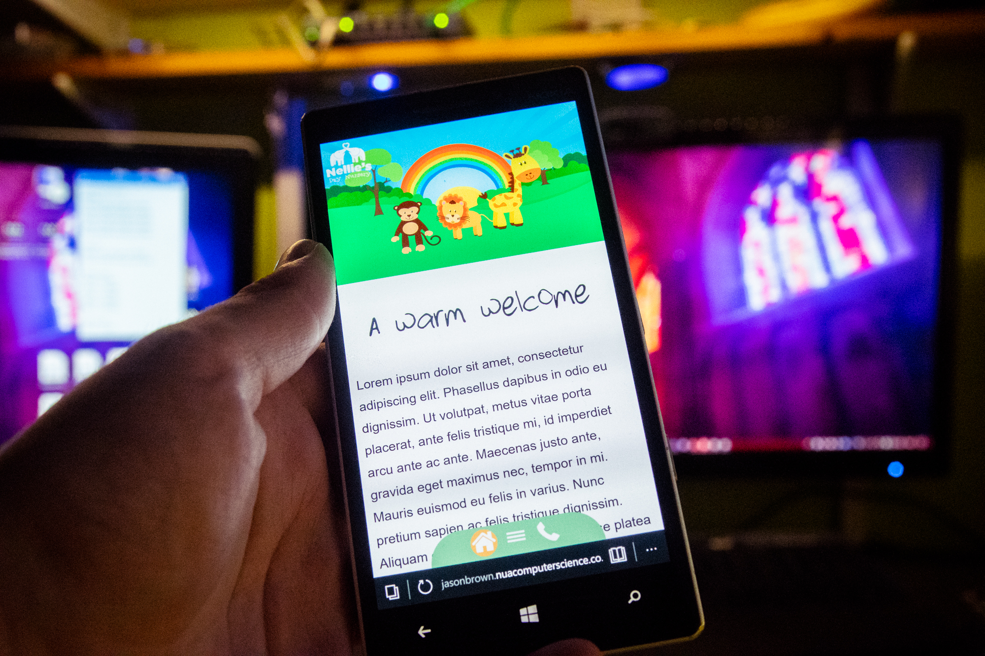
Just steering the blog back towards the focus of my uni work, Elebase, for a moment – today (April 8th 2018) what’s been done so far on Elebase 4 was publicly demonstrated for the first time in a series of videos on my Instagram and Facebook accounts. Development of Elebase 4 officially began on Wednesday 4th April and as of today it has reached a point where the current build is stable and responsive across a wide range of devices. The feedback provided by the testing of Elebase 3 on March 16th has been used to create Elebase 4.
What’s new in Elebase 4… so far?
Elebase 4 may look a lot like Elebase 3 on the surface, but underneath there have been a vast number of improvements too. So much so that the codebase is drifting further and further away from that of Elebase 3 and especially that of Mobile Prototype 1 which Elebase 3 was initially built on. A lot of new code has been added to improve performance, appearance and of course usability as the framework has evolved over the past two or three months.
The video below sums up the differences between Elebase 3 and Elebase 4 very nicely:
Animated feature image
Elebase 4 now features an animated feature image! The children that were in the feature image have been replaced by each of the Nellie’s Nursery group characters (the monkey, the lion and the giraffe) and the user can click on each of these characters in the feature image to play the respective animation! The animations also have appropriate sounds to add that ‘playful’ feel to the website, whilst not being so over-the-top that the professionalism of the site is diminished.
When the user rolls over the menu buttons on the desktop site the characters jump and then the mouse is moved away, the animals move about across the feature image.
Clouds also move across the feature image, again to add some uniqueness to the website. That’s really the idea of the new animated feature image – give the user something to remember and make the nursery seem a fun and friendly place to visit!
The feature image has also been made more saturated to make the site seem more colourful and vibrant. The clouds from the top of the image have also been removed to make the line between the header and the top of the feature image straight.
The animations are of course responsive across a wide range of devices in both landscape and portrait orientations. See the videos below for a software emulation demonstration of this and a real-world ‘iPad vs smartphone’ demonstration to show responsive the animations are!
This is the biggest (and most noticeable!) difference between Elebase 3 and 4.
Updated responsive design
The animated feature image works best when there is as much screen real-estate as possible, so now on smartphones when the page is viewed in portrait orientation the text container does not come over the feature image at all, giving more room to place the animated characters (and therefore provide a better experience using these new animations) and when viewed in landscape orientation the feature image takes the entire device screen space for the same reason. The menu on the left side of the screen is of course still visible and accessible for navigation and the user can scroll down to see the rest of the page.
Also new is the fact that the header is no longer visible on mobile devices at all. Inside, a white version of the Nellie’s Nursery logo is placed in the upper-left corner of the device above the feature image. This button can be tapped to return to the home page just like it could in Elebase 3, but it is no longer fixed. Having a fixed header on mobile devices is not necessary because the menu bar at the bottom is always visible for navigation and includes a home button and so by removing the fixed header, reading space is increased making the site easier to read (especially on smaller devices) and also makes the animated feature image display better. The logo on the mobile site now serves as a reminder to the user which site they are on and provides a little brand identity. A lot of the feedback from the March 2018 testing indicated that legibility on mobile devices needs to be improved, so this is one way I have addressed that.

A different font for the page headings
The ‘Child’s Play’ font was heavily criticised during both the February 2018 and March 2018 testing sessions. It has now been replaced with a font called ‘Strawberry Pink Child’ which is not as bold as the previous font was and in my opinion is more legible. The font is now also available in the more modern *.woff2 format meaning that it can be displayed on all modern internet browsers and the font will continue to be able to be displayed for a long time to come (as the *.woff format is gradually deprecated and very few browsers read *.ttf and *.eot fonts which are the other formats of this font that are installed on the server).
Text is now left-aligned and the leading has been increased
The justified text in Elebase 3 and older prototypes was criticised heavily during Elebase 3 testing, so now it is left-aligned and the leading (line spacing) has been increased to improve legibility. Headings on the mobile site remains centred however, to make the best use of available space.

Addition of a favicon
It’s a small thing, but the site now has a favicon. In fact, it has favicons for a range of browsers and devices meaning that if you pin the site to your phone home screen or create a shortcut to it on your desktop, you should get a good resolution image. There’s even an icon for the touchbar on the newer MacBooks! This means that when the site is open in Safari on a MacBook with the touchbar, the Nellie’s Nursery logo (which is the favicon, by the way), will appear!
Removal of the home button from the hamburger menu
Testing of Elebase 3 dictated that the home button needn’t be in the hamburger menu on mobile devices because there is already a button for it on the fixed menu, so away it has gone for Elebase 4!
Superior loading speed and mobile broadband performance
By ensuring that as many JPEG images as possible are used (instead of PNG) and that these are all well under 1MB in size where possible, Elebase 4 is capable of loading much faster on slower and mobile connections than Elebase 3 was. On an average UK 4G connection (using 2014 data), Elebase 4 took 1.23 seconds to load and Elebase 3 took 1.4 seconds to load, despite Elebase 4 having more content to load. Elebase 4 also uses a preloader, a little like the Storehouse website, which helps to make it load faster and gives the user a loading animation to look at whilst the site is being loaded. More work will be completed on Elebase 4’s preloader before April 16th when it is due to be finished, but already it is more efficient than Elebase 3. Already Elebase 4 is meeting my 1.2 4G load time with the use of a preloader, albeit it an un-optimised one (at the moment).

Improved testing
Elebase 4 has already been tested on a fairly wide range of devices which Elebase 3 was never tested on. I am committed to trying it on as much real hardware as possible before it is launched and before any user testing begins so that I don’t get an embarrassing repeat of the March 2018 testing session where a bug that could, and should, have been spotted and rectified during testing marred the test experience and possibly influenced some tester’s opinions.
See the videos below showing Elebase 4 being tested on an iPad 4 and a Nokia Lumia 930.
What still needs to be done?
Elebase 4 may have been demonstrated for the first time today, but there is still some work to do before it is scheduled to be completed on April 16th.
Addition of content and photography
Both of these require the input of Nellie’s Nursery whom haven’t had a chance to arrange a suitable time to do this before the 16th. It could be a tight squeeze but I am hoping that this week I can visit and get some photos and content. If I can’t then I plan to get photos from a stock photography website and attempt to write some copy myself.
Finalise the animated feature image
The animated feature image works really well at the moment, however it has been complex to develop and still needs to be refined. All of the animations need to be checked against the different screen resolutions and each needs to be properly adjusted for the specified target resolution.
Further optimise performance on poor and mobile connections
As mentioned above, more can be done to make the site load faster.
Perform user testing!
I’m not too sure how this is going to work this time around. I might do it in a similar style to the previous two times where I conduct it in the UX lab at university, or I may do something more informal like sending a link to the people who participated in the previous sessions and just ask for some comments. I know some new people who can test my work but I am running out of people who haven’t tested either! There’s only so many people I know that would be willing and able to do it.
Either way, initial feedback has been very positive so far with people impressed with the new animated feature image. My posts on social media have attracted a lot of likes – this could be taken as a sign that the new design and features are popular, but obviously these people haven’t visited the site and experienced it for themselves, they’ve just seen a video of what I’ve done and liked it because it looks cool to them.
Stay tuned!
More is definitely on the way! A more detailed write-up documenting what has been done so far will also be published soon. The idea of this post is just a very quick update to document what has been done and what still needs to be done at this point in time.
4 Comments on “What’s new in Elebase 4? First public demonstration!”
Comments are closed.