Following my previous journal, here is my reflective journal for the 22nd-26th January 2018.
Monday 22nd January 2018
Still no official go-ahead or response from Nellie’s Nursery about the project. The Memorandum of Understanding was sent on Friday 19th however and with the nursery only operating during the week they may not have had a chance to read it yet. I’m a little concerned that I need to be moving forwards with the project so will be pushing Nellie’s Nursery for some contact during the week.
On Thursday 25th I need to deliver a short presentation to my tutor and peers, pitching an idea for their new website which I will have thought about and prototyped using the user research that I should have completed, so the project really needs to move along!
Today my course tutor introduced myself and my peers to some thought process / idea generation methods. We looked at brainstorming and the ‘SCAMPER’ method in depth and then thought about how we could use these to design a game, thinking about its name, storyline, objectives and obstacles.
SCAMPER
This was the first ideation method that we looked into. ‘SCAMPER’ is an acronym for substitute, combine, adapt, modify, put to another use, eliminate and reverse. This ideation method is ideal if you have an existing product that you want to improve or modify and really encourages you to think about each step of the ideation process, carefully considering how you might modify an existing project, adapt it, combine it with another one, find another use for it, find another context that it could work in in order to come up with ideas quickly. The disadvantage of this ideation method is said to be that whilst it is good for generating lots of ideas relatively quickly, it often isn’t suitable to use for coming up with new ideas (the nature of the individual element being more applicable for improving existing products than coming up with new ones) and that often the results it can produce are unattainable, meaning that sometimes it allows you to generate ideas that might be difficult or impossible to execute. The aim of SCAMPER however is not necessarily to generate completely realistic ideas from the get-go, but rather to simply allow you to generate as many ideas as possible and then allow you to consider which idea(s) are best.

Brainstorming
Brainstorming is simply the process of coming up with ideas and solutions in a relaxed manner. Often ideas are recorded on a piece of page, with the problem to solve written inside a cloud or a circle in the middle of the page and then ideas / points / factors stemming out from this circle, a little like a spider diagram or a mind map. Brainstorming is said to be ideal because it allows contributors to voice their ideas in an informal, relaxed environment. On the contrary, structured planning and analysis meetings may seem too formal for some people who may not contribute as much as they’d like to because they feel the professional environment of a meeting is not relaxed enough to think creatively (or at all!) Working in groups on brainstorms usually renders the richest and most developed end results. Professionals recommend to brainstorm in a comfortable environment with minimal distractions.

Coming up with an idea for a game using brainstorming
After having researched two methods of ideation, our course tutor gave us a game to brainstorm ideas for. The game was called ‘Flying Fish’ and the aim was to create a game where the fish had to return to home. That was all the information we were given. We had to use brainstorming to come up with ideas for where home was, how the fish was going to get home and any obstacles that might get in the way of the fish. I worked with fellow student, George Britton, and together we came up with the idea that the fish managed to get into space by being catapulted by a whale’s tail and had to get back to Earth by avoiding space junk, aliens, space pirates, frontiers, asteroids and the gravitational pull of other planets. Once we had brainstormed the basic idea of the game, our course tutor got us to think about how a user might interact with the game. The game was targeted at mobile platforms, specifically tablet computers, and would utilise swipe and pinch gestures. We decided that swipe gestures would be useful for moving the fish up and down and pinching could be useful for changing the shape and size of the fish and also for avoiding obstacles. After just being directed to think about a few things, using brainstorming we had come up with an idea for an entirely new game. If this game were to be developed, we could use the SCAMPER ideation method to improve it.
Solving a problem using themes
Another way to solve problems and come up with ideas is to think about themes. My course tutor got the group to come up with ideas for themes on a nursery website, a little like the one I am working on now. By defining themes that the solution or idea must have, it is easier to then use brainstorming and SCAMPER to come up with more ideas to further develop the solution.

So, when asked what themes a nursery website might have, my peers and I came up with:
- Treehouse – could be literally a treehouse theme (often synonymous with children and playing) but could also refer to the ‘treehouse’ structure of a website.
- Animal kingdom – many nurseries (including Nellie’s Nursery) feature animals in some way, whether it be class names or in their logos, animals often play a big part of nursery and children’s websites, mainly because they often look friendly and teach the children about animal kindness.
- Primary colours – red, yellow and blue feature a lot on nursery websites, they are bold and add interest and a bright, friendly feel to the website. Children also love playing with colours and mixing the primary colours to make other colours.
- Cartoons – many characters in children’s TV shows and books are drawn a little like cartoons, they help to make the site appeal more to children and parents.
- ‘Soft things’ – perhaps cushions, soft clothes, mats, rugs or maybe ‘soft things’ means things that aren’t dangerous and protect you, like a nursery should.
- Jobs – ‘astronaut’ is written on the board as it is a typical ‘dream job’ of a young child, but others might include ‘firefighter’, ‘train driver’, ‘zookeeper’ and so on. This follows similar logic to the animal kingdom point, often nurseries and other children’s associations use these type of things as names for classes or groups of children.
With these themes in mind, using SCAMPER the current website for Nellie’s Nursery can be analysed and suggestions for improvements can be made. So, currently the site and the nursery brand utilise animals, with elephants appearing in the logo and the class names being animals. These animals should probably stay since they form a core part of the brand and the structure of the nursery, so they probably shouldn’t be substituted for anything, but perhaps ‘jobs’, ‘soft things’ and maybe cartoons could be an addition to the brand? Maybe the animals could be put into another place or maybe the animals should just be in the logo and on the website but another theme could be used to identify class groups, student groups or room names? This is the kind of thinking that I am now able to go into using the SCAMPER ideation process, some of this is actually thinking beyond the design of the site and more into the strategy of how the nursery runs – which isn’t my forte to think of!
Here are some ideas for Nellie’s Nursery’s website that can be generated using SCAMPER:
- Substitute – the colours on the site at the moment could definitely be changed for something brighter and more vibrant. Even a white background with lots of colourful illustrations or graphics would be an improvement.
- Combine – different themes could be combined as discussed above, this could actually go as deep as restructuring the nursery (which is not what I am intending to do, it’s just a thought about how SCAMPER can also be applied to strategy other than design). Target audiences could be combined too – maybe parents and children could be the target audience?
- Adapt – the site needs to be adapted to work better with mobile devices.
- Modify – the site needs to be modified from the ground up really. New colours, new way of showing information, new photos (possibly?)
- Put to another use – the site could be targeted to be appealing to children too, therefore making the site useful to both children and adults.
- Eliminate – eliminate poor navigation, bland colour choice, poor information layout amongst other negative things about the site.
- Reverse – how would the nursery promote itself in another format? Video? Poster? Advert on a billboard? Think about the colours and information they’d have in that and put it on a website.
SCAMPER has helped me consider how the website can be improved.
SCAMPER vs Brainstorming
I don’t really have any preference, I think they’re useful for different things. Brainstorming is my preferred method of coming up with new ideas or considering how different ideas link together to make one product or one theory. SCAMPER is more suited for considering exactly how you can improve an existing product.
Tuesday 23rd January 2018
I have a presentation to deliver to my peers about my provisional idea on Thursday and in this presentation I want to show a prototype or ‘proof of concept’ website to my audience on Thursday during the presentation as it will show that I have considered all of what I thought about yesterday with SCAMPER and what I learned last week when I looked at other nursery websites. If I can apply these to the prototype it shows that I have taken speculated target audience into consideration and am able to apply these concepts.
I decided to start coding a prototype using the Bulma CSS framework which I have used before for the analytics project. I decided to use Bulma to make a prototype because:
- It is a comprehensive CSS framework that includes many elements such as navigation bars, tiles, sections, hero images and many other things that are useful for making a website.
- It uses logical and easy-to-remember syntax which is great because it makes coding the site very quick.
- To put these elements into your code, literally just place the HTML code for these elements in the order you want them to appear on the website.
- Bulma’s CSS stylesheet is already very comprehensive but can be easily extended by adding additional classes to the end of the stylesheet, or modifying existing ones to suit your needs.
- Bulma is designed to be mobile-first, so it is an effortless way of making mobile sites with code.
At first I thought I would be able to code a home page using Bulma in just a few hours and then build the presentation, however it turned out to take a lot longer than I thought. It’s true that Bulma is a framework that contains many elements but unfortunately it is quite rigid in how they work unless you modify the Bulma CSS framework or write your own additional stylesheet.
I wanted my prototype to look a little like the Angels Nursery website, which is one of the websites I looked at last week. I feel that this is a good site to base my prototype on because:
- It loads quickly because it is not covered in multimedia content like videos that takes ages to load.
- It’s bright and colourful, yet the text is easy and clear to read. The colours show the nursery brand really well and give a great, positive feeling.
- It’s easy for parents to find information such as booking a visit, downloading a ‘parent pack’, what certifications the school has achieved, the facilities available (such as toddlers’ rooms, baby rooms and quiet rooms), the values the nursery pursue and the staff who work there.
- The site is responsive and scales well to different screen sizes.
These are all qualities that I want the new website for Nellie’s Nursery to have.
I decided to only make a prototype home page – I don’t have time to design an entire prototype website. As it is, designing just the home page is taking a long time. I could have made a prototype using Axure or even a Photoshop or Illustrator mock-up, but I feel that for my presentation it’ll be more impressive as it demonstrates that I can turn my ideas into code and thus a workable solution and it also more useful to me for two reasons:
- Firstly, get me back into coding. I need to keep coding in order to be good at it (it’s like learning a language or a musical instrument).
- Secondly, this could potentially be a very early ‘evolutionary prototype’, meaning that even if the final product does not look or function exactly like this I can build future prototypes on the core codebase of this prototype should I wish to which saves time. Eventually, the final product will be derived from a prototype meaning that this prototype could potentially be the first steps of creating the final product.
Unfortunately, at this stage I have still not been able to visit Nellie’s Nursery and perform solid user research, therefore I have to assume exactly who the target audience is and what the users want from a website about this nursery going by what is currently on the site and also what other nursery sites offer. I am building the prototype and the presentation on the following assumptions:
- It is typically the mother who is most interested in their child’s education and has a big say over where and how their child is educated, so therefore the site is more likely to be accessed by women than men.
- The site’s function is to inform potential parents of children about what the nursery has to offer and why Nellie’s is the nursery for their child.
- Parents want to easily find information to help making the decision about which nursery to send their child to easier.
- Parents want to know that the nursery is going to be a fun, friendly place for their child to go.
- Parents want to feel secure in the knowledge that their child’s education and safety/security is the top priority at a nursery.
- Many parents use mobile devices such as tablets to play games with their children, so it is important that the site works on mobile devices and looks attractive for children too (even though the site isn’t directly targeted at them). Parents may wish to show information on the website to their children to help get their child interested in going to the nursery, so it is important that content is also age-appropriate.
- Not to mention that a large amount of internet browsing is done on mobile devices these days.
A video of the first prototype I produce will be included in the presentation and these assumptions about the user will be communicated, however it will have to be made very clear that these are assumptions that I have made.
The Presentation Brief
This afternoon the presentation brief was presented to us. This is the information that I will need to present on Thursday afternoon:
Stage 1 – Elevator Pitch:
- A 5 second description that summarises the essence of the idea in a single sentence.
Stage 2:
- 30 seconds long and adds more detail such as mentioned 2 or 3 ideas in more detail. This should be about a paragraph’s length.
Stage 3:
- 5-10 minutes, fully substantiate ideas with evidence and talk in-depth about topics and themes. This should be about a page of A4 in writing.
A name for the product (Nellie’s Nursery), key images, key videos, a unique selling point and referencing products and services that I have researched in the weeks prior to the presentation are also important to include. Additional information to present about includes audience/user information (who is the intended audience and what do I know about them?), industry trends, other relevant research (it may include the platform that the app/website is targeted at) and lastly, a summarising statement which puts the user’s attention back at the core subject – a website for a nursery, in my case.
The whole presentation should last between 5 and 10 minutes.
Ideation workshop with Tim Caynes from Foolproof

Tim Caynes is a Principal Designer at Norwich-based UX firm, Foolproof. Foolproof have been involved with the course and NUA several times in 2018 so far, starting with Terika Seaborn-Brown’s talk about research on Tuesday 9th January and Pete Abbot’s talk about getting started with UX which was presented to the NUA SU Coding Society members on Wednesday 17th. The talks from Foolproof and other external organisations have all been perfectly timed as yet, and this week was no exception. Ideation is of course a big topic at this stage of the project with the past week or so having been dedicated to ideation and how to come up with new ideas and of course the presentation on Thursday will be all about presenting the results of our ideation.
Tim started by talking about how to pitch an idea and what things to include. He mentioned that you need to be confident and only include the relevant information in your presentation – there’s no need to mention wireframing and creating prototypes really. It’s all about showing how the final product is what the client wanted and exactly how it is better than what went before it and back this up with evidence.
But how do you come up with an idea?
Tim split the group into two – we had some Year 2 BA Graphic Communication students with us for this talk (including my friends Callum Brown and Simone Costa) who were interested in hearing about ideation, so we had two groups of four students to work with. Each group was given four cards, each with one of the following on it:
- An industry, e.g. fashion, media, sport
- An API to get data from, e.g. Facebook, Twitter, Tinder, Skyscanner (each group got two of these)
- A device, e.g. a breathalyser, holographic headset, robot, mobile phone
Using these three things, each team had to come up with an idea for an app that utilised all of these things and then we had a minute or two to pitch the idea to the group. Tim repeated this exercise three times, each time mixing up the group members so that the BSc and BA students got a chance to work together and skills could be transferred.
For the first round, I worked with my BSc peers Naomi Winter, Ameer Ashhab and Kieran Adams. We had to make an app that utilised holographic technology, robots, connected to Tinder’s API for data, also connected to Spotify and was applicable to the fashion industry. After 15 minutes, we eventually came up with an idea that involved being able to use Spotify to find potential matches on Tinder based on music tastes and then if you wanted to go on a date with somebody you met on Tinder this way, you could use a holographic headset to preview clothes to wear and then in select stores have robots bring the clothes to you. It was a completely crazy idea, but that’s the point! It was all about being creative! Naomi delivered a great pitch that captivated the audience and Tim declared our idea the best.


The second round was even crazier. I was with Ameer and my friend Callum Brown from Graphic Communications – and also Callum Edward Arthur from Graphics. We were given the task of creating an app that utilised a breathalyser, an Apple Watch, data from betting and stocks and was applicable to the media industry (including gaming). After 10 minutes we could only figure out that betting was something wealthy people did ‘at the races’ (horse betting) and that there would need to be alcohol involved to utilise the breathalyser. An interface would also have to run on an Apple Watch. We spent a while trying to link these all of these together but we couldn’t come up with anything, so in the end Callum Edward Arthur suggested we just make a game that involved all of these and before you knew it, everybody was chipping in:
The game went as follows: the game is called ‘Bet You’re Drunk’, the winner is the player who ends up the drunkest (measured by blood-alcohol levels in your body) and the richest. You have to drink a certain amount of alcohol before you can place bets or trade stocks. The more you drink the more you can trade and buy, enabling you to become richer but potentially take much bigger risks due to the fact you are intoxicated and unable to make decisions as rationally as you would be able to if you were sober. The game runs on an Apple Watch and paired with a breathalyser for verification, the Apple Watch determines ‘how drunk’ you are by measuring your pulse – the more alcohol you drink the lower your pulse because alcohol is a depressant drug. To help you win, the interface of the game is a very simple set of scales, which shows a bottle of beer on one end and a stack of coins on the other. To win, the scales must be balanced (i.e., you must be drunk and have money) and as you drink more, the bottle ‘gets heavier’ and weighs the scales down, and as you earn more, the money does that. If you end up sober but rich, you lose. If you end up drunk but penniless, you lose (and have a splitting headache in the morning!)
We came up with this idea in just a few minutes, right before the presentation deadline. I presented the game. I realised that this was an absolutely crazy idea for a game, so didn’t feel able to deliver a professional-style presentation on it, so instead I went for a humouristic approach with the aim of talking with a straight face and using phrases like ‘everybody loves a raving night out, but we all know it’s bloody expensive – so what if you could play a game where you got paid to get drunk?’ to try and make my audience laugh. Originally we had targeted the game at rich people who likely had the money to blow on drunk betting, but after realising that this would potentially be a hit with drunk students betting their loans away, I convinced Tim that it was a great investment for him and he declared our idea the best.


The third round was the final. This time I was with Ameer and Simone Costa and Lewis Powell from Graphics. We were given sport as an application, an E.ON and Facebook as an API and augmented reality as a platform and NFC and/or Bluetooth as a technology that must be used. Initially I felt we should make an app for lazy people to ‘do sport’ in augmented reality (i.e., not actually do sports – I felt the market would be large!) but then Lewis came up with a better idea. He proposed that we create a gym called ‘Exogym’ that produced electricity by exploiting kinetic energy produced by its members doing exercise. Gym equipment would be connected to the National Grid and would generate electricity when the user activated the meter on the equipment using NFC on their phone. Eventually, the more electricity you produced, the cheaper your membership would become. You would be able to share how much electricity you’ve produced and invite friends to join the scheme via Facebook. If you found doing exercise in the gym boring, you’d be able to exercise in an augmented reality world, such as in Jurassic Park being chased by dinosaurs to make you run faster. You could share your worlds to exercise in you’ve made with friends on Facebook. Simone gave a convincing pitch and Tim liked the idea but said he felt that the augmented reality implementation our team had chosen was a little generic so this time the other team won.


It was a great session, a lot of fun and got us to think really creatively! None of the products we pitched were realistic – all of them were crazy – but the idea was that we learned how to quickly create ideas by brainstorming ideas as a group and working with what we’ve got, and we learned how to pitch any product, no matter how bad it was!
Wednesday 24th January
I spent most of today continuing to work on my prototype and eventually finishing it. I ran into quite a few problems with creating the prototype, mainly due to Bulma’s CSS which is great for creating responsive websites quickly and easily enough to extend if you want to change the colour of certain elements, but can be a pain if you want to create a website that doesn’t stick to Bulma’s rigid appearance. I wanted to create a div over a hero image which would be a white box containing text (a little like the home page on the Angels Nursery website), but unfortunately no matter how many z-indexes I used and how I laid out my HTML and modified Bulma’s CSS (and wrote my own!) I could figure out how to do this, so for the time being my prototype doesn’t have any overlaying divs. I’m starting to think that when it comes to making the website I will probably hand code it and learn how to use media queries to make it responsive. I feel that I will have a lot more control and it may not take as much time as people think since things like overlaying divs will be easy to do without having to really pick apart a complex CSS stylesheet that somebody else has written.
The image in the hero is a vector illustration that I found online from a website called Freepik. It is free to use and you get the *.ai file to use in Adobe Illustrator to modify the vector if you like. I did modify the image a little by moving the children ‘higher up’ the image to create some more green space at the bottom where I had hoped I would be able to cover a bit with a div containing information.
The prototype uses very similar code to the London website I made for the analytics project, using very similar elements such as heroes and figures. The great thing about using hero images in Bulma is that they scale perfectly to mobile devices and different screen resolutions, so if I was going to code the site from the ground up when I come to produce this I would definitely examine the code Bulma uses to make this work. The only additional code that this prototype has that the London website doesn’t is the code for tiles, which are responsive ‘blocks’ that can contain text and images. The code is relatively simple, they are just classes defined in the Bulma CSS stylesheet that create different sized sections on a page that all fit together and respond together when the screen resolution is changed. The code is below:
<!--Tiles--> <div class="tile is-ancestor is-primary is-rounded" id="tiles"> <div class="tile is-4 is-vertical is-parent"> <div class="tile is-child box notification is-green"> <p class="title">Sessions</p> <p>Nellie's is open 51 weeks of the year, Monday to Friday from 7.30am to 6.30pm (closed for a week between Christmas and New Year and all bank holidays).</p> <br /> <p>Full day 8am - 6pm</p> <br /> <p>Extended day 7.30am - 6.30pm</p> <br /> <p>Morning 8am - 1pm</p> <br /> <p>Afternoon 1pm - 6pm</p> </div> <div class="tile is-child box notification is-green"> <p class="title">Visit us!</p> <p>To arrange a visit to look round Nellie's Nursery or to request a copy of our welcome pack, please contact us.</p> </div> </div> <div class="tile is-parent"> <div class="tile is-child box notification is-success"> <p class="title">Your child at the heart</p> <p>The child is at the heart of all that we do and we are committed to ensuring that they can achieve their full potential, thus we have 3 purposeful and stimulating rooms containing age appropriate, multi-sensory and challenging resources.</p> <br /> <p>Our Mini Monkey room caters for babies and toddlers from 3 months to 2 years old, the Little Lions room is for 2-3 year olds, and the Jolly Giraffes room is for children from 3-5 years. For more information on the rooms at Nellie's, please go to the Nursery Rooms section of our website.</p> <br /> <p>Our care and education is based on the Early Years Foundation Stage framework.</p> </div> </div> </div>
There are default classes for the tile title and the tile content just like there are for sections and articles in Bulma and the size, font and colour of these is set in the stylesheet but can be changed by either adding your own classes or modifying the existing ones.
By about 4.00pm I had a semi-complete prototype for the home page. I simply copied and pasted the text from the existing website onto the prototype website to show how the information would look and kept some of the placeholder text to show how additional content would look on the website. I spent the afternoon with my friend from Graphic Design, Emma, who gave me some great ideas for taking the prototype further. She suggested that I should use the colours from their existing logo to theme the website, so the buttons could be orange and then turn to green when the user rolls over them and the tiles could be green and orange. Combined with colourful graphics, this would make for an attractive looking website that utilises the brand. Emma also suggested animating the clouds and other assets on the hero image to make the site appeal more to children and also change the children on the image to animals instead to give a friendly look and fit better with the nursery’s branding. Later that night I went home and modified the colours and using Photoshop’s eyedropper tool got the exact orange and green hue of the logo, but I didn’t have enough time to do any animations – these will have to wait for the next prototype.
The live version of my prototype can be viewed here.
Creating the presentation
Once I was happy that I had made enough of a very early prototype to show, I spent the evening creating the presentation. When it comes to making presentations I like to use full-size images on slides that show what I am talking about. I don’t like putting text on slides because often what happens is the audience reads what’s on the slides rather than listen to the presenter, and/or the presentation just reads off the slides which does not look professional. The presenter should know what they are talking about without having to read off their own slides. The full-size images show the audience what you’re talking about without distracting them and subtly give the presenter a reminder about what you need to talk about. I also like to use a remote to advance the slides, usually I run the presentation from a laptop and use the Office Remote app on my Windows Phone that allows you to remotely control a PowerPoint presentation (or a Word document) from your Windows Phone if the Office Remote plugin has been installed on the PC the document is running from and the phone has been paired with the PC via Bluetooth. Using a remote means that I can walk around during the presentation, thus my stage presence is far superior to how it would be if I were sat behind the PC, because there is nothing in my way I am able to maintain more eye contact with the audience, get and sustain their attention easier, speak more confidently and deliver an all-round more successful pitch. Walking around the stage allows me to project my voice without having to raise it. If I walk around the stage talking, more of the audience get a chance to hear it without me having to shout.
This is a presentation style that I adopted around 3-4 years ago when I started presenting weekly to my Student Digital Leader team that I was running at Wymondham High Academy whilst I was a student and later a staff member there. As I started presenting more I realised that big images were the only things really required in a PowerPoint presentation and that the text should be replaced by my voice. I also famously used this presentation style during my TEDx presentation which I delivered on March 19th 2016.

Talk from Will Tait from Hethel Engineering Centre about ideation in business
The Hethel Engineering Centre is located very close to my hometown and the town that I live in, Wymondham. It is best known for being the home of Lotus Cars, though today the site has many other engineering and technology businesses based there. I visited the site in November 2015 whilst I was in Year 13 and studying at Wymondham High during my final year of A levels and remember talking to and connecting to local businesses and their employees, notably energy company PROEON. Norwich University of the Arts is running a series of sessions called ‘Platform’ between now and March 21st which are talks delivered by professionals and ex-graduates. Will Tait delivered a presentation about coming up with an idea to run a business on and how to find a customer and target audience. The talk was very good and informative as well as interesting and Will was a very captivating presenter, however it wasn’t what I thought it would be about. It was a lot more about starting a business and how big MNCs manage to get customers and keep them rather than coming up with ideas. I had hoped to attend the talk and see how business people come up with ideas to make money, then apply some of that logic to my project and the UX industry in general. I thought the talk would focus on how to make brand new ideas and make money from them, but instead it was mainly about taking an industry that already exists (like the pub trade) and developing a successful business plan around that.
Thursday 25th January
The morning was spent learning about how to use Axure RP 8 with James Van Roose, the lab technician. Axure is a piece of software that can be used to produce wireframes and low- and high-fidelity prototypes. These prototypes can have ‘actions’ and some functionality meaning that they are ideal for showing clients how the actual product would look if it were to be created. My wireframing and prototyping attempts in the previous project took a long time to do because I had to manually create all of these in Photoshop and Illustrator and the prototype had to be hand-coded using HTML, CSS and JavaScript and assets had to also be made in Photoshop and Illustrator. As mentioned in previous blog posts, using software like Photoshop and Illustrator to create these is great because you can be very flexible and for the car interface I had to design, they were ideal because I needed to make assets of a very particular shape and size that most wireframing software does not allow for. However, the downside is that it is extremely time-consuming. Software like Axure and other pieces of software allow you to simply drag-and-drop standard elements like buttons and placeholder images onto a blank canvas to allow you to very quickly create a wireframe or a prototype. In the past I have used an online tool called MockFlow to create a wireframe version of this blog, however for this project I intend to use Axure because it has all of the tools I need to quickly create a wireframe (and potentially a prototype, depending on if I choose the code it or not) of a website and you can even create ‘masters’ to apply certain elements to all pages to make the wireframes and prototypes look uniform.
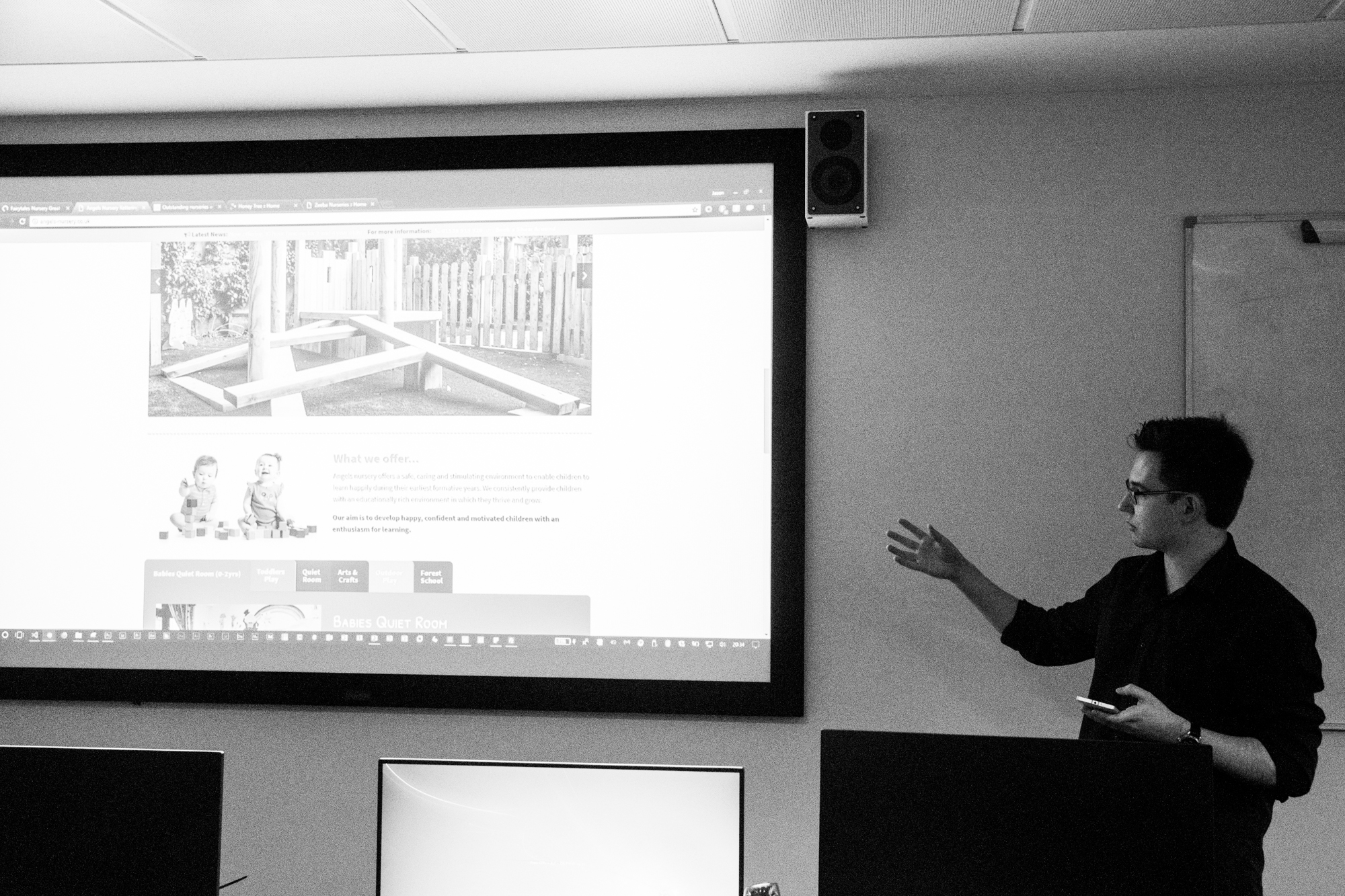
The afternoon was spent listening to and critiquing the presentations of my peers. I felt that the quality of presentation from my peers was very good, with everybody presenting well and pitching a great product, many of which had been thoroughly researched and considered to work with the application it was intended for. I left positive critique for each presentation that I watched.
My presentation followed the structure given to us on Tuesday.
- The ‘elevator pitch’ was a simple sentence explaining that Nellie’s Nurseries is a local start-up nursery whom need a website to inform parents about what the nursery has to offer them.
- I then went into more detail about exactly who I feel the target audience is, based on my presumptions. I described the presumptions I wrote about on Tuesday.
- I went into detail about the appearance of the existing site does not lend itself to a typical nursery website. I presented a video I had recorded which showed me using the existing website to show the audience the poor navigation, poor information layout and generally uninspiring design. The video was a great way of showing how all of the pages connected with each other and the general journey that a user might take when using the website.
- I showed some examples of the nursery websites that I found last week and showed a video of these sites being used by myself. Whilst the video was playing I spoke about the strengths and weaknesses of each compared to the website of Nellie’s Nursery, mainly noting their superior appearance and general layout.
- I showed similarities between the sites such as the ‘parent areas’ and ‘parent packs’ that can either be downloaded from the site or collected from the nursery.
- I showed a video demonstration of my prototype I had made for the same reasons that I showed the other videos. They work so much better than screenshots and show how pages link together and how a user would actually use the site. I just scrolled up and down the home page I had made and as the video was playing I talked about how I had implemented features from the example websites that I had looked at and how these would help improve the Nellie’s Nursery website.
- I finished with a conclusion that summarised who the target audience was and how the new website would make its end users happier. The final picture on my presentation is of my cousin when he was about 4 years old smiling. I made a joke and said that Nellie’s Nursery’s new website would make its customers happy, referring to the photo on the slide.
The presentation can be viewed below.
I use the notes feature in PowerPoint to write prompts and these are displayed on my phone whilst the Office Remote app is open. I didn’t really find myself looking at my phone for the notes though, I found that whilst I was presenting I was prompted more by the pictures and videos on the screen and I got into my flow and felt confident presenting my work and the background knowledge I had of my project. It’s a shame I wasn’t able to present any real user research since I hadn’t been able to perform this, but presenting my assumptions was enough.


Feedback from the presentation was excellent. Several students said that they loved my presentation style and felt I possessed a natural talent for presenting. I do enjoy presenting and public speaking, so I really enjoyed this task. They felt that the use of full-size images on my slides was very good – a bit unique and as I had hoped, it meant that they paid more attention to me than what’s on the slides. They liked the use of videos instead of screenshots as it they felt it was clearer for them to see what I was explaining and they liked the fact that I had a prototype to show which gave them an idea of how I would put the things I had been praising the other sites for into context.
There were just two criticisms:
- It was noticed that during the video demonstrations that I had my ad blocker software enabled which might have detrimental to showing the full user experience of the sites displayed. There might have been adverts or other popups on the site that I might not have seen because of the ad blocker software. Had their been ads or popups (unlikely for a nursery website, but you never know!) I could have talked about the negative impact on user experience these posses.
- My course tutor noted that I spent most of the presentation talking about how my prototype looked better than the original site and that I had clearly taken visual inspiration from the sites that I had looked at, however he mentioned that I could have also taken navigational, presentation and structural inspiration from these sites. I could have talked a lot more about how the other sites display information in a different way to the existing website and how my prototype displays information better than the existing website.
I was so pleased with the feedback from the presentation and it was also really nice to give positive critique to my peers on their presentations too.
Friday 26th January
Today I secured a meeting with Victoria at Nellie’s Nursery for Tuesday 30th January at 2.00pm. Due to changes in the brief, creating a focus group to work with is a little bit of a grey area, so what I intend to do is create an online survey (possibly using Microsoft Forms since it is part of Office 365 which the university has and because Forms is excellent for collating data) which allows users to enter data anonymously. The form will have a range of questions suited to finding out exactly what users and staff want from their website. The link could be distributed, perhaps via email or a newsletter (if the nursery has one – most schools have one at least monthly). I’ll create the form over the next few days so that it is ready to show Victoria on Tuesday.
On Monday I planned some questions to ask Victoria when I saw her, here they are:
- What is the website for?
- Specific objectives, business objectives
- Who is the website for?
- Current website
- What’s good about it? What do you like and why?
- What don’t you like about it and why?
- Do they know about your Google Analytics?*
- Which extra features would you add and why? (2 features)
*I looked at the source code of the existing website and it seems it has Google Analytics enabled. It’s possible that because it was made on Wix there is some custom control panel that Wix uses to show user analytics and this is powered by Google Analytics. If it is possible to obtain this data and depending on what has been collected, this data could provide a useful insight to the users of the website, where they’re located, what kind of devices they view the site on, view user journeys and so on.
I also spent today reflecting back on the week and thinking about what needs to be done next week to move the project forwards.
Going forwards
Next week I will begin the process of starting to collect user data by creating the survey that I hope the nursery can distribute and I’m looking forwards to speaking to Victoria next week and seeing where the project can go.
Bibliography
Mindtools.com. (2018). SCAMPER: Improving Products and Services. [online] Available at: https://www.mindtools.com/pages/article/newCT_02.htm [Accessed 22 Jan. 2018].
Mindtools.com. (2018). Brainstorming: Generating Many Radical, Creative Ideas. [online] Available at: https://www.mindtools.com/brainstm.html [Accessed 22 Jan. 2018].
3 Comments on “Reflective Journal – 22nd-26th January 2018”
Comments are closed.