Following my previous journal, here is the journal for the 15-19th January 2018.
Monday 15th January
Today my course tutor evaluated the email I sent him about my meeting with the client last week. We decided that the initial project that the client had set out is too big so would need to be scaled down, and that the client would need to be open to new ideas since I would have to design this site, but it looks fairly positive. He contacted the client via email outlining what would be expected of me and how the project benefits both parties. Over the next few days he will be writing a Memorandum of Understanding which he will send to the client if the client accepts.
At this point in time, I am still unsure exactly what the client wants to be kept secret and what he doesn’t mind being public knowledge, so details of the project are still kept secret when writing about it online. Only when the Memorandum of Understanding has been signed and the client has told me specifically what is secret and what it is not, it will have to remain secretive.
Prior to this, my peers and I with the help of my course tutor conducted some user testing of our own. We made a hypothetical situation where we had been given the task to redesign the university’s VLE (virtual learning environment) as a mobile app. We began by determining which smartphones we were using and how long we spent on them – I say ‘we’ because as students we are the target audience of the app, though only a very small sample of that. Then we did a ‘SWOT’ test, recording what the strengths, weaknesses, opportunities and threats the current system poses. On the whole we liked that it was already responsive and the timetable was easy to read and generally we didn’t like the sheer number of times you have to log into the system to do tasks such as read emails. Then, we were challenged to write three things that we’d like to see in a ‘beta one’ version of this app and pin them onto a board. The ideas were grouped together, each of us had to four stickers to stick on four ideas of our choice and what we discovered was…

Yes, we discovered that food and timetables were all we wanted to see in a VLE product!
Food is currently not in the VLE, it was a new idea introduced by a student who originally had a reward system in mind that would give you money off food if you attended a certain number of lectures or get a certain grade on a project or nominated for the reward by a tutor and so on.
It’s interesting that food and timetables are all a student needs!
Joking aside, the purpose of this exercise was to allow us to have a go at doing some formative user research to find out what a userbase require in a product. This is essential for the project I am doing which is more about doing user research to find out what users need and making a website to suit their requirements than it is about making a website that just looks pretty and has some nice animations and navigation on it. The methodology used here was very simple and by getting the ‘users’ (us) in a room together to talk about what we wanted we were all bouncing ideas off each other and in the end after considering strengths and weaknesses of the current system and what we’d like a new VLE to have, we were able to come up with several features that we all agreed the VLE must have. If the project was real, the next steps would be for the developers to go away and develop a VLE that features a food ordering system and timetable access (amongst other features) that works on Android and iOS which were the most popular smartphone platforms in the target audience. I will be doing a similar thing with my client’s website.
Tuesday 16th January
I’m still waiting to hear back from my potential client about the project that I have in mind, so today has mainly been about research. On Monday our course tutor introduced us to the idea of studying psychology in UX design but warned us that using the internet to research this would yield a lot of results from people claiming to know about the subject, but really they are not that knowledgeable about it at all. Eventually I found an article on UX blog ‘UX Pin’ which has links to 14 different articles about the use of psychology in user experience design, some of which are quite interesting reads and others of which aren’t so relevant to me. One of the articles cited in this blog post was about how bad UX can make the feel like it’s their fault they cannot achieve the goal, with the author (Ivana McConell) using paying taxes to HMRC as an example. McConell closes the article with the following thoughts about the experience of paying taxes online:
It didn’t have to be beautiful; you don’t need to make taxes sexy or perfectly kerned, but you do need to ensure that users feel taken care of at every stage of the process. After all, I’m trying my hardest to give you my hard-earned money— surely, this is the time to make someone feel safe and secure. Instead, I felt woefully underprepared, as if I should have studied how to use the interface before using it.
McConell makes a very good point here about how the user should feel that they are being cared for and assisted – a point that comes up in the exercise about identifying pain points in user experiences that my peers and I did with external speakers Harry Harrold and Rupert Redington that evening.
What does this tell me about what users of my website might expect? The users of the website will expect the site to provide all of the information for them, they will want to be guided through the website and assured of the business or charity’s legitimacy. They may not necessarily be making payments on the website or doing anything as important to trying to pay tax, but the idea still applies. You want to get clients or at the very least, visitors, so when they visit your site you want them to stay and not leave in frustration. This will ensure your site has a low bounce rate and maintains a high number of loyal users, see my previous project on web analytics for more information on this.
Being cared for and feeling you are know what you are doing on a website is more important than many people take for granted. In Liraz Margalit’s article on ‘The psychology behind Web browsing’ she states that stress responses in the brain, similar to those felt by human ancestors when they were in a foreign environment, are triggered!
I’ve witnessed visitors start scrolling along a page and suddenly realize they don’t know where they are anymore. It’s a thoroughly modern phenomenon but it evokes the same fear triggers that our ancestors felt when they were in a foreign environment and suddenly didn’t know how far they were from home.
It’s interesting how closely web browsing can be related to the ancient parts of our brains that influence our behaviour. Margalit later goes on to say:
Our prehistoric ancestors used trail markers in order to not get lost. And websites that understand human psychology can also do something similar, employing sticky navigation – website menus that move with the page as the visitor scrolls, “sticking” in place and always remaining visible – to keep visitors feeling in control.
This is a very interesting concept that very few websites actually employ. Some users find navigation that ‘follows’ them down the page a little irritating, but think about news websites: usually they have a sidebar filled with articles which could possibly act as a reminder to the user as to their whereabouts on the website. For example, if you’re reading a news website and reading a political piece, it is likely that the other articles in the sidebar are also of the same nature. Little things like this could sub-consciously ensure that the user that they are not lost and know where they are. Navigation as a whole is a very important part of web design and will be something that needs to be taken in consideration when designing my website. User research will initially dictate how provisional users envisage navigating the site and user testing will prove whether or not navigation methods suggested during research are practical.

Visit from Harry Harrold and Rupert Redington from NEONTRIBE
Harry Harrold and Rupert Redington work at local UX firm, NEONTRIBE and very kindly volunteered to visit the university to deliver a presentation and several practical exercises on the importance of user personas, user journeys and pain points. The information that they communicated in this presentation will be very helpful for my upcoming project which does involve a lot of user research and defining target audiences. Their current project is the Mind of My Own (MOMO) website which allows teenagers and young adults with mental health issues to anonymously contact professionals for help. I feel that this is an extremely noble product and one that can genuinely change lives for the better if executed and supported correctly. It’s saddening to see how many young people suffer from mental health issues these days and with funding being short, private firms are going to have to do more to help tackle the issue.
The full details about this project and what was gained from it can be read in my separate article here.


As can be seen if you read the separate article, user personas and identifying and explaining pain points can get incredibly detailed very quickly and can really begin to flag up issues with the usability of an app without to interview a real person. However, a user persona cannot be used in place of real-world testing since a user persona has pre-defined qualities, whereas ideally a tester has no bias whatsoever.
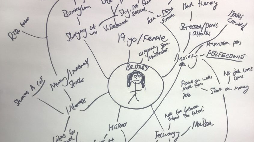
I found identifying pain points particularly difficult. A lot of my friends who study Graphic Communication, including Emma whom I am working on Inspix with, tend to be able to think quite deeply about the meaning of elements of graphic design, such as what a logo might speak to a viewer or the meaning behind different shades of colour and the meaning of wording. I tend to be able to read between lines quite well and understand wording and language, however I am not as good at trying to decipher the meaning of a logo or give a very detailed response as to why a certain shade of red might have been used on a website. I often lack the empathy and ability to think deep enough to really think about how somebody else may view a product on a detailed level – especially when the end user is nothing like myself like in this case. As I thought more and more about it and whilst I was writing this article collating my thoughts (or rather, Britney’s) I felt I improved at it, but it didn’t come naturally to me straight away.
The workshop was extremely-well delivered and very informative. It was a great session and the eccentric nature of Harry’s and Rupert’s personalities made the session even more enjoyable. User research plays a huge part of the project I am doing and user personas may be absolutely necessary for the project since the client I end up doing the site for might not want me to talk to real users, so a user persona (or several) based on their clientele will be very useful for user research and identifying pain points. The negative of using a user persona rather than a real user is obviously that I can’t imagine every thought and emotion that a persona may be thinking – and I may get these wrong which could result in some pain points being incorrectly identified, or not identified at all. Sometimes I find it hard to think as if I were a completely different person trying to use the product, so I hope that my client is keen to let me talk to real users.
Wednesday 17th January
A lot happening today!
Firstly, I decided to change my client after I had had a chance to think about the project proposed by my potential client and decided that it didn’t fit the brief given to me terribly well. The brief is all about using user research to design a website that works best for its users, first and foremost. The project that my potential client had in mind didn’t really involve enough user research to make it fit my brief, or if it did, the user research would have been fairly difficult to do effectively in the time scale. I spent the morning hunting for a new client and by the afternoon I had a new client! Nellie’s Nursery – a local nursery that has just started up! I’m so excited about working with a nursery! I used to work in a primary school that had a nursery before I started university as an IT technician. The job wasn’t as exciting as what I am doing now, but I did enjoy working in the primary school and nursery environment. Initial communication with the nursery seems very positive, at this point in time I waiting to hear back from them to confirm all of the details, at which point the project can move forwards much faster, but I have spent some time researching websites for similar nurseries in the area and I am very excited!
The video below shows me examining a few nursery websites and my comments on them.
Generally I found:
- Most of these sites are bright, bold and colourful
- Nearly all have a ‘meet the team’ section
- Nearly all have a parents’ section (or similar)
- Nearly all have features that allow the user to book a visit
- Nearly all have multimedia content (sometimes it make these sites take a while to load)
- Nearly all focus heavily on what they can offer a child, using testimonials from parents to back up why they are the nursery for your child
These are just a few points that I will consider for the project. The current website is not like any of these sites at all and has been created quickly using Wix by some staff at the nursery. By doing just a little bit of research into websites for other nurseries I am able to determine that the website for Nellie’s Nursery does not conform to the general design of nursery websites. It lacks the colours and nice appearance but it does have a parents’ area and the same kind of information about the nursery as most other nursery sites do, so it will be interesting to see what stakeholders want from a new site. I predict that they’ll want the site to look nicer and maybe for the information to be presented in a clearer and more visual manner.

Inspix
Following a talk about UX from Foolproof employee Pete Abbott about user experience design, the Inspix project that Emma and I have been doing has now taken a different turn for the time being. Emma is now getting interested in UX so for the time being we are focusing on really defining our defining target audiences and what exactly we want Inspix to be, before we start to really continue with designing the system. This is great for me because it allows me to practice doing a bit of user research, target audience consideration and (eventually) user persona creation before doing it for my actual project – this is a little like doing it in a ‘sandbox environment’. It’s also great to inspire another student. I feel that if I can interest her in the subject then I am able to deliver the information to her in a way that shows I understand what I am talking about.
The project is going to get quite big, so I’m going to make a separate section on my blog for articles related to the development of Inspix and just mention changes in these weekly reflective journals. However, there are some diagrams we created below showing how our thought processes on defining our target audience and what we want the app to be. We spent several hours talking and diagramming this. We found drawing spider diagrams was an easy way to link ideas and points together.


Inspix is a side project of course, not related to the nursery project, however this kind of consideration of target audience and what the product is for will have to be taken into account when designing my website for the nursery. The target audience for the nursery website will likely be parents (parents who are interested in sending their children to this nursery and parents who already have children in the nursery) and staff members at the nursery. It is unlikely that the children enrolled in the nursery will ever need to or want to visit the website (unless the nursery owners thinks differently – I will need to find out who she personally thinks the target audience of the website is!) since there is little information on it that will interest them. At this point in time I feel that the nursery website is, and will continue to be, more of an information source than a website aimed at children unless the nursery plan to use content on the website (perhaps interactive games or similar) to teach children how to use websites. The site therefore does not necessarily need to use language aimed at children and can provide a lot of information, but visitors will expect the nursery’s brand and ‘friendliness’ to be present on the website, so it needs to look bright, colourful and ‘friendly’ which at the moment I feel it doesn’t. It’s all very well saying ‘we are a friendly, bright community’ (or similar – a lot of nursery and school websites say this), but if the website appearance doesn’t communicate this then it may be hard for somebody who has never visited the nursery to believe this. The nursery is new and might be recruiting for staff, or if not yet there will come a time when they may want to or need to recruit – a website that speaks the brand of the nursery may interest those looking for career opportunities at this nursery as they immediately see that the nursery is a fun, vibrant place to work. From a usability point of view, having information clearly laid out will also make the nursery more attractive to prospective staff members and parents.
This exercise with Emma has really made me stop to consider target audience more carefully.
Talk about UX from Pete Abbot at Foolproof
Year 2 Graphic Communication student Callum Brown and I run the Coding Society at university (it’s where we first met and where I first met Emma). As part of the society, Callum arranged for a UX designer from local UX agency, Foolproof, to visit the university to deliver a presentation about user experience design to members of our society and other university students who were interested, but not members of the society. Pete Abbot was once a student at NUA who studied Graphic Communication and has been working as a UX designer at Foolproof since July 2016, having graduated that year too. The talk focused on defining what user experience design is and introducing the audience to the ‘5 stage of UX’ framework starting with defining problems and user groups and also introducing them to user personas and other user research methods. At the end Pete took questions from the audience about working in the UX industry and what kind of degrees are necessary to work in the field. Again, the talk reiterated the importance of defining a target audience and the steps that are required to make a product really work for its target users so was a valid talk to attend to support me in this project.
Thursday 18th January
Waiting to hear official confirmation from the nursery, I spent today investigating user research methods. At this point in time, the client has not confirmed whether or not I can set up a small focus group of staff, parents and other stakeholders to ask about the website and the kind of features and information that they’d like to see on the site. I’d really like to set up a focus group to work with for the duration of the project whom can also test the prototypes and various iterations of the website with me until I reach a final product in May and should the nursery continue to want the use the website, these people could be ideal for post-release testing.
Initially, I’m thinking that interviews might be a good way to conduct the user research. UX Booth’s article on user testing states that ‘One-on-one interviews are a tried and true method of communication between a researcher and a user or stakeholder.’ There are three main types of interview to consider:
- Directed interviews where the researcher (me) asks a question and the user gives a specific answer. These are a good idea for if you want to make direct comparisons between answers.
- Non-directed interviews which is one where a researcher simply engages in a conversation with a user or stakeholder to find the answers to questions, but never really asks the questions directly to the user. These are good for finding out more sensitive information or for talking to people who may be put off by having a direct question aimed at them.
- Ethnographic interviews which is where a researcher simply observes a user or stakeholder using the existing product and/or ‘going about their daily business’. These interview types reveal to the researcher how the user would expect to complete a task and immerses the user in their home or work environment. Sometimes when asked directed, a user or stakeholder will tell a researcher what they do, but actually because they’re not used to explaining to people how they do things, they don’t explain how they do it but rather what they think they do. An ethnographic interview allows the researcher to see what they really do as well as seeing user reactions to the product.
Some of these methods are more suited to user testing than user research, especially directed interviews where it is likely that I will want to ask the user how they felt about a particular part of the user experience and the test that they’ve just done, similar to the user interviews that I completed at the end of my ‘Prototyping’ project in November. For user research, I feel that getting the members of the focus group in a room together and just talking about what they’d like on a nursery website would be the best place to start (kind of like an ethnographic interview, but done as a group and not aiming necessarily to find out how the users use a product, rather what they want in a product). I feel that a group session is a great place to start because one person will suggest an idea and then somebody else will build on that idea and somebody else might suggest something different and so on, whereas putting stakeholders on the spot individually may not produce as much data or may produce more repetitive data if people are saying the same thing. Later on in user testing, group interviews are probably not the best idea because opinions may be skewed by other members in the group.
For user research, I feel that surveys are not necessary to start with. The benefit of a survey is usually that a wider audience can be reached with minimal effort and time but as long as I can put together a focus group that is small enough to manage but contains enough users and stakeholders with differing needs I feel that a survey for user testing is not required. For user testing it may be helpful as it would allow users to answer direct questions about their experience and allow me to easily collate data to analyse. Surveys may also be useful for user testing as I can gather data from a large number of people so that more data can be collected to make identifying trends easier.

Friday 19th January
Today my course tutor sent the Memorandum of Understanding to Nellie’s Nursery which just explains what is expected of each party in the project. I hope to begin the project next week, hopefully having a meeting with the staff at the nursery too.
I have been working on university-related things today, but again it’s for a side project – this time creating some early prototypes of the university’s magazine (Storehouse) website using HTML, CSS and jQuery. I’m working in a team of around 7 peers to create a website for the Storehouse magazine using skills I have learned on my course and inspiration from the people in my group. In a way, by creating these prototypes and sending them to my group members and acting on their feedback I am doing some user testing so it does relate a little to this project. I’ll have to be similarly open to criticism and ideas of other people when designing the new website for Nellie’s Nursery. The prototypes for the Storehouse magazine site that I have made are based on wireframes designed by the designers in my team, Of course some of the code I have been using for these prototypes may also be useful for the nursery website, however I feel that the nursery website is going to take a very different design style to the magazine site. The Storehouse prototypes shown in the video below have been designed with Storehouse’s strict styling guidelines taken into consideration, however at the moment it seems that Nellie’s Nursery does not have such strict styling guidelines, if any at all. Though the staff there may have an idea about how they’d like their site to look.
The last time I did any large amount of coding was creating the Christmas card for my father’s business which was my first attempt at using CSS animations and CSS keyframes. I created this over the Christmas holidays because I really wanted to experiment with CSS animations and each Christmas I make BrownTech IT Service’s Christmas card, so I thought I’d combine the two. Using the basic CSS animations I had learned in that little side project, I was able to create these prototypes for the Storehouse website with the Storehouse Online team and will likely also be using CSS animations to animate menu items and other elements. I feel that for a nursery website subtle animations will help to evoke a sense of ‘play’ and ‘fun’ which is what I feel a nursery should be like. Children are very interactive and so the website should be too. I feel that coding is like learning a language or a musical instrument: you have to keep doing it to be really good at it and progress, so side projects like Storehouse and Inspix are great for supporting the main projects I do at university especially if a lot of the code can be used across the three projects.
I’ve also spent today reflecting on the things that I have researched, the talks that I have attended, the activities I have done at university and the side projects I have been working on and thought about how they relate to my project, the skills I can take away from each and how all of these are going to help me perform great user research that will allow me to produce a product that fits the purpose.
Going forwards
Next week my peers and I are due a talk from UX designers at Foolproof on Tuesday. I am due to attend a talk on Wednesday at the university titled ‘You’ve Got An Idea – What Now?’ with Emma which is aimed at people wanting to create their businesses but will focus on how to find your target market and (most importantly for my project), how to connect with them. I’d also love to hear back from Nellie’s Nursery and hopefully arrange a time to visit and possibly set up a focus group to start user research.
Bibliography
Cao, J. (2018). 14 Design Psychology Articles for UX Practitioners. [online] Studio by UXPin. Available at: https://www.uxpin.com/studio/blog/14-design-psychology-articles-for-ux-practitioners/ [Accessed 16 Jan. 2018].
McConell, I. (2018). How Bad UX Makes Users Blame Themselves. [online] Studio by UXPin. Available at: https://www.uxpin.com/studio/blog/bad-ux-makes-users-blame/ [Accessed 16 Jan. 2018].
Margalit, L. (2015). The psychology behind Web browsing. [online] The Next Web. Available at: https://thenextweb.com/lifehacks/2015/06/09/the-psychology-behind-web-browsing/ [Accessed 16 Jan. 2018].
Nurserysuccessclub.com. (2018). Nursery Web Design Portfolio – Nursery Success Club. [online] Available at: http://www.nurserysuccessclub.com/showcase [Accessed 17 Jan. 2018].
Uxbooth.com. (2016). Complete Beginner’s Guide to UX Research | UX Booth. [online] Available at: http://www.uxbooth.com/articles/complete-beginners-guide-to-design-research/ [Accessed 18 Jan. 2018].
6 Comments on “Reflective Journal – 15-19th January 2018”