Recap – Tuesday 29th January 2019
Over the last two weeks, we have gone on two field trips and performed two user research sessions. These have provided us with lots of valuable data, urgently requiring organisation and structure. In light of this, we started the session by writing down all themes we have thought of along the way. This was a great way of teasing out what was prominent in our minds and what had been put on the back burner.
 Our general themes
The key idea of the session was preserving the essence of the Norfolk Broads. This refers to the elements that lie right at the heart of a user’s immersive experience. Our keywords were:
- (Mini) wilderness
- Unique/Contrast
- Reeds
- Internal/External peace
- Wellbeing
- Solitary/Group
- Freedom of thought
- Conversation
- Reconnecting with the environment
- Curiosity to find out more…
- Mystery/Unknown
The buzzwords were split between us so that we could write them down on some sticky notes. Following this, we thought of any relating words and included those in the pile as well. I came up with quite a few but, admittedly, was finding myself writing a lot of the same thing. Having said this, I do stand by my ethos of “it’s better to have too much than not enough”.
Post-It On The Wall
We placed our words on the wall and took a step back to take it all in. It instantly became apparent that they could be grouped into overarching themes. My words are written in red.
 Ideas board
The themes are their buzzwords are: Exploration
- Mysterious
- Historial
- Education
- Eye Opening
- Adventure
- Following Path
- Mini-Wilderness
- Contrast
- Lost
- Solitary
Experience
- Calm
- Quiet
- Slow (paced)
- Tranquillity
Community
- Group
- Conversation
- Sharing
- Social
Environmental Beauty
- Diversity
- Beauty
- Rural
- Unspoiled
- Clean
- Sensory Feast
- Reeds
- Unique
- Muddy (All weathers)
- Environment Connection
- Reality
Health & Wellbeing
- Health
- Healing
- Freedom
- Escapism
- Wholeness
- Internal/Eternal Peace
- Wellbeing
Emotions & Feelings
- Spirituality
- Emotion
- Immersion
- Memories
Concepts
This exercise showed us that our ideas can fit into 6 main themes. From these themes, we individually came up with catchphrases and taglines to amalgamate some of our ideas together coherently. I found this to be very interesting and it was definitely my favourite part of the morning. I am excited to try this technique again in the future because it got us thinking outside of the box. I felt that by trying to articulate these themes, I was also branching my knowledge out to connect some dots. I can see how this may be troublesome and ideas could stray off topic, but by working in a group, there was always someone there to help dissect idea if it felt inappropriate.
 Concepts
Functionality
To wrap up the morning, we brainstormed some ideas for functionality. We had A LOT of ideas between us, but these were grouped for ease of consumption.
 Ideas for functionality
The main themes that emerged were: AR/VR
- Web VR/Google Cardboard history re-enactment
- AR different seasons
- AR ground arrows
- AR experiences
- Treasure hunt
- Mobile-friendly 360 image using compass gyro
- Take photo then it shows in old view
Pros
- Kid-friendly
- Utilise/show off new technology
- Cool
- Different
Cons
- Technically challenging
- Alienate some users
- May require special hardware/accessories
Bio-health Fitness
- Step counter
- Calories counter
- Track monthly activity
- Time spent walking
Pros
- Achievable. Easy to make
- ?? health & fitness
- Improve mental health
Cons
- Could upset users if the target is not met
- May require special ?? that not everybody had
Mapping
- Landmark recogniser
- Mao
- Gyro compass points of interest
- GPS mapping different layers
Pros
- Genuine use case
- Simple. Plenty of senses and expertise available to do this
Cons
- Requires connection
- May have already been done
Immersive Audio
- Audio guide
- Audio walk
- Seasonal
- Voice recordings
- Voice recordings (factual)
- Audio for history/wildlife/biodiversity
Pros
- Complement walking
- Doesn’t require the user to read the screen
Cons
- Requires headphones
Identifier
- Audio preview of bord calls
- Wildlife sound identifier
- Photo album organisation
- Geolocation information
Pros
- Easy to understand
Cons
- Audio disturbing others
- Need to record every bird. What about new breeds?
Social
- Social media sharing
- Group activities
- Community finder
- Internal/external reviews
Pros
- Exposure
- Encourage people to use the app
Cons
- People may be abusing social media
- Non-moderated activity
- Difficult to contain to one platform
Rewards
- Reward points
- Unlock customisation
- Token/fact/story-line collection
Pros
- Fun
- Sense of accomplishment
Cons
- Childish
- Requires checkpoints to be built
Instructional
- “Look for the blue flowers” These are…
- “Touch the reeds”…
- “Can you see ..? Take a pic… Tag as wildlife/landmark/etc”
Pros
- Easy
- Range
Cons
- Too simplistic?
Due to the enormous amount of information we were dealing with, we felt it best to organise it by priority. Along with attaching a list of pros and cons to each, we performed the trusty sticky dot voting exercise. We started with blue sticky dots and selected our top 5. After this, we whittled it down to three and then to our favourite two. The three most popular themes were AR/VR, mapping and instructional. Using these functionality themes, we came up with three concepts to test with the user group in Beccles.
Developing Concepts – Thursday 31st January 2019
The three concepts that we chose were:
- An Adventure for the Senses – An exciting experience designed to stimulate the users’ senses and let them enjoy all that the Broads has to offer.
- Discover What Nature is Hiding – Delve into the mysteries of nature’s hidden corners.
- Escape to Explore – Break away from the norm to explore the landscape, culture and biodiversity of the Broads.
We were confident with our choices apart from one word, “Escape”. We wondered whether users may interpret this in a negative way such as running away from problems. We were now ready to work on the app itself and considered what needed to be placed on the landing page. When the user scans the QR code, they need to be greeted with a welcome screen. We discussed the difference between global branding (the design identity of the whole Broads digital experience) and local branding (the design identity of the concept we decided to develop) and agreed that we needed global branding on the first landing page, followed by local branding for the rest of the experience.
 Concept curation
With an idea in our heads about the general layout of the experience, we explored how each location we had visited so far would fit the three heritage themes (cultural, landscape and eco/bio) in. Some very crucial questions came to light such as:
- Once users have viewed the landing page, should they be able to choose to explore by the three heritage themes?
- Some sites predominantly lean towards one heritage theme, should this be the basis for concepts surrounding each site?
- Can each heritage theme be represented by icons? Dual-coding?
- Should the experience be split between children and adults? What classes a child and adult in this case?
- If the experience was object-orientated, would it take a sensory approach? Would it take a Five W One H approach? (Who, what, where, why, when, how)
- Can the user be guided through the experience with a digital tour guide and can this be split between one for children and one for adults?
 Concept curation
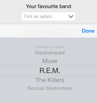
To conclude the session, I decided to wireframe an experience related to “Discover What Nature is Hiding”. I came up with “Hidden Habitats”, a digital experience designed to showcase the hidden corners of the Norfolk Broads. This idea is based on our visit to Carlton Marsh and uses the functionality theme “Identifier”. The objective is to let users choose which season (Spring, Summer, Autumn, Winter) and a location (Subterrane, Surface, Sky) to look at what type of animals and habitats reside there. I played with different ideas for presenting these selectors.

Hidden Habitats selector wireframe
The first is in the style of an iPhone scroll selector. This gives users an integrated and recognisable way of choosing, lining up with Nielson’s Heuristic “recognition rather than recall”. The other method I will be testing is a dial. I expect this to be more fun and engaging way to interact with a simple task.
I drew a rough user journey where the user is shown information about a birds nest. This was used as a jumping off point for a digitalised version.
 Hidden Habitats pt.2
Digitalised Wireframe
To mock my wireframe, I used Adobe XD because I want to brush up my skills using the program. I also know it has preset for different desktop, tablet and mobile screens (should I need it) and I didn’t need any functionality. In comparison to my last wireframe, Switch, which was colourful and digitally interactive, I knew this was going to be black and white to show to the focus group as a paper prototype


