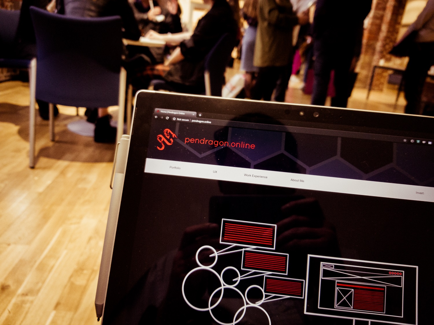
The first proper ‘public appearance’ of Pendragon II and my first ever professional portfolio critique was at The Big Book Crit on May 2nd 2019. This is a bi-annual event held at NUA where students are invited to show their portfolios to a range of designers for critique and feedback. It’s also a networking event where jobs and internships sometimes get offered.
I took my portfolio along on my Surface to show the professionals. I also took a copy of Storehouse 18 along to the event but ended up not really talking about Storehouse. Whilst Storehouse is something I do that I love and shows team management skills and an extra-curricular interest, I don’t want to graduate into the magazine industry.
Thoughts on the event as a UX student
From the perspective of a UX student, I found this event a little bit disappointing. There are several great UX firms in Norwich, several of which I completed work placements at in 2018, but sadly none of them attended the event. There were a lot of design agencies at the event, some of whom do websites, but often their interests lie more in the appearance and presentation of the final product than the usability and functionality of it, which UX firms and software houses with dedicated UX departments tend to focus on more. This means that what visual and graphic designers look for in a portfolio is different to what a UX designer would look for in a portfolio. I felt that it was very difficult for me to get a proper ‘UX portfolio’ review at this event without there being a UX designer to assess my work.
Regardless, the critique I received is still very valid, I am extremely grateful for it and I am already working to implement it.
The good
All of the professionals I spoke liked the work I had been completing and thought it was all very exciting and interesting.
They liked that I could talk about my work in fairly good detail and give answers to questions on the spot, for example justifying the use of the breadcrumb buttons in the Nature Finder prototype in the Broads Authority App.
The short ‘What is UX?’ infographic video which has been on my portfolio since October 2018 went down well with most people who thought it was an interesting way to describe UX. They were especially impressed that I had created it myself using Adobe After Effects. However, some professionals felt that this video’s place at the top of the home page was a little odd and instead information about me should appear in its place.

Not related to my portfolio since it’s not on it, but professionals are really interested in my dissertation proposal. They say it’s a challenging but exciting project and is exactly what the industry is looking for at the moment. This fills me with confidence!
The bad
The biggest problems with my current portfolio site are:
- There’s arguably too much content – the number of pages could be reduced. I’m not sure whether the professionals loved or hated the mega menu, but I observed that they were able to find my portfolio pieces quickly with it.
- The content is too long. There’s too much ‘back-story’ on a lot of the pages. Case studies on a portfolio website need to be a few hundred words long at max.
- Some case studies don’t have enough wireframes and preparatory work shown. This kind of contradicts the last point about keeping things short, but they did want to see more sketches and diagrams.
- Despite having a link to the outcome and a very brief description of the project in the header of each case study, this went unnoticed by a number of the professionals who had to scroll through the long pages to find the outcomes.
- The WymTrails case study doesn’t really belong on the portfolio website since it is a review of somebody else’s app – it should probably be on this blog instead.
- I don’t do a very good job at promoting myself. I’m not the first thing on the home page nor am I the ‘star’ of the site. This means that people might not know really who I am or what I do unless they go to the About page – especially since I elected not call my portfolio ‘Jason Brown Design’ or something boring like that and instead use a brand name. I guess the brand name overshadowed me.
The ugly
Not an awful lot was said about the visual design of my portfolio site, but three things were mentioned:
- Mega menus had a lot of content in them and looked a bit cluttered. Some content should be removed or segregated.
- Font size in the menus and footers (on my Surface) was possibly too small.
- There were some bugs with colours noted in the menu bar buttons, e.g. sometimes the text is black and the button highlight is red.
The number one question I was asked tonight was…
‘…so, are you a designer or a coder? Or both?’
-Far too many people to mention!
I find this a difficult question to answer. I love both. I can say that, but my site doesn’t really make it obvious that that’s the case.
Thoughts on the feedback
I really value the professionals giving up four hours of their evenings to come and talk to students, for free, about their portfolios, I am therefore very grateful for the feedback that I received.
I agree with the vast majority of it and have already begun to implement some of it, for example the first item on the home page is now the ‘About me’ section which was at the bottom of the home page. I don’t want the site to look like ‘me, myself and I’, but really in a portfolio website that is the most important thing as this site is no longer about a ‘brand name’, it’s now about me.
This is where I think the Pendragon Online site is a little bit muddled now. When the previous site launched in October 2018 it was all about my work and also an advert for my freelance services. I felt that it needed to be more about the work and my understanding of UX and user testing than all about me. But since the Pendragon Online website is now solely a portfolio website it can be more about why an employer should hire me.
It’s a shame that no UX designers could give me an idea about how my portfolio fared as a specific UX design portfolio as opposed to a ‘web design’ portfolio. I feel that they would have likely appreciated the detail a little more, but would have advised that content was too long.
I’ve never had a professional portfolio review before and we have never touched on creating a portfolio on our course. Students on other courses at NUA have a lot of assistance with creating portfolios with regular critiques from their tutors. This is a short-coming of my course. I feel that given I’ve created this site with no guidance other than what I thought was right I’ve done OK. On the whole the critiques went well, but the user tester in me knew that after the fourth critique and hearing exactly the same feedback again that there was little point having a fifth.
My technique at the event
I went in to the event with the idea of selling myself to get an internship. I think at this particular event that wasn’t a great idea. I’ve just launched a new portfolio site, it’s untested, I’m still not 100% sure how to talk about my work in this manner and so I slipped up a few times and started talking about non-relevant things like my A level work and photography in an attempt to show that I was rounded person. They’re interesting, but not as relevant to obtaining a UX internship as a few well-written UX case studies. Also, this is a critique event and not really like the other networking events I’ve attended where you talk about your work and the wider world of technology to make connections.
I realised this after my first critique which was a bit of a mess – my phone even went off! I changed my approach and basically turned the event into a big usability testing session for my portfolio website and instructed the professionals to use the site and tell me their thoughts. This was a good idea because now I’ve come away with solid feedback on how it can be improved which means that the next time I attend an event like this hopefully the portfolio itself will be in a better shape and I can enjoy talking more about the work on it. The work will also be better presented so it will be easier to talk about.

Is Pendragon II a success?
Pendragon II is probably a ‘stepping stone away’ from being my final portfolio. It seems apparent that it’s still not quite there yet, but with the feedback that I received I can make it much better.
Looking at the list of improvements in Pendragon II compared to the original, I’m very pleased that I took the time and effort to produce a new portfolio for this event. I’m not sure how the original site would have been received!
For somebody in Year 2, this is definitely a step in the right direction.
-One of the comments from a creative director at BigDog this evening.
Interestingly, I sent an application for an internship off today and this portfolio is attached to it. If I’m also unsuccessful with gaining this internship then perhaps the portfolio is part of the reason why I’m finding it hard to get internships this year. There could be lots of factors, such as money and time, but maybe it’s too difficult for employers to see what I can actually do because visuals are ‘buried in text’ that they don’t have time to read.

‘Pendragon 2.1’ – the next step
Called 2.1 because it’s likely to be a case of updating content and some visual elements on the current site as opposed to a complete rebuild. I’m already implementing the feedback and will be doing the following over the course of the next few months to improve the portfolio:
- Removing pages that are not relevant (several were removed from Pendragon I to II, I wonder if more can be removed).
- The ‘What is UX?’ video is now at the top of the UX page and information about me is now at the top of the home page.
- Content rewrites on almost every page:
- Shorter.
- More imagery (and bolder imagery, too).
- Have images/videos/GIFs of the final outcome directly beneath the header image, then the case study copy can follow (case study copy could possibly be held in a collapsible section to improve the appearance of the site even further).
- Any new content, e.g. some information about my dissertation proposal.
- Home and portfolio page redesigns with my best content pushed to the top of the page.
- Restructured menu system to segregate university work from other work that I have completed before or outside of university.
- More focus on the fact that I like to think I am a fairly ’rounded UX designer’, i.e. enjoy most aspects of the UX process.
- A few visual design tweaks here and there such as font size changes and ensuring that colours in menus are correct.
- Hope to get it critiqued by industry contacts before it is used to apply to graduate schemes and jobs.
The last point is really important. I want to start applying for graduate schemes this summer, so ideally these changes need to be made soon. I envisage spending most of May implementing these changes, ready for the summer. In Year 3 I also don’t really want to be doing massive updates to the portfolio site besides adding new content, so I want to try and get it right now.
It doesn’t look great on me to have posted all about Pendragon II on April 28th or 29th all over social media, only to then post all about a ‘Pendragon III’ or ‘new portfolio’ about a month later, so this time the update will be much quieter. I might mention that there have been some updates or content additions rather than ‘a whole new site!’

Everything about presentation needs to be to reduce the amount of scrolling and reading that a prospective employer has to do.
I’m confident that by the summer, this portfolio will be much improved.

Closing thoughts
I don’t want to beat myself up too much about the critique. I’d be lying if I said I didn’t go in wanting them to say, ‘Wow! You’re hired, start next week!’ but actually what I’ve come away with is much more useful. I haven’t been given any prior critique or assistance with making the portfolio and I don’t spend a lot of time looking at portfolio sites from students so I’m not 100% clued up on what’s required (to be fair, I could have looked at a few as research), so I thought I did OK all things considered.
Pendragon II is like a public beta – and now the feedback has been received, the final product can be made. The portfolio site was a beta and tonight’s event was a big usability testing session. That’s how I’m looking at it.
4 Comments on “Pendragon II at The Big Book Crit – May 2nd 2019”
Comments are closed.