Year 2 of BSc User Experience Design is very much underway now, starting with scanning patterns.
What are scanning patterns?
They are theories that suggest we read and digest information on web pages in a certain pattern, scanning different areas of the page for content and often missing out (or not looking closely at) anything which does not fall into the ‘scanning region’. Generally speaking, there are two main scanning patterns that have been identified through the use of eye tracking and asking users to complete reading comprehension tasks – these are the ‘F’ and ‘Z’ scanning patterns.
The ‘F’ scanning pattern theory suggests that users initially scan for content down the left side of a page, then often read the first paragraph of text or look at whatever content is beneath the header, then maybe read whatever is below that and just simply scroll down the page not really digesting any content. If you were to map it out on a screenshot of the page, the gaze spots would loosely resemble the shape of an F.
The ‘Z’ scanning pattern suggests that a user initially scans across the top of a page, then diagonally to the bottom left corner of a page (or an element on a page, such as a header or footer area), then across the bottom of the page or element to the bottom right corner, opposite. This suggests that all content is scanned, but really only the information at the top and bottom of the element is digested with anything in between not really being looked at in any great detail. If you were to map out the gaze spots, they would loosely resemble the shape of a Z.
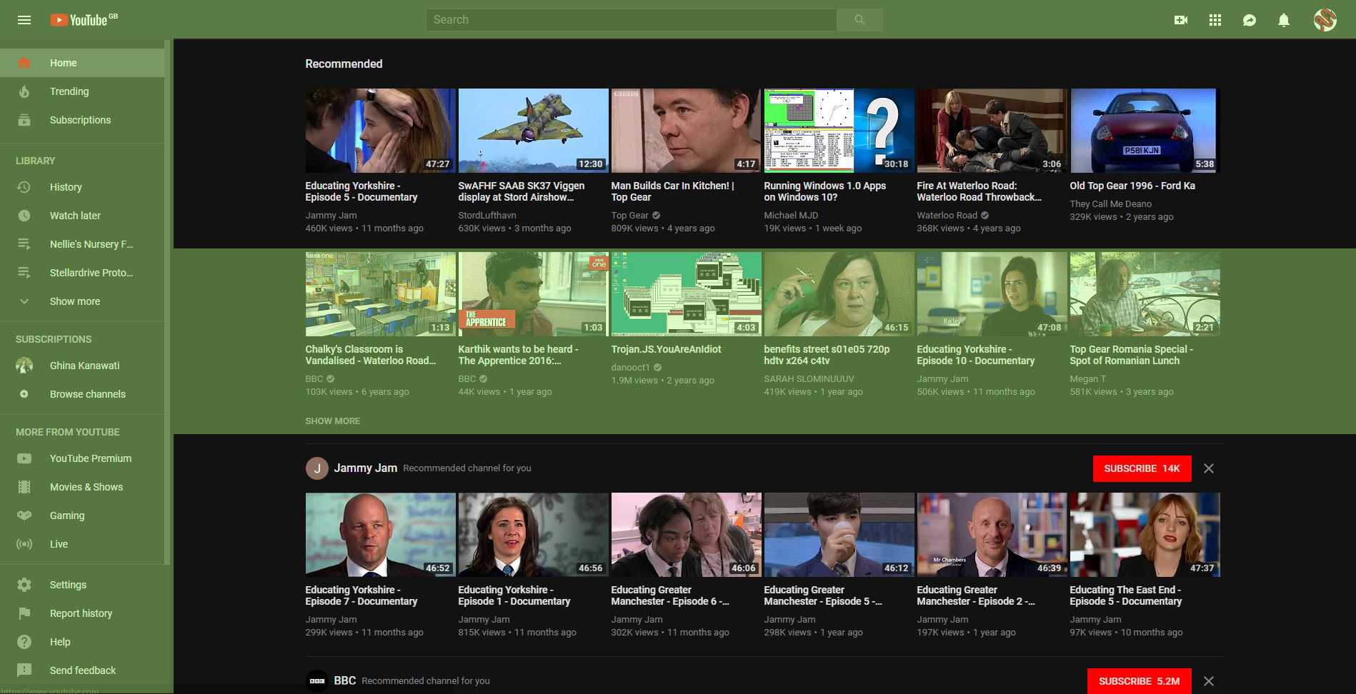
Examples of famous websites that seem to follow the ‘F’ scanning pattern
Whether by design or coincidence, these are just several examples of famous websites that follow the ‘F’ scanning pattern.


Generally, websites where there is a lot of text or lots of items for the user to click on or look at seem to follow this pattern. Most of them don’t have ‘perfect’ ‘F’ scanning patterns, but they do often produce scanning patterns that look roughly like an F.
Examples of famous websites that seem to follow the ‘Z’ scanning pattern
Websites that follow the ‘Z’ scanning pattern are generally a little harder to find, however those that follow this pattern seem to have one thing in common. Look at the websites below.


Generally, websites with large header areas and calls to action and information in these header areas tend to lend to a ‘Z’ scanning pattern.
Websites that don’t seem to follow either pattern.
Of course, not all websites follow these patterns.


It seems that pages that do not fit the model have very little information on them and generally there is one clear call-to-action or task to be completed on them. Content is often placed in the centre of these pages because that’s where it looks the most attractive.
Thoughts on scanning models
It seems that naturally some pages just seem to follow the ‘F’ model, however there are some criticisms of it, notably:
- Some believe that the only reason a user would scan in an ‘F’ shape is because page content has not been formatted for the web – pages are either too text heavy or the text is not appropriately broken up.
- Some believe that the ‘F’ model exists because a user will read a page not really being committed to reading every word, rather just scanning – does this suggest the content is too boring or difficult to read?
- It may not be relevant on mobile devices where content is often arranged in a single column due to narrow, portrait screens.
It is often believed that users looking for information on web pages want to find out whatever it is that they are looking for quickly and move on. It’s often believed to be bad for business practice because users are missing massive chunks of information that could be important. To avoid this, using proper text hierarchy and start key paragraphs with words that lure the user in to get them to continue reading the paragraph. Bullet point lists could also be a good way to break up content.
It is thought that you should concentrate on creating a good text hierarchy and ensuring that information is easy to find and read rather than trying to set out creating a website that follows the ‘F’ pattern perfectly from the get-go.
Alternative scanning patterns
Some alternative patterns include:
- The ‘layer cake’ pattern: headings and subheadings are scanned, but text in between is missed. A gaze map will show lots of straight horizontal lines – like the different layers in a cake.
- The ‘spotted’ pattern: the user knows what to search for and so massive chunks of text are missed apart from the specific bits that a user is looking for,
- The ‘marking’ pattern: tends to happen on mobile devices, but the eyes are focused in one place and the page is moved up and down – a little like a dancer being fixated on an object during a twirl.
- The ‘bypassing’ pattern: the user purposely skips the first few words of a line when multiple lines of a list all begin with the same word.
- The ‘commitment’ pattern: the user actually reads all of the text and is very attentive – this is very rare and only happens when the user is totally committed to reading a whole article and is not just looking to ‘scan’ for information.
References
Pernice, K. (2017). F-Shaped Pattern of Reading on the Web: Misunderstood, But Still Relevant (Even on Mobile). [online] Nielsen Norman Group. Available at: https://www.nngroup.com/articles/f-shaped-pattern-reading-web-content/ [Accessed 1 Oct. 2018].