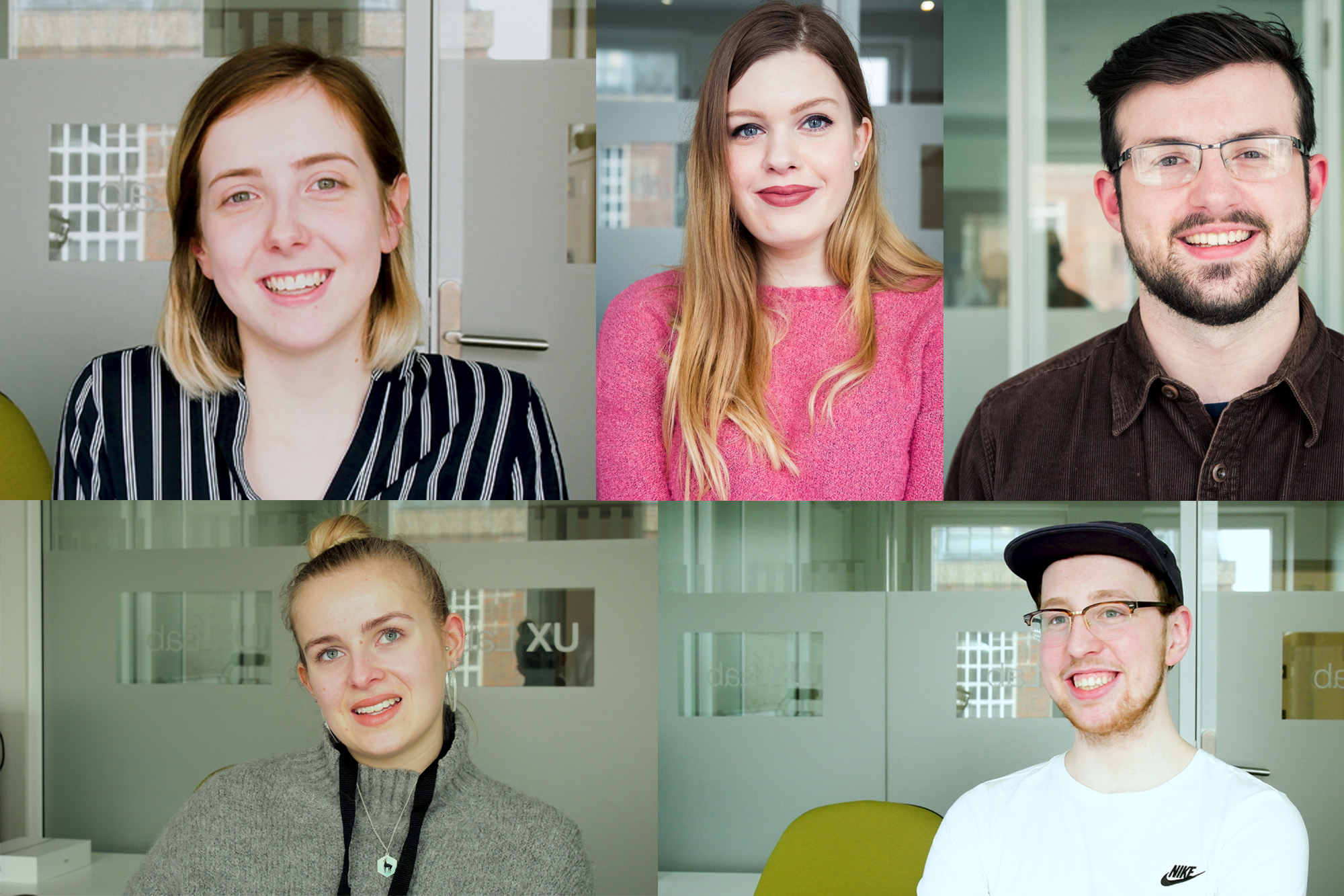
Elebase 3 was tested by five NUA students on Friday 16th March 2018 in the UX lab. The purpose of this testing session was to test the navigation system of Elebase 3 to see if it was more usable than that of the previous Mobile Prototypes.

Prerequisite reading
- To see the results from the previous testing session, please read the February 2018 testing post.
- To understand the thought processes and design inspiration behind the Elebase 3 menu system, please read the February 26th-March 2nd reflective journal.
- To see the development process of the Nellie’s Nursery website between the end of the February 2018 testing and the beginning of this testing session, please read the March 5-9th and the March 12-16th reflective journals.
Alpha testing
Alpha testing was completed by myself on a range of browsers and hardware. The list of browsers and hardware that I had intended to run alpha on was in the 26th February-2nd March reflective journal. Unfortunately I wasn’t able to test the prototype (Elebase 3) on all of the different hardware and software combinations listed in that post, however I was able to test on the following combinations.
Devices in italics are devices that I don’t personally own or have direct access to but either the university or my friends own that I hope to be able to borrow.
Desktop prototypes
- Desktop PC with Windows 10 with Google Chrome, Mozilla Firefox, Opera and Microsoft Edge installed. 24″ 1920×1080 16:9 and 22″ 1680×1050 16:10 monitors.
- Lenovo ThinkPad T440s Touch with Windows 10 with Google Chrome, Mozilla Firefox, Opera and Microsoft Edge. 14.4″ 1920×1080 16:9 touch display.
- Desktop PC with Windows 7 with Google Chrome and Mozilla Firefox installed. 27″ 2560×1440 16:9 monitor.
- Mid-2014 Apple MacBook Pro with macOS High Sierra with Google Chrome, Opera and Safari installed, 15.4″ 2880×1800 16:10 display.
Mobile prototypes – Apple
- Apple iPad 4 (November 2012), iOS 10.3.3, Safari and Chrome installed (9.7″ 2048×1536 4:3 display)
- Apple iPhone 6 Plus (September 2014), iOS 11, Safari and Chrome installed (5.5″ 1080×1920 16:9 display)
Mobile prototypes – Android
- Samsung Galaxy S4 Mini (July 2013), Android 4.4.2 Lollipop, Chrome and Samsung Browser installed (4.27″, 540×960 16:9 display)
- Samsung Galaxy A5 (2017) (January 2017), Android 6.0.1 Marshmallow, Chrome and Samsung Browser installed (5.2″, 1080×1920 16:9 display)
- Samsung Galaxy Note8 (September 2017), Android 7.1.1, Chrome and Samsung Browser installed (6.3″, 1440×2960 18.5:9 display)
Mobile prototypes – Windows Phone/Windows 10 Mobile
Note: due to low market share mobile Windows platforms are not testing priority, however the prototypes can be tested on the following devices to check compatibility.
- Nokia Lumia 710 (December 2011), Windows Phone 7.8, Mobile Internet Explorer 9 installed (3.7″, 480×800 5:3 display)
- Nokia Lumia 925 (May 2013), Windows Phone 8.1 Update, Mobile Internet Explorer 11 Update installed (4.5″, 768×1280 5:3 display)
- Nokia Lumia 930 (April 2014), Windows 10 Mobile (Anniversary Edition, Build 14393), Edge 38.14393 installed (5.0″, 1080×1920, 16:9 display)
Browser versions:
Desktop: Google Chrome (65), Mozilla Firefox (59.0.1), Microsoft Edge (41.16299), Apple Safari (10.1) and Opera (51).
Mobile: Google Chrome (62.0.3202.84), Samsung Internet (6.2.01.12), Safari (11.1.1), Edge (38.14393).
I hope to be able to test the final version of the website on the full list of devices, but for the time being I have managed to do some testing on a range of devices running various operating systems and browsers and found that the site displayed fine on all of these devices. Most of these devices are ones that I personally own or have access to, with just a couple of devices being borrowed from friends to test on hardware and software that I don’t have my own access to.


I found that the only ‘modern’ browser that is not compatible with Elesbase 3 is Internet Explorer which does not render the Siema slideshows correctly. This is true on desktop and mobile versions of Internet Explorer. I use the term ‘modern’ loosely since the last major release of Internet Explorer came out in October 2013 and has not been updated since. In July 2015 with the launch of Windows 10, Microsoft replaced Internet Explorer with Edge as the new default browser and development of Internet Explorer is now discontinued. I only call it a ‘modern browser’ because it still ships with Windows 10 (Microsoft’s current operating system) and despite no longer being developed, Internet Explorer 11 is still going to be supported by Microsoft until support for the operating systems it runs on (Windows 7, 8.1 and 10) is ended. That’s 2020 for Windows 7 and 2023 for Windows 8.1. Windows 10’s lifecycle policy is different to that of previous versions of Windows in that two major updates to the operating system are released every year and this will likely be the way forever now. I believe that older versions of Windows 10 will be discontinued soon and support for Internet Explorer will be discontinued with them.


It’s not just Internet Explorer 11 that the site is not compatible with – Google Chrome 40 running on the Samsung S4 Mini displays Siema slideshows in the same way and whilst the Elebase 3 menu system is compatible with it (even featuring the vibrating buttons), the hamburger menu in the older Mobile Prototype 2 is not visible at all (perhaps a media query problem). However, the S4 Mini is a mid-range device from 5 years ago and Google Chrome 40 is now dated and discontinued (being released in 2015), but it happens to be the final version of Google Chrome that will run on Android 4.4 which is the newest version of Android that will work on the S4 Mini.

Whilst Android 4.4 (‘KitKat’) still held 12% of the Android OS market share in February 2018, it’s not as commonly used as the more modern versions of Android such as 5.1 ‘Lollipop’, 6.0 ‘Marshmallow’ and 7.0 ‘Nougat’, so I am not greatly concerned about compatibility with this older browser. However, it appears that with Elesebase 3 at least, the site is at least usable since the menu system is compatible, even if the Siema slideshows do not work as slideshows.
My policy with supporting these older browsers and operating systems is that with Elebase 3 the site is usable in both Internet Explorer 11 and Chrome 40 because the user can navigate around the site and both browsers apply the media query correctly so that the site at least displays on the device. The only device and browser compatible that I have tried Elebase 3 on that is not usable on is Mobile Internet Explorer 9 on my 2011 Nokia Lumia 710 running Windows Phone 7.8. This is a really old (and small!) phone, so I am not concerned about compatibility. On this device the fixed menu doesn’t fix to the bottom and pressing the menu button does not activate the hamburger menu, possibly due to Internet Explorer 9’s inability to recognise the ‘slideToggle’ function in JavaScript. Internet Explorer 9 is also only partly-compatible with CSS 3, clearly it does not recognise code used to fix the menu to the bottom of the screen or it is unable to apply media queries correctly. Media queries became a standard part of CSS 3 in 2012 and Internet Explorer 9 was released in 2011, so perhaps this is the problem.

Testing was not very rigorous – I basically just opened up the home page and tried a few of the other pages out to see how the prototypes looked on various mobile devices and if it looked OK and worked as expected then it was a ‘pass’ in my mind. Below is a video of Elebase 3 being tested on a Samsung Galaxy Note8 which gives an idea of how I tested the prototypes on the devices.
With the site running well on modern devices, I was confident that user testing would not be a problem.
User testing strategy
Testing aims
Generally the testing strategy was very similar to that to the February 2018 testing. The questions asked were the same and the testing took the form of an A-B-C test with participants first testing the desktop version of Elebase 3, followed by Mobile Prototype 2 (which was the older prototype with the hamburger menu accessible in the top right corner of the page) and lastly the mobile version of Elebase 3. The aim of the testing was to:
- Find out if the desktop website still had the preferred navigation system (February 2018 testing concluded that 72% of participants favoured the desktop prototype to the two mobile prototypes). I wanted to see if Elebase 3’s mobile prototype could compete with the desktop prototype and maybe even win some testers over.
- Find out if the mobile version of Elebase 3 is an improvement from Mobile Prototype 2, which was the favoured mobile prototype last time (with 86% of participants favouring Mobile Prototype 2 to Mobile Prototype 1). Ergonomics and ease of use will be tested.
Test tasks
The tasks set for the users were very similar to those of the February 2018 testing. I wanted to keep the questions the same for the following reasons:
- It’s easier to compare the testing data between February and March 2018 if the tasks set for the users are the same. Direct comparisons can be made between the different users, their approaches to the tasks and what the outcomes are.
- It’s acceptable to use the same tasks when the testers are completely different people to who tested it last time. If I had the same people testing the new prototype I would have made a different set of tasks, but because different people were testing it, none of whom knew my testing strategy (as I kept it secret from them), it was fine.
- The tasks were also relevant to what I was testing which was the menu system. I did also test the information architecture a little to, but around 72% of the tasks set are based around navigation, so my tests have a strong emphasis of testing ease of navigation.
The interview questions at the end of the tasks were kept the same as well for the same reasons.
The tasks and questions were as follows:
- (A) The user must firstly find the session times and tell me what they are.
- (B) The user advance the slides on the slideshow.
- (C) The user must navigate to the ‘Groups’ page.
- (D) The user must navigate to the:
- Desktop: ‘Jolly Giraffes’ section.
- Mobile Prototype 1: ‘Little Lions’ section.
- Mobile Prototype 2: ‘Mini Monkeys’ section.
- (E) The user must tell me the age range of the children in the group they had to navigate to and the rooms that that group use.
- (F) The user must navigate to the ‘Day-To-Day’ page and tell me some information about either the Courtyard or the Nature Garden. They cannot repeat the same information they told me last time,
- (G) To complete this stage of the testing, the user must navigate back to the home page.
These tests collectively evaluate:
- How easy information is to find, this is verified by getting them to tell me some information that’s displayed on the page that they have visited. I won’t prompt them to tell me some information, they’ll have to tell me when they’ve found some (to prompt this, instructions will be worded like ‘navigate to the
- How easy the site is to use – did they manage to find the pages and make the slideshow advance?
- This data is backed up using quantitative data by using eye-tracking. Heat and gaze maps from the eye-tracking software can be used to evaluate where the user is looking on the screen, meaning I can once again evaluate if they are looking in the right places, clicking on the right things and so on in order to build a picture of how easy the site is to use in terms of UX and information architecture.
After the first stage of the test has been completed, I gave users an opportunity to answer these open questions which allowed me to collect some qualitative data to allow my testers to elaborate on certain points.
- Information architecture questions
- What kind of information would you expect to find on a nursery website?
- Going by the buttons alone, would you say that this site has all of the information that you’d expect to find on a nursery website?
- Was there anything distracting or misleading on the pages?
- UX questions
- Did you find finding information on the page easy? Was the information clearly laid out and easy to read and find?
- Generally, did you prefer navigation on the desktop or the mobile site?
- Was the navigation more logical to use on prototype 2 or prototype 3?
- Which prototype was it easier to find the pages on?
- Were the icons on prototype 3 logical and easy to work out?
- When using the handset, did you find it more comfortable to navigate on prototype 2 or prototype 3?
Data was collected using the TechSmith Morae UX software, a Logitech webcam recording the user using the prototype on the device and my camera was used to record a video of each interview after the test. The data collection setup was different in this prototyping session to the previous session – more on this later.
The testers
From the moment the February 2018 testing was completed. I knew that I wanted a different set of people to test the next prototype. Asides from UX designers at Redgate advising that the testers should be changed every time you iterate a testing session so that other bugs are found, I wanted to ask new people for the following reasons:
- Most of the people who tested the February 2018 prototypes had also previously tested Stellardrive for me. I felt that these people were becoming accustomed to my resting strategy and might be able to almost ‘predict’ what the next round of testing would involve, therefore possibly corrupting the results a little.
- If I got the same people to test my project again, they might overlook some bugs and pain points because they know that it ‘might be eventually fixed’.
- They were all BSc students of a similar age and a similar mindset. Most were also male. I wanted much more of a mix of people to test my work this time so I asked my friends who are in Years 2 and 3 (a little older than most of the people who tested in February 2018) and study different courses and I asked a mix of men and women. These people are also more accustomed to giving critique to others just due to the nature of the courses that they are means that they are always being critiqued and always giving critique to others, so I felt that their feedback could potentially be a tiny bit more detailed. These people also (generally) study design courses, so would be able to give me critical feedback on the appearance of the site and things like the typography that I am not an expert in myself. My BSc peers were able to give me the feedback on how the site functioned which I used to make this new prototype, and my BA peers were able to give me feedback on the design and typography which is what matters now that this prototype has been developed and tested.
- These new testers have never seen the website before so could give feedback with ‘fresh eyes’ and no ‘distant memories’ of the prototypes that went before, therefore there could potentially be less bias in their feedback. For example, a participant who tested Mobile Prototypes 1 and 2 before and preferred 2 might naturally still prefer 2 in this round of testing, just because last time they remembered that prototype being the stronger one.
The testers are:
- Elena Lockyer (Year 2 BA (Hons) Graphic Communication)
- Harriet Taylor (Year 2 BA (Hons) Fashion Communication & Promotion)
- Emma McIlwaine (Year 2 BA (Hons) Graphic Design)
- Callum Brown (Year 2 BA (Hons) Graphic Communication)
- Joshua Garner (Year 3 BA (Hons) Visual Effects)
I did originally have six people down to test the prototype, but unfortunately one of them could not make the date.
I know that Emma has already contributed a bit to the design of this project as I have shared a bit of my work with her, but she doesn’t know my testing procedure or what she will be tested on, so whilst she will have a slight advantage in some areas (for example navigation), I am still happy to include her in my testing. I have deliberately held back from telling her about my testing strategy as I had her down as a potential tester before I asked her. The other students don’t know much, if anything, about the prototype and certainly nothing about my testing strategy. They are all friends of mine so I made sure that I didn’t reveal too much about what I am doing to them in general conversation in order to help keep the test fair. I tried not to work on my project work whilst I was studying with them at university so that they could not see what thy would be testing.
Methodology
Again, it was similar to the February 2018 testing, but there were some key differences.
Removal of eye-tracking
In both the February 2018 prototype testing and the Stellardrive testing I had used eye-tracking software to record gaze and heat maps showing where the user was looking on the screen. At the end of the February 2018 testing I evaluated that the eye-tracking had been useful for the Stellardrive prototyping session since it allowed me to judge whether my software was ‘safe’ (since if the user didn’t look enough at the road if the software was real, they’d likely crash the car and cause an accident), but for testing the Nellie’s Nursery website it wasn’t helpful at all. I felt that the gaze maps didn’t really tell me anything particularly useful and generally just got in the way of the test footage. In my opinion, eye-tracking is only helpful when you need to analyse if users are looking at multiple parts of the screen or if you want to test if something is really catching their eye, for general usability testing like what I am doing now, eye-tracking doesn’t add a lot of value and observation is more important. The eye-tracking software is also difficult and time-consuming to set-up on the mobile device testing rig and is often mis-calibrated, thus recording inaccurate data, so by not using it my testing went a lot smoother and I wasn’t recording inaccurate a data – a win-win situation.
Eye-tracking can however produce quantitative data, but just like in my previous testing session I aim to be able to turn qualitative data into quantitative data by creating graphs and charts based on the ‘general response’ from the qualitative interview data.
TechSmith Morae
Morae is a piece of software made by TechSmith, who also produce Camtasia Studio which I use frequently to record my screen (many of the videos of my screen in my reflective journals are produced using Camtasia Studio). Morae enables you to record several input sources and then compile them into a final video. It can do a lot more than this, for example whilst it is recording you can take notes of what the user is doing and whether they have completed tasks successfully or not, but I really wanted to just record my users doing the tasks so that I could later watch the footage back and see what they were doing.
The Tobii eye-tracking software can be a little unstable and crash a lot, but Morae was much more stable and worked perfectly all day, again making my prototype testing session smoother and quicker. Morae was also able to export directly into MP4 video format which is my preferred video format, whereas Tobii can only export video in AVI format. I much prefer the MP4 format because the files are far smaller and encoding an MP4 file takes far less time than encoding an AVI file and MP4 files are easier to edit. Little things like this made Morae a better piece of software to use for this user testing.
A different testing setup
Using Morae meant that I could record two input streams simultaneously, which meant that I could use some extra hardware.
The desktop testing was once again done on an iPad on the mobile device testing rig. A Logitech webcam mounted to the top of the rig recorded the participant using the desktop prototype on the iPad. The iPad was a good device to use because it was a device that all of my users were familiar with and recording what was happening on it was easy, but I had the same problem as last time which was that my desktop results aren’t truly representative now because the desktop test questions were written to test usability using a mouse and keyboard and testing the site on a large display, but at the end of the day the user was able to see how the site would look on a desktop device like a PC or a laptop. In hindsight however, I could have got my laptop out, recorded the screen using Camtasia Studio and got the participant to use the desktop site on that. But, this would mean that I wouldn’t be able to record the user’s fingers (sometimes you can see if they are hesitating, enabling you to judge UX even deeper) and I was able to leave the iPad on the testing rig throughout the day, meaning that again my testing session went smoothly.
The desktop site was tested on an iPad, but unlike last time I didn’t test the mobile sites on the iPad, instead I used a Samsung Galaxy S7 and attached a device to it called a ‘Mr Tappy’ which is basically a pole with a webcam mounted to the top of it that records what the user is doing on the phone. This gives a more realistic mobile experience for the participant and enables me to test ergonomics.

Using Morae I had one webcam recording the participant’s face and one webcam recording the device screen, either on the mobile device testing rig (the iPad) or from the Mr Tappy (the Samsung S7). The footage from the cameras recording the devices obviously allows me to see what the participants are doing on the devices and allows me to analyse their actions. The footage from the camera recording the participant allows me to see facial expressions, emotions and body language that might be able to give me some insight as to how the user is feeling during the test.
I did record a video on my phone of the testing setup but unfortunately the file corrupted, however I was able to take the still below which shows the testing setup that I used.

The testing session
Essentially the participant was instructed to complete the tasks on the desktop website first on the iPad, then on the S7 I would open Mobile Prototype 2, get them to complete the tasks again on that and then finally I would open the mobile version of Elebase 3 on the S7 and the participant would complete the tasks again. I would then record a short interview with the participant after the testing to find out their thoughts on the information architecture, UX and see if they had any suggestions for going forwards with the prototype’s development.
I had found that this formula rendered the results that I wanted for the previous testing session, even if it meant that some of the later tasks were potentially easier to complete as participants ‘remembered’ how to find information on the site and learned how to use the interface.
Data Analysis
Data was collected in three forms:
- A recording of the participant completing the test.
- A recording of the participant’s actions during the test.
- A recorded interview with the participant at the end of the test.
Like last time, actions and comments from the participants were generally very similar and focused mainly on a bug that sometimes made the menus go off-screen on the groups page, the justification of the font, the sections on the groups page and the navigation system on the mobile prototypes.
Elena Lockyer
Studies: BA (Hons) Graphic Communication (Year 2)
Aspires to be: an interaction designer in children’s design.
Testing
Desktop
- Found session times on the home page and read perfectly.
- Found slideshow on the home page and advanced slides with the buttons.
- Found groups page perfectly.
- Found Jolly Giraffes icon and tapped icon to go to the section.
- (I made an error and asked her to find the age range of the children in that class after getting her to go to the section – but she looked at the copy and found it was pre-school education. When instructed to scroll up the page to find it she found it easily).
- Found day-to-day page perfectly.
- Found the information about the courtyard perfectly, read text perfectly, noticed error in copy.
- Navigated back to home page perfectly.
MOBILE PROTOTYPE 2
- Found session times on the home page and read perfectly.
- Found slideshow on the home page and advanced slides with the buttons. When asked if there was another way she instinctively swiped.
- Found groups page perfectly.
- Found age of children in Little Lions perfectly.
- Started navigating to the Little Lions section by scrolling, then remembered you could tap on the icon and scrolled back up and tapped on that.
- When navigating to the day-to-day page, she noticed that the hamburger menu was no longer visible so started looking for another way, then swiped over and saw the menu reappeared. Then she found it fine.
- Found and read information about the nature garden perfectly.
- Went back to the home page by scrolling up a bit, then tapping on the burger menu and going back to home. Afterwards tried tapping the logo, but didn’t work.
ELEBASE 3 (MOBILE)
- Found session times on the home page and read perfectly.
- Swiped the photos on the slideshow to advance the slides.
- It took her approx. 5-6 seconds to see that the menu was at the bottom, but immediately saw the hamburger menu after this and navigated to the groups page. Then commented that she thought that she would have probably found it faster had she not just used the other prototype.
- Found and read the age of the children in Mini Monkeys perfectly.
- Instinctively tapped the arrow to go back to the top of the page.
- It took her a couple of seconds to remember that the menu was at the bottom of the page, but then tapped on the hamburger menu and found the page easily.
- Found and read information about the courtyard perfectly.
- Went back to the home page by instinctively tapping on the home icon in the bottom menu bar.
Interview
Key points from the interview
- On a nursery website: opening times, contact, different age groups, different sessions, different areas of the nursery (you want to know what where you’re sending your child is a safe environment), lots of pictures of happy children, about section that shows that the nursery is genuine.
- Website covers everything – just needs more pictures.
- A lot of distracting things: doesn’t like the justified text, too confusing to read. Instead, set it out with leading. Buttons on the groups page to go to the top are a good idea, but not consistent through the page and distracting to look at whilst reading – felt it was just as quick to scroll up. The groups page kept moving and hid the navigation.
- Information clearly laid out and text easy to read. Text too tight, needs to be broken up with pictures. Easy to scroll past information.
- Generally preferred the desktop website – felt that this kind of site would be used more on a tablet or laptop than a phone. The desktop site was more spacious.
- Preferred the navigation on Mobile Prototype 2 since a lot of other websites are laid out like that one is. Felt that if she had not been on Mobile Prototype 2 prior to going on Elebase 3 she would have probably naturally gone to the bottom of the page to access the menu. From a design perspective she felt that it was pointless having a home button in the menu and a home button on the fixed menu. To keep the site looking cleaner, deprecate one.
- Wasn’t sure which mobile prototype it was easier to find pages on because the menus kept going off-screen on both. Felt that by the time she was testing the second prototype she had already partly-learned the website and noticed that the items in the menus were laid out in the same order, so it was familiar.
- She felt that the icons on the second prototype were clear but said that naturally she’d just click on a menu to get where she needed to go. She didn’t even look at the button on the right because she felt that she could just open the hamburger menu and everything that she needed to know would be in there.
- Found Elebase 3 more comfortable to navigate on the mobile phone, wasn’t sure why but felt that it might be because it’s closer to your thumb. She felt that the scrolling on both prototypes was too fast.
- Said that she felt I had done a ‘good job’ quickly followed by ‘I couldn’t do that!’
- Suggested replacing the hero image at the top with some photography to engage on a more emotional level with users. Parents would see happy children on the website and think ‘that could be my happy child!’
- Suggested sorting the text out (as per earlier feedback) and removing the buttons from the site [in mobile view] and replacing these with arrows to make the site look cleaner. Also suggested making the gaps between the sections bigger to make the site look more spacious.
Harriet Taylor
Studies: BA (Hons) Fashion Communication & Promotion (Year 2)
Aspires to be: a brand identity strategist.
Testing
Desktop
- To find the session times she started on the home page, then quickly moved onto the day-to-day page, spent approx. 10 seconds looking for them on there before looking on the groups page and finding them there quickly. She read the text perfectly.
- Instinctively advanced the slides in the slideshow using the buttons.
- Navigated to the groups page perfectly.
- Found the age of the children in the Jolly Giraffes class perfectly.
- Instinctively navigated to the Jolly Giraffes section by tapping on the icon.
- To go back to the top of the page she started scrolling, then noticed the arrows on the other sections and tapped one of those to go back to the top of the page.
- Found day-to-day page perfectly.
- Found the information about the courtyard perfectly, read text perfectly, noticed error in copy.
- Navigated back to the home page perfectly.
MOBILE PROTOTYPE 2
- Instinctively went to the groups page to find the session times and immediately knew where to tap to access the menu. Read the information perfectly.
- Instinctively advanced the slides on the slideshow by pressing the buttons. When asked if there was another way she instinctively swiped.
- Found the age of the children in the Little Lions class easily.
- Tapped on the Little Lions icon to navigate to that section.
- Noticed the bug where the hamburger menu is moved too far right on the groups page, swiped left to reveal the hamburger menu and found the day-to-day page and information about the nature garden perfectly.
- Navigated back to the home page by using the home button in the hamburger menu.
ELEBASE 3 (MOBILE)
The bug on the mobile prototypes frustrated her, every time the page kept moving over erroneously she muttered ‘God’.
- Instinctively tapped hamburger menu at the bottom of the screen to find the groups page in the menu and found and read the session times perfectly on that page.
- Advanced the slides on the slideshow by swiping.
- Found the age of the children in the Mini Monkeys class easily.
- Went back to the top of the page by tapping the arrow button.
- Navigated to the day-to-day page very easily and quickly and read the copy text about the courtyard perfectly.
- Went back to the home page by using the hamburger menu. However, the page didn’t go back home.
Interview
Key points from the interview
- On a nursery website: opening times and prices per hour, what they have to offer that would benefit the child, the activities they run, certificates/reviews/testimonials that show trust.
- The site seems to cover everything.
- She commented that it was hard to navigate because the site kept moving on mobile devices. The menus kept going off the screen. The arrows aren’t very neat, a fixed arrow in the corner that is always present would be better than having one in each section. To go back to the top, you currently must first scroll up the page to find an arrow, whereas a fixed one is always visible.
- Generally preferred the navigation on the desktop site, but she liked the layout of Elebase 3 on the mobile device.
- Preferred Elebase 3 to Mobile Prototype 2 because the hamburger, home button and ‘phone’ [it’s a ‘contact’ button] are all in one place – they’re the main things that you need and they are always there and easy to get to.
- She recognised what all the icons on the fixed menu were for, but she didn’t realise that she could have pressed the home button on the fixed menu to get back to home until her interview was being conducted. Instinctively she pressed the home button in the menu and felt that she would do it this way again in the future. She associated the home button with ‘address’ because it’s next to a phone icon.
- She would have used the contact button had she needed to contact the nursery though.
- She felt that one was not more ergonomic than the other because she found herself scrolling back to the top of the page a lot anyway and also trying to correct the bug where the menus went out of view.
- She felt that the groups page was a bit confusing to navigate because the arrow buttons made it feel like you were on lots of different pages but actually you were only one on.
Emma McIlwaine
Studies: BA (Hons) Graphic Design (Year 2)
Aspires to be: a graphic designer working in fields such as healthcare with the intention of improving these services through graphic design.
Testing
Desktop
- Emma started looking on the home page, then quickly moved onto day-to-day and spent approx. 50 seconds looking for the session times on that page. Then she went onto the groups page and found them quickly. She had no problem reading the times.
- Instinctively advanced the slides in the slideshow using the buttons.
- When asked to find the age of the children in the Jolly Giraffes group she initially tried to go onto the meet the team page but got a notification telling her that this page had not been built yet. After some guidance she found the information on the groups page which she was already on. She later said that she didn’t know why she tried to go onto the meet the team page.
- When asked to navigate to that section of the page she looked like she was going to tap on the icon (her finger was hovering over it and she tapped near it a few times), but she scrolled down to that section instead. She mentioned that as she was scrolling down the page she was also having a look at the other sections on the page.
- She accidentally went back to the home page when asked to go back to the top of the page (by tapping on the nursery logo in the upper left corner), but very quickly realised her mistake and went back onto the groups page.
- She instinctively tapped on the nursery logo in the upper left corner to go back to the home page.
MOBILE PROTOTYPE 2
- She found the session times by using the hamburger menu to navigate to the groups page. It seemed that whilst the hamburger menu was opened she tried to scroll on the home page as well to see if they were there, but found it easier just to navigate to the groups page. She read the times fine.
- Instinctively advanced the slides on the slideshow by pressing the buttons. When asked if there was another way she instinctively swiped. Said that she would have likely instinctively swiped straight away had the previous and next buttons not been there.
- It took a little while to find the age of the children in the Little Lions class, but when she found it, it was clear to read.
- When asked if there was a quick way to get to the Little Lions section she instinctively tapped the Little Lions icon. She instinctively tapped the arrow to go back to the top of the page from the Little Lions section.
- She knew how to get to the day-to-day page, unfortunately the bug on the groups page that hides the menu button prevented her from accessing the hamburger, but once I swiped to reveal the hamburger she knew to tap on the menu icon and find the page in the menu.
- Found and read the information about the courtyard perfectly.
- Tried to go back to the home page by tapping on the nursery logo in the upper left corner but saw that this doesn’t work on this older prototype. So, she then used the hamburger menu.
ELEBASE 3 (MOBILE)
- Instinctively went to find the session times on the groups page and found the hamburger menu on the menu at the bottom perfectly.
- Swiped the slides to advance them and then also pressed the previous and next buttons.
- Went back to the top of the groups page by using the arrow.
- Found the age of the children in the Mini Monkeys class perfectly. Instinctively knew to tap on the icon to navigate to the page section and then tapped the arrow icon to go back to the top of the page.
- Instinctively used the hamburger menu to go to the day-to-day page.
- Found and read the information about the nature garden perfectly.
- Navigated back to the home page by pressing the home button on the menu at the bottom.
Interview
Key points from the interview
- On a nursery website: location, the staff, activities, about the nursery.
- The website seems to have the most important information, not every detail though. Some details might not be applicable to all target audiences.
- She felt that as she tested the prototypes more and more she ‘learned’ how the site worked and where information was.
- She felt that the next and previous buttons on the slideshows could be removed and replaced with an animation or text that disappears that instructs the user to swipe the pictures to advance the slideshow frames.
- The menu button on Mobile Prototype 2 and menu bar on Elebase 3 was too far right (noticing the bug).
- She felt that after 5 minutes she had found her way around the site despite not really knowing the format of most nursery websites. She said there was a lot of scrolling and suggested that the information in tiles could be put into collapsible sections instead to save scrolling and to only show information that the relevant users are interested in. She said that as she was looking through the website she was looking mainly at section headings to determine if the information she had been asked to find would be in that section, so some good headings above collapsible sections could ensure that information is not missed but scrolling is reduced.
- Generally preferred navigation on the desktop site – felt the buttons being at the top worked well for the desktop website.
- Preferred Elebase 3 mobile to Mobile Prototype 2. She felt that I had done a good job at adapting the interfaces to the intended platforms.
- She did however question if the home button was needed in the burger menu given that tapping on the nursery logo and on the home button in the bottom menu also took you to home. She felt that having the two buttons [home and contact] on the bottom menu generally worked well and possibly better than the arrangement in Mobile Prototype 2.
- When asked if she would use the contact button on the bottom menu to find contact details, she said that she felt that the icon of that button led her to believe that the button would immediately start calling the nursery, acting more as a ‘dial’ button than a ‘contact us’ button. The home button was perfectly logical to her.
- She found Elebase 3 mobile more ergonomic to use than Mobile Prototype 2 because the buttons were closer to the thumb.
- Emma said that she is used to using an iPhone so doing the test on a Samsung was a little bit of a learning curve to her because she was unsure of how to make the browser go back a page, meaning that the whole navigation experience was done using my menu system whereas an actual user would rely a lot more on the back button on the browser.
- Emma doesn’t like the font I used for the headings, she doesn’t think it is clear. She felt that some of the characters in the font aren’t clear so if people are trying to read the content quickly they will have difficulty reading the information correctly.
- Emma liked the use of the logo colours on the website elements.
- Emma also suggested changing the icons on the menu bar at the bottom and maybe making the hamburger menu itself look more visually appealing. She suggested that looking at what corporations such as Apple, Google and Facebook are using for similar icons could help me create an icon set that users understand. She said that my target audience likely are familiar with these websites and icons that these companies use, so it makes sense to take inspiration from them.
Callum Brown
Studies: BA (Hons) Graphic Communication (Year 2)
Aspires to be: a UX designer working for a large corporation such as Google or Facebook working in the USA.
Testing
Desktop
- Found session times on the home page and read them perfectly.
- Instinctively pressed the buttons at the bottom of the slideshow to advance slides.
- Navigated to the groups page perfectly.
- Found the button to navigate to the Jolly Giraffes class section after carefully scanning the page, but didn’t recite the age of the children in the class. Tapped the button to go to the section and scrolled up the page to go back to the top. When scrolling back to the top he remembered he needed to tell me the age of the children in the class and found and read it.
- Navigated to the day-to-day page easily.
- Easily found and read the information about the courtyard.
- Navigated back to the home page perfectly.
MOBILE PROTOTYPE 2
- Found the session times on the home page and read them perfectly.
- Used the buttons to advance the slides. When asked if there was another way he suggested placing arrows on the edges of the image to indicate that the images were in a slideshow, but then realised I wanted him to try another way during the test (rather than suggest an alternative design method), so he swiped the slides and they moved – he said it wasn’t obvious that you could swipe.
- Used the hamburger menu to navigate to the groups page.
- Found the age of the Little Lions group in one of the tiles on the page, not on the button to take the user to that section of the page.
- Navigated to the Little Lions section by scrolling down the page to the button and tapping on that.
- Returned to the top of the page by tapping on the up arrow.
- Navigated to day-to-day page easily.
- Found and read the information about the nature garden easily.
- Tried tapping on the nursery logo in the upper left corner to navigate back home. Found it didn’t work in this prototype, then used the hamburger menu to navigate back to home instead.
ELEBASE 3 (MOBILE)
- Found the session times on the home page and read them perfectly.
- Used the buttons to advance the slides, liked the fact that the buttons got bigger and changed colour. Swiped too.
- Navigated to the groups page by using the hamburger at the bottom, liked the vibration on the button.
- Found the age of the Mini Monkeys group in one of the tiles on the page, not on the button to take the user to that section of the page.
- Firstly tried to navigate to the Mini Monkeys section by tapping on the tile, then on the text in the tile that says ‘Mini Monkeys’, then by scrolling down to the buttons and tapping on the Mini Monkeys button.
- Returned to the top of the page by tapping on the up arrow.
- Was confused that the navigation menu disappeared on the groups page but on swiping it reappeared and he tried to access the day-to-day page from the hamburger menu. However, the button did not work. I suggested he went to the home page from the hamburger menu instead and then from the home page he was able to navigate to the day-to-day page perfectly.
- Found and read information about the courtyard perfectly.
- Navigated back to the home page by tapping the home button on the bottom menu.
- When asked how he’d contact the nursery from the site he said that he’d tap on the contact button on the bottom menu, but he thought it would call the nursery directly.
Interview
Key points from the interview
- On a nursery website: age groups, location, nursery fees.
- Felt that the website would have everything if the content was added. Felt it was well-planned out and there would be enough information but not too much. Navigation was easy.
- Felt that the justified text was a bit distracting – a bit ‘distant’ to read. Justified text was hard to skim-read. Felt that the logo not going back home was a bit misleading (but noticed Elebase 3 had this functionality). Felt that the phone icon on Elebase 3 was a bit misleading – felt that pressing the button would invoke a call to the nursery, not take the user to the contact page. He felt that the contact information might be better-placed in the footer or somewhere else on the website.
- Content was where he expected it to be and was easy to read. Felt that the experience would be better when the Lorem Ipsum was removed. It behaved the way that he expected it to. He didn’t have difficulty finding the sections he was asked to find – felt that sections were clearly labelled. He felt that as somebody who skim reads the heading allowed him to skim read through the text and progress through the tasks quite rapidly.
- Generally preferred the navigation on the desktop website as the buttons were present on the screen at all times. It was natural to look to the top right and see the available options. On mobile prototypes he felt that he had to scroll through the page a little bit more to see if the content he had been asked to find was on the page, then if it wasn’t check the hamburger menu.
- Felt that the navigation was more logical on Elebase 3 despite being used to hamburger menus being in the top right corner of mobile sites. Felt that the experience was unique but the hamburger menu still had enough presence on the screen to be obvious to the user where it was. The menus were a little buggy that hindered the experience.
- From an ergonomic point of view, Callum recognised that Elebase 3’s buttons are always accessible and easier to use with one hand, thus more ergonomic. But, he felt that Mobile Prototype 2’s hamburger is in a more familiar place even if it requires more taps to navigate.
- Callum recognised the icons on Elebase 3’s bottom menu. However, he thought the contact button was a phone button, but he said he’d still associate that icon with ‘contact’.
- Recommended justifying type to the left to avoid ‘rivers’ (spacing created by justifying type). Left justification is easier to read.
- Callum liked the consistency with the colour palette which made the experience coherent, but felt that calls-to-actions should have a more unique colour that could reinforce they are clickable elements.
- Callum felt that the hero image should reflect the content of the page and not be the same on all pages. He said that this would help to inform the user that they have moved onto a different page.
- He felt that a good information hierarchy had been achieved and that there was a good balance between the different type sizes. Headings and body copy were clearly defined which helped Callum to scan the copy on the pages quite quickly.
- Callum felt that the website was an easy experience to learn.
- Callum quite liked the heading font. He said that the handwritten-feel made it look liked it belonged to an educational institution, but not formal, so it ‘humanised’ the type which he felt was comforting. He said that the font would help parents be reassured that the nursery appreciates infancy. He mentioned that he is usually a fan of corporate, clean and ‘swish’ looking typography, but liked this font too.
- Overall Callum enjoyed the experience.
Joshua Garner
Studies: BA (Hons) Visual Effects (Year 3)
Aspires to be: a visual designer for architectural plans.
Testing
Desktop
- Immediately went to the groups page to find session times and read them perfectly.
- Used the buttons to advance the slideshow.
- Navigated to groups page perfectly.
- Found the age of the children in Jolly Giraffes class by reading it from the Fee Information tile on the groups page. Suggested a table to display information about the different groups rather than paragraphs.
- Navigated to the Jolly Giraffes class by tapping on the button.
- At first when asked if there was an easy way to get back to the top of the page he started scrolling up the page, then saw the up arrow and taped that.
- Navigated to the day-to-day page perfectly. Read and found information about the courtyard perfectly.
- Went back to home by pressing the menu button.
MOBILE PROTOTYPE 2
- To find the session times he initially opened the hamburger menu as if he was going to navigate to another page, then closed it, quickly looked on the home page, couldn’t find it, so opened the hamburger again and looked on the day-to-day page. He couldn’t find them there, so he then looked on the groups page again. He read them perfectly.
- Instinctively swiped the slideshow to advance the slides.
- Found the age of the children in Little Lions firstly by scrolling up the page, missing the age of the children on the button to the page section but then tapping the appropriate button, saw that the information wasn’t in the section, tapped the up arrow to go back to the top of the page, then found it in one of the tiles.
- Navigated to the Little Lions section firstly by scrolling up back to the top, then remembered that on the page were buttons to go to the relevant sections, found the right one and tapped that.
- He knew that tapping the arrow would take him back to the top of the page.
- Used the hamburger to navigate to the day-to-day page.
- Found and read the information about the nature garden perfectly.
- Tried tapping on the nursery logo in the upper left corner to navigate back home. Found it didn’t work in this prototype, then used the hamburger menu to navigate back to home instead.
ELEBASE 3 (MOBILE)
- Found the session times on the home page and read them perfectly.
- Found a slideshow on the groups page, navigated to it instinctively using the hamburger menu at the bottom of the page and instinctively swiped the photos to advance the slides. Also tapped the previous and next buttons.
- The slideshow he found was already in the Mini Monkeys section. He read the age of the children in the group from the copy text in the section.
- When asked to navigate to the day-to-day page, he initially tapped the up arrow to go back to the top of the page, then he tried moving the site left to see if the bug was preventing the hamburger menu from showing, scrolled up and down the page for a bit (presumably to see if the menu had hidden itself) saw it wasn’t, then remembered that the navigation is done from the bottom of the page on this prototype. Found the page in the hamburger menu.
- Found the information about the nature garden easily and read it fine.
- Navigated back to home by using the button in the hamburger menu, but then saw it didn’t work, so he collapsed the hamburger menu and used the home button on the bottom menu instead.
Interview
Key points from the interview
- On a nursery website: opening and closing times, resources, the age range, a lot of imagery.
- The website seems to appear like it would include everything, even if the same images are repeated at the moment. Some elements like the colour palette, layout and font are already there and have that ‘welcoming’ feel.
- He felt that there was a lot of scrolling through paragraphs before information was found and that tables would help to make the information more obvious and easier to find and easier to skim-read.
- He felt that some pages may potentially have too much information on them. He thinks that information should be ‘straight to the point’ and involve as little text as possible. He felt that the information could be laid out in a series of questions that are answered in short sentences to help make skim-reading easier. Josh did recognise however that a parent looking to spend money to send their child to the website would likely be prepared to spend more time looking through the content on the website than he did.
- Josh felt it was easy enough to find information on the website. He said that he felt the target audience were people in their 20s or 30s and used to navigating mobile websites, so the site would likely be easy enough for them to use.
- He felt it was quicker to find things on the phone but he said that he was reading more content more closely on the phone.
- He preferred Elebase 3 because the buttons at the bottom were always visible and weren’t so big that they got in the way. Navigation was faster and he said that this is what he wanted when browsing a website on a phone.
- Ergonomically speaking, he enjoyed Elebase 3 because it felt natural to him to use it with one thumb.
- Josh’s suggestions for improvements were to add more images to the site and remove some of the text. He justified this by saying that the aim of the website is to sell the nursery and people are quicker to make a judgement through images than they are through text. Like Elena, he said that photographs of happy children make parents believe that their child will be happy at the nursery.
Conclusions from the testing
My five testers were able to provide me with a lot of qualitative data to work with. Qualitative data is good because it is often detailed and testers can elaborate on specific points, but it is harder to analyse and put together. What I have done below is summarise what testers collectively liked and disliked about my prototypes and what some individual testers liked and disliked about them. From here, I am able to evaluate what needs to be done to address the faults that my testers found in the prototypes and how the next set of prototypes should look.
What my testers collectively liked about the prototypes
Desktop
- It was overall the preferred prototype.
- Testers were able to navigate the menu system with ease with virtually no incorrect button presses.
Mobile Prototype 2
- Testers felt that this prototype was quick and easy to navigate around.
- Testers felt that they were able to quickly and easily find information because it uses the same layout as the other prototypes.
- Testers all seemed to know exactly what the hamburger menu was (even if not by name) and knew that pressing the ‘three lines’ icon would open a menu. Even Heather who doesn’t often browse the internet on mobile devices knew that it was a collapsible menu.
- There were virtually no incorrect button presses when testers were testing this prototype.
Elebase 3 (Mobile)
- Testers felt that this prototype was ergonomic and enjoyed using it on mobile devices.
- Testers generally had no problem navigating this prototype.
- Testers generally felt that the buttons at the bottom of the website on this prototype were useful and quite liked having the three ‘common buttons’ put together.
Commonly liked assets of all three prototypes
- Participants felt that the prototypes would contain all of the necessary information on a nursery website when the content is added.
- The colour palette was often praised. Participants felt it fit the nursery website brief and conformed to the nursery brand identity whilst looking fresh and friendly.
- Generally participants felt that the information was easy to find and the text was easy to read, however the layout of the text was criticised.
- Participants ‘learned’ how to the use the website and remembered where to find information very quickly.
- Participants felt that navigation was generally quick and easy across all three of the prototypes.
- Participants generally felt that there wasn’t many distracting or misleading elements on any of the prototypes.
What my testers collectively disliked about the prototypes
Desktop
- There were very few negative comments about the desktop prototype. Most of the negative comments about the desktop site are also applicable to the mobile sites because they relate to the design and specifically typography of the site.
Mobile Prototype 2
- Unfortunately there was a bug with the prototype that meant that the hamburger menu was hidden on the groups page. This was because the size of the buttons to the groups sections on the page was too large and they pushed the hamburger menu off the screen. Unfortunately this made the experience pretty poor and frustrated many of my testers, so I may not have got an accurate representation of the experience of Mobile Prototype 2. This bug wasn’t noticed in the last round of testing which was done on an iPad, probably because the iPad is a larger device.
- Some participants were expecting to be able to tap the nursery logo to take them back to the home page.
Elebase 3 (Mobile)
- The bug was also present in Elebase 3’s mobile view, but it wasn’t such a problem because the menu was still visible, just sometimes shifted slightly right. Some of my participants noticed this – others didn’t.
- Almost all participants felt that the ‘contact’ button was actually a ‘dial’ button and would have expected it to call the nursery directly.
- Several of the participants questioned the need for two home buttons in the menu system, however a couple of the participants instinctively looked in the hamburger menu to navigate back to the home page.
- Some users had trouble navigating to the home page by using the button in the hamburger menu – this is a bug with the prototype.
Commonly disliked assets of all three prototypes
- The justified text was criticised by many of my participants. Some felt that the justified text may look nice, but to read – especially quickly – the spacing between the letters caused by the justification makes it hard, contributing to a negative experience and even missing out on information.
- The heading font is generally not liked by any of the participants from this session or the previous one. Many feel that it is too hard to read. I was surprised to hear that Callum Brown liked it, though.
- Many of the participants felt that the site didn’t contain enough imagery. Although most felt that there was enough information, some felt that it was too text-based and suggested either removing some of the text or using collapsible sections to help finding information easier and reducing the amount of scrolling.
- Several participants suggested the use of photography instead of the illustrated hero image to try and connect with the parents visiting the website on a more emotional level to sell the nursery in that way. A few participants said that the hero image should not be the same on every page of the website.
- On mobile prototypes, many participants felt that there was not a call-to-action to swipe the slideshow. Most participants instinctively pressed the buttons underneath the slideshow just like they had done on the desktop prototype.
- The arrow buttons on the groups page were often criticised for the way they were ‘bedded’ into the text, looking unsightly, for not always being present throughout the page and some participants even said that the buttons were not necessary because scrolling was ‘just as fast’.
With the vast majority of my participants being graphics students, it’s no surprise that most of the criticisms and suggestions for improvements come from an aesthetic and/or a typography point-of-view.
Observations analysis
- Interestingly, only two participants went to look for the session times on the ‘day-to-day’ page. In the previous tests, nearly all users had done. In this session, no participants started looking for the session times on the day-to-day page, but two of them did spend a long time (in excess of 5 seconds) looking for the times on that page.
- Only one participant tried to swipe the slideshow to move the frames without being asked if there was another way of moving the slideshow besides using the buttons first. All participants instinctively thought to swipe the slides when asked if there was another way to advance slides.
- Very few participants had any trouble with navigating the prototypes. Any issues with navigation were down to bugs with the prototypes, not due to the participant not knowing how to navigate the site.
- Almost all users found the age of the children in the groups in the nursery groups by reading the text underneath the buttons on the groups page. A few found the information in the page copy.
- Almost all users instinctively tapped on the buttons in the groups page to navigate to that particular group section on the groups page.
- Almost all users instinctively tapped on the arrow buttons on the groups page to return to the top of the page.
- The information about the courtyard and the nature garden was found easily by almost all users, however they were instructed which page to find these bits of information on. This was to test navigation too which was the core purpose of the testing.
- Almost all participants went back to the home page by tapping on the home button in the bottom menu.
- Participants recognised what all of the icons on the bottom menu of Elebase 3 meant, but many mistook ‘contact’ for ‘dial’.
- The bug with the menus disappearing on Mobile Prototype 2 was a clear pain point amongst almost of the users.
- Some participants were a tiny bit ‘slow’ to notice that the navigation was done from the bottom of the website when first presented with Elebase 3 on the mobile device, however they tended to notice the change in navigation location quickly and adapt to it.
From qualitative to quantitative data
The qualitative data shown above is great but can be a lot to read and interpret, so what I have done is create some graphs using the responses I got from the interviews and what I observed my testers doing during the testing to better show where pain points where.
All of the data below proves the usability of the prototypes using quantitative data.
I have compared the data from this testing session with that from the previous one (February 2018) if the applicable data is available. The aim is to determine whether Elebase 3 was an improvement from Mobile Prototype 1 in terms of usability.
Page user went to first for session times (Desktop)

This data is taken from the desktop prototype because this is the first time that the participants were asked to find the session times. Most participants tended to remember where they had found them previously when the other prototypes were tested.
Although technically no users actually instinctively went to the day-to-day page to find the session times, two users did spend a considerable amount of time looking for the information on this page, meaning that they probably expected to find the information on this page. The February 2018 testing session suggested that the session times were not on a page that users would expect to find them, but with no changes made at all to the copy text or the information hierarchy in Elebase 3, it is interesting to note that more users instinctively looked on the home page and on the groups page to find the session times, with 40% looking on each.
The data from the February 2018 testing session is shown below for comparison’s sake.

In February 2018, 71% of the seven participants in the sample instinctively thought to look for the session times on the day-to-day page, but in March 2018, with no changes made at all, this number was down to 20% (with a smaller sample size, admittedly). It’s likely that because the majority of the participants this time were graphics students who do work with information hierarchies in their own work, they were more inclined to look on the home page for information. The two participants who did look on the home page for the session times both have an interest in web and interaction design, so perhaps they felt that information as headlining as the session times would be presented on the home page. Those who looked on the groups page perhaps took a more logical approach and thought that the session times might be different for the different groups, so they’d best check the groups page and see.
Slideshow advance instinct (Mobile Prototype 2)
The reason the data is taken from the Mobile Prototype 2 testing is because this is the first time that a user could potentially swipe or touch the device screen to interact with the slideshow. Yes, the desktop test was conducted on an iPad – but imagine using the prototype on a desktop computer which likely does not have a touchscreen – testing on a mobile device would be a vast majority of the population’s only way to interact with the website by touching.

Only one user thought to swipe the slides when on the mobile device. Perhaps he felt that this is what he would instinctively do when viewing the site on a mobile device and that to him the buttons to move the slides on the mobile device do not make a lot of sense. For the 80% who still used the buttons, it’s interesting to note that after they were asked if they could try and see if there was another way to move the slides, they all instinctively tried to swipe the screen. This shows that swiping the slides to move them forwards (or backwards) is the way that users generally think to interact with slideshows on mobile devices. The fact that 80% did not do it instinctively shows that there are not enough (or any) calls-to-action on the page to inform the user that slides can be swiped.
Interesting, for the February 2018 testing the data was a little different.

In February 2018, 43% of the participants attempted to swipe the slides – even on the desktop website. This is possibly because the tests were completed mainly by BSc students who are creating similar things to me and just naturally think to swipe slideshows to advance slides, whereas for graphic designers perhaps it doesn’t come as naturally as they generally do not create interactive content like slideshows.
Understood all of the menu icons on Elebase 3 (Mobile)

It was very reassuring to see that all participants understood the icons on Elebase 3’s fixed menu. It did not come as a great surprise as the icons were chosen and used based on the feedback received in the February 2018 testing session when the home and contact buttons were really the only icons in Mobile Prototype 1 that the participants understood, see the graph below:

The graph above shows the icons that participants didn’t understand on Mobile Prototype 1 and as you can see, the home and contact us buttons do not appear at all in the graph.
However, although 100% of participants had an idea about what the buttons meant, there was still some ambiguity because most of the participants thought that the contact us button which is depicted by a telephone was actually a button to call the nursery. Perhaps they felt that logically on a mobile device a telephone icon is a cue to call a number.
Navigated back to home page using fixed menu button (Elebase 3 (Mobile))
To test the usefulness of the extra buttons on the fixed menu (besides the hamburger menu) and to see if the participants noticed the extra buttons. There was only one test in my session that the user could use either the fixed home or contact button on Elebase 3 and that was the final task which was to navigate back to the home page.

It was great to see that 80% of the participants used the home button on the fixed menu to navigate back to the home page. The one participant who didn’t said that she later noticed that she could, but felt that generally she’d just prefer to use the hamburger menu. Another candidate used the home button to navigate back to the home page, but in her interview said that she didn’t even notice the contact button and probably wouldn’t use it. On the whole though, it was good to see that the participants knew that to quickly return to the home page they could just tap that button.
The home page can be accessed in three ways on the Elebase 3 mobile prototype:
- By tapping the home button in the fixed menu.
- By tapping the home button in the hamburger menu.
- By tapping the nursery logo in the upper left corner of the website.
Several of my participants commented on this and suggested removing the home button from the hamburger menu – 40% in fact were in favour of removing the home button from the hamburger menu.

However, given that one of my participants instinctively used the home button on the hamburger menu, I am unsure what to do at this point. I put a button for home in the hamburger menu to give users the choice and to provide a route back to home if the user didn’t notice the home icon fixed in the fixed menu. However, I do understand the comments that my participants made about the interface being cleaner and more streamlined without that button and to be honest, if the home button in the fixed menu is not obvious to all users then it is not fulfilling its purpose and needs to be redesigned. At first I might have put the home button in the hamburger menu because I didn’t know how many people would instinctively think to use the home button in the fixed menu, but now that in this round of user testing, 4/5 (or 80%) of people used it, it might give me the confidence to remove it from the hamburger menu and know that users are likely going to be still be able to navigate back home.
Preferred prototype for navigation

Once again, the desktop prototype was favoured. The participants praised its simplicity and ease of use with all navigation visible at all times and located in the contemporary upper-right corner of the website like on many other websites. Interestingly, no participants felt that their overall favourite was Mobile Prototype 2 (possibly due to the menu bug) but one participant did favour Mobile Prototype 3. These results are very similar to those from February 2018.

The desktop site was also favoured the most in this testing session. It seems that no matter how innovative I try to be with mobile navigation or how easy I try and make it, the sheer simplicity of buttons that use text (not icons) at the top of a website for navigation cannot be beaten.
Preferred mobile prototype for navigation

Elebase 3 was the favoured mobile prototype this time around which was interesting since last time although Mobile Prototype 1 ended up being more favoured, it was by a much smaller margin. There are possibly a few reasons for this. Participants may have been put off by Mobile Prototype 2 due to the bug that made navigation difficult on the groups page and I feel like they liked the uniqueness of Elebase 3’s menu system. A lot of participants felt that the fixed menu system in Elebase 3 made navigation fast because the hamburger menu and the home and contact buttons were always visible and easy to access if they wanted to navigate, yet not distracting or consuming a lot of precious screen estate. Some users commented that navigating to the home page in Mobile Prototype 2 took more taps than with Elebase 3 because they had to tap the hamburger menu and then tap the home button in the hamburger menu (and in Mobile Prototype 2 that is the only way to navigate back to the home page since the nursery logo is not clickable). In Elebase 3 it’s just one button tap – half the taps, twice as fast.
The data from the February 2018 testing is shown below for comparison.

Mobile Prototype 1 is the fixed menu system developed in February that uses a set of icons fixed to the bottom of the screen for navigation. I feel that it was only the favoured mobile prototype last time because participants felt it was unique and had potential to grow into a better system – it certainly wasn’t the best to navigate as many participants were very confused about what the icons meant. This time around, I can safely say that Elebase 3 is the preferred mobile prototype because it fit several key areas best: speed, efficiency, uniqueness and ergonomics – as shown below.
Preferred mobile prototype for ergonomics

Elebase 3 has been built with ergonomics in mind from day one – it’s almost ‘in its genes’ since Elebase 3 takes its codebase from Mobile Prototype 1 which was also designed from day one with ergonomics in mind. The fixed menu system placed at the bottom of the website is designed to be used with the smartphone held in one hand and the menu operated with one thumb. The idea of the fixed menu system is to also maximise screen real estate too, thus making the site more comfortable to read (less eye strain) and less scrolling (even less thumb action). When the hamburger menu is positioned in the header area, like it is on Mobile Prototype 2 and most other mobile websites, the header area always has to remain visible on the page (or has to be activated with some kind of swiping gesture if it hides itself) so that the user can always access the navigation. On Elebase 3, the header area could potentially be hidden. It wasn’t surprising to see then that 40% of users felt that Elebase 3 was the most ergonomic and nobody felt that Mobile Prototype 2 was. Interestingly, 60% of participants had no preference but maybe that’s due to how they held the device or maybe software bugs disrupted the experience.
The next stage of development is clear
The feedback from this testing session screams to me that technically, the Nellie’s Nursery website may well be almost ready with just a few tweaks to be made to it. The feedback from this session has mostly been about the design of the website and especially the typography, so the next version of Elebase will focus on addressing the criticisms brought up about that. Of course, I may have received this feedback because I got a lot of design students to test the prototype, but actually I feel that this feedback was given because technically, the site works and the participants were happy with the navigation system and the way that the site works.
Self-evaluation of my testing
Generally, the testing went really well this session. I felt that the participants were well-chosen and all gave excellent feedback and using Morae and not worrying about eye-tracking, the testing sessions were smooth and quick. Analysing the testing footage was easier too because I didn’t have to try and consider or analyse eye-tracking (which wasn’t terribly useful last time anyway).
Improvements since the February 2018 testing:
- A completely new range of testers to give a fresh perspective.
- Faster and smoother testing thanks to using software that was easier to use.
- Mobile device testing was represented much more effectively by actually getting the participant to use the mobile prototypes on a smartphone.
- I tried to talk less during the interviews and the user testing.
- Even less prompting of participants during the testing.
Compared to the Stellardrive testing session which was the first user testing session that I ever independently ran, all of the above and the below is improved:
- All testers did the same or a very similar test without any massive differences between each.
- I prompted testers much less than I did when testing Stellardrive.
- I tried to use a more diverse range of testers by introducing older people, one of whom does not feel she is massively confident with using technology (but is not a ‘technophobe’).
- The tests were blind, but once the user had used the desktop site they had a rough idea about what was potentially coming up for the mobile prototypes.
- All testers knew exactly what they were testing.
- The prototypes tested were evolutionary meaning that the next prototype(s) that will be tested will be based on the same codebase as these ones and will essentially be an ‘evolution’ of these prototypes. This means that I will be able to compare data and user pain points between prototypes and identify if progress is being made.
- The prototyping did provide the ‘concrete quantitative data’ that I wanted it to produce. Admittedly it didn’t do this through the eye-tracking and analysing gaze maps as initially anticipated, it did this by providing me with qualitative data that could easily be converted into quantitative data. For example, by observing user behaviour during the testing I saw that ‘a lot of testers first went to the Day-To-Day page to try and find the session times’. This was later converted into ‘29% of users went to the home page to look for session times and 71% of users went to the Day-To-Day page’ by analysing observation footage. I have done the same thing with the interview footage. I wasn’t able to convert any of the qualitative data from the Stellardrive prototype into quantitative data like this.
- The nature of the prototype that was being tested this time was a lot easier to prototype than Stellardrive because there were far fewer externalities to consider. The website could be tested and assumed that if the website were to be launched that is how a user might actually use it, but with Stellardrive the prototype didn’t take into account crashing the car, not concentrating, changing speed, changing gear and so on.
I feel that my testing strategy has come on leaps and bounds since I first started doing this only 4 or 5 months ago. Tom Haczewski from The User Story who I have been working recently with (information about this to come in an upcoming post!) has even referred other NUA students to me who have asked him about user testing advice for their projects! User testing is something that I enjoy and I hope that the length of my analysis posts and the level of detail that I go into to analyse data collected during the tests shows this.
The negative points of my testing
The biggest problem with this round of testing was that I didn’t test this version of my work at all on the Samsung Galaxy S7 prior to user testing which was the device that I used for testing. In hindsight, it was an odd decision using an untested device for my user testing, however I chose to use the S7 for several reasons:
- The display is large and bright meaning that it looks good on video – even on poor quality webcam footage like my testing footage is. With a screen width of 5.1″. the S7 is the largest smartphone that I can borrow for testing from university.
- It’s representative of the size of most modern smartphones – the iPhone 6, 7 and 8 are still much smaller than their current Android and even their dated Windows counterparts.
- It was available to borrow for the day from the university for my testing and I did not want to use my own phone (Nokia Lumia 930) for testing because I didn’t want the possibility of notifications distracting the user, nor did I want to drain its battery and I feel that this smartphone is not representative of modern hardware (being a 4 year old device) or modern software (running a 2 year old browser and operating system). I was also reading the test and interview questions from my phone since I didn’t want to also have to carry my laptop to the testing session along with my camera and tripod.
- It runs modern software which many of my own mobile devices don’t.
- Android and the browsers that run on it can make use of the jQuery vibrate library that Elebase 3 uses in its menu systems, so it was a good idea to use an Android device to test the vibrating buttons with my participants to see if they’d give any feedback about this feature.
However, by using a device that I hadn’t tested I took a huge gamble and unfortunately paid the price for it. On the groups page the buttons to navigate quickly to each class section rendered larger than they had done on other devices during testing meaning that the size of the buttons increased the page width and on Mobile Prototype 2 pushed the hamburger menu over to the left and off the screen and on Elebase 3 meant that the fixed menu at the bottom did not display centred. This confused and frustrated my participants and it’s such a shame that the participants had to endure this bug that could easily have been averted by using a different device for testing or testing the prototypes on the S7 beforehand and fixing the issue. After the second participant experienced the issue and got frustrated by it, I was tempted to use an iPhone 7 for the remainder of the tests but I didn’t in the interest of keeping the tests fair and not wanting to introduce another variable to the testing (meaning that only the participant and prototype being tested were the only variables being changed throughout).
Participants were a little nervous as it was without the frustration of a bug hindering their testing session and embarrassing them. I reassured the participants that the bug was not their fault and helped them overcome it as it was not a participant error. Some of the participants figured out how to fix the bug for themselves by readjusting the positioning of the website.
I did also have an iPhone 7 available for me to use and in hindsight it might have been a wiser choice to use that instead, but the smaller screen would have been harder to analyse and the vibrate functionality wouldn’t have worked. However, many of my participants use iPhones as their primary phones so might have felt more relaxed and ‘at home’, but by testing the prototypes on a device that many of my participants aren’t familiar with I can say that I am testing usability more effectively because if they can use the prototype on an unfamiliar device, they can probably use it on any device. Only one participant mentioned anything about the vibrating buttons so perhaps it wasn’t a necessary feature or really added anything to the experience, so testing on an iPhone 7 instead would have given similar data with regards to that.

In the future I need to test my prototypes on the device I intend to test on much more thoroughly, probably by completing my testing tasks on each and every device and browser I try my prototype on. Had I actually done this, I would have noticed the other bug which was that the home button in the hamburger menu doesn’t work. This only affected a couple of my users who tried to use this button, but it was still an issue for them and hindered their experience. This is a code error, so unfortunately is an error that is present across all browsers and all devices. It’s a shame that I didn’t notice this during my alpha testing either.
What’s next for Elebase?
Feedback from this testing session will be used to create the next prototype. Elebase 3’s menu system was overall the favoured system, which means that development of Mobile Prototype 2 is now deprecated. With the discontinuation of development of Mobile Prototype 2, issues found with this prototype during the testing will not be addressed, instead Elebase 3 will be developed into Elebase 4.
I have written a more detailed post called ‘Elebase 4 – New Beginnings’ which goes into more details about what’s coming up in Elebase 4, but here is a short list of changes that are going to be made:
Technical changes
- Improved performance on slower internet connections through the use of asset optimisation and possibly a preloader (like seen on Storehouse Online).
- Improved scaling on smaller devices, especially in landscape orientation.
Visual changes
- Left-aligned text with bigger line spacing to improve legibility.
- Removal or replacement of the heading text. I may instead use some more standard font but arranged in a different way (e.g. slanted lettering).
- Likely removal of the buttons and up arrows on the groups page and replacement with collapsible sections containing information.
- Removal of the home button from the hamburger menu.
- The contact button on the fixed menu may be changed to a ‘dial’ button that will call the nursery directly, or the icon may be changed to something representing ‘contact’ better, like an email envelope (but I wonder if this will lead users to believe that tapping that button will directly email the nursery).
- A visual overhaul featuring CSS animations and other visual improvements to give the nursery website a better look and a more friendly feel.
Content changes
- Addition of copy – this will be lifted from the current website and also newly-written in conjunction with the nursery.
- Addition of photography – I will try and attend the nursery at some point over the next 3 weeks to take photos for the website (Nellie’s Nursery safeguarding and data protection policy providing). If I cannot take my own photos I will likely use stock photographs for the purpose of this project.
- Creation of additional pages such as contact and meet the team pages.
Testing strategy
- There will be numerous changes to the testing strategy. The increased amount of content on the website will mean that direct comparisons in terms of information architecture between Elebase 3 and 4 will not be fair and so the test will be redesigned to accommodate testing out the new information and finding the new pages in Elebase 4.
- The testing will only be completed on an approved device on an approved browser.
- The testing will focus on the whole usability of the prototype – navigation, information architecture, information hierarchy, aesthetics and so on.
- I will try to find even more people to participate in my testing to continue to get a broad range of input.
- Device testing will be done on a similar range of devices but it will be much more thorough. I will test the prototype on my own devices by effectively completing all of my testing tasks on each device. It will be more time-consuming, but it should mean that bugs like the one encountered during my testing are ironed-out before testing.
Building on the foundations of Elebase 3 and the feedback from its testing, I feel that Elebase 4 will be the first prototype that could actually be passed off as a nursery website. I understand that this project is about using usability testing to iterate evolutionary prototypes, which is what is happening. Mobile Prototypes 1 and 2 evolved into Elebase 3 with the feedback gained from testing and Elebase 3 is about to turn into Elebase 4 with the feedback from this round of testing. Elebase 4 will of course share some code with the older prototypes as they are built on top of each other.
Bibliography
Microsoft.com. (2015). Internet Explorer End of Support for Older Versions | Windows for Business. [online] Available at: https://www.microsoft.com/en-us/WindowsForBusiness/End-of-IE-support [Accessed 22 Mar. 2018].
En.wikipedia.org. (2018). Google Chrome version history. [online] Available at: https://en.wikipedia.org/wiki/Google_Chrome_version_history [Accessed 22 Mar. 2018].
Distribution of Android operating systems used Android phone owners in February 2018, p. (2018). Android version market share 2018 | Statistic. [online] Statista. Available at: https://www.statista.com/statistics/271774/share-of-android-platforms-on-mobile-devices-with-android-os/ [Accessed 22 Mar. 2018].
4 Comments on “Nellie’s Nursery March 2018 Prototype Testing (Elebase 3)”
Comments are closed.