The idea
For nearly the past decade, cars have had rather complex ‘infotainment’ systems which generally control ICE (in-car entertainment) elements such as satellite navigation, music players, radio and hands-free phone just to name a few. However, these systems tend to have very poor interfaces that are not terribly well thought-out, difficult to navigate, display information poorly and do not fit in well with traditional car instruments such as speedometers and rev counters.
I want the system I design to fulfill the following criteria:
- Be easy to use – as few button presses as possible to get through menus to achieve goals.
- Make use of space in the car interior/on the dashboard – too many systems waste space, in my opinion the focus should be on information in the infotainment system and wasted on dials and gauges.
- Be easy to use whilst driving – too many of these systems are too difficult to use whilst driving which is when you want to use them. Why else have a hands-free phone? A system that is well-designed, not distracting and can be used with multiple inputs should be able to be used whilst driving.
- Have useful functions only – too many systems have features that don’t really interest users. I want my system to have only the features that users need, but I want these features to be very well-developed with lots of good functionality.
Current systems
I started my research by quickly reviewing the infotainment systems of the cars in my household, starting off with Dad’s 2016 Ford Focus Titanium X. Previously, Dad owned a 2013 SEAT Leon FR which also had an infotainment system. He found the system intuitive and easy to use, especially from a phone point of view because it could be operated almost entirely from the wheel, but since getting the Focus instead he has always said that in comparison to the Leon FR, the infotainment is pretty poor and lacks the logic and ease of use that the SEAT system had. Watch the video I recorded below to hear his full thoughts and opinions on the system.
Key points
- The system runs too slowly and can be frustrating to use because of this.
- The touchscreen acts like a resistive style touchscreen, found on older smartphones that required a stylus, so to press buttons you need to apply a lot of pressure.
- The button layout on the steering wheel is illogical, for example the phone buttons on it don’t always relate to the phone app (they double up as other buttons, which is not obvious).
- The app screen in the instrument panel is small and doesn’t give a great view of what you’re looking at and only shows very key information, but the digital speedometer is a positive.
- The app screen in the instrument panel can only show trip information such as fuel economy and an odometer and very scaled-down versions of the Sat Nav and phone apps – it cannot show mini versions of the all the apps in the infotainment system such as a scaled-down version of the music app.
- The design of the instrument panel is mostly wasted space and is not a terribly exciting or interesting design.
- It takes far too many unnecessary button presses to program the Sat Nav and some things are not easy to type into the Sat Nav, e.g. post codes don’t automatically start with a letter so the user must first press a button to type typing with a letter before they can input the post code and the app insists that post codes have spaces, but does not add them automatically. However, once it is programmed it is very clear and easy to use and does display key information in the instrument panel.
- Large screen for infotainment system is great.
- Phone app is easy to use (though button layout on the wheel isn’t particularly logical).
- Switching between apps by tapping one of the four corners on the screen is OK but not that obvious to use and difficult to do whilst driving.
- Some features have both a button and a digital way of using them, e.g. the climate control system.
The next infotainment system I reviewed was the aftermarket one that I installed in my 2007 Ford Fiesta Zetec S. This car was made in a time when infotainment systems and in-built Sat Navs were becoming optional extras on higher-end cars, but lower-end models like my Fiesta couldn’t be figured with them, however aftermarket stereo replacements can be fitted to these cars and often these have features of infotainment systems found only on more premium models. The system in my car runs a practically unmodified version of Android 5.5 Lollipop which is of course an operating system designed for smartphones and it tends to use physical buttons and the touchscreen as a means of navigation. Watch the video below to hear my thoughts on it.
Key points
- Android as an operating system for an infotainment system doesn’t work too badly on the whole, however the system does have some rather useless apps pre-installed such as Adobe Reader which is a useful app to use on a smartphone to read PDF files, but it’s a feature that will likely never be used on a car. However, with the system running Android additional apps can be installed if desired by the user and it is possible to update the software and operating system fairly easily.
- Android runs well on this system once the system has booted, however the system does take a couple of minutes to fully boot and some apps are sluggish to load first time. The slow boot time can mean that you’ve already started driving before your music comes on which can be a pain.
- Android Auto is a more car-suited version of Android that would probably work better than a stock version of Android, however I believe it needs to run from an Android smartphone to work whereas this system is actually installed onto the stereo’s hardware.
- Again, some of the button labeling is a little confusing, e.g. the CD player is labelled ‘DVD’ on the software and the hotkey button to open it and whilst it’s true that the app can also play DVDs and the unit is fitted with a DVD player, most users will be playing CDs, not DVDs, so labeling the app as ‘CD’ probably makes more sense.
- The included iGO Sat Nav app is probably easier to use than the Sat Nav app in the Focus and certainly doesn’t require as many button presses to operate, but it’s still not always terribly logical or easy to use.
- The capacitive touchscreen on this unit is just like the touchscreen on a smartphone and is really fluent and fast to use. Android is an operating system designed for capacitive touchscreens which is probably why this unit features one.
- This unit is designed for older cars which don’t have steering wheel buttons or only have a few of them, but it is possible for the user to map any buttons on the wheel meaning that the user can choose what buttons do what and set them to do things that are logical for them.
The final car in my family to review was Mum’s 2015 Fiat 500 S. This car doesn’t really have an infotainment system as such, for example it lacks a built-in Sat Nav and large LCD display on the dashboard to show, but it does have some features that most infotainment systems have such as a hands-free phone kit that uses Microsoft Cortana voice recognition. Watch the video below to hear Mum’s thoughts on the design of the instrument panel (mainly) of her car.
Key points
- The instrument panel wastes very little space and shows only relevant information.
- The instrument panel clearly shows important information like the speedometer and the fuel gauge.
- The instrument panel shows the song that is currently playing.
- Has nice additional features such as a diagram of the car to show maintenance notifications, a ‘happy monitor’ which glows green as you drive more economically and also some analogue TV effects when you turn the engine off for a retro feel.
- However, sometimes setting some settings such as the time is not that easy to do due to the buttons not being on the wheel and actually being close to the panel meaning you need to stretch to press the (rather small) buttons.
- The TomTom Sat Nav is not a feature of the car, but it has a simple interface and only requires a few button presses to program a destination compared to the iGO System in my Fiesta and the complicated Sat Nav system in the Focus.
Other systems
Motoring magazine recently reviewed infotainment systems from the most popular car manufacturers of 2016 (defined by the most-searched for manufacturers that year). They reviewed the following infotainment systems.
- Audi MMI
- BMW iDrive
- Ford SYNC 2
- Jaguar InControl
- Mazda MZD Connect
- Mercedes COMMAND
- Nissan CONNECT
- SEAT Full Link
- Vauxhall IntelliLink
- Volkswagen Discover
Each system was judged on the following categories out of 5 possible points:
- Usability: this tests how easy the system is to use, how many steps it takes to change a setting, how quickly it can be used and how distracting the system was. Autoexpress claim that the risk of an accident increases 24-fold with every two seconds spent looking away from the road.
- Performance: this tests the interface’s performance and how quickly things like apps opening take and how quickly voice recognition systems take to react.
- Connectivity: this tests how easy it is to connect mobile devices to the car’s infotainment system and how well the device was remembered by the system after it was paired to it. Onboard apps and systems were also tested.
- Satellite navigation: this tested one of the most-used functions of an infotainment system. The same route was tested on all of the systems and map quality, accuracy and ease of us was assessed.
- Cost: how much functionality do you get as standard and what do you get if you pay more? Who offers the best value?
Autoexpress felt that the weakest of the systems that they tested was Nissan’s CONNECT infotainment system which they felt was slow and so the system only scored 2 out of 5. They also felt that the Mercedes COMMAND system was too expensive and didn’t offer enough functionality as standard, so they awarded the system 2.5 points out of 5.
Generally, they felt that the SEAT system was the strongest of the systems that they tested (interesting. given my father’s experience with SEAT’s system was also very positive) because it scored the most 5 out of 5s on individual categories and they also praised the BMW, Audi and Vauxhall systems too.
Autoexpress on Audi MMI
MMI is Audi’s infotainment system and it recently received a very positive review from Autoexpress. Autoexpress felt that it was not necessarily the easiest system to use but once the user had learned to use it, it was easier to use than the other systems that they reviewed. They praised the touchpad input method saying that it ‘lets you write letters with your finger. This is much easier than using a QWERTY touchscreen’. Reprogrammable fast keys were also a positive of the Audi system and the wheel with buttons on it was also noted as a positive and a good way of interacting with the infotainment system. Autoexpress praised Audi’s use of Google Maps/Earth for navigation which gives great detail – better than that of other systems that they tested and the screen that the system is displayed on was also praised for being high-resolution and have great colour contrast.
Autoexpress awarded this system 4.5/5.

Autoexpress on BMW iDrive
Autoexpress said that the iDrive system that BMW produce is the ‘most intuitive infotainment system on the market.’ They like that it is controlled by a mix of wheels, buttons, fast keys and a touchpad and they programmable keys can be programmed to do things such as call home, take you to a set destination that you use a lot or could even be used to play favourite songs or radio stations. The fast keys in the BMW system are a great time-saver and reduces distraction whilst driving. They also praised the performance of the iDrive system too, saying that there’s ‘no waiting time for screens to load.’ Autoexpress also praised the BMW’s satellite navigation saying that ‘you’re better off following the BMW’s sat-nav system than your own instinct- even if you are familiar with the route – because it knows best.’ They liked the fact that the BMW satellite navigation was good at redirecting users from traffic jams and congestion.
Autoexpress awarded this system 4.5/5.

Autoexpress on SEAT (Full) Link
This is the system that Autoexpress feel is the best overall. They say that the UI isn’t as nice to look at as competitors’, but the SEAT system is ‘easy to use’ and ‘everything is clearly located on the touchscreen and there are eight buttons to these sections surrounding the screen.’ For an extra £150 a buyer can specify ‘Full Link’ which enables phone integration, Apple CarPlay and Android Auto and Mirrorlink. Autoexpress feel that Android Auto and Apple CarPlay are excellent systems and well-worth the £150 investment. Volkswagen is the parent company of SEAT and the system that VW offers (called ‘Discover’) is very similar, but Autoexpress noted that the SEAT’s screens don’t have as much contrast but the satellite navigation in the SEAT system is better than that of the VW system. They felt that the satellite navigation on the VW system was too complex and didn’t show user-friendly on-screen commands. Autoexpress also felt that the SEAT connected better with the VW system failing to connect consistently to popular smartphones such as the Apple iPhone 6 whereas the SEAT system connected fine to most phones they tested using USB and Bluetooth. On the whole Autoexpress felt that the SEAT system offers excellent connectivity for a great price.
Autoexpress awarded this system just under 5/5 – a near-perfect score.

Autoexpress on Ford SYNC 2
SYNC 2 is the infotainment system that my father’s 2016 Focus Titanium X has. Interestingly, Autoexpress found similar problems that what we did when reviewing it. They also felt that the touchscreen was not terribly responsive and that the system was slow with screens taking too long to load. In fact, they claimed that scrolling through an entire playlist took among the longest of any of the cars that they tested. They said that splitting the UI into four key elements – namely climate, navigation, entertainment and phone made the system easy to navigate and put the four most used aspects of an infotainment system at the front of the system (though I must admit I don’t find the UI particularly intuitive) but the satellite navigation has too many options and therefore takes too long to program. Autoexpress did however praise SYNC 2’s connectivity and noted that the Ford system even allows for the car to become a Wi-Fi hotspot which very few other systems do.
Autoexpress awarded this system 4/5.

Autoexpress on Mercedes COMMAND
Autoexpress criticized the UI of the COMMAND system, saying that ‘it looks like it’s been dragged out of the early 2000s after a bad bout of the Millennium Bug’, however they praised its satellite navigation claiming that it was the only system they tested that was able to find the specific house number with the postcode that was tested. They said that the arrival time was accurate and traffic updates were a helpful addition. Autoexpress praised the voice commands and felt that they helped to reduce driver distraction as they meant that the driver wouldn’t have to look at the screen, but they criticised the high price (with most things being an optional extra) and also the fact that it didn’t connect to all of their test devices.
Autoexpress awarded this system just over 3/5.

Autoexpress on Nissan CONNECT
This is the system that Autoexpress feel was the weakest. They felt that the system was dated compared to rivals’ with poor screen and graphics quality and sub-par audio quality. Autoexpress also found that the system struggled in its connectivity tests, only allowing a very basic level of connection and wouldn’t even let the user skip tracks when playing music from a connected device. Autoexpress did however praise the system for being easy to use and that the use of a touchscreen and real buttons did help to make the system easy to navigate. The satellite navigation was praised for taking only 4 steps to program and that if you want to find a petrol station whilst en-route there was a button just for that, but the arrival time wasn’t accurate with the journey finishing earlier than predicted.
Autoexpress awarded this system just over 3/5.

Initial sketches for an infotainment system of my own
After I had done some research into existing infotainment systems, I started sketching some ideas of my own.
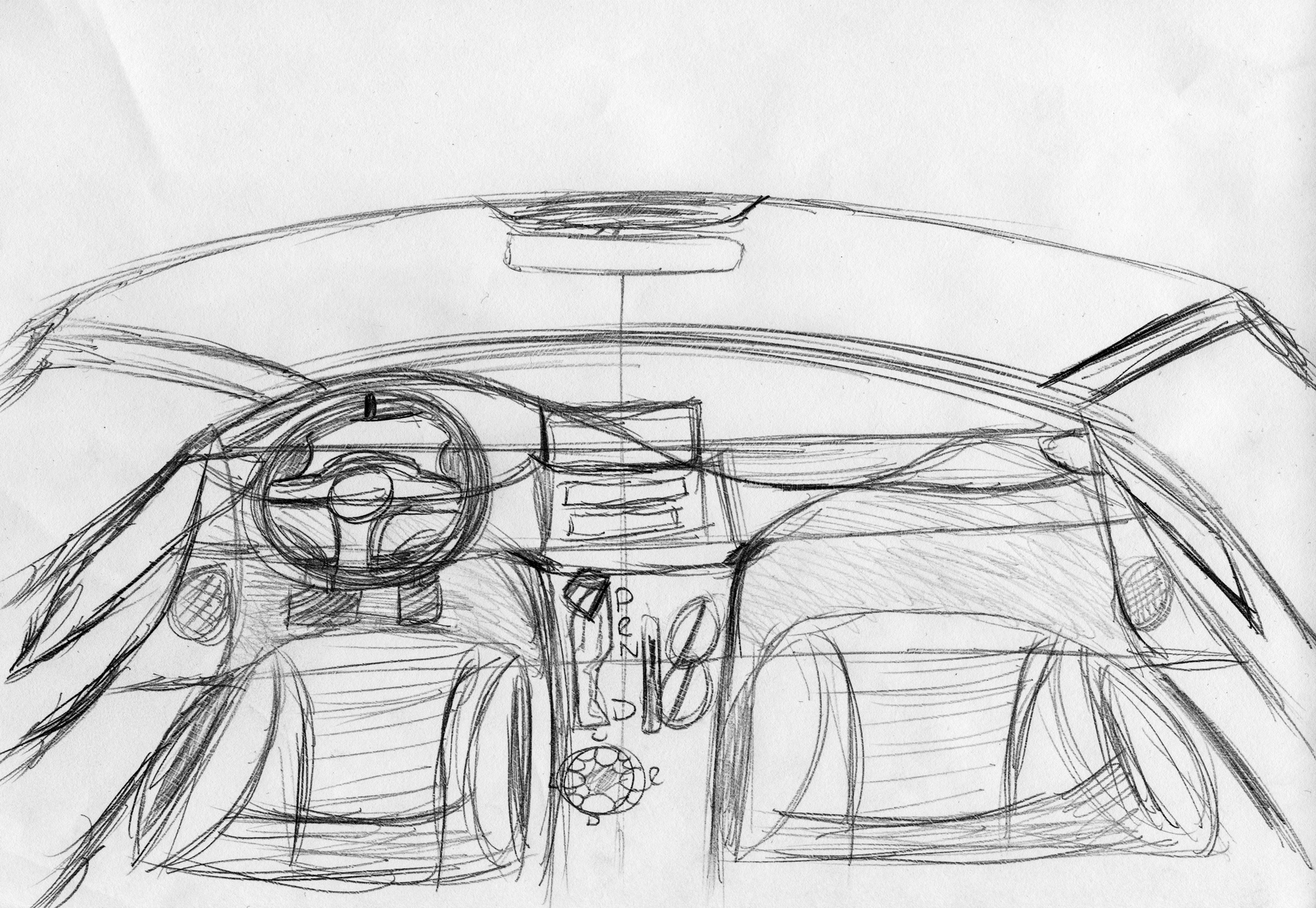
Below is a sketch of a prospective interior design for the car, showing how I envisaged an infotainment system looking in the car interior. Initially I had a display like Tesla’s in mind where the screen takes up all of the centre console, however after hearing from a Tesla Model S owner that he preferred tactile buttons for things like heating and that some buttons require a response that you just don’t get from a touchscreen, I decided to go with an interior like those found in BMWs and Audis where the screen takes up the top half of the dashboard.

After I had sketched the interior, I decided to focus on sketching some wireframes for the infotainment system itself. I decided that I’d start by wireframing the home screen which is the first screen that is shown as soon as the user turns on the ignition. Most infotainment systems, including those found in BMW and Audi cars, start off by showing all of the different apps that the user can open, usually by showing icons of the apps and then the user scrolls through the menu either by rotating a joystick/dial or swiping the touchscreen. I wireframed a very basic ’tiles’ theme wireframe, similar to how Windows Phone worked, because I feel that it could work in a car with the interface being very bold and clear and scrolling through tiles would work using a touchscreen or the joystick.

The next app I designed was the music player, specifically showing the Now Playing screen. I decided to have a large photo of the album cover of the song with the song information on the cover and the relevant buttons such as the skip and the timeline on the album cover.

I also decided that the Music app should have views for showing ‘All Artists’ and/or ‘All Albums’ and also a list view in case the user would prefer to select a song like that.

I wanted the Sat Nav to be very clear and easy to use, so I took inspiration from Google Maps to design it with the large area of the UI dedicated to showing a map and the route information in the left-side pane. Note, I also wanted to show a more detailed view of junctions

The final app I sketched was the phone app. I decided to have the dialpad on the driver side (I designed this initially with left-hand drive models in mind, on right-hand drive models the interface would be flipped) with a list of recent calls above, then on the other side of the app all of the contacts appear so that the driver can just tap them to call or text them rather than having to scroll through a lot of options which is difficult to do whilst driving and slow and frustrating to do whilst the car is stationary.

The wheel was fairly easy to design – I based the shape of my wheel concept on the wheel found in the latest BMW M5, though I reduced the number of buttons on it and added a ‘D-Pad’ to the left hand side of the wheel to allow the user to navigate through menus on the infotainment system using the directional buttons and then pressing the centre button to select – a little like the joystick on the drivetrain inside the car.


The hardest part to design was the instrument panel. I was keen on having as many items shown in a digital display as possible because what’s shown on a digital display can be customised by the user so they can have information that they want shown on screen. The instrument panel needs to have some required information on it such as a speedometer and a fuel gauge but it also needs to have enough space to make the apps easy to use and clear whilst not being distracting. This was an extremely hard combination to design for and whilst designing I learned that traditional circular gauges wasted a lot of room unless I designed an instrument panel like the Fiat 500’s which contains all of the information in one singular dial, however I found that this puts too much information in front of the user, especially when you start trying to design apps that fit inside it. Below are some of my sketches of various instrument panels that I designed, inspired mainly by


The final design I settled on for the instrument panel UI and the steering wheel buttons are shown below. I felt that the instrument panel I sketched below was modern, unique, didn’t waste as much as my previous designs and also allowed enough room to create apps to be displayed underneath the speedometer. It doesn’t take inspiration from any system currently on the market in particular, rather I created it as an analysis of a few systems that are presently available and thought about what they lack that I could offer.


User Requirements
After doing some research on existing systems and having tried out the systems in the 2015 Fiat 500S and 2016 Ford Focus Titanium X (as well as the aftermarket Android system in the 2007 Ford Fiesta Zetec S), the following user requirements were determined. These are all things that buyers of cars today expect in an infotainment system and there are also some additional features that have been added into the user requirements too to make the system I am designing stand out from the existing systems in cars today.
- Must be controlled primarily by a joystick on the drivetrain by the gear selector and handbrake and secondarily by button controls on the steering wheel. The interface also needs to work as a touchscreen too which is the tertiary input method.
- Must have two main displays, the big display on the centre console in the middle of the dashboard and a smaller display behind the steering wheel which shows the instruments.
- All apps must be usable on the big display on the centre console and the smaller display behind the driver – they need to scale effectively so that the most relevant information is shown.
- Must be able to multi-task, e.g. you must be able to be using the phone whilst also using the SatNav or the music player.
- The system must run fast and smoothly.
- The system must be easy to update.
- The system must be good enough for the user to want to use but also work with other systems that the user may prefer to use instead such as Android Auto and Apple Carplay which run from their respective smartphones.
- On the main display, apps must have the ability to be run in split screen mode and scale/rearrange elements appropriately so that they are still easy to use and display information in a clear manner that does not distract from driving.
- Must have the following functions:
- Music player
- CD, MP3/WMA/M4A from external storage device (e.g. USB flash drive or SD card)
- Auxiliary input for playing music from smartphone, tablet or portable music player using a 3.5mm audio cable
- Able to easily switch between music in different folders on external storage devices
- Able to view music by album, artist, length and shuffle
- Radio
- Play DAB, FM and AM radio
- Satellite Navigation
- Must have the ability to navigate using the following options:
- Fastest route – using the best quality roads (e.g. motorways and dual-carriageways) to get the user to the destination as quickly as possible (default)
- Fastest route – using any kind of road, this could include small dirt tracks (available in Settings only)
- Non-motorway route – the fastest route avoiding motorways (available as an option on the app)
- Scenic route – a route that focuses more on country roads than it does on speed (available as an option on the app)
- Route avoiding – a route that avoids a certain road or location that the user specifies (available as an option on the app)
- Waypoint route – a route that goes via another location (available as an option on the map)
- In the addition to the above, the satellite navigation must also:
- Be able to used hands-free
- Be able to show live traffic data and suggest routes to avoid traffic delays
- Recalculate the route if the user changes the route mode or does not follow the route
- Have the ability to turn the voice off and specify when the voice is used, e.g. the voice could be used at every junction or only major intersections
- Show a map or a satellite view of the route
- When approaching junctions, show the user the lane that they need to be in
- Must have the ability to navigate using the following options:
- Phone
- Must be compatible with any phone that has Bluetooth
- Essential that the user can use the phone to dial a number whilst driving using steering wheel controls and the phone interface on the display behind the steering wheel
- he app must be able to read back text messages and allow the user to reply, either using a keyboard and the joystick on the drivetrain, or speaking
- The user must not be able to send texts from the steering wheel or the instrument panel UI because they shouldn’t be texting whilst driving
- Camera
- The user must be able to activate the reverse camera (and front camera, if applicable) whenever they want and it must be displayed on the instrument panel or the main screen
- If the camera is activated at night, it must go into infra-red mode.
- Settings
- The settings app must contain settings such as music and radio settings, Sat Nav settings, phone settings, camera settings and also things like car interior lighting settings, the head-up display settings (if applicable), sound settings and driving settings such as how fast the user wants automatic gear changes to be and if they want the seat bolsters to grip if the driver makes a hard turn
- Music player
Additionally, these are the kind of safety features that buyers expect from modern cars.
All of the following features can be disabled.
- Pulse sensors in the steering wheel and gear selector (automatic models)/lever (manual models) that do the following when moderately high pulse is detected:
- Brake
- Shut down parts of the infotainment system to stop users from fiddling with the system whilst the car is thought to be in an unsafe situation
- When a high pulse or rapidly increasing pulse is detected:
- Brake hard – emergency stop
- Rearrange the seat to position the occupants best for being hurled into the airbag at the speed which the car is travelling at when the feature is activated
- Apply tension to the seatbelt pretensioners
- Shut down most of the infotainment system asides from the phone feature
- When a very high pulse is detected and the front-facing camera (if applicable) detects impact is imminent:
- Do all of the above but also deploy both front airbags
- Dial the emergency services automatically using the infotainment system and give the emergency services the coordinates of the car via the Sat Nav app
- When a low or slowing pulse is detected:
- The steering wheel and the gear selector/lever will vibrate to alert the driver
- The seat bolsters will clench three times
- These also occur when the driver drifts over the white line in the middle of a single-carriageway road for a prolonged period of time
- When a very low or rapidly declining pulse is detected:
- All of the above happens, but the car also starts braking and will eventually stop and turn on the hazard lights as it assumes that the driver has fallen asleep or is not fit to drive.
- If the pulse falls below a certain level the emergency services will be alerted using the infotainment system and the coordinates of the car will be given to the emergency services via the Sat Nav app.
- The interface will scale depending on the speed of the car. Slower speeds will produce a more scaled-down interface and allow more functionality to be used as the car is thought to be not moving or moving very slower and therefore it is safe to use the system. Higher speeds will produce a more scaled-up interface so that buttons are easier to use whilst driving, but some functionality of the system may be reduced to ensure that driver concentration is on the road and not on the infotainment system. This feature can be disabled in the settings.
- Radar-guided cruise control keeps the car at a safe distance from the car in front and brakes if objects are detected in front of the car, e.g. other cars or objects in the road such as animals or debris.
User Personas
To help understand how fluid the system is to use, I have created several different ‘users’, each with a different persona to use my system. The idea is that no two users will ever use the system in the same way or for the same purposes, therefore they’ll all have different ‘user journeys’ meaning that some users will never some parts of the system and only focus on the parts they use. The idea is to try and make the system appeal to a wide range of users so that everybody is using it to its full potential.
User A
Is a woman in her late 50s, more interested in getting from A to B than the pleasure of driving. She’s not at all interested in car features apart from Satellite Navigation to help her travel to places in the centre of larger towns and cities that aren’t that obvious to find. She doesn’t like driving on busy motorways, much prefers country roads but appreciates that by travelling on country roads the journey is often slower so will drive on some motorways and dual carriageways if she must.
She would want:
- A Sat Nav system that is easy to use and clear to see whilst driving.
- A Sat Nav system that allows you to avoid certain roads on your route.
- An infotainment system that does not distract from driving or get in the way of using the car. She’d want certain functions like lights, heating and the actual driving of the car to be down to the driver to set manually, not set automatically by a computer system in the car.
User B
Is a young man, early 20s, well-off financially for his age, interested in technology and loves cars with all of the latest technology even though he only really uses the phone regularly and the Satellite Navigation on occasion. He has high expectations of quality and design. Everything has to work fluently and be fast – just like his car.
He would want:
- The system to be easy to use whilst driving, especially the phone feature. He would want buttons on the steering wheel to make this easier.
- The system to be feature-rich with lots of different ways to customise the system and adapt it to his likingThe system to be feature-rich with lots of different ways to customise the system and adapt it to his liking – The system to be fast and responsive.
User C
Is a mum of age 35, has several kids who love to change music in the car! She likes driving as a break from the kids and when driving alone or with her husband she likes to have her own music on, but when her kids are in the car they like to change the music back to their own. Doesn’t really utilise many other features of the infotainment system – music is her priority.
She would want:
- An easy way of updating the music in her car – her kids are always requesting for new music!
- An easy way of switching between her music and her kid’s music without having to change SD cards/USB drives or CDs
- Great quality sound
- The ability to control the music from the steering wheel, e.g. change track and also change volume, as well as change the location to read the music from
User Goals
These are the objectives that the users need to achieve by using my system. These goals are based on the user’s personas and what they’re most interested in.
User A
- Wants to navigate from 13 Ella Road, Norwich to 7 Worcester Road, Hatfield avoiding the A1(M).
User B
- Wants to make a call to a contact called ‘Elena’ whilst driving and then send a text message to a contact called ‘Mum’ afterwards whilst stationary.
User C
- Wants to play music from a CD and listen to a track whilst driving on the way to school to pick her children up, then when her children are in the car she wants to play music from the ‘Kids’ folder on a USB drive and skip a track.
How the system I’ve designed works
The infotainment system runs on two screens: the main screen which is on the centre console and is anywhere between 7″ and 9″ in size (depending on car model) and on a smaller screen on the instrument panel directly behind the steering wheel. Like many modern infotainment systems, the instrument panel display is designed to be used whilst driving which makes the system easier and more useful to use whilst driving since the driver won’t need to glance down at a screen on the centre console. The larger screen is meant to be used by passengers and occasionally by the driver when they need to use a bigger display to see more information. The larger screen is designed to be used with the joystick (a little like what Audi and BMW have in their cars) which makes using the system easier to use whilst driving, or by touching the screen which is probably more suited for use when stationary or if the passenger wants to use the system.
I Christened my system ‘Stellardrive’, the ideology behind the name being that the system is exceptional, the best, easy to use and helps to improve your drive.
Creating the wireframes in software
After having sketched some ideas earlier on paper and having defined the user personas and user goals, I set about creating the wireframes in software. There are plenty of wireframing tools available, MockFlow, JustInMind, UXPin and Axure just to name a few, but none of these were really suited to producing wireframes for a car infotainment system. So instead I decided to manually create the wireframes using Adobe Photoshop which was a very time-consuming option because all of the assets had to be made manually and placed on individual layers, whereas most wireframing tools allow you to drag-and-drop common assets onto a canvas to create a wireframe, but using Photoshop gave me a lot of flexibility. To make working more manageable I made sure I used groups within layers so I could hide the layers I wasn’t editing.

The wheel, instrument panel and drivetrain were drawn in Adobe Illustrator as vector graphics. Illustrator was a sensible choice for designing these assets since a wireframing tool would be no use when creating something like these, but the nature of my project and user journeys meant that designing assets like these took time.

I only created wireframes that were applicable to the user journeys and user goals that I had in mind but I also created low-fidelity mock-ups of the steering wheel, instrument panel and the gear selector/joystick in the drivetrain area since these would all be essential for showing how a user would interact with my system in the user journeys.
I made wireframes for both the main screen display and the instrument panel display of my app, see below.


Technical diagrams of the system I have designed
To help make the user journey diagrams easier to understand, I have created technical diagrams of the different input methods showing what each of the buttons do and how they enable interaction with the infotainment system.
Click on an image to see a larger view, download PDF for viewing here.


User Journeys
The diagrams below show each user outlined above would use the system and the buttons they’d have to press to get to their end goal and the screens that they’ll see whilst on their journey.
Download PDF of all three user journeys here for viewing.
User A
Goal: Navigate from 13 Ella Road, Norwich to 7 Worcester Road, Hatfield avoiding the A1(M).

Steps:
- When the infotainment system starts up the user is presented with the home screen, shown on the large display in the centre console. The user can scroll through the apps by using the joystick located just beneath the gear selector (automatic models) or gear level (manual models) which can move left, right, up, down and be rotated to move through options.
- When the user has selected the Satellite Navigation app as the app to open, they launch the app by suppressing the joystick which acts as an Enter button. When the Nav app opens, the journey options page opens. The user scrolls through the options/buttons by rotating the joystick and suppressing it to select. When the user selects the field to type an address or postcode of a destination the keyboard is shown. The user can type characters by rotating the joystick, pressing the left, right, up or down buttons, or tapping the keys on the touchscreen.
- Once the destination has been inputted, the user can select the ‘Done’ key on the keyboard to confirm the destination and the keyboard goes away to reveal the Route pane where route options can be selected. The user can scroll to the Options button by rotating the joystick and suppressing it.
- Selecting the Options button brings up a pane showing various route options that the user can select, including ‘Avoid Motorways’ which this user wants to do. The user scrolls through options by rotating the joystick.
- Once the Avoid Motorways button has been selected, the user needs to scroll down to the Go! Button and suppress the joystick to begin the navigation.
User B
Goal: Make a call to a contact called ‘Elena’ whilst driving and then send a text message to a contact called ‘Mum’ afterwards whilst stationary.

Steps:
- Whilst the user is driving, they can press the Phone Up button (right side, top row, left button) and that will open up the Phone app on the instrument panel. The user can use the D-Pad on the left side of the wheel to scroll through contacts, shown at the bottom of the app in the instrument panel. To find Elena, the user needs to move the right button on the D-Pad since Elena is the last contact in view.
- When the user has found the contact they want, they can suppress the D-Pad which acts as an Enter button. From there, the user has several different options for contacting the contact depending on the contact information stored on their phone. The driver can use the Scroll Wheel on the right side of the wheel to scroll through the different phone numbers for the user. Note: texts cannot be sent in this mode – texts can only be sent from the main screen to discourage drivers from texting whilst driving.
- When the user has selected the number that they want to call, they can suppress the Scroll Wheel which also acts as an Enter button. This will then dial the contact and in-call screen which displays a large picture of the contact and the duration of the call will be shown. There are no buttons on this screen – the user needs to use buttons on the phone to either hang up or alter the volume.
- Texts cannot be sent from the instrument panel UI unless voice recognition is used for safety reasons. Texts can however be sent from the main console UI whilst the car is stationary. The interface can be used either by the touchscreen interface or by using the joystick located underneath the gear selector (automatic models) or gear level (manual models). The user can press the left and right buttons on the joystick to find the contact to select, in this case Mum.
- To select the contact, the user suppresses the joystick which acts as an Enter button. The joystick can also be rotated, so to scroll through the options on the left pane the user needs to rotate the dial in a clockwise direction to scroll down.
- To select an option, the user suppresses the joystick and in this taken they see the text messaging screen. The threaded messaging shows responses two and from the contact and the keyboard displays. The user types a message by either rotating the wheel and suppressing to select characters, by using the left, right, up and down buttons and suppressing to select characters, or by touching the letters on the touchscreen to type a message.
- To send the message, the user simply selects the send button using the joystick and then suppresses the joystick to send.
User C
Goal: Play music from a CD and listen to a track whilst driving on the way to school to pick her children up, then when her children are in the car she wants to play music from the ‘Kids’ folder on a USB drive and skip a track.

Steps:
- Whilst driving, the user can press the ‘H’ (Home) button on the wheel (right side, top row, centre button) to open the screen shown above this wheel. This opens the Home screen in the Infotainment System on the screen in the instrument panel. This is a scaled-down version of the Home screen that is usually displayed on the larger, 8″ display on the centre console.
- To start the Music app, the user suppresses the Enter button which is in the middle of the D-Pad on the left side of the wheel. The user selects an app to start by using the left, right, up and down buttons on the D-Pad. When the user suppresses the Enter button to start the Music app, the Now Playing screen is shown in the instrument panel and music from the selected source starts playing.
- To change the source of the music, the user can press the ‘O’ (Option) button on the wheel (right side, bottom row, centre button) to open the menu screen shown above this wheel. From here the user can choose to either play music from the Radio (which will close the Music app and open the Radio app instead), a USB drive, SD card, Auxiliary device (e.g. a phone) or open the Settings app to adjust settings relating to the Music app.
- To change the source, the user can use either the ‘L’ (Left) or ‘R’ (Right) buttons on the D-Pad to select a source and then suppress the Enter button in the middle of the D-Pad to select that option, or they can use the Scroll Wheel on the opposite side of the wheel to move through options. The user can scroll up to move the selection left or scroll down to move the selection right. The user can suppress the Scroll Wheel itself to select a source. The user can select a specific folder to play music from if the music is stored on a USB drive or an SD card or they can choose to ‘Play All’ to play music from all folders on the USB drive or SD card.
- After the user has selected the folder that they want to play music from, the Now Playing screen appears in the Instrument Panel again.
- Whilst the Now Playing screen is showing, the D-Pad left and right buttons act as skip and reverse buttons for the Music app and the up and down buttons act as folder selectors, i.e. the user can use these buttons to move through the folder list, playing music from different folders. Here, the user presses the right button to advance the track. As the track changes, the album art picture moves left and the album art of the next track (the one that is about to be played) moves in from the left over the top of the old art. The same happens for the song title, artist and album title text.
Thoughts and conclusions
I really enjoyed this project. I’d love to develop this further and actually try and produce a part-functioning or even fully-functioning version of this. Using a lot of complex code and imagination, it may be possible to actually produce this as a web app.
The research I did helped to create a system that I feel is a great blend of the positives of the Audi, BMW and SEAT systems are the best-regarded systems on the market. I liked the features that these manufacturers put into their infotainment systems and I tried to mimic these features in my own. Such features include:
- A high-resolution display.
- Simplicity – as few button presses as possible to get to where you want to go.
- Multiple inputs – touchscreen, buttons, voice recognition and a joystick/wheel to input data and interact with the system.
- High performance – screens and apps load quickly.
- Great connectivity – support for Bluetooth connections as well as Android Auto and Apple CarPlay connections.
I feel that my system is definitely focused a lot more on instrument panel displays than any current system is. It’s quite interesting that in the reviews for the current systems that manufacturers provide, very little is said about the instrument panel UI. To me it’s quite important and could be a great way to reduce driver distraction if done properly and if key information is shown in a sensible way on a screen in the instrument panel.
If I were to redesign my system however, I would consider the following:
- The inclusion of a touchpad as an additional input method for writing text. It was highly-praised in the Audi and BMW systems for helping to increase the speed at which users could type -helpful for satellite navigation and text messaging.
- A bigger focus on future technology, for example BMW is rumoured to be testing holographic technology in their future infotainment systems.
I’d like to think that if my system ever went into production it could be a success and work as an actual infotainment system.
Bibliography
Auto Express. (2017). Top 10 best cars for infotainment, connectivity and electrics. [online] Available at: http://www.autoexpress.co.uk/best-cars/99672/top-10-best-cars-for-infotainment-connectivity-and-electrics [Accessed 29 Oct. 2017].
Auto Express. (2017). Audi MMI in-car infotainment review. [online] Available at: http://www.autoexpress.co.uk/audi/q7/93642/audi-mmi-in-car-infotainment-review [Accessed 29 Oct. 2017].
Auto Express. (2017). BMW iDrive in-car infotainment review. [online] Available at: http://www.autoexpress.co.uk/bmw/3-series/93661/bmw-idrive-in-car-infotainment-review [Accessed 29 Oct. 2017].
Auto Express. (2017). SEAT Full Link in-car infotainment review. [online] Available at: http://www.autoexpress.co.uk/seat/leon/93669/seat-full-link-in-car-infotainment-review [Accessed 29 Oct. 2017].
Auto Express. (2017). Ford SYNC 2 in-car infotainment review. [online] Available at: http://www.autoexpress.co.uk/ford/mondeo/93662/ford-sync-2-in-car-infotainment-review [Accessed 29 Oct. 2017].
Auto Express. (2017). Mercedes COMAND in-car infotainment review. [online] Available at: http://www.autoexpress.co.uk/mercedes/gla/93666/mercedes-comand-in-car-infotainment-review [Accessed 29 Oct. 2017].
Auto Express. (2017). Nissan CONNECT in-car infotainment review. [online] Available at: http://www.autoexpress.co.uk/nissan/qashqai/93668/nissan-connect-in-car-infotainment-review [Accessed 29 Oct. 2017].
6 Comments on “Functional Design – Stellardrive”