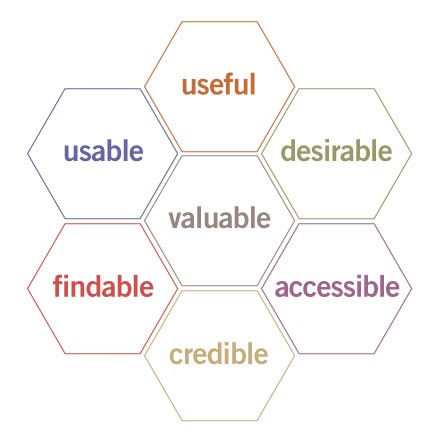
Maybe they’re not sins, rather areas to think about, but this was an interesting article I was reading that relates to my course by Peter Morville. The article describes the transition from being an information architect where the three main things to consider are content, users and context to being a user experience designer where more things need to be considered. The article states that these 7 areas are key to creating a high quality user experience:
-
Useful. As practitioners, we can’t be content to paint within the lines drawn by managers. We must have the courage and creativity to ask whether our products and systems are useful, and to apply our knowledge of craft + medium to define innovative solutions that are more useful.
-
Usable. Ease of use remains vital, and yet the interface-centered methods and perspectives of human-computer interaction do not address all dimensions of web design. In short, usability is necessary but not sufficient.
-
Desirable. Our quest for efficiency must be tempered by an appreciation for the power and value of image, identity, brand, and other elements of emotional design.
-
Findable. We must strive to design navigable web sites and locatable objects, so users can find what they need.
-
Accessible. Just as our buildings have elevators and ramps, our web sites should be accessible to people with disabilities (more than 10% of the population). Today, it’s good business and the ethical thing to do. Eventually, it will become the law.
-
Credible. Thanks to the Web Credibility Project, we’re beginning to understand the design elements that influence whether users trust and believe what we tell them.
-
Valuable. Our sites must deliver value to our sponsors. For non-profits, the user experience must advance the mission. With for-profits, it must contribute to the bottom line and improve customer satisfaction.
Morville shows these qualities in a diagram he calls the ‘honeycomb diagram’, see below:

This is an interesting way of looking at all of the variables that make a great user experience. All of the variables he talks about are vital for creating a great experience, but for me a great user experience is one that looks great and is easy and logical to navigate, therefore I feel that the points Morville raises about making the interface ‘findable’, ‘usable’ and ‘desirable’ the most important.
The article is a little dated (being published in June 2004), but what he mentions about accessibility is also really important. Morville talks accessibility from the perspective of making interfaces and experiences easier to use for disabled people and at the time it wasn’t something that most interface designers really thought about, however with the rise in knowledge of certain disabilities that impact day-to-day computer usage, such as dyslexia, and with the rise of mobile devices and design where interfaces have to be scaled-down and screens are brighter and higher contrast, it’s something that designers are being forced to think more about. This is an example of how good user experiences and good interface design can help to extend the target audience and market of your product.
In a more modern sense, Morville’s point about accessibility could be applied to the technology we have today. It could be interpreted in the sense that we have more devices to view interfaces on than ever, so for an app or a website to be deemed ‘accessible’ it needs to work across a wide range of devices such as traditional desktop and laptop computers but also tablets, smartphones and in the future virtual reality and augmented reality headsets.
Usefulness is an interesting topic. There are many apps, websites and programs that have been released that are successful, but not particularly useful. Examples of this include the game Flappy Bird which was a game that aggravated many users (so it didn’t really have any great entertainment value) and didn’t really benefit society, so it therefore wasn’t ‘useful’, but it was successful because the developer was eventually making $50,000 per day from its sales. However, I understand that for an experience to be considered a success it needs to serve its purpose – maybe that’s a better way of expressing this point than solely saying it needs to be ‘useful’? Flappy Bird was successful because it was designed to be a frustrating game and it was, so the experience served its purpose – but it wasn’t useful. It wasn’t improving productivity, solving problems or benefiting humanity.
Credibility is important in experience design too. As Morville rightly says, we understand the design elements that instill a since of confidence and trustworthiness with the end user. Whatever it is we’re doing: buying a car, reading a review, downloading an app, we’re always looking for an element of trustworthiness and reliability. Some legit businesses, like Lings Cars, may be putting themselves at risk by having websites with terrible interfaces which put customers off. Too many popups, animations, GIFs, garish colours and confusing buttons and layout may put a user off from using a service, even if the business is legitimate. Designers are split over the approach that Lings Cars has to their design, but generally people who are visiting this website for the first time will believe it to be a scam and untrustworthy, an example of how poor user experience and web design can ultimately impact a business by turning customers off.
To conclude, this article was an interesting read especially for those interested in the field of user experience design and thinking about the elements that make a successful and pleasant experience for the user.