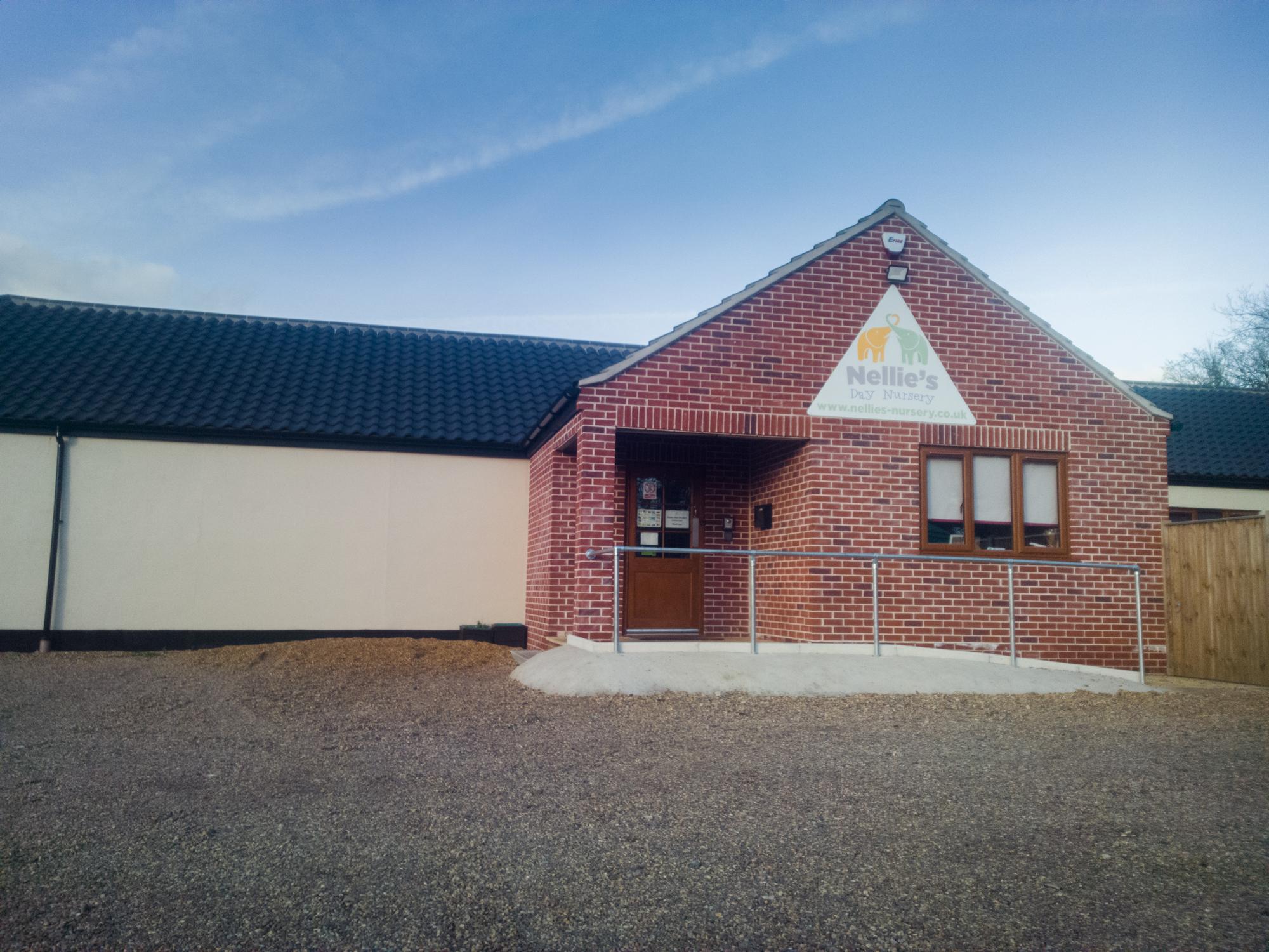
Following my previous journal, here is my reflective journal for the 29th January-2nd February 2018.
Monday 29th January 2018
Today I was introduced to three main features of my project:
- Requirements statement – this was covered in the Functional Design project in 2017, it is basically a list of requirements that the product (a nursery website in my case) needs to have as defined by the users or by the client.
- Decomposition of project – breaking down a problem or the project into smaller steps to make solving these problems or managing/completing the project easier. It gets you to really think about each step involved with reaching the end goal.
- Identification of risk – this is the process of thinking of possible risks that could threaten the development of your project, how severe these risks are and the steps that will be taken to mitigate them. A good example for my project is that poor communication or an achievable goal could lead to the project taking a long time to complete, or not be completed at all which may end up in the project being cancelled and me having to find a new client (which has already happened).
Most of our Monday morning sessions are introductory sessions to ideas that we will be covering throughout the week and often include at least one group activity. Today was no exception. This morning the group was introduced to the three features above and we did three group exercises. The first was creating a very basic requirements statement for the ideas that we presented last week and using the following questions to come up with a requirements statement:
- What is it?
- What does it do?
- Who is it for?
- When and how are they going to use it?
- What are the benefits / unique selling points?
- What are the restraints?
You need user research and user data as well as a client in order to create a requirements statement. I only have a client at the moment, but using my assumptions about the target audience for the nursery website I was able to come up with the following requirements statement:
- What is it?
- A nursery website.
- What does it do?
- Inform parents.
- Who is it for?
- Parents and staff.
- When and how are they going to use it?
- When the users need to find out about the nursery. They will use it on a mix of ‘desktop’ and mobile devices.
- What are the benefits / unique selling points?
- Compared to the existing website, information will be easier to find, it will look a lot more attractive and the new website will be more in-line with other nursery websites.
- What are the restraints?
- Customer feedback may show that the customer and I have differing ideas. Slow or infrequent communication could restrain the project – the longer it takes to get feedback or discuss an idea, the longer the project takes. Time can be an issue, especially if the customer starts requesting for more complex features to be implemented.
This is of course very basic, but it’s a start! Once I have collected real user data, the requirements statement will be a lot easier to write and it will have a lot more detail, e.g. it will include the kind of things that the users say that they look for in a nursery website.

The second group activity was to decompose a project – our course tutor gave us a very vague brief to try and decompose:
I want to create an image browser app that allows me to easily tag images and then to browse images by tag or combination of tag.
This was a very vague brief and from it we had to identify that the key components of this brief were the tagging system, the image upload system, the image viewing system and the search facility. There were probably other features that needed to be decomposed too, but these were the main ones.
The third and final group task was to do this but for our own ideas. I worked with fellow User Experience Design student Naomi Winter who is designing a website for a local ecological cafe. We decided to take the perspective of looking at the similar things that needed to decomposed in each of our projects and then identifying what specifically. For example we both identified downloadable content as being a feature that users would desire on our respective websites so we felt that this was a part of our projects to decompose, however we acknowledged that the downloadable content on Naomi’s website would be things like the cafe menu and wine list, whereas downloadable content on mine would be admission forms, session times and other documents that would interest parents.
These tasks taught us to use our user data to create a list of requirements for the project and really think about how achievable these requirements were.

Collecting my user data
At the time of writing I still don’t have any definitive user data to build my project on. This is obviously a key component of the project because without solid user data to build the project on, I cannot build a website tailored exactly to my users – the best I can do is use my own assumptions.
Initially I had intended to create a focus group within Nellie’s Nursery which would consist of parents and staff who would be able to give me ideas about what they wanted from a nursery website and then provide feedback during the prototyping stages. The benefit of this (other than working with real users) would have been that these people likely would have bounced ideas off each other to create ideas for the website and also these people have a connection with the nursery so they can really understand its brand and ethos. Unfortunately, due to time restraints and data protection, I won’t be able to form a focus group to work with so instead my method of collecting user data is going to take form of creating an anonymous survey to send around to parents and staff at the nursery which will ask them about how they use the existing website. By asking them how they use the existing website, I will be able to determine exactly what the purpose of the website is. I can ask Victoria (the nursery owner) tomorrow when I see her and although she will have her own opinion on what the purpose of the site is, the user data will speak volumes. The survey will also ask users what kind of visual style they feel is most appropriate for a nursery website and what kind of information they think the website should have on it.
At first I had the intention of making the survey specific to Nellie’s Nursery and sending it to only parents and staff at the nursery, however my course tutor suggested that I made the survey generic which would mean that I could get more people to answer the survey. Of course, I only really want people who have sent their child to nursery within the past 5 years or so to answer the survey to keep the data as relevant to my target audience as possible. I plan to distribute the link to the survey via Facebook and other social media streams to get data (I’d post it in groups which have a large proportion of users who represent who I feel are the target audience for the site) and also try to get Victoria to send it directly to the parents of the children – perhaps through ParentMail or the newsletter if the nursery has such a thing. I’d also be interested to hear from parents who send their child to an infant or primary school since these sites often have a similar design to nursery websites. The only real disadvantage of making the survey more generic is that I can’t ask ‘what do you specifically like (or dislike) about the Nellie’s Nursery website?’ but by not having this question I avoid the awkward situation of insinuating to a client that their existing website is bad and it’s a trade off I’m prepared to make for more data to work with in exchange.
Designing an effective survey is never an easy task. The first thing to consider is whether or not open questions are a good idea. The benefits of an open question are that the user can elaborate on ideas because they have the freedom to write whatever they want, but the disadvantage is also just that. Users could write reams and reams and reams, or very little – neither of which is terribly helpful. Too much data takes too long to analyse, too little means you don’t have enough to draw a meaningful conclusion. Open questions also take longer for the user to answer because they have to write an answer rather than select an option and they are also impossible to show in the form of graphs and charts unless you somehow categorise keywords in long answers and graph those. Closed questions on the other hand allow the user to only select a handful of preset answers which are easy to graph (since there’s only a few responses that you’ll get), they are quick to answer and don’t allow the user to give potentially long and irrelevant answers. It doesn’t remove the problem of people just selecting any random option, but not a lot can be done about that. A good survey should include a mix of both question types, so in my survey I will try to improve both.
As mentioned in my previous reflective journal, Microsoft Forms is my preferred survey tool. I’ve had a lot of experience with it and I love it’s simple design and how it collates data into graphs and charts that you can simply export and use elsewhere. It’s part of Microsoft Office 365 that the university has. I spent the afternoon with Naomi designing the survey. Naomi was able to help me think about how to word the questions and the kind of options that I should give my users.
I thought about what information was important to find out. Really, what’s most important to me is finding out if parents visit their child’s nursery website frequently and if so why. Also, if not then why don’t they visit it more? Visual design is also something I’d value opinions on and it’d also be good to find out if users feel that the website should be a core communication tool that the nursery should use to communicate information to parents.
Provisionally, these are my questions:
- Have you visited your child’s nursery website?*
- Yes / No
- If not, why not?
- Text box
- If so, why did you visit? 1
- Phone/email the nursery
- Find out more about the nursery
- Sign up to a newsletter
- Receive information about my child(ren)
- Locate the nursery
- Find out about features of the nursery
- Other
- What do you think would be the most important information to have on a nursery website?*1 (select three)
- Ethos
- Information on nursery facilities
- Information on education strategy
- Information for parents (e.g. admissions, SEN support, security information, fee information)
- Information about the staff
- News and events
- Other
- In your opinion, which visual style would best suit a nursery website?*
- Vivid colours
- Subtle colours
- Two-tone colour scheme
- Minimalistic
- Which device are you most likely to view the website on?*1
- Desktop computer or laptop
- Tablet
- Smartphone
- Other
- Would you ever visit the website with your child?*
- Yes
- No
- Maybe
- Do you feel that the nursery website should be the core link of communication between parents and staff?*
- Yes
- No
- Maybe
- Please feel free to leave any other comments regarding what you’d expect to find on a nursery website!
- Text box
Questions marked with * are compulsory questions.
Questions marked with ‘1’ allow for multiple options to be selected.
I feel that I may eventually alter the wording of the visual styles question before I send the survey out – it’s a difficult question to ask with words without showing examples and asking the users to pick an example – but otherwise I am fairly happy with the survey and believe it will provide me with insight as to what people expect to find on a nursery website, what it should look like and how they view the site on different devices.
Tuesday 30th January

Big day today because I met Victoria from Nellie’s Nursery to discuss their website! Before that though, I attended a session with James Van Roose, the lab technician, to learn about making Gantt Charts with an open source piece of software called ProjectLibre. A Gantt Chart helps to make time planning and project management easier by creating a basic chart that represents how long a task in a project will take to complete using bars. Tasks can be made to be dependent on one another and there can be parent and child tasks to help organise the tasks and project. I will be making a Gantt Chart using ProjectLibre which will hopefully show how I envisage this project being planned, however due various reasons I am technically already behind schedule.
I’ve been thinking about how to get people to answer my survey when it’s live. I want as many people to answer as possible, starting with sending the link around to the parents of the children at Nellie’s Nursery either in their monthly newsletter or a separate letter. To get more exposure, my course tutor knows some people who could help answer it and I am thinking that it might be a good idea to post the link on Mumsnet or another community where there are a lot of mothers who would certainly have an opinion on how a nursery website should look and function. The only thing to consider would be the terms of service of the forum – having moderated several large forums, I know it’s not uncommon for new users who sign up simply to advertise or get people to complete a survey to get banned or have their post deleted pretty quickly.
Meeting with Victoria at Nellie’s Nursery
Victoria is the owner of Nellie’s Nursery. I had a half-hour meeting with her today to introduce myself to her and to also tell her a little more about the project as well as find out what she likes and dislikes about her current website and what she’d like to get from a new website. She has very clear aims for the website but is open to new ideas and suggestions which is great to have in a client – using what she told me today I am confident that I can create a website that fits her needs. I can also create a requirements statement using what she told me:
Requirements statement
What is it?
- It’s a website for Nellie’s Nursery.
What does it do?
- The aim of the website is to inform prospective parents about the nursery, what it has to offer and why Nellie’s Nursery is the nursery to send their children to. It is entirely an information website and can be also be used to access policy documents that the parents need to sign in order to send their child to the nursery.
Who is it for?
- The website is strictly targeted at adults. It is not aimed at children and there will be nothing there for them or any particular reason for them to visit the website due to the website not having any content appropriate to them. This does not mean that the website is ‘adults only’ or contains adult material, it means that the nature of the information on the website is targeted at parents and may use language that children won’t understand.
- Parents are the main target audience, specifically prospective parents. The site needs to sell the nursery to them. However, there is currently a ‘staff area’ that they want to develop and get the staff using more to access more policy documents that are applicable to only the staff.
- Parents of current students are a target audience. The website should tell them all about what their child is doing at nursery and how the nursery is helping their education. It should be an information communication platform between the nursery and the parents. There should be helpful for current parents on the website such as menus and newsletters.
When and how are they going to use it?
- The website should be accessible all the time – whenever somebody wants to know about the nursery, they should be able to access the website and the information should be there.
- The website should work in all modern browsers. The current site does not work on anything older than Internet Explorer 10 which at the time of writing is a 5 year old browser. Thus, support for older browsers is irrelevant.
- The website must be responsive since it is believed that a lot of traffic comes from mobile devices. It must scale to mobile phones and tablet computers and have a touch-friendly interface for these devices.
What are the benefits?
- Compared to the existing website:
- It will bring Nellie’s Nursery more in-line with competitor websites, thus increasing their traffic and hopefully an increase in students and staff.
- The information hierarchy on the new website will be superior to that of the existing site, so information will be much easier to find and read. This will reduce the bounce rate and also reduce the length of time that a user has to spend on the site to find content.
- It will look a lot more attractive which again will help to draw traffic and increase the number of customers.
What are the restraints?
- The project needs to be completed before May 2018 and there is limited time to code a website.
- Communication must be frequent in order to help develop a website that has the client’s needs in mind. Regular feedback will be required in order to move forwards with the project.
- It is possible that the client and I may have differing ideas about the website which could lead to conflict.
- A lot of the user research data will be based on people answering the survey honestly, so any dishonest answers could corrupt user research data and then potentially mean that the site includes things that people don’t really want.
In addition to the requirements statement, Victoria also mentioned:
- She doesn’t want any kind of payments for anything to be placed through the website.
- She wants the staff to feature more heavily on the new website so that the parents know who they are and what they do. She wants a short bio of each staff member that states their specialism, the children that they work with and their interests.
- She wants to keep the site looking ‘homely’ and friendly, but doesn’t want the new site to look corporate. She personally prefers subtle colours and the soft colours used on the existing website.
These are the principles which I shall build the website on.
Talk from Terika Seaborn-Brown from Foolproof about prototyping

Terika has attended NUA recently to deliver a talk about research, tonight she came back and spoke about prototyping. She talked to us about prototyping tools that we can use including Principle, Axure, InVision, JustInMind and InVision, briefly going over the pros and cons of each one and what each one is good for. She also explained the difference between low- and high-fidelity prototypes, different prototyping methods such as creating storyboards, paper prototypes and wireframes and the pros and cons of these. She also told us about some mistakes that people make when pitching a prototype to a client including simply presenting a screenshot or static image of a mockup and claiming that it is a prototype, showing off a high-fidelity prototype before the client has even seen anything low-fidelity (thus the high-fidelity prototype has not been validated by the user) and using very quick iterative testing which does not leave a lot of time to put new ideas into the prototype.
Terika left us with 8 really great takeaway points, namely:
- When narrowing down a problem, use lower fidelity and when narrowing down a solution use higher fidelity.
- If you have a crazy idea, only spend time making a high-fidelity prototype if you are confident about it.
- To understand user needs, use low-fidelity prototypes. Use additional research techniques to strengthen your findings.
- When the journeys have not yet been validated, use a multiple path prototype.
- Unmoderated research must simulate a real environment as much as possible: high fidelity, multiple paths and correct copy.
- During RITE testing, or ‘tight on time between research’ sessions, use a prototype that can be easily amended.
- To test designs that are reactive / depend on user input or depend on data (for example, a calculator) use a prototype that will simulate the experience – considering coding a prototype or using software like Axure.
- When the content on the designs will affect the quality of the insight, don’t use Lorem Ipsum.
These will all be helpful when pitching a prototype to Nellie’s Nursery. I didn’t have time to show them the provisional prototype I made for my presentation, so they don’t yet have any indication of what I can do for them.
Wednesday 31st January 2018
Finalising and initially distributing the survey
Nellie’s Nursery can send the survey out to parents in their monthly newsletter which is released on the 20th of each month. In the meantime, I can collect data from other sources such as friends and people on the internet.
I made a few changes to the survey that I drafted yesterday, most notably changing the question about visual styles. I changed it to a simpler ‘What do you think a nursery website should look like?’ question with a text box for the user to type an answer. I wanted to also find out about theming, so I listed some popular children’s books that the parents should know, each with very different visual styles and theming/illustrations and asked them to decide which book theme would best fit the website.
I plan to post a link to the survey on Mumsnet and get their users to complete it for me. Mumsnet is a large community of parents, mainly mothers, who all post on a forum and post about motherhood and childcare and so on. It strikes me as being an ideal place to collect user data from for this project from which is all about nursery websites. Before I post the survey on Mumsnet and potentially get hundreds of responses, I’m going to send the survey around some smaller organisations/groups first to ‘test the water’ with the survey and get some feedback on the actual survey from, meaning that if they suggest any changes I can make them before I post it on Mumsnet.
You can see the survey I made embedded below.
Once I had completed making the survey, I sent a message to the admins of my town’s Facebook page to see if I could post it there to get some people to answer it for me. Then I made myself a Gantt Chart on Microsoft Project Professional. Gantt Charts are ideal for project planning and represent tasks and the length of time they take to complete, how they relate to each other and the order that they need to be completed in. Project Professional is a part of the Microsoft Office suite which is sold as a standalone application and is ideal for quickly and easily make Gantt Charts and export them. It also has a lot of other sophisticated project management tools. Below is a PDF exported from Project Professional of my Gantt Chart for the prototyping stage of my project which will all be happening next week.
I intend to spend most of next week wireframing, collecting feedback and developing my prototype from a basic sketch on paper, to a clickable wireframe in Axure to a high-fidelity prototype, perhaps made in Axure or something hand-coded.
Thursday 1st February 2018
Today I got permission from the admins of my town’s Facebook page to post my survey on the page to get local parents to complete the survey for me. In my post I asked the users to also provide feedback for the actual survey itself. The first thing that was pointed out to me was that I had set the permissions incorrectly meaning that only people with an NUA email address could access the survey. After this had been pointed out to me I amended the settings and writing this a day or so later, I have 10 responses. This is a good amount to work with initially, it will provide me with some basic insight as to what people want before I plan to get more user research by putting the survey on Mumsnet next week.

Decomposition of the project and risk assessment
This was an idea that was introduced to me on Monday. Now that I have met with Nellie’s nursery and am getting some user data come through from the survey, I am able now to decompose the project and consider the risks associated with each part of the project.
- Information heirarchy
- The information on the page needs to be displayed clearly and pages need to be easy to find and accessible to the right people. Information also needs to be easy to update and organised in such a way that information is prioritised based on what the user data dictates is most important to the users in a nursery website.
- Risk: Differing ideas may result in information being organised differently, some people might think nursery fees are the most important thing to have on the website and others might feel that actually information about the day-to-day activites are more important. Another concern is how the site is updated. If a CMS like WordPress is used to build the site, updating information is easy and anybody with a login credential and account for the website can update it. However, if I hand code this, I will be the only one with access to the source code and thus the only person who can add and remove information from the website.
- Prototype: Various different navigation systems, menu options, different ways of arranging information. Use iterative testing and evolutionary prototypes to alter the information hierarchy depending on user feedback.
- Responsiveness
- Very early data from my user survey states that smartphones are currently the preferred way of viewing a nursery website and the brief states that the site needs to be responsive.
- Risk: There are many different mobile devices to code for, all with different screen resolutions, but using media queries you can specify how the website should look on devices with diferent screen widths and heights. Using a CSS framework would make coding a responsive website quicker, but as I discovered last week there are issues with trying to understand all of the code if you want to be more technical and modify it yourself. Coding it yourself gets around this but takes more time. Time is a precious commodity in this project – I will need to prioritise tasks.
- Prototype: The mobile site needs to work portrait and landscape and scale suitably, the mobile prototype must take into account the information hierarchy as defined previously and apply the information hierarchy of the desktop site onto the mobile site.
- Downloadable content and secure delivery of it
- The nursery website may have some downloadable content on it such as application forms, forms to sign, ‘parent packs’, lunch menus, session times and fee information. Some of this information will be confidential so must be delivered securely.
- Risk: I will need to spend time researching secure delivery. I know that you can use an HTACCESS file to prevent access to certain directories/pages on the web server and even password protect them, but I still need to do research on this. The current site has password protected staff and parent pages with downloadable content, so it is likely the nursery will expect the new website to have something similar. The files need to be in a format that most computers can read to improve accessibility. Again, it’s a question of allocating time to research.
- Prototype: The prototype should eventually include a secured area where parents can download the policy documents.
- Clear branding and theming
- The nursery website needs to look homely yet professional and incororate the branding of the nursery and its logo colours. This is a challenge because typically websites either look corporate or childlike with little in-between. I feel that this is actually the hardest thing about the whole project.
- Risk: The risk here is that the website ends up looking too childlike or too corporate and not a mix of the two. My user research will give me an idea about themes for the website and help influence a design style.
- Prototype: Different design styles and different themes, different ways of incorporating through the branding through the website such as alternative uses of the Nellie’s Nursery logo colours.
The next stage is to create a clickable wireframe prototype using Axure. I will be making this prototype whilst more data is coming in, so it really will be ‘evolutionary’ from the perspective of collecting data and modifying the prototypes to suit the new data. My predictions are that the 10 responses I have now will be very similar to the data that I will be collecting from Mumsnet. The prototypes will be made over the coming days using Axure RP 8 which is industry-standard software that makes wireframing and prototyping simple by allowing you to drag common elements such as placeholder images, boxes and text onto a blank canvas to prototype your design. Using events, elements can be linked to one another to make the prototype interactive.
Friday 2nd February 2018
In a reflective journal from a couple of weeks ago I mentioned the website I am making for the Storehouse Magazine. I’ve been doing a lot more work on it today and this will be helpful for when I come to make the final versions of my prototype in several weeks time. I envisage creating a prototype in Axure and then hand-coding this prototype. Initially I felt that using a CSS framework would be a good idea for speed and best mobile responsiveness, but after the struggles I had with creating a very early prototype of my website for the presentation last week, I feel that actually coding from the ground up allows more control and more people will be able to help me as my code will be easier to understand and not require any prior knowledge of a framework to dissect. I’ve handed-coded the Storehouse website from the ground-up and today have been using media queries again to make the site responsive. When I first used media queries back in October I didn’t really understand them, however today I have been far more successful with them and have managed to make the site responsive to different screen resolutions, phone sizes and also landscape and portrait orientations on mobile devices. My user data already is suggesting that most people would view a nursery website on a smartphone and the project brief specifies that the site needs to be responsive, so getting confident with media queries and creating responsive websites in my own time is critical. If I am going to hand-code it all, it is critical that I know the coding skills required so that I can make the site quickly and find and correct faults easier, so today has been perfect for learning responsive design. On this site, the logo gets bigger as the page is made smaller and eventually the hero image disappears, leaving just the article titles, which get bigger. On phones in landscape mode, the text and logo are made smaller again as there is more screen estate to work with in landscape mode.
Watch the video below to show the portrait and landscape mobile views on a Nokia Lumia 930 with the Storehouse prototype site running on Microsoft Edge.
In creating the magazine website, I’ve also done a lot of research into asset optimisation. Using the HTML 5 preload and prefetch tags and a bit of JavaScript to create a loading screen that displays whilst the assets are being cached it’s possible to load assets so that they display correctly and fluidly when the page loads. The prefetch tag downloads all of the specified assets into the cache on the local machine and then when the page loads it tries to load of all of these assets onto the page regardless of whether or not they are needed. This can mean loading takes a while if there are a lot of assets to load and the internet connection is poor. The preload tag is more intelligent because it downloads all of the assets into the cache, but any that aren’t used within seconds of the page opening are cached immediately meaning that page loading performance is improved and assets are loaded directly from the cache only when they are needed. It’s possible that the nursery website is going to have a lot of assets on it such as text and videos. The preload tag can be used to preload images, videos, stylesheets, JavaScript scripts and other assets, so it could be used to improve performance of the nursery website. Clearly, the videos on some of the example websites I found a week or so ago do not use this technique to help improve page loading times.
The final thing that I have learned how to do from making this site is how to use jQuery to load a stylesheet. I have a button on the page that changes the page theme from light to dark, the light theme being the default. When the user clicks on ‘Toggle View’, the ‘dark’ stylesheet is loaded which is a clone of the default stylesheet but with the text colour set to white instead of black and using the Web Kit invert filter the black images are reversed to white. This probably won’t be so helpful on the nursery site as I doubt I will need such a feature, but nonetheless it’s a good thing to know how to do!
Watch the video below to show the responsiveness and theme changing in action.
Going forwards
Over the weekend I want to begin making clickable wireframe prototypes in Axure by using the small amount of data I have collected this week. This small amount of data will be published and analysed next week. I will be publishing the survey to Mumsnet next week to get more data to build future versions of my prototype on.
2 Comments on “Reflective Journal – 29th January-2nd February 2018”
Comments are closed.