Wow! Here it is, the final week of Year 1! How quickly time flies! This week has been about adding the final touches to Elebase 4, finishing off my 2,000 word report and generally ensuring that everything is ship-shape before submitting on Friday 11th May, which marks the end of Year 1!
Monday 7th May
Today was a bank holiday and an unusually sunny one at that, however that didn’t stop me from doing work (I had spent the Saturday and Sunday enjoying the sun and with the ever-approaching deadline it was probably a good idea to get cracking again today). The main focus of today was developing Elebase 4 Build 4375 which was the build that was sent out for testing at the end of April. Last week I began to implement some of the changes suggested from the last testing session, including narrowing the text container on mobile devices to create more white space on the left and right edges, changing the paragraph font from Arial to Proxima Soft and changing the heading font from the handwriting font to Proxima Soft Semibold. I also began to implement a mute button which was the result of testers saying that the sounds were unexpected, which I finished creating today.

Audio toggling
By default, sounds on the page are muted until the user clicks or taps on the speaker icon in the feature image which enables the sound. This is done by using the .pause() method in Howler to mute the audio (although it’s called ‘pause’ it does actually completely stop/mute audio) and by using a variable to check if the speaker button has been clicked or not. Calling the button a ‘mute button’ is a little ambiguous because actually it’s more like a ‘sound toggle’ since clicking on it once enables the audio and clicking on it disables the audio, but here is the code:
//Mute audio by default
    var muted = 1;
    console.log("PAGE LOAD Value of 'muted' is: ", muted);

    //Speaker button (toggle sound)
    $("#speaker-cross").click(function () {
        if (muted == 1) {
            muted = 0;
            $('#speaker-cross').addClass("active");
        }
        else {
            muted = 1;
            $('#speaker-cross').removeClass("active").css({ transition: '.3s' });
        }
        console.log("Value of 'muted' is: ", muted);
    });
As soon as the page loads, this jQuery code is executed which creates a variable called ‘muted’ and sets it to 1. 1 is muted and 0 is enabled. This value is also displayed in the console for debugging purposes. There are two images for the speaker button which are placed on top of each other. One is an image of a speaker with a red cross through it which is the default image – the ‘muted sound’ icon. This image has the CSS ID of ‘#speaker-cross’. The other image is exactly the same image but with the cross removed and this image is not clickable. Clicking on the speaker cross image checks to see what the value of the ‘muted’ variable is and changes it accordingly. If the value of ‘muted’ is 1, then that means that the audio is muted at the moment and needs to be enabled, so the value is changed to 0 and a CSS class called ‘active’ is added to the speaker cross image. This CSS class is shown below.
#speaker-cross.active {
        filter: opacity(0); /*reduce opacity rather than hide so that the element is still clickable even if it is not visible*/
        transition: .3s;
    }
This class hides the speaker cross image, revealing the speaker image directly beneath it which signifies that the audio is enabled. I could have set the visibility to ‘hidden’ or the display to ‘none’ to hide the image with the cross on it, but doing this ‘disables’ the element meaning that it is no longer clickable. Instead, the opacity can be reduced to 0 which makes the image invisible, but still clickable. This means that when the user clicks on the speaker again, now that the value of ‘muted’ is 0, the value of ‘muted’ is changed back to 1 and the class ‘active’ is removed from the speaker cross image, thus showing the original image again as the opacity is put back to 100%. This is all animated smoothly by using the CSS transition effect which is only applied when adding a class, so to make the removal of the class smooth the CSS has to be appended to the end of the removeClass line in JavaScript, as can be seen in the example above.
To actually mute the audio, each declared sound has to use the following code.
//Monkey
    $("#monkey").click(function () { //listen for click event on monkey
        console.log("MONKEY Value of 'muted' is: ", muted);
        var monkeySoundEffect = new Howl({
            src: ['../assets/monkey.mp3'],
        });
        if (muted !== 1) {
            monkeySoundEffect.play();
            console.log("play");
        }
        else {
            monkeySoundEffect.pause();
            console.log("mute");
        }

    });
The code above is from the monkey animation sound, but the same logic is applied to all three of the animation sounds. The variable ‘monkeySoundEffect’ is defined as a new Howl (I’m using the howler.js library to play audio) and its source is set. Then an if statement runs to check the value of the ‘muted’ variable again. If it doesn’t equal 1 (i.e, it’s 0 meaning that the sound is enabled), then the ‘play’ method is added to the monkeySoundEffect object and the sound plays. Otherwise, the ‘pause’ method is added and that mutes the audio, meaning that the sound does not play but because the animation is independent, it plays. Again, some variables are printed in the console for debugging purposes.
The call-to-action has also been updated to accommodate for the sound toggle button now. Before there was a message at the top of the feature image which said ‘Click or tap on the animals!’ which got people to click or tap on the animals – now they also need to be told to click or tap on the speaker icon to enable sound. The message changes halfway through the animation now (it still fades away after a certain amount of time). This is done using jQuery to replace the HTML text.
//Calls-to-action (change from the animals text to the speaker text)
    $('#hero-cta').fadeOut(14000, function () {
        $(this).text('Click or tap on the speaker').fadeIn(14000);
        $(this).addClass("text-styling");
    });
The text that says ‘Click or tap on the animals!’ is contained within an HTML div called ‘hero-cta’. After 14,000 milliseconds (14 seconds), the text in that div is to fade away and then be replaced with ‘Click or tap on the speaker’ which is inserted into the HTML using the jQuery method ‘this.text()’. By default adding text into the HTML div using jQuery does not inherit the CSS styling, so a CSS class called ‘text-styling’ is applied which is just a copy of the ‘fi1’ text tag properties which the ‘Click or tap on the animals!’ text uses. See below.
#hero-cta.text-styling { /*hero image call-to-action*/
        font-family: ProximaSoftSemibold, Arial, Helvetica, sans-serif;
        font-size: 35px;
        color: white;
This works really well but unfortunately the text does not fade from ‘Click or tap on the animals!’ to ‘Click or tap on the speaker’. I’m not sure why that doesn’t work, but as long as the users are informed that they can tap on that speaker to enable sounds that’s fine. The div fades in and out which is good. I could have written ‘Click or tap on the speaker to enable sound!’ or ‘to the hear the animals!’ or similar, but unfortunately this message was too long and so didn’t fit properly on mobile devices and the white clouds in the feature image obscured the white text, making it illegible.
I came up with this solution on my own because I couldn’t find out how to mute audio in Howler. All I could find were solutions on how to mute all audio on a page using JavaScript and targeting the ‘audio’ and ‘video’ DOM elements to mute them, but because I used the Howler library to play sounds this didn’t work. Howler does not interact with the DOM (Document Object Manager) in the same way that the HTML ‘audio’ and ‘video’ tags do. The other thing I could find was a thread on a forum about the ‘pause’ method in Howler muting/stopping sound rather than pausing it. Annoying for the person who asked the question, but good for me because this told me that I could use ‘pause’ to stop audio from playing using Howler. I knew how to make a dimple toggle button using a variable to determine if the button had been clicked or not (the best example is the dark theme toggle on the Storehouse Online website), so I put the two together and made this solution.
The video below shows this in action, as well as the header hiding and improved slideshows.
Farewell, Internet Explorer!
The next thing I did was create a page informing users of Internet Explorer that the site isn’t compatible with their browser. Siema slideshows do not work in any version of Internet Explorer and several other things don’t work right in IE either, for example sometimes CSS is not correctly applied. This is due to Internet Explorer being an outdated browser (the latest version is almost 5 years old at the time of writing) and due to its ever-declining market share for a project like this it isn’t worth supporting it. Using the ‘notice’ page that I made for the last release of Elebase 4 (the one that tells the user that they are participating in beta testing), I created a page informing the user to use another browser. Unlike muting audio in Howler, there are plenty of examples of how to redirect a user to a page based on their web browser (specifically Internet Explorer) ranging from fairly simple HTML comments that only IE reads to fairly complex JavaScript functions that get the job done but in about 50 lines of code (unnecessary) to this example below which I like a lot.
//Display browser incompatible page on IE

if (navigator.appName == 'Microsoft Internet Explorer' || !!(navigator.userAgent.match(/Trident/) || navigator.userAgent.match(/rv:11/)) || (typeof $.browser !== "undefined" && $.browser.msie == 1)) {
    window.location.replace('ie.html');
}
I like this JavaScript method a lot because it can be written in its own file and simply referenced on each HTML page and it catches all versions of Internet Explorer! It catches all versions of IE! The chances of somebody stumbling across the Nellie’s Nursery site whilst browsing the web using Internet Explorer 4.0 on Windows 95 are quite low, but I guess you have to be prepared! Over the past 20 years or so, the engine name for Internet Explorer has changed so many times that often most scripts to detect IE only detect the newer versions by looking for the more recent engine names, meaning that sometimes you can bypass these scripts by using a really dated version of IE. The reason why Microsoft has changed the engine name is so often is because as Windows has evolved, so has IE and also to try and stop scripts like these from working. This script works by detecting the old ‘Trident’ versions of IE (up to around IE 6) and checking the version numbers to detect the newer versions. Once it finds a match, it takes the user to a page called ‘ie.html’ which is the page I have created to inform IE users that their browser isn’t compatible.
I wanted to use a funny image of a child screaming or crying on the page, but most of the images of children I found looked a bit sad. Eventually I found a good image and by putting a photo of the completed page up on my Instagram Story and making a poll, I was able to see what people thought! A new way of doing user testing!

So despite 41 people viewing the story, only 5 people voted (a shame) but it seems that 4/5 people liked the page, so it’s staying!

A redesigned header
I felt that the white fixed header was simple to use and made the navigation always available, but in the end I just felt that it looked too bland. I had changed the style of the header a little for the ‘notice’ and ‘IE’ pages by making it smaller and also by using a black, translucent background and I felt that it looked better. I implemented the same changes to the other pages, so the white header is no more. The buttons stand out really nicely against the black and on the home page the blue from the top of the feature image gives a nice effect to the colour of the header as it is partly visible through the black header. The logo was also modified so that the text is white meaning that it can be read easier on the black header. I feel that this just makes the site look a bit more visually appealing. The smaller header area also gives more space for the hero image to be seen and admired.

The fixed navigation works well on a phone and to a degree on the desktop. I feel that on lower resolution desktop monitors the fixed navigation was taking up too much screen estate (especially with the header being fairly large), so now I have implemented code that hides the header when the user scrolls 1,200 pixels from the top of the page. This is all possible thanks to jQuery.
//Hide the header part-way down the page

$(window).scroll(function () {
    if ($(this).scrollTop() > 1200) {
        $('#header').addClass("header-hide");
    }
    else {
        $('#header').removeClass("header-hide");
    }
});
Again, this code relies on the addition and removal of CSS classes, specifically the ‘header-hide’ class this time. Here is the class.
#header.header-hide {
    animation: header-exit .3s linear forwards;
}
All this class does is activate an animation called ‘header-exit’, which is defined elsewhere (shown below). The header is hidden and is animated for a more visually appealing look and to fit in with the rest of the site’s design which is animated too (elements animate into view on page load). The way that animations generally work in Elebase 4 is that the animations themselves are defined in a CSS file called ‘animations.css’, then in the ‘elebase4.css’ file, references to these animations are often classes of individual elements like the example above. These classes are then often added to the element using jQuery in a JavaScript file called ‘animations.js’ using the addClass and removeClass methods. This is the only way to execute pre-defined CSS animations using jQuery/JavaScript. Animations can simply be called in CSS and some in Elebase are, for example the animations that load some of the elements such as the text container and feature image into view on page load, but you can only really use CSS to execute animations when you want them to be executed immediately (on page view) or upon a CSS selector, for example on rollover, on active, on hover and so on. Unfortunately, CSS does not have a ‘click’ selector, meaning that if you want an animation on click then you likely need to use jQuery to activate the animation by making the animation a CSS class that is added to the element when it is clicked. Or, if you want an animation to be executed after a certain parameter has been met, for example scrolling 1,200 pixels from the top of the page (like the example above), then again jQuery needs to be used.
The actual CSS animation code is shown below.
/*Header exit*/
@keyframes header-exit {
    0% {
        transform: translateY(0px);
    }

    100% {
        animation-delay: 2s;
        transform: translateY(-100px);
    }
}
When the page is loaded, the header is loaded into view by using an animation called ‘header-entrance’ which is the reverse of the animation shown above. The animation above moves the header 100px upwards, essentially hiding it. The 2 second delay on the animation is essentially used to set the duration of the animation in this example, but often the duration of a CSS animation is actually called, but in this example I wanted the animation to transition into view so I used .3s as the duration when the animation is called.
Going back to the CSS class that calls this animation, the ‘linear’ method means that the animation only plays once (don’t want the animation looping and the header appearing and disappearing every two seconds) and the ‘forwards’ method means that once the animation has completed the element remains in its final location. This means that the header remains hidden in the example above.
I implemented this to provide more screen estate to make reading easier and the chances are that if the user has scrolled 1,200 pixels down a page they are probably reading it and don’t want to move away. To move away, they will instinctively want to scroll up to the top to find the menu buttons again so this solution means that the menu buttons will reappear again before they have reached the top the buttons will reappear and they can quickly navigate away.
Tuesday 8th May
A month ago today Elebase 4 was revealed for the first time and it’s now in its very final stages of development. The difference between the original build of Elebase 4 and the latest (4.8.70, Build 4870) is huge and the difference between Elebase 4 and any previous version is enormous. Today I tried to think what code from those early prototypes compiled in February still remains in Build 4870 and the answer is ‘not much’. I think the only original code that remains is the CSS code for the text container and the positioning of the feature image – and of course the feature image itself has changed since the early prototypes. The JavaScript code to execute the hamburger menu is still the same and the HTML mark-up for the pages is still roughly the same, but of course recently the Groups page was edited massively with collapsible sections for each of the classes. The mark-up changed even more today as I implemented the final suggested feature from the April 2018 testing – a slideshow with clickable ‘dots’ underneath the image to signify which image is being displayed.

The first problem with implementing something like this is that the Siema slideshow library that I am using does not include support for slideshow pagination by default and modifying the siema.min.js file to add support for pagination is a royal pain because it is minified, meaning that it is not human-readable. Scouring the internet for solutions led to me finding some JavaScript that can be used to add support for pagination, see below.
//Siema doesn't come with pagination built in
//Add a function that generates pagination to prototype

Siema.prototype.addPagination = function (slideshowName) {
    for (let i = 0; i < this.innerElements.length; i++) { const slideshowButton = document.createElement('button'); slideshowButton.id = "slideshow-button"; slideshowButton.addEventListener('click', () => this.goTo(i));
        document.getElementById(slideshowName).appendChild(slideshowButton);
    }
}
I modified this code a little to suit Elebase, but essentially what this code does is inject itself into the Siema prototype (meaning that is adds itself into the Siema library), then creates an index for each image in the slideshow and creates a HTML button for each image in the slideshow. The button is created with the HTML ID of ‘slideshow-button’ (which can then be styled using CSS) and a click event listener to added to each button. Each button has an index that refers to the slide that it displays when clicked on, starting with index 0 (which is the first slide in the slideshow – remember that in programming indexes tend to start at 0 rather than 1, apart from in Python which is just a weird language anyway) and clicking on a button advances the slideshow to the slide that has an index that matches the button that was just pressed (using the ‘this.goTo’ line). These buttons are then appended into a div called ‘dot-buttons’ instead of the slideshow’s containing div.
Adding pagination changes the CSS, JavaScript and HTML code relating to the slideshow. Firstly, the HTML looks like this.

All of the slideshow elements are held within a div class called ‘slideshow’. Instead this div, another class is created this time with the name ‘siemaX’ (where ‘X’ is a unique number – each slideshow on the website must have a unique number). Unfortunately this div must contain the word ‘siema’ in its name else the slideshow will not be created in the right div. Each image in the slideshow is its own div and in the ‘siemaimg’ class so that styling can be applied to all of the images. Then there are the next and previous buttons which appear on the left and right sides of the slideshow (in Elebase 4 Build 4870 they are positioned correctly unlike in the older 4375 build where they often don’t display right – they’re also smaller now too) which have unique IDs and finally there is a div below the slideshow in the ‘dot-buttons’ class and each slideshow has to has a unique ID for this div. The buttons generated by the pagination script shown earlier are generated in this div.
The JavaScript scripts to make the slideshows function are fairly easy to understand, but still must be placed in the HTML document for some reason (a DOM problem if not, perhaps?) Below is an example from the Mini Monkeys slideshow.
//---Monkeys Slideshow---//
                    const monkeysSlideshow = new Siema({ selector: '.siema3' });

                    //Butons
                    const miniMonkeysPrev = document.getElementById('monkeysPrev');
                    const miniMonkeysNext = document.getElementById('monkeysNext');
                    miniMonkeysPrev.addEventListener('click', () => monkeysSlideshow.prev());
                    miniMonkeysNext.addEventListener('click', () => monkeysSlideshow.next());

                    // Trigger pagination creator
                    monkeysSlideshow.addPagination('monkeysButtons');
A new constant is defined as a Siema slideshow and the selector must be unique, so ‘siema3’ can only be used for this slideshow. The constant must also have a unique name. The buttons need to have unique needs too because event listeners have to be added to them so that when the user clicks on one the program knows slideshow needs to be advanced. The final line injects that pagination function into the Siema library and takes a parameter into the function to determine the number of buttons that need to be created.
The CSS is a lot more simple by comparison, essentially by setting the width of the various div classes and IDs that the slideshows and images sit in to 100%, it makes the slideshow fully responsive because it is always occupying 100% of the text container width which of course is responsive.
/*Siema slideshows, can add more classes to this if more slideshows are required*/
.siema, .siema1, .siema2, .siema3, .siema4, .siema5 { /*siema = Home, siema1 = Courtyard, siema2 = Nature Garden, siema3 = Mini Monkeys, siema4 = Little Lions, siema5 = Jolly Giraffes*/
    width: 100%;
}

.siemaimg { /*styling for the image in the Siema slideshow (they're all the same for each slideshow)*/
    width: 100%;
}

.slideshow {
    position: relative;
}
I wrote the various ‘siemas’ that refer to the different slideshows in the comments so that I didn’t forget!
Styling for the various buttons is nothing special. The next and previous buttons now look similar to the menu buttons and the fixed menu on the mobile site, i.e. they are green when inactive and go to orange when rolled over or clicked on and they are curved.
.prev, .next { /*previous and next buttons on the slideshows*/
    background: rgba(174,210,167,.8);
    position: absolute;
    width: 40px;
    height: 80px;
    top: 0;
    margin-top: 30%;
    border: none;
    cursor: pointer;
    transition: all .25s;
    font-size: 35px;
    font-family: ProximaSoft;
    font-weight: bold;
}

.prev {
    border-radius: 0px 45px 45px 0px;
}

.next {
    right: 0;
    border-radius: 45px 0px 0px 45px;
}

    .prev:hover, .next:hover {
        background: rgba(251,196,119,.95);
    }
Of course, the border radius has to be different for the left and right buttons so that each looks correct. Like with the code for the feature image, by setting the ‘top’ of these buttons to 0 and then setting a ‘margin-top’ it is possible to ensure that these buttons are always centred no matter the resolution of the display.
.dot-buttons {
    position: relative;
    margin-left: auto;
    margin-right: auto;
    left: 0;
    right: 0;
    width: 50%;
}

#slideshow-button { /*dot buttons at the bottom of the slideshow*/
    border: 0;
    width: 30px;
    height: 30px;
    border-radius: 30px;
    background-color: #aed2a7;
    margin: 20px;
}

    #slideshow-button:hover {
        background-color: #fbc477;
    }

    #slideshow-button:active {
        background-color: #fbc477;
    }
Above is the styling for the dot buttons. Remember that ‘dot-buttons’ is the div class that the individual buttons are placed in and ‘slideshow-button’ is the ID given to each of the buttons. The ‘dot-buttons’ class is 50% of the container width and has automatically left and right margins which means that in theory it will display centred beneath the slideshow (hence for the ‘relative’ positioning). The individual buttons are 30 pixels high and 30 pixels wide by default (they do get a little smaller on smaller devices in media queries) and the margin is set to 20px meaning that each button is 20px apart from one another and also 20px from the top, bottom, left and right of the containing div (‘dot-buttons’). Of course, the hover and active selectors on the CSS change the colour depending on the state.

This took me the majority of the day to figure out given that the example I found on CodePen wasn’t responsive so I had to try and merge my old slideshow code with the new slideshow code which was challenging. I had problems getting multiple Siema slideshows to work on the same page before and I had that issue again today too. Siema isn’t designed to run multiple times on one page, but by using very unique IDs for each element of each slideshow it is possible, as I have shown.
Improving scaling

It seems in every reflective journal for the past two or three months I’ve talked about scaling. The nature of Elebase 4’s animations makes scaling very hard because all of the animations have to be adjusted to specific screen resolutions and the various elements in the feature image have to be positioned to fit the resolutions. This does mean that it’s not possible to make the site display absolutely perfectly on every single resolution or make it super fluid (meaning that you can just drag a browser window and the elements all position themselves), but the key elements such as the menu bar, text container and feature image do adjust to any resolution, even if the various elements in the feature image on the home page like the characters, trees and clouds don’t always. The site has been tested and all elements display correctly on the following resolutions and devices:
- iPhone 5/SE
- iPhone 6/7/8
- iPhone 6/7/8 Plus
- iPhone X
- Google Pixel
- Google Pixel 2 XL
- Samsung Galaxy S8/S9/Plus
- Samsung Galaxy Note8
- 1920×1080 desktop
This covers most areas, however until now I have omitted full support for the most common resolution which is 1366×768. Not my favourite resolution but it is the resolution that most laptop computers use, so it’s important that the site works on this resolution. I added the appropriate breakpoints and modified the animations to make the site scale better on this resolution.

With the rise of monitors with higher resolutions than 1920×1080 (1080p), I also added the appropriate animations, breakpoints and text-scaling for 2560×1440 resolution so that the site displays correctly on this resolution too. This was a requested feature from my April 2018 testing (high-DPI scaling).
Other changes that have been made
In addition to the changes mentioned so far, there have been several other minor changes made:
- Animations can now be played after the lion animation has been played – on previous versions there was a bug that prevented the monkey and giraffe animations from playing if the lion animation had been played. Essentially the code has been modified so that the appropriate CSS classes are removed/reset after the lion animation has been played.
- Menu button rollovers are now available on the groups and day-to-day pages too because the appropriate JavaScript and CSS files have now been linked.
- Elements animate into view on every page now, again because the appropriate files have been linked.
- There is a JavaScript file that checks to see if all of the CSS and JavaScript files are intact and throws an alert if files are missing or damaged. This is a feature that I first implemented on the Storehouse Online website whilst building it to notify me if files are missing (the project was being developed in a group and sometimes files went missing) and I wouldn’t normally implement it on a project like this but there are so many additional files now required to make Elebase work that it would be useful to know if any have gone missing. This script runs on AJAX so it can only run from a server, meaning that if the site is run locally the message will be displayed. This means that the message can also be used to inform the user that the site is not running from a server (if it is being run locally) and notify the user that not all features will be available. The chances are that the error message will be seen if the user runs Elebase locally, so the tone of the message is directed at this scenario. A good example of a feature of Elebase 4 that does not work when the site is run locally is sound – Howler is a server-side library, so does not function when run locally.

Submitting Elebase 4
That’s it! For the time being at least, there will be no more changes made to Elebase until I begin to develop the next version which will hopefully turn into the final product.
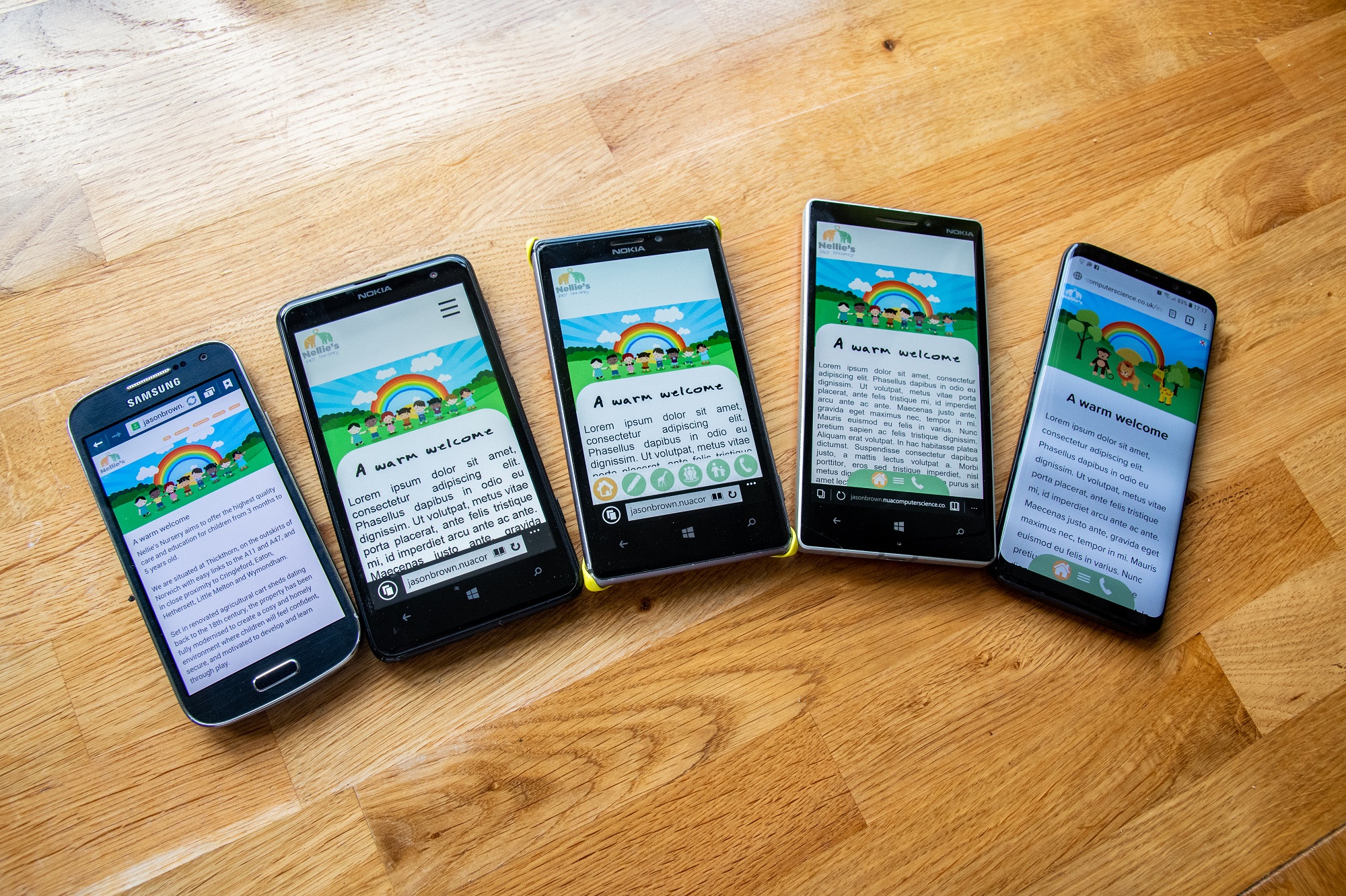
Comparing all of my prototypes the changes appear massive. In my opinion, the latest version, shown far right, definitely looks the best. The font looks a lot easier to read and the brighter colours in the feature image make the website look more inviting, as does the removal of the header image. The great thing about UX design is that it encourages you to design for people rather than just designing something because it fits a framework or because a designer somewhere thinks it’s a good idea. User testing confirmed that the first two prototypes had their flaws: the one with the fixed menu had illogical icons on the buttons that made for a somewhat confusing user experience and the one with the hamburger menu was OK, but a little ‘generic’ and the hamburger menu itself had its issues. The funny thing is that I thought at the beginning that the fixed menu with the icons was a great piece of design and very unique, but compared to the latest prototype it doesn’t look at all – and there’s only two or three months between those two prototypes.

Wednesday 9th May and Thursday 10th May
With the development of Elebase over for the time being, today was about finishing the 2,000 word report. The report that I started writing a week or two ago is very nearly finished, all I needed to do was modify the appendix to include my own research from the three testing sessions instead of quotes from articles online about children’s design. I wrote this information into the main body of the article, being careful to ensure that I didn’t go over the 2,000 word limit. This and writing the majority of this reflective journal took most of Wednesday.
Thursday was spent going through the report with a ‘fine comb’, ensuring that it was under 2,000 words long and that it read correctly. I also added some references to Hick’s Law and the Schlatter and Levinson’s Characteristics of Good Interface Design framework that I wrote about back in October. My site fits these design protocols so they were worth writing about. I feel that on the whole the report writing has gone relatively well, time will tell if I did it right or not. The report explains what the nursery require from a website, how I’ve gone about to create that for them, the design choices I have made (using advice found on the internet from credible sources and referring to design frameworks), findings from the user testing and how those findings have been put to good use by developing the prototype as can be seen in the photograph above. The report finishes by offering some recommendations for further developing the site. The appendices are now full of information and graphs depicting the findings from my testing so that if a reader wants to know more about the testing and my findings they can look in the appendices.
With the report written, it was time to double check the code for Elebase again and ensure it had enough comments in it. I think it probably has enough comments without being over-the-top. There’s no need to comment every line, but my work with Storehouse Online has proven that occasional well-written comments on lines of code that are harder to understand or if you need to record information about the code then comments are a good thing. Comments shouldn’t be obstructive or distracting, they should inform and give a reader (one who knows a bit about coding) some idea about the gist of the code.
The final thing to do was go back through all of my reflective journals and work and put the URLs into the submission document ready for hand-in tomorrow. With that done, it’s officially the end of Year 1!
Friday 11th May
This is the only entry I’ve written the day before the actual day – but I already know what’s happening tomorrow, so this will be a short reflective piece.
I wrote most of my thoughts at the end of the last reflective journal in my entry for Friday 4th May, but in short Year 1 has been great! I can’t deny that I’ve loved every project and have learned so much. I’ve met many fantastic industry professionals and learned so much about the industry. I’d love to be an able to get an internship over summer, that’d be great. The course has given me so many great opportunities: getting back into coding, presenting again, going to Redgate and having industry links and of course doing really interesting projects working for clients. I can’t wait for Year 2 to start and continue working with the industries we have formed close relationships with and all of the fantastic students who have become my friends and I work with on projects. I’ve learned how to collaborate in Year 1 and I highly value the skills of other students and they value my skills. The skills exchanges that I have gotten involved in are mutually beneficial and help to make everybody’s work better.
The Nellie’s Nursery project in particular has taught me (in no particular order):
- How to work with clients: Victoria gave me the requirements and I built a website that fit those requirements. When working with clients it is important to build what they require, but you can offer your own advice and ideas as a designer/developer. If they like them, great, if not, then accept that. Victoria left the brief fairly open-ended, we didn’t communicate that much until she wanted to see what I had done and luckily she loved it! Thank god! I think if I was doing this again I’d try and maintain more contact with the client and keep them a bit more in the loop.
- How to code: OK so I’ve known how to code for years and years, but there’s nothing like a big project that you are working on every day to keep your skills on point. Actually, although I had a lot of coding practice and experience prior to this project I wasn’t particularly confident with JavaScript or jQuery. Working with these two languages every day has made more confident in them and has also boosted my confidence in writing C# again! I’ve also learned a lot more CSS, getting more confident with animations and also getting very familiar with media queries and responsive design. However, I do have working on Storehouse Online to thank for getting me confident with responsive design since I did use that platform to experiment with media queries before I put them into my own work.
- How to be methodical when solving problems: It’s not just about being able to get up every morning and writing 500 perfect lines of JavaScript or CSS (though that is an amazing feeling!), it’s also about knowing what to do when things go wrong or you get stuck. It’s about learning to stay calm and maintained and thinking logically and methodically about how to solve it. I thought for hours about how to make that mute button work, no amount of Googling really helped me – what did help me was putting it at the back of my mind for a bit and then later thinking logically about a variable could be used to determine if the sound was muted or not. This is what being a coder teaches you how to do – it’s a great way to learn how to cope with stress!
- Learn to love coding and design! Every time I see my brother play his guitars I think ‘how amazing must it be to be able to pick up those instruments and just play them?’ Then I am reminded that I can wake up, open up Visual Studio and make something beautiful just by coding – and that is an amazing feeling! This project has made me completely fall in love with coding and design!
- How to design for children: I’ve worked in education before and used and promoted a great deal of educational technology, but I’ve never really designed an app for children before. I know the site isn’t aimed 100% directly at children, but part of the brief was to make it look homely and friendly and that means making it also look appealing to children too.
- How to also make a website that has elements of children’s design work for adults: This was a difficult challenge – the two target audiences are polar opposites – but actually ensuring that adults can use a children’s app is vital because they are the ones who should be supervising children and setting up the app. The use of colours, certain fonts and language all contributes to building a website or an app that appeals to both age groups.
- About running user testing sessions and researching: I had done this once before, now I’ve done it several more times and using different methods such as giving tasks to complete, interviewing, asking people to fill in surveys and collecting and analysing Google Analytics behaviour to track and analyse behaviour. I’ve been approached in the past few months by several students on other courses asking for advice on how to run UX testing sessions. I feel that with each session I did I learned what I did right and wrong and then took these reflections onboard for the next testing session.
- About accepting criticism: I’ll admit, for a long time I wasn’t good at accepting criticism. The first time I can remember taking constructive criticism onboard was in Year 9 when I made a video about how humans pollute the oceans for a geography assignment. I was 14 then – before then I just couldn’t take criticism. The criticism I took onboard for that video helped me get a great grade in it – the video was missing subtitles and adding them helped to make the video more interesting and relevant. Over the years I’ve had to learn to take, accept and build on constructive criticism and getting into photography and doing Graphic Communication at A level did that for me – there’s nobody like photographers and artists to criticise! That’s what I thought until I started university and got into this design course and met graphic designers on other courses. Graphic designers (or at the least ones I know) can critique like no other group of people I’ve ever met. If you want your work critiqued – talk to them! They’ll make sure every T is crossed and every I is dotted. The feedback they have given has been fairly brutal on several occasions, but 100% valid and implementing their feedback has made my work many, many times better. It’s not just feedback from designers that I’ve listened to, it’s feedback from user testing. Observing how people use what you think is a great design and see that actually it’s horrible to use can be hard – but completely necessary – necessary to keep innovation alive and improvements coming. That’s what I love about UX design.
- That every browser and piece of hardware has its own little ‘characteristics’: A lot of people think that all of the modern browsers display sites in the same way – after all, the sites look the same on every browser? They’d be wrong – doing this course and trying my work on a large range of browsers and devices has taught me that you cannot try your work on one browser, device or emulator and expect it to work on all of them. Nothing is more valuable during the testing phase than actually trying your work on as many physical devices as possible.
- How to get back into networking: Being in the working world for a little while and generally not needing to meet any professionals other than those I worked with, I was a little out-of-touch with the whole networking world having not done any for several years. Finding a client to work with and then attending several networking events to meet new professionals and talking to those who came in to give us lectures and sessions was a great reintroduction to the world of networking.
- How to demonstrate my work: I’ve never had to demonstrate my work to a client or to industry professionals before really. At school I only had to show my work to friends and teachers, but nothing is quite like having a client be happy with the work that you have done for them or an industry professional take a keen interest. When showing your work to a teacher or a friend you just show them what you have done and other than feeling good if they say ‘this is amazing’ you get nothing from it. When showing your work to a client or a professional it’s more about selling yourself than selling your work. I think selling yourself is a really important industry skill – if you produce amazing work but come across as being a terrible person to work with then you won’t make the sale and your work is useless. What use is a nursery website that I’ve made which never gets sold and thus never used thanks to a poor attitude from the creator? Your work cannot speak for itself in the real world – it’s also all about you. I don’t think schools put enough time into teaching students how to pitch and how to sell themselves. There are so many reasons why you need to learn to sell yourself, self-esteem and making a sale are just two of them. If schools put more time into teaching students how to sell themselves and find the positives in themselves instead of focusing on being modest and praising others all of the time then I think you’d reduce the number of anxiety cases that seem to affect youngsters these days. Other people can tell you a thousand times that you are great and your work is too, but if you don’t believe it yourself then unfortunately that will show when you come to pitch your work and yourself. University has taught me a bit about how to promote myself to get a client onboard and professionals interested in me.
- How to project plan: I won’t lie, it is a boring task, but getting your project tasks and timeline down in Microsoft Project helped me to realise exactly what I needed to do and how long I had for each task. Time management wasn’t a massive concern for me, rather just knowing what needed to be done and when by (there’s a difference – the later is ‘project managing’).
- How to collaborate: Until I started university I was not what you’d call a ‘team player’. Working with the Storehouse Online team to create that website introduced me to the idea of working with passionate, dedicated and knowledgeable people to produce a great end product – and then go and party hard with them after it launches! Storehouse made me realise that I can work in a team and I don’t need to naturally try and take the lead as long as I am working with dedicated people. I had to do a group presentation for this project and I feel that I did a much better job at working in a group for that than I would have done had I been asked to do the same task a year or two ago. My natural instinct to try and lead and takeover led to many a group task failing back in my high school days as the other members of the group twigged that I would be happy to essentially do all of the work if it meant that they didn’t have to, but in university I am now far more relaxed about working in a group and open to letting others take on work. I have more trust in people to get work done and to a good standard than I had years ago.
- How to use new software: I’ve fallen in love with Axure RP! What a fantastic piece of software! It’s so good and easy to use that I’ve taught several of my other friends how to use it and even taught 11 year olds how to use it! It just makes wireframing and prototyping so much easier! There’s other programs too that I’ve been using a lot such as ScreenToGIF to record short animated GIFs of the Windows desktop for my reflective journals and FileZilla is my rock! I’ve also learned how to use software that I’ve been using for years better – for example Visual Studio. I have been using Visual Studio since 2010 but I’ve only just realised that you can have multiple files opened at once in split window tabs! Amazing! This has improved my productivity no end – I can now modify several HTML, CSS and JavaScript files at the same time!
There are so many things that I have learned that have made this project completely worthwhile.
I said in my last reflective journal that I thought this one would be shorter, but in true Jason-style I am signing Year 1 off after writing 7,900 words. Reflective journals will return when I am on the other side – in Year 2! In the meantime, this blog will continue to be updated with posts about the projects that I intend to take on over summer including posts on how the development of the Nellie’s Nursery website goes.

1 Comment on “Reflective Journal and Production Diary – 7-11th May 2018 – The final week!”
Comments are closed.