Following my previous reflective journal, here is my journal and production diary for 12-16th March 2018.
It’s been another very busy week, it’s been an absolute rush to get Storehouse Online and Elebase 3 ready for Friday 16th but I have managed it! Many of the changes to Storehouse this week have been about refining article content and layout, very little of which applies to Nellie’s Nursery at the moment (but will in the future when the copy is added to the website) and most of the work on Nellie’s Nursery this week has been about perfecting media queries – notably the landscape media queries. Of course, testing has also been completed and substantial feedback was given by the five candidates who tested the latest prototype on Friday 16th March. A separate post about this test and the testing data is available here.
Monday 12th March
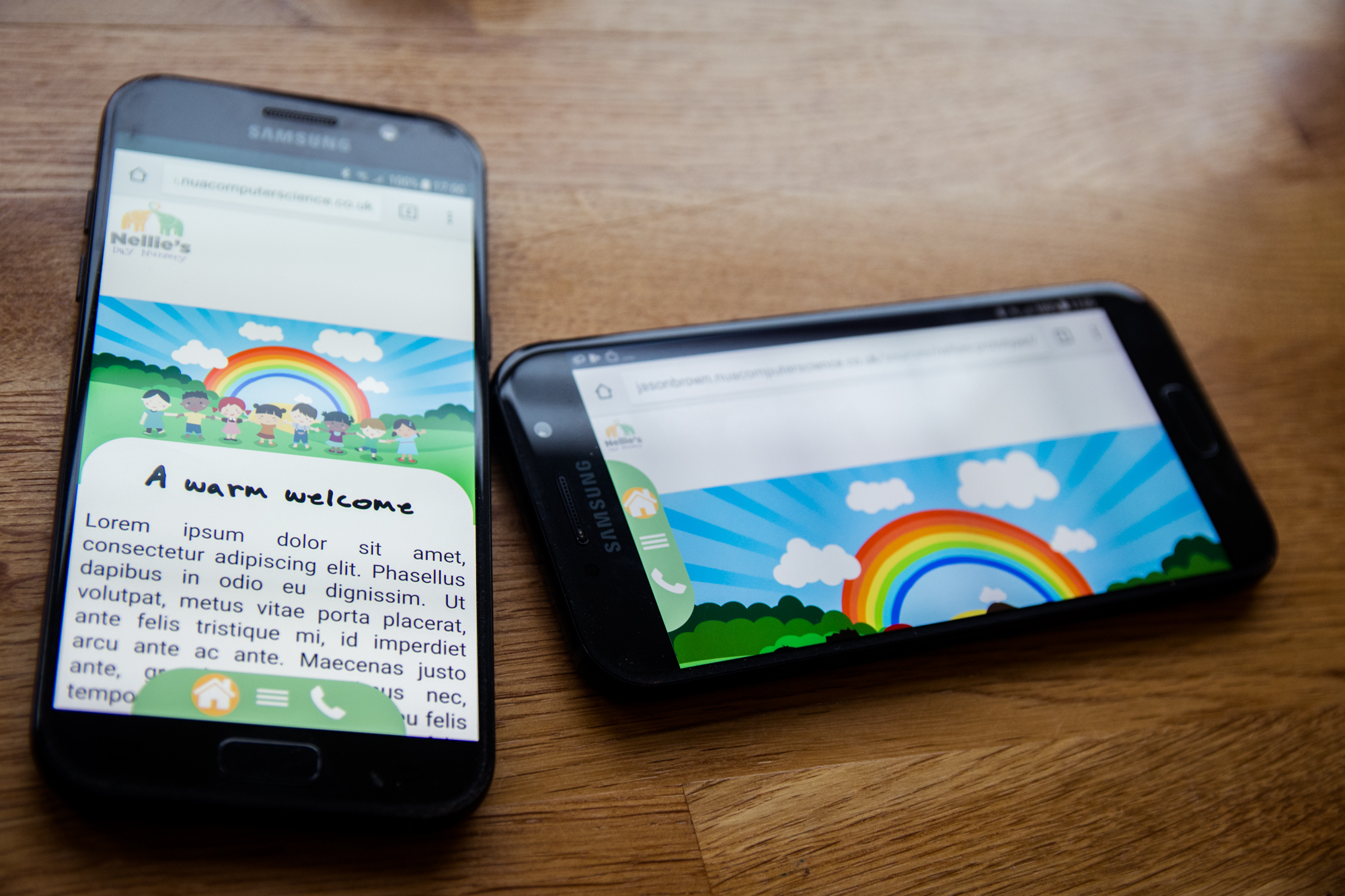
Today I decided that I really needed to get on and sort out the landscape media queries. As outlined at the end of my previous reflective journal, my idea was to have the menu buttons moved from the bottom of the screen to the left side when the device was rotated and then the hamburger menu would come out and occupy about half of the page width. Unfortunately, doing this was much easier said than done. I’ve created landscape and portrait media queries before but I spent hours and hours trying to move the menu from the bottom of the screen to the left and nothing I tried would work correctly. The issue was that the div containing the bottom media had some kind of padding that was preventing it from being able to be placed against the right side of the page without having a ton of padding.

To make coding this easier, to make rotate the menu and its buttons the right shape and size for the left of the screen I simply used the CSS rotate transform property to rotate the menu and the buttons by 90 degrees. This did work but when applying ‘top’, ‘bottom’, ‘left’ and ‘right’ styles to the div once that property has been applied, these styles are still applied as if the div was not rotated. For example, setting ‘bottom: 0;’ on the div once it has been rotated 270 degrees, it still applies it to what was originally the bottom of the div which would now be the left side if the div had been rotated by 90 degrees. It was easier and quicker to just rotate the div and try to get my head around the styles than code a new div that was only visible in landscape mode – it’s also less code so arguably more efficient.
Unfortunately, I spent a long time trying to figure out why the div would not move properly. At first I used the code below to style the ‘bottommenu’ class when the device is rotated.
.bottommenu {
    visibility: visible;
    text-align: center;
    position: fixed;
    transform: rotate(90deg);
    margin: 0, auto;
    width: 30%;
    background-color: #aed2a7;
    z-index: 1001;
    border-top-right-radius: 500px;
    border-top-left-radius: 500px;
    bottom: 0;
}
In my mind, this code puts the menu on the left – the menu has been rotated by 90 degrees therefore ‘bottom’ is the left side, so surely setting it to 0; means that there is no padding? And there is no margin at all on this class. Unfortunately, it was not to be and when viewed in Google Chrome’s mobile device emulator in landscape the menu is clearly not where it is supposed to be.

After hours of playing with the margin, padding, top ad bottom CSS properties, I could not for the life of me figure out how I was going to get this sorted. Although not a requirement for my testing on Friday since the testing does not involve anything to do with the device being rotated, I still wanted to get this fixed as in my mind this had been a bug for too long and sooner or later it was going to come up in user testing. Making the site in landscape orientation was also the final bit of the core codebase that needed to be written. After this had been done I was confident that the only thing that would need doing to complete the site would be adding the copy and some original photographs.
Tuesday 13th March
Today I decided to get some help with my landscape orientation issues. James Van Roose is our lab technician and has extensive knowledge of coding. I spent about half an hour with him today and was able to sort the issue out with him. The solution we came up isn’t the most elegant to be honest, but it works pretty well. By adding the following code to the CSS shown above, the menu is somehow able to stay fixed to the left of the screen.
left: -94%;
bottom: 42%;
To me this just confirms that there is something funky going on with the margins. I don’t really understand why placing it -94% from the left and 42% from the bottom makes it stay left. We literally just keyed in some values until it looked right and by using percentages rather than straight pixels it’s also responsive. With the menu fixed, I was able to write some more media queries for the landscape view to help make the site more usable and also code the hamburger menu styles.

Initially I had a half-width hamburger menu in mind for the landscape menu, however I changed my mind and decided that it would be best if the hamburger menu was full-width and full-height. The buttons on the menu are quite large and so it made sense to me that to maintain maximum usability I should make the menu big. By adding some padding to the right of the screen I was able to move the buttons to the right of the screen meaning that they did not obstruct the menu, further improving the usability.
The code for the hamburger menu when the device is rotated is as follows:
.hamburger {
    visibility: visible;
    z-index: 1000;
    width: 100%;
    height: 100%;
    top: 0;
    padding-left: 8%;
    padding-right: 2%;
}
The 8% padding means that buttons do not obstruct the menu and by setting the top to 0 it means that the menu slides down from the top. I had hoped that if I set the ‘left’ property to 0 it would slide in from the left, but unfortunately this was not the case. It still looks fine sliding out from the top though.
The animation below shows the hamburger menu being emulated in landscape mode on a variety of smartphones including the Google Pixel 2 XL, iPhone 5/SE, iPhone 6/7/8, iPhone X and Samsung Galazy S8.

With the hamburger menu created, it’s now time to add some additional breakpoints to the landscape orientation media query to ensure that the menu buttons, hamburger buttons, text container and font size is set to scale well to as many different device sizes as possible.
Wednesday 14th March
With only two days to go before testing, there’s not an awful lot left to do on Elebase 3 before it is ready to be tested. Taking into account the remaining time and what I was testing, I made the decision not to update the copy on the Elebase 3 prototype for the following reasons:
- The purpose of Friday’s testing is to determine if the new menu system is a success, not really if the copy is easy to read (though tasks related to finding information will be asked during the testing, just like last time).
- During the test the older Mobile Prototype 2 will also be tested. I didn’t want to people to favour the newer prototype just because it had more copy – I wanted them to evaluate the prototypes based on the menu system.
When conducting a test to keep it fair only one variable should really be changed, in the testing on Friday that will be the menu system. Future prototypes and ‘Phase 3 Testing’ (which I am hoping to conduct in April) will focus much more on copy, font and readability. At the moment I am interested in trying to perfect the mobile navigation experience.
To help perfect the mobile experience, I added several media queries to my landscape media queries to scale the text and text container size to different sized devices. The idea of the fixed menu in general (even on Mobile Prototype 2) is that it is ‘always there’, meaning that if the user wants to navigate to another page they can simply press a button (the hamburger button) and up pops a menu with all of the different pages that the user can visit. The user is never more than two taps away from another page on the site and there is no need to do any additional gestures such as swiping or scrolling to navigate to another page as the user can just tap a button either at the bottom of the screen (portrait) or on the left side of the screen (landscape) to navigate. The menu bar should not obstruct the text at all.
By default, on larger screens the menu bar does not obstruct text when then device is in landscape orientation, but as the device screen gets smaller the menu bar begins to obstruct the text. The best way to sort this is to use media query breakpoints to alter the size of the text container and font depending on the width of the screen.
Most smartphones on the market such as the iPhone 5, 6, 7 and 8 and mid-range Android phones display websites in widths between 400 and 700 pixels, so this is the most important breakpoint to get right. Higher-end and larger smartphones like the iPhone X, iPhone Plus series and the Samsung Galaxy S8, S8 Plus and Google Pixel 2 XL tend to display websites in widths between 700 and 900 pixels, so this is also a breakpoint to get right. Very few modern phones display websites in widths of less than 400 pixels, but to try and support some older phones I wrote code for this breakpoint too.
Essentially, the only difference between the three breakpoints really is that on screen widths of 400 pixels and up, the height of the fixed menu is 30% of the screen height but below 400 pixels it is 60% high because as the screen width gets smaller, the buttons actually need to get bigger so that they are easier to touch on that smaller screen. On screen widths of 700 pixels and below the width of the text container is 75% so that the menu bar does not obstruct the text container on the narrower resolutions. On screen widths of 1,000 pixels and up the text container is 95% wide because on these larger resolutions the menu bar does not obstruct the text and screen estate is maximised for the text which is important as it reduces scrolling, these making the website more comfortable and ergonomic to use. Font sizes stay the same size regardless of resolution – 50px size for the H1 (heading) text and 20px size for the P1 (paragraph) text was perfect across all resolutions.
The result is a landscape mode that is responsive across pretty much all of the common smartphone resolutions and is fluid thanks to the 3-point break system.

Sure, when the screen width falls below 400 pixels the menu bar could do with becoming a little smaller, but look how tiny that resolution is. So few smartphones use resolutions this small in this day and age and if you can find a smartphone that does use a resolution this small, the chances are the software and browser running on it is nowhere near modern enough to sufficiently run the website. Below is a video showing how the menu is meant to be used on a real device, shown on a Samsung Galaxy A5 (2017) on Google Chrome.
This completes the menu system for the time being (unless anything is found in Friday’s testing session) and for the time being, development of the prototype. Since I am not editing the copy on the site to help keep the comparison between Mobile Prototype 2 and Elebase 3 fair, this completes development for the time being. The prototype is now ready for testing on Friday and then after that the next phase of development will begin.
Thursday 15th March
Two big things happened today: the first was that I delivered a short presentation to my peers about what I had been working on for the past two weeks, and the second was that the Storehouse website finally went online!
Let’s talk about Storehouse first. I’ve been working with several friends of mine since November last year to take the university magazine’s content to the internet and today it was finally finished! All in all we wrote over 3,000 lines of HTML, CSS and JavaScript code in our spare time to produce a fully-mobile compatible news website for the university whilst following a very strict design brief from the magazine’s editorial team. The magazine’s editorial team made it very clear about how the site needed to look, what fonts needed to be used, how elements needed to be laid out and the general direction that the site needed to go in. Storehouse’s development has featured in many of my reflective journals this yesterday, most notably last week’s because last week I was very much developing Storehouse and Elebase 3 side-by-side and the two share some common components.


Working on Storehouse has been a fantastic opportunity for several key reasons:
- This is a real website that is online and will be read by potentially hundreds of people. Nellie’s Nursery may eventually also go to market but it won’t be for a couple of months yet and may not happen.
- Working on Storehouse Online has enabled me to learn how to work to a very strict design brief, almost like company guidelines. I feel that this is fantastic experience for the future when I will be expected to create solutions that follow brand identity. This is something that at the moment the Nellie’s Nursery project is lacking as the nursery hasn’t given me any strict design guidelines – rather I’m quite ‘open’ to do what I wish. It’s been very interesting working on one project with strict guidelines and one where I am free.
- Working to such a strict guideline has enabled me to learn how to design, build and develop a website that is targeted at a very particular audience and allow me to experience building a website for another industry besides education and information.
- Before I started working on Storehouse Online and coming to university in general I did not really call myself much of a ‘team player’, more of a ‘natural leader’. I would often not work too well in a group because I would naturally want to take the lead to ensure that the task was completed. Working on this project has enabled me to be more of a team player whilst still having a key role in writing the code and being responsible for testing this website.
- I’ve also learned how to write readable code, formatting and commenting the code in such a way that others can read and edit it. This is a critical skill to have for industry.
- I’ve had a chance to work with some of the university’s finest designers and learn all about design from them, whilst being able to teach them all about UX, coding and bug-finding and patching.
- The Storebase framework has been a great ‘experimental platform’ to try code on before I put it into my own work. I first mastered the art of writing media queries in early February when I first made Storehouse Online mobile-friendly in Prototype 4. The hamburger menu that is on Elebase 3 today was originally written for Storebase but it was written with the intention of it being easily-portable to Elebase. Storehouse features a pre-loading system that could potentially be very helpful for the Nellie’s Nursery website once photographs and larger assets go onto the site. Coding the Storehouse Online website has given me an extra ‘security layer’ for testing code, making sure it works and refining it before I put it into my own work, thus saving time, teaching me how to write transferable code and reduce the overall number of bugs in my own work.
- I’ve made fantastic friends in Callum Brown and Emma McIlwaine whom I was friendly with before, but working so closely with them on this project has cemented our friendship and Emma and I have also started work on several other private projects that involve my UX and coding skills and her graphic design expertise.
- The Storehouse website will need constant maintenance and updating as it gets older, so it is a fun project that just keeps on giving. We already have lots of greats to ideas to introduce before Issue 17 (and thus Storebase 17) is released in September this year.
We unofficially launched the website today and went to celebrate with some drinks and will officially launch it tomorrow.


Now let’s talk about my presentation. For the past two weeks I have actually been in university a lot to work on Nellie’s Nursery, Storehouse and a variety of other projects that I am involved with. I just love coming into university and can’t really stand spending time at home. I love being with my friends and working with them. We haven’t needed to come in for regular BSc sessions for the past two weeks because we’ve had the past two weeks to build our next prototype, which is what I have been doing. This afternoon we each had to deliver a short presentation about the work that we have completed recently and where our prototypes stand.
My presentation started by introducing Elebase 3 and what I meant by ‘Elebase 3’ (basically describing that I have made my own little framework for Nellie’s Nursery and I also explained the etymology of the name ‘Elebase’ that I had created), then I went onto explain the problems that I had found during the February 2018 testing in which Mobile Prototypes 1 and 2 were tested for the first time. I explained that the problem with Mobile Prototype 1 was that many users did not understand what the icons on the buttons at the bottom of the page meant and how this contributed to a poor user experience – much poorer than I had originally anticipated. I used data from my testing to back up the fact that users didn’t understand the button icons but liked the ergonomics of Mobile Prototype 1 more so than Mobile Prototype 2, however on the whole Mobile Prototype 2 was the favoured prototype due to its ease of use and contemporary design – the more ‘radical’ or ‘ground-breaking’ Mobile Prototype 1 was not favoured as much. I showed how, using screen recordings of my Axure wireframes, I had taken this feedback into consideration designing what was to be known as ‘Elebase 3’ – the next prototype. This was the first time that I had publicly shown the newly-designed bottom menu design featuring the home button on the left, the hamburger menu in the centre and the contact button on the right. I used photographs of real smartphones and my own provisional user research that states users visit nursery websites to find out information and contact the nursery to justify my reasoning for placing these buttons at the bottom of the page in this arrangement.
I then went onto show a screen recording of Elebase 3 running in Google Chrome, emulated on several different devices in portrait and landscape orientations to show that it is fully-responsive. I went onto talk about my alpha testing and physical device testing strategy (which will be carried out next week), justifying my reasons for prioritising testing on iOS and Android handsets and screens of 1366×768 and 1920×1080 for the desktop websites. I also justified my choice of browser testing using user research and browser market share statistics. I also explained how I felt that Elebase 3’s menu system would work on the new ‘bezelless’ phones such as the iPhone X, Samsung Galaxy S8, S9 and Note 8 as well as the Google Pixel 2 XL.
An embedded version of my presentation is below.
After the presentation, a friend of mine explained that the fixed menu at the bottom would not be a problem on the Samsung S8 or Note8 because on those phones to activate the software home, all apps and back buttons you have to swipe up from the bottom of the screen. He let me try Elebase 3 on his Note8 to see for myself.
It was great to see that it worked perfectly with no problem with accidentally activating the operating system’s menu buttons.
Most of my peers will have their work tested on Monday 19th, however I am pleased that I am getting mine privately tested tomorrow by people who will be impartial because I feel that the presentations revealed too much of what people had done and could therefore corrupt their testing data. For example, I now know the flaws in almost everybody’s work before I’ve even tested it and I can think of things to suggest before I’ve even tested the product meaning that I feel that I don’t really have to try hard to find faults and pain points since I already know where to look. Since mine is not being tested by any BSc students tomorrow, I didn’t mind revealing the full details of what I had done, but had I been having my work tested on Monday I would not have revealed anywhere near as much to try and keep my work a surprise until it was tested.
I look forward to giving my feedback to my peers on Monday, their work looks great but I think it should have been a surprise for Monday morning!
Friday 16th March
Another spectacularly busy day – the morning and most of the afternoon was filled with user testing of Elebase 3 which went very smoothly. Testing followed a very similar style to the older prototypes but with some changes to improve the test data. Of course, this time it was mainly tested by design students who could give a new perspective on my work. The feedback provided was great, if a little surprising! I have published a separate post about the testing including all of the user testing footage, their interviews, an analysis of the data and identifying what Elebase 4 needs to have!

The evening saw the launch of Storehouse Issue 16 and the official launch of Storehouse Online. The two were released with great fanfare at Studio 20 on Wensum Road in Norwich, promptly followed by an evening party which epitomised the phrase ‘work hard, play hard!’ That’s what it’s all about really: working very, very hard, producing a fantastic product, then letting your hair down and getting a little worse for wear with your mates once your work is all done and out in the wild. I had a fantastic evening and it was really a celebration of finally launching Storehouse Online as well as a successful day of testing Elebase 3 and really marking the end of that development. I’m very excited to see what Storebase 17 and Elebase 4 bring! For several months straight I have been working tirelessly at these, with some of my peers likening my energy to that of a ‘nuclear power station’, so it was great to spend some time relaxing and having fun.

1 Comment on “Reflective Journal and Production Diary – 12-16th March 2018”
Comments are closed.