Following my previous reflective journal and production diary, here is the journal and diary for the 12-16th February.
Monday 12th February 2018
Again, no morning session this week – we had mid-term reviews instead. My course tutor is pleased with the progress that I made last week. We discussed some ideas about testing my prototypes, which will take place on Thursday 15th between 1.30pm and 4.30pm in the UX lab, and decided that using eye-tracking and the mobile device camera in the UX lab an ideal test for my prototypes would be investigating the UX of the fixed menu bar at the bottom of the screen versus the hamburger menu. I was going to do a test based on information architecture, but I think I will change it to investigating the UX.
Learning from my last prototyping session’s mistakes to plan a prototyping session for this project
When I last did prototyping I used the Tobii eye-tracking hardware and software in the UX lab to find out where users were looking when testing out my ‘Stellardrive’ car infotainment system. I wanted to find out if my testers were looking at the road, at the infotainment system [web interface] itself or a good mix of the two. Before anybody did their tests, I conducted my own test to use as a control , i.e. a ‘perfect example’ of somebody who used the prototype as it was meant to be used. This person processed ‘perfect knowledge’ and ‘perfect information’ to use the system perfectly. I was then able to look at the gaze and heatmaps that the eye-tracking software produced and use it to compare my ‘perfect’ results to evaluate if the prototype was a success or not.
This time I want to use eye-tracking again and perform a similar kind of test. When testing my Stellardrive prototype I set the user several goals to achieve including changing the music source and track and whilst they completed the tasks I was recording their eye movement to collect quantitative data. At the end of the test I asked some questions to collect some qualitative data and learn how the tester found their experience. Collecting a mix of quantitative and qualitative data worked really well because I had a lot of data to analyse and points to draw from to make a solid conclusion, but there were some flaws with the overall testing methodology. I will do a similar thing this time, but I am going to make a few changes based on my own evaluation of how my last prototyping session went:
- This time the testing will be a true A-B-C prototype with three different prototypes being tested. The Stellardrive prototype was more like A-B-B2 with ‘B2’ being the eye-tracking to check where the user was looking which was a test that the user was sub-consciously also completing whilst testing B. By having a real A-B-C test you are collecting 33% more data than you would be from an A/B test. Eye-tracking will form a core part of all three tests in this session.
- This time the testing will be blind. Before, I gave the users some prior information about how the prototype worked and what to expect during this testing. All I will do this time is tell the user what the prototype actually is (i.e., tell them it is a nursery website) and that is it. By having a blind test, you are effectively testing a first-time user’s reaction to the website and learning how they would use it and how they would achieve the set tasks without any prior knowledge of the website. It tests how easy the interface is to learn and handle – an important part of UX.
- This time the testers will know exactly what the prototype is. Some people were a bit confused by the Stellardrive prototype and didn’t understand that it is a simulator. This time the nature of what they’re testing is completely different, so I hope that it is obvious to them that they are testing a responsive nursery website which is running live from a web server in a web browser on a desktop PC and on a mobile device.
- This time everybody will do the same test, no exceptions made. They’ll also do the tests in the same order. When prototyping Stellardrive some testers did it with the video off first and others the other way round. Some people had more guidance than others. This time everybody will be doing the same test to ensure that the data collected is fair.
- Instead of using a throw-away prototype like my Stellardrive simulator a paper prototype or a high-fidelity prototype made in software like Axure, this test will be using an evolutionary prototype that with a bit of tweaking, refining and content addition could potentially be passed-off as a completed piece. By having a prototype that is realistic to the actual experience of using the product, you are able to analyse much more easily. For example, when prototyping Stellardrive I generally concluded that my users spent too much time looking at the instrument panel and not enough time on the road, so I concluded that my system was ‘dangerous’. But was it? Was it that the prototype was missing so many variables (such as consequences for not looking at the road, the missing driving controls such as steering and changing gears, no time limits and my testers’ inexperience of driving) I could never really get a straight answer just by testing my prototype. This time I will be able to say for sure if user’s can’t find a page because there won’t be any variables to try and consider other than ‘did they look in the right place for the button, did they find it, did they press it and did it take them to where they wanted to go?’
- I will add a second dimension to my user testing by adding a user persona. I’ve talked a lot about user personas and user journeys recently, but basically by having a persona you start to employ empathetic testing to consider how they might use the prototypes. As explained in the article I wrote about user personas and identifying pain points, very detailed and well-thought-out user personas are not a replacement for real human testers, but can give an insight as to how a certain person might use your product. They are especially helpful if the persona is completely different to any of your testers, effectively broadening your user test base.
Generally, the prototyping for this website will be a lot simpler than the prototyping for Stellardrive ever was and will hopefully produce concrete quantitative data rather than quantitative data that you have to evaluate with an ‘if, but and maybe’ in mind. Just looking back at my write-up for the Stellardrive prototype testing, there are so many things that I said in my evaluation that my prototyping test method didn’t consider, just due to the nature of the project really. This time I will be consider and control a lot more variables.
The prototyping session
The test method will be an A-B-C evolutionary high-fidelity prototype, meaning:
- Two different prototypes will be tested.
- The prototype is not of the final thing – but with some tweaking, refining and content addition, it could be passed-off as a final product. The codebase used to make the prototype could be edited and added-to to make a final product.
- The prototype looks realistic or semi-realistic, so although it is not of the actual finalised software, it is high fidelity.
The three different prototypes will be:
- (A) ‘Desktop’ which is the desktop site running on a desktop computer.
- (B) ‘Mobile Prototype 1’ which is the prototype that has the fixed menu bar at the bottom of the page when scaled on mobile devices and low resolution screens.
- (C) ‘Mobile Prototype 2’ which is the prototype that has the hamburger menu in the top right corner of the page when scaled on mobile devices and low resolution screens.
The tests will be run in that order. The desktop site testing will be run on the desktop computer in the UX lab and the mobile site testing will be run on a physical smartphone in the UX lab (likely a Samsung Galaxy S7, though this is subject to change). I’d rather that the mobile sites were tested on an actual handset rather than a scaled down browser window because the user needs to be able to test the site on actual hardware to get a feel for how the site runs on that device in order to honestly answer the open questions in the latter half of the testing process and also to allow me (and them!) to evaluate the ergonomics of each prototype. The mobile prototypes have been designed for touchscreen devices, not for desktop devices (though if you scale the browser window down enough you will eventually reach the mobile website).
Each of these tests will be performed once on each prototype:
- (A) The user must firstly find the session times and tell me what they are.
- (B) The user advance the slides on the slideshow.
- (C) The user must navigate to the ‘Groups’ page.
- (D) The user must navigate to the:
- Desktop: ‘Jolly Giraffes’ section.
- Mobile Prototype 1: ‘Little Lions’ section.
- Mobile Prototype 2: ‘Mini Monkeys’ section.
- (E) The user must tell me the age range of the children in the group they had to navigate to and the rooms that that group use.
- (F) The user must navigate to the ‘Day-To-Day’ page and tell me some information about either the Courtyard or the Nature Garden. They cannot repeat the same information they told me last time,
- (G) To complete this stage of the testing, the user must navigate back to the home page.
These tests collectively evaluate:
- How easy information is to find, this is verified by getting them to tell me some information that’s displayed on the page that they have visited. I won’t prompt them to tell me some information, they’ll have to tell me when they’ve found some (to prompt this, instructions will be worded like ‘navigate to the
- How easy the site is to use – did they manage to find the pages and make the slideshow advance?
- This data is backed up using quantitative data by using eye-tracking. Heat and gaze maps from the eye-tracking software can be used to evaluate where the user is looking on the screen, meaning I can once again evaluate if they are looking in the right places, clicking on the right things and so on in order to build a picture of how easy the site is to use in terms of UX and information architecture.
After the first stage of the test has been completed, I will give users an opportunity to answer these open questions which will allow me to collect some qualitative data.
- Information architecture questions
- What kind of information would you expect to find on a nursery website?
- Going by the buttons alone, would you say that this site has all of the information that you’d expect to find on a nursery website?
- Was there anything distracting or misleading on the pages?
- UX questions
- Did you find finding information on the page easy? Was the information clearly laid out and easy to read and find?
- Generally, did you prefer navigation on the desktop or the mobile site?
- Was the navigation more logical to use on prototype 1 or prototype 2?
- Which prototype was it easier to find the pages on?
- Were the icons on prototype 1 logical and easy to work out?
- When using the handset, did you find it more comfortable to navigate on prototype 1 or prototype 2?
Like last time, these interviews will be recorded and the results posted on this blog.
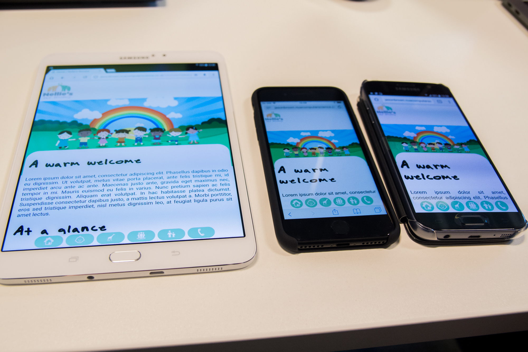
More device testing
Today I was also able to try my prototypes on some slightly more modern devices than the iPad 4, Nokia Lumia 925 and 930 that I previously tried it on yesterday, all of which are over 4 years old now. I tried the prototypes on a 8″ Samsung Galaxy Tab S2 8, an iPhone 7 and a Samsung Galaxy S7. These are all previous-generation devices at the time of writing and are 2 years old, but are still more modern than the older devices I previously wrote about testing them on.
Device compatibility with the more modern devices was good. The site displayed pretty much exactly the same on the iPhone 7 and the Galaxy S7 as it had on the Lumia 930 and even the 925 and both have the same problem with the hamburger menu when the site is viewed in landscape mode. On the Tab S2 8 the site looks the same as it does on an iPad, it displays the mobile site in portrait mode and the low-end desktop version in landscape mode. One bug is that in prototype 1 the button placement in desktop mode is too close to the bottom of the the header area, otherwise the prototype is compatible.


Below is a video demonstrating how the prototypes run on each of the devices.
Whilst I had an iPhone 7 to hand I thought I would look at the existing Nellie’s Nursery website again and show that even when Google Chrome is set to render the page as it would display on an iPhone 7, it doesn’t actually display as it would on an iPhone 7. To be honest, it’s not terribly important to understand why this is is the case, rather it’s just something that is interesting me at the moment whilst I develop what could potentially be a mobile version of their new website. As I’ve said previously, I think Wix is using some kind of media query to detect if the device is running on a mobile device using ‘max-device-height’ instead of ‘max-height’ (same for width) which means that the media query is not applied simply when the screen resolution changes – it has to be running on a device.

Some very provisional user testing
My work has already attracted some interest amongst my peers. My friend Ameer gave the mobile sites a try (he tried them on his iPhone 6s Plus, it rendered fine). I showed him prototype 1 first, he was very interested in the fixed menu bar at the bottom of the page and said he hadn’t seen any websites with this navigation before but understood that on a mobile device it could work really well. He suggested I pursue this route because it’s different and unique to the hamburger menu that a lot of mobile websites and apps employ. Before he had seen the buttons on the desktop site or in the hamburger menu on prototype 2, I asked him what he thought each of the icons meant. He got the Home, Contact and Parents’ Area buttons straight away. The others weren’t so obvious to him. He mentioned that the baby icon for the ‘Day-To-‘Day’ page seemed kind of logical since it signalled kids, so he kind of got that, but the other two were a mystery to him until I explained them. I showed him prototype 2 on his phone and he said he felt that the hamburger menu was ‘easier to use’ in the sense that the menu buttons are labelled so it is crystal clear where each button will take you and he predicted that in my testing most people will prefer it because they were more used to it, but the menu bar had its ergonomic benefits and was more unique. He liked the site overall and when I mentioned adding labels to the menu bar in prototype 1 he was against this.
James Van Roose, our lab technician, liked the design overall. I also asked him to see if he could identify what the menu buttons were for and he also got the Home, Contact and Parents’ Area buttons straight away. He also got the Meet The Team button straight away too. The other two (Nursery Groups and Day-To-Day) were not so easy to grasp. James remembered from various presentations I have done to the group over the past few weeks that the nursery groups at Nellie’s Nursery are called ‘Mini Monkeys’, ‘Little Lions’ and ‘Jolly Giraffes’. James remembered that one of the groups had giraffes in it, so was able to link this to the giraffe icon on the button but explained that without knowing the context he wouldn’t have been able to do this. He didn’t get the Day-To-Day one at all and suggested changing the icon to crayons or something similar. I like this idea and will be doing it. I asked if I should also change the icon for the groups link but he said to keep it as it was since most parents visiting the site will already know the context – but if they’re new parents, will they? Maybe they’ll click on it for curiosity’s sake and find out. It could be a good tactic to employ to increase page visits and user engagement. He also said that he didn’t like how the heading text justified to the left on mobile devices, it left a lot of white space. He suggested to centre the text instead.
Tuesday 13th February 2018
Today was all about minor bug fixes and applying the final touches to the prototypes. The first thing to do was to copy the index.html page and then modify it to create the other pages. Using the wireframes I made a week ago and the framework that I had produced to make the index page, it was a fairly quick job to just edit the text and a few of the styles to make the ‘Day-To-Day’ and ‘Groups’ pages. There are of course other pages in the website, but my prototype testing only involves the use of the home, ‘Day-To-Day’ and ‘Groups’ pages, so I don’t need to worry about making the other pages. Having the wireframes at least gave me an idea of the design that I needed to follow.
I’m trying to create two websites at once, so having style sheets, JavaScript files and as much functionality as possible in external files that can just be copied between the two projects and work is ideal. Things like page navigation that can be handled in a JavaScript file using jQuery and using separate stylesheets for things like the tiles and the media queries that can just be copied across makes working on the two sites easier to work on at the same time. Navigation can be done using HTML but doing it that way you have to manually put the HTML code on each page. If you do it using jQuery, you can simply reference the JavaScript file in each HTML file which saves a lot of time. Likewise, if you ever want to or need to change anything it is easier to just modify the one JavaScript file than modify each page’s code – that way you also know that the changes are applied to each HTML page that is using that JavaScript file.
For these reasons, I chose to wrote a JavaScript file using jQuery to handle all of the navigation on my prototypes.
$(document).ready(function () {
    $('#home').click(function (e) {
        location.href = 'index.html';
    })

    $('#daytoday').click(function (e) {
        location.href = 'daytoday.html';
    })

    $('#groups').click(function (e) {
        location.href = 'groups.html';
    })

    $('#team').click(function (e) {
        featureUnavailable();
    })

    $('#parents').click(function (e) {
        featureUnavailable();
    })

    $('#contact').click(function (e) {
        featureUnavailable();
    })

    function featureUnavailable() {
        window.alert('This feature is not available in this prototype');
    }
The way that this works is that each button on the page has a unique ID and is assigned a click event, so when the button is clicked the click event function is activated and the user is navigated to the appropriate page. By default the ‘location.href’ component navigates to the same browser window/tab, so this is ideal. The buttons that would go to the pages that aren’t built yet simply show an alert on the screen which says ‘This feature is not available in this prototype’ instead. This is just in case when it comes to testing on Thursday in the event of a tester clicking on a button that goes to a page that doesn’t exist yet they are at least told what is happening so that I don’t get comments criticising the usability of the prototype when my testers inevitably try and click on a button that doesn’t take them anywhere.
When I first tried this it worked fine on the desktop site, but didn’t on the mobile sites. Then I remembered the buttons on the mobile sites have ‘-mobile’ after them, so I added those into the code and it worked perfectly. Now every time I make a new page all I need to do is reference the JavaScript file at the top of the page and the navigation is all set.
Some other changes included centring the heading text on mobile devices and also making the active page button highlight in the yellow colour. This is done using a little bit of inline scripting on each page that just adds a class to the button to change the background colour from green to yellow.
$(document).ready(function () {
            $('#home').addClass("current");
            $('#home-mobile').addClass("current");
        });
This code has to be run as soon as the page loads, so the easiest way to do that is to have a script inside of <script> tags in the HTML document. Generally, I’m not a fan of inline scripting (or inline styles for that matter), but if it’s the only way and it’s not too much code then it’s OK.
I noticed that having multiple Siema slideshows on the same page often causes issues with the buttons at the bottom, so tomorrow that needs to be sorted as some pages have up to 3 different Siema slideshows on them and tomorrow I also need to apply all of the changes I have made to the other mobile prototype since at the moment all of these additions have only been applied to the first mobile prototype.
I made all of the flexbox tiles I made last week fit 100% of the container width. I was having trouble with putting them in a grid that scaled properly, so a quick fix for the sake of getting a prototype tested was to just make the tiles 100% width. They are still responsive and change size as needed depending on screen width.
Wednesday 14th February 2018
One day before testing and things aren’t too bad. I’m not particularly happy that only one site is really ready for testing and the other needs some more work and also that the Siema slideshows are now giving me grief and taking a lot of my time, but given that I have only been working on these for a week and have effectively developed three prototypes, I think I’ve done a good job!
I spent hours and hours today trying to figure out why multiple Siema slideshows on the same page won’t work properly despite them all having unique names. It turns out that you can’t have multiple Siema slideshows on the same page and have the JavaScript code for them in an external file and it took me most of the day to realise this. Making all of the scripts inline did work. This doesn’t make a lot of sense to me but for some reason it works. Unfortunately, for some reason this breaks compatibility with Internet Explorer which perhaps cannot execute the inline scripting properly, but compatibility with the latest versions of Chrome, Firefox, Edge and Opera is not affected.


The script for the Siema slideshow looks like this.
//Slideshow
const mySiema = new Siema();

//Butons
const prev1 = document.querySelector('.prev1');
const next1 = document.querySelector('.next1');
prev1.addEventListener('click', () => mySiema.prev());
next1.addEventListener('click', () => mySiema.next());
For this code to work, the siema.min.js file needs to be referenced after this code. This is using constants to define the previous and next actions of the slideshow to advance the slides. Event listeners are added to the buttons and the ‘.prev’ and ‘.next’ classes in the Siema JavaScript file are referenced which move the slides along.
Once I had worked this out, I turned to putting all of the modifications into the source files of the other prototype. This involved copying the code over and modifying it to work with the hamburger menu. Once this had been done, the prototype was made and ready to be tested.
At the university’s networking society meeting this evening I demonstrated the prototypes and some interesting comments were raised, the most interesting of which was raised by Year 2 Fashion Communication & Promotion student Harriet Taylor whom asked about the diversity of the children on the feature image. She said that a lot of people these days get upset when minorities are missed out and suggested that to stop people commenting on this I should either change the image or modify the image, maybe putting animals on it to fit the branding. Is this a part of UX? Maybe, but it’s an interesting point to raise because some people do get funny about this kind of thing. Truth be told, the feature image is temporary since I think Victoria wants some images of the children on there instead – possibly a slideshow (might be fun putting another Siema slideshow on the page!)
Thursday 15th February 2018
Today was testing day. I felt that my testing was successful and I found out so much additional information on how people will use my website prototype and For complete details on my prototype testing including an analysis of the results, please read my post about it.
I tested 6 of my peers’ work and felt that I was able to give positive, yet honest and constructive feedback about each of them. As ever, I was impressed by the calibre of work that my peers had made. There was quite diversity and a lot of good tests and I look forward to seeing their data and where they are going to move forwards with their projects.

Friday 16th February 2018
I’ve worked hard for the past two weeks on this prototype and have put a lot of energy and time into it. Today I started documenting my testing and analysing the results to determine the direction in which the project needs to go in going forwards. I have a week off from university next week so will use this time further analyse my testing, document it at all and start to look at building the next prototypes.