I feel that part of UX that gets overlooked quite a lot are error messages. Error messages don’t necessarily have to be beautiful, but they do have to be meaningful, easy to understand and reassure the user that the error has been handled and clicking ‘OK’ or ‘Cancel’ will be the end of the problem. Error messages should also not put the user off using your application or website.
Whilst reading the book ‘The Elements of User Experience’ by Jesse James Garrett, there was a small section devoted to error messages and their importance, the paragraph on page 64 of the book is particularly interesting: ‘Every time I see an error message on a Web site like “Null input field exception,” I know some engineer’s placeholder message made it into the final product because nobody made that error message a content requirement.’ This passage inspired me to look on the internet for some error messages that don’t help the user understand why the error has occurred or what has caused the error. The examples below may not contain technical information that only an engineer would understand, but the meaning of them is questionable at best and makes you wonder whether anybody took the time to check these error messages before the software was released. All of the following examples are from software that was popular at the turn of the century, so are dated now of course, but that’s not the point: UX is not a new phenomenon, strictly speaking it has been around since the first piece of software was ever written.

The first thing that needs to be considered is the language used in the error message or alert dialogue. The message above is trying to inform the user that a battery (presumably a laptop battery) is low or is not present and it is advising the user that if the battery is not plugged in they can likely continue the operation they are attempting to perform, but can disable the notification in the settings section. It took several reads of this message to come to that conclusion due to the poor and unclear language used in this error. Alerts need to be easy and concise to read. If an error or alert is misunderstood due to poor language, the user could potentially make the wrong choice or simply ignore the message.

This error shown in a software application running on Windows XP is also another example of inappropriate language in an error message. It’s best not to use humourous language in error messages – it makes the software look unprofessional and sometimes untrustworthy.

Again, slightly humourous though likely not intended. A poor choice of words leads to an error that’s not helpful at all, though it could be assumed that the message is trying to inform the user that they haven’t selected any tasks for the software to perform.
 The next thing to consider should be the options that you give the user when an error is thrown or user input is required. Here, a piece of software called A.X.E. is asking if the user is sure that they want to overwrite a file, but with the close button disabled and the only option being ‘OK’, it appears the user has no option.
 Informing the user about how they can resolve an error is also important. This error message was very common whilst installing Microsoft Office 2000 and occasionally Office XP and 2003. Searching online will reveal that the error can be caused by incorrect permissions (for example trying to install the software whilst logged in as a standard user when an account with administrative privileges is required), but nothing in the error message indicates that this is the cause. Simply adding ‘Ensure that the user account has sufficient privileges’ would have made this error message a lot more helpful to the user and tends to be the kind of thing you’d see in error messages in more modern pieces of software.

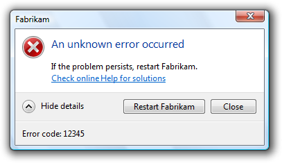
This ‘Catastrophic Failure’ message is not exclusive to Windows Movie Maker on Windows XP, it also appears in several other Microsoft programs too and even on Windows Phones, but it has the same issue as the Office 2000 installation message above. The chances are that this error is caused by a very specific software conflict or hardware conflict that is not common, so a generic failure message is displayed instead of an informative message. It may be caused by several different things and instead of writing a message for each case, this more generic message is shown instead. The use of the word ‘catastrophic’ may instil an unnecessary sense of panic into the user.
 Technical language should be avoided unless an error code that the user can search for online or in software documentation is provided with a clear, ‘no-jargon’ explanation of the error and likely cause. The error above is from an Adobe application in 2000 and incredibly this error message is still occasionally seen in modern versions of Adobe software released nearly 20 years later. Those who have studied computer science and know what pointers are will have a rough idea of what the cause of the problem is, but most people have no idea at all. Again. not helpful.
 This error message does a better job at explaining what might be the cause of the issue, but the line ‘The error was: No error occurred’ is rather contradictory to say the least. Was there an error with library? Was there an error with the library but no error with something else that the software is checking for? Who knows. Technically-minded people may think that it’s possible that here a string is generated and is simply concatenated onto the end of the ‘The error was:’ text to create the full sentence, but clearly this is not working as maybe a programming error means that string always contains the text ‘No error occurred’ or a boolean that produces that message is always true (no error). Either way, avoid contradictions. This error message would have made a lot more sense without that sentence.

Speakings of strings containing the name of an application or error and just concatenating it into the text or other ways of automatically filling in sentences with the offending application or error in a message, here’s one where something in the code has returned ‘<unknown>’ (presumably because the software cannot decipher the problem). This way of coding message text works if the software can always find the text to concatenate if it can’t then they produce meaningless messages like above.

Here’s another example of contradiction – not enough free disk to delete a file or folder, so to resolve delete some files? Although the cause of the problem is given, the solution is not helpful. It may also appear illogical that a file cannot be deleted due to there being a lack of disk space. Surely deleting a file removes it and frees up disk space? That seems to be the logic in the latter half of the error, but not the former!

SourceSafe is a component of Microsoft Visual Studio 6.0 which at this point in time is 20 years old, but some pieces of software still produce errors like this. When writing an error message or an alert message, it’s always a good idea to assure the user that the software is sufficient rather than try to point out its flaws. Here, it would be better to suggest that adding more than 150 files ‘might system performance’ or ‘take longer’ or similar. A lot of scanning applications take this approach. When you attempt to scan in a very high resolution, many suggest scanning at a lower resolution scan will take less time and look similar to a high resolution scan.

When communicating software features to a user it is best to use language that is not ambiguous. This is Microsoft Outlook Express 5.0 informing the user how to delete a file when the user looks in the Deleted Items when it’s empty. But is the software offering to:
- Delete items from Deleted Items? Which seems odd given that there is nothing in the Deleted Items folder to delete.
- Delete items from the Inbox folder? If so, is it offering to delete items automatically based on it thinks is a spam, junk or wanted email, or is it going to allow you to select an email to delete?
At first it seems that it’s the first one, in which case it’s impossible and a little confusing. But after having read the message several times over, it’s easy enough to see that it’s going to delete emails from another folder. It doesn’t specify which folder, so it has to be assumed that the Inbox folder will be the folder it looks for messages to delete in, but the point is that this message is too ambiguous and can be easily misinterpreted. Later versions of Outlook simply say ‘We didn’t find any items to show in this view’ (or similar) when the user looks in an empty folder.

When displaying information for the user to read it is important to be concise and also use the appropriate message box style. Here, a warning message box is used to inform the user all about a feature in Acrobat Reader 4.0. It’s not necessary to display this information in a warning box, it should be communicated in the Help & Support section of the software or online. It’s also technically the wrong type of dialogue that has been used – the message is not a warning, it’s information, so an information alert should have been used if this message must have been communicated to the user this way.

The same applies to this message shown in Windows Vista or 7. By putting a success message in an error alert, it makes the user initially think that the operation has failed, possibly instilling an unnecessary sense of panic into the user.


Sometimes though, no matter how careful you are, error messages can come out rather humorous, even if not intended to. There’s not really any other way to word these messages apart from maybe explaining a little more what the problem is and what can be done to remedy it.
These are just a few examples of poor communication and some basic explanation of how they lead to poor UX. Typically they leave the user confused or panicked unnecessarily.
Bibliography
Chayes, B. (2000). interface hall of shame: recent additions [mirror of iarchitect.com]. [online] Hallofshame.gp.co.at. Available at: http://hallofshame.gp.co.at/new.htm [Accessed 14 Jan. 2018].
Shultz, G. (2009). Weird Error Messages. [online] TechRepublic. Available at: https://www.techrepublic.com/pictures/weird-error-messages/ [Accessed 14 Jan. 2018].
1 Comment on “How not to communicate errors or information to a user”