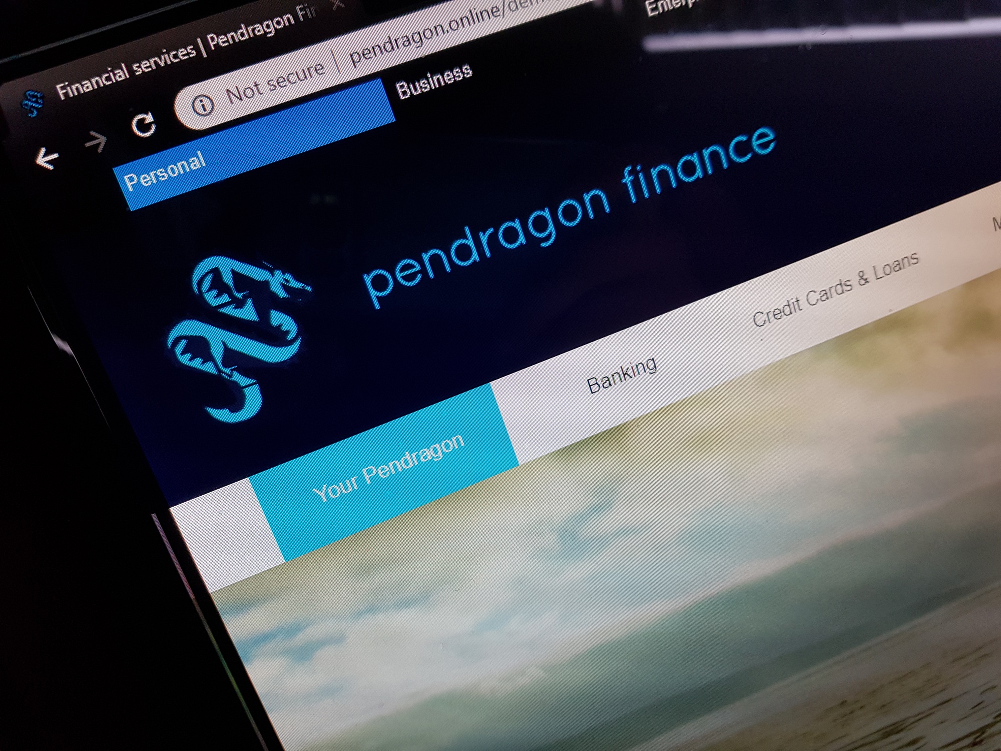
Using what I have learned over the past few weeks during the Design Toolkit unit, I created a prototype banking website. I used common conventions such as a mega menu, use of blue and white colours, Sans Serif fonts and appropriate imagery to create a professional-looking banking website.
How I created the prototype
I had a limited amount of time to create the prototype, so the natural tool to turn towards may have been something like Axure RP (which I used in the past for Nellie’s Nursery prototyping way back in February 2018 and more recently for a task about wireframing a student letting website) or Adobe XD to quickly create a wireframe or a high-fidelity by dragging and dropping common elements on a canvas and viewing the results in a web browser. Alternatively, I could have even mocked something up in Adobe Illustrator like I did a year or so to draw some wireframes and later high-fidelity prototypes for my ‘Stellardrive’ car infotainment system and much more recently for a task about creating a new way to refine search results. However, I knew that using Illustrator could have taken a while.
Instead of these visual options, I decided to code the prototype using HTML, CSS and JavaScript – much like I decided to do the same thing for Stellardrive a year ago! I find that coding prototypes is sometimes quicker than using tools such as Axure and XD and often produces nicer looking results if you know what you are doing with CSS.
At the end of Year One in May, I said that one of the many things I wanted to do over the summer holiday was to create a ‘common framework’ that could be used to code future projects. This is exactly what I did. Between May and October 2018 I developed an HTML, CSS and JavaScript (powered by jQuery) framework called ‘Dragonbase’ which combines all of the elements of Elebase (used to create the Nellie’s Nursery website) and Storebase (used to create the Storehouse website) and adds several new features, such as:
- Parallax scrolling sections
- Custom-built slideshows with text panels for captions
- ‘Grid’ menus
- Much-improved responsiveness, especially in landscape orientation on smaller devices.
The Dragonbase framework is currently only being used on my new portfolio website (launched on October 14th 2018) and up until now no information has been published about it. It was written to be ‘malleable’ (meaning it is easy to change and adapt without breaking) and this has been proven now by completing this task in a day or so by using this framework to create a home page for a banking website.
The completed prototype can be viewed here.

Key areas I focused on
For this project, I focused mainly on:
- Information architecture in navigation systems
- Conveying a personality
- Visual hierarchy
That being said, these were also possible assessment criteria and also important:
- Page Scanning
- Text Scanning
- Typographic Hierarchy
- Design Patterns
I feel that a lot of these come sub-consciously when designing good content anyway.
Why the name ‘Pendragon Finance’?
Asides from the fact that Pendragon Online is already my portfolio and sometimes ‘trading’ name, I get asked a lot by people what Pendragon means. Essentially it is Welsh for ‘head dragon’ and whilst I am not Welsh myself (though perhaps the mythical Pendragon Finance company could be) the message is strong. ‘Head’ or ‘lead’ suggests a best in class or field and the dragon is a powerful animal. For a bank this suggests best-in-class, power and knowledge – all good things for a bank to possess.
Initially, the bank was going to be called ‘Pendragon Banking’, however this was changed to ‘Pendragon Finance’ after I decided that it was more than just a bank – it also offered advice services, insurance services, mortgages and money borrowing and lending, so ‘finance’ seemed to covered more ground. It also sounds a little less intimidating.
Information architecture in navigation systems
My research has shown that the favourite navigation system for financial websites is the ‘mega menu’. These sites tend to have a lot of pages categorised into a lot of categories and the mega menu makes it easier for users to quickly find what they are looking for. Some banks hide their menus by default, others don’t, but I decided to hide mine to give a cleaner, more polished feel.


The top-level menu options on the Aviva and Barclays sites outline the services that are provided and then the categorised options in the mega menu re listed in order of importance going left to right and the appropriate items are placed in the categories to help make finding them easier. For a mega menu to be successful there needs to be as few top-level and category option as possible.
The mega menu on my site is similar. Items are placed in order of importance from left to right and also top to bottom to help make finding information easier and I have tried to use as few top-level options and category options as possible. The structure of my mega menu is based on that of the Barclays site, so the information architecture is very similar. I chose to base my work on Barclays’ because:
- They have a similar site design and company image to what I wanted.
- They will have hopefully done their research and A/B/C testing on what works best in the menus, so they are likely a good example to follow.
Below is a screenshot of my mega menu.

I decided that some kind of section dedicated to things relating primarily to your accounts was the most common thing a user would visit the site for, so I put that on the left-most side of the top-level menu. Banking was probably second to that, applying for credit and loans next, then mortgages, then information about savings accounts and then insurance (since this isn’t an insurance company only a few types are offered so it is not the main focus of the business), then a bit about financial help for various big life events such as first houses and retirement and finally, support at the end.
Like the Aviva and Barclays examples, my mega menu:
- Has clear headings for the categories that follow the site branding – the use of the blue quicksand font (more on this later).
- Indicates the currently opened tab by using a blue accent, but on mine the whole button shows blue, not just an accent.
Side note: another reason I decided to code was because I knew that it would be easier to code a mega menu than trying to create one in Axure or XD. The mega menus are just divs that are hidden by default and shown when the mouse is moved over one of the menu buttons (using JavaScript/jQuery). The columns of items are simply CSS columns.
Navigating between different sites within the site
A lot of these sites have different pages for different types of customers, for example Barclays has different sites for ‘Personal’, ‘Premier’, ‘Business’ and ‘Corporate’ organisations, as well as a site dedicated to wealth management. Links to these pages are at the very top of the site to keep them out of the way, but also make them easy to find and access at the same time. I’ve done a similar thing on my prototype site and have also included a button to the e-Banking site in the upper right. I felt that a lot of people would want to visit the e-Banking site so putting a link up there and also in the mega menu helps people to find it.

Navigating to other pages via buttons
The menus at the top of the page aren’t the only form of navigation on the site. As the user scrolls down the home page they’ll find more detailed information about services offered and can use the buttons underneath the information to navigate to the appropriate pages.
This isn’t usually common practice on banking websites. Most tend to have very short home pages with just a few links to various pages not presented in a terribly visual way, but Barclays breaks the trend and has pictures and information with links to the pages on their site, see below.

Nationwide’s site is more typical, with just a few images and information with some buttons underneath and then effectively another menu underneath that.

My site looks much more like Barclays’. The information is arranged again in order of importance (or what I believe to be important, if this was a real company there would be testing to verify this) and it offers information and an appropriate image to accompany a button which takes the user to a relevant page.

One thing I learned on my internship at Earthware ltd was that buttons should not have the same text in them (e.g. they shouldn’t all say ‘Read more’). Button text should be relevant to the page that the button is taking you to, UX Designer Steve Edwards told me whilst on my internship. He said that this was because people with disabilities (e.g. those using text-to-speech software to read page content to them) would not be able to differentiate which buttons took you to which page if they all said the same thing. It also makes the text on the site more interesting and improves navigation. Like Barclays, I used rounded buttons to make the buttons stand out from the images a little more and give a clear call-to-action. The stark blue also gives a clear call-to-action.
Fat footer
These are becoming very popular – they are essentially another menu system. Often on financial websites they are not a full menu replica because there would be too many pages to display, so often they are simplified somewhat. Look at the HSBC example below.

I decided to make my fat footer fairly fat/tall and include a smaller version of my mega menu in it. The menu in the footer features six links per category which is not the full menu, but it covers most of it. Items are arranged into the same eight categories that they are in the main mega menu.

The use of the dark blue provides a nice contrast between the footer and the main page content (white, above) and matches the header, complimenting the other menu. The footer also includes legal information and social media links.
Personality through colour
As explained a lot in my personality post, the use of the following colours is common on financial websites.
- Blue: natural, calming (sea and sky), professional, trusting
- Green: natural, calming (plants and trees), professional, fresh, new, friendly
- Black: powerful, controlling, knowledgeable
- Purple: premium, expensive, luxurious
- White: open, simple, fresh, clean, space
Occasionally red may also be used to evoke excitement and action and possibly even love and romance.
I went with a blue theme to evoke the trustworthiness and professionalism which is a persona I wanted to get across and I also used a little black above the header, not so much to show power or anything like that, more just to give some subtle differentiation between the header area (dark blue) and the menu bar for the highest-level menu (black). White was used as the colour for the main body to give an open, fresh and modern look. Black would have looked a little intimidating for a banking website, the white looks friendlier and more reassuring.
I didn’t use red as it is often seen as an aggressive colour and not often used by financial services (HSBC to some degree, Nationwide and Direct Line might be the exceptions, but red is used more in their logos and is only used subtly on their sites) and I didn’t want to use purple because I didn’t want to give the impression that this was a ‘premium’ bank. This is not because the bank isn’t good at what it does, rather I wanted the brand to appeal to everybody and not just those looking for something high-end. Therefore, blue was a better choice.
Personality through font and font colour
The company logo is written in a light font called Quicksand which looks clean, modern and professional. As explained in the personality post, the use of light Sans Serif fonts is very common amongst banking websites because although many are proud of their heritage, they don’t want to evoke a nostalgic experience.
The Quicksand font is ideal for large text and headings, but not ideal for body copy. For that, Arial has been used. Arial is installed on many computers so it is highly compatible and also another Sans Serif font that is ideal for body copy as it is clean and easy to read.
Black is used against a white background for the best legibility and the blue headings fit the company branding and corporate personality evoked by the use of blue. It also stands out really well against the white body and also the parallax images (more on this later).
Personality through imagery
My work needed to be different from what’s currently out there in at least one way and I decided imagery would play a large part on my site. A lot of banking sites use very limited imagery, but from the moment you open up my prototype you see a big slideshow with the following images and captions in it (all images in this small slideshow are taken by me):

Never very far away from you
‘Never very far away from you’ is supposed to be interpreted as being accessible anywhere – on the high street, on your computer and in your pocket. It shows we are a company that uses technology and knows current trends. It’s also supposed to be interpreted as literally being close. This suggests that we are always close, always happy to talk and always happy to help. The image shows a family walking across a beach in the sunset looking relaxed and most importantly, together. It suggests that we are a friendly company and not to be afraid of.

Always prepared for the unexpected
This image shows some people getting splashed with blue paint on a colour run, an unexpected but exciting event! Just like moving home or going to university or starting a new job. The bank is always here to help you settle in and offer the best help and advice we can give for these exciting, yet sometimes unexpected and difficult situations. Too many banks come across as being for older people, this image and caption helps us appeal to a younger, more dynamic audience who may make impulse decisions that affect them financially greatly. But that’s what young people do.

Keeping your money safe
A slightly literally image to go with the heading. Caernarfon Castle in Wales (to go with the ‘Pendragon’ name) is pictured here at twilight and symbolises keeping money safe (the ‘keep’ is also the most secure part of the castle). This portrays us to be knowledge and seem that we know what we are doing without having to use a lot of purple or other premium design patterns which may put some customers off.

Piece of mind
Again, some word-playing here, you could substitute ‘piece’ for ‘peace’ which is what this image shows. This portrays us to be a simple bank to us and that we’ll take care of the complicated bits and leave you to enjoy life with your loved ones and spending time on what really matters (which is not micromanaging your money). It shows us to be caring, supportive and family-orientated.
All of the images in the slideshow have elements of blue in them, usually in the sky, which follows branding and also that professional theme. So whilst these images mainly are here to show that the company is caring, we still want to be seen as professional.
Other images
Images for the site have been chosen very carefully. These are all from Unsplash which is a website offering high quality royalty-free images.

These images are here to help depict certain company qualities and the services that are offered. Simplicity is the first one where a very simple image of some barley in a field is used. It’s simple, but it’s calming and relaxing and gives the impression that the company is easy to work with.
The image of the man using the smartphone in the crowd shows that we are available on technology, but we’re also by your side (depicted by the fact that he is in a crowd and not alone). If the image were to show him alone using a phone it may suggest that our services are for solitary use and we are not easily contactable in person.
The image for ‘start saving’ shows people counting coins and although it’s not a great amount, it’s something – the use of the word ‘start’ and the fact that you can save with as little as 50p reinforces that everybody starts somewhere – and usually from not a lot. It shows us not to have great expectations to people and that we want to help people.
The image for planning a future shows a bright, big, empty sky. This symbolises that although it may not seem like there is anything there and at the moment it may be empty, something bright is over the horizon (the source of the light in the image is from over the horizon). We want to help fill that sky and help plan a future (financially, at least), so no matter what questions you have or what your plans are, we’ll understand and help. We are a caring, understanding company who you can reach out to.
Again, in all of these images blue is a theme, even if not immediately obvious. For example the images of the man holding the phone and the counting money one do use slightly muted blue tones in them.

A good image that sums up that we want to appeal to a wide audience is this one. The use of the house keyring in the image rather than a photograph of a house means that the type of house that the customer could be moving into is left to the reader’s imagination. If an image of an expensive mansion were to be used then it may make some people think that we only deal with rich clients, if an image of a small bungalow were to be used some people may (wrongly!) turn their noses up. Here, it is neutral and so the image shows that we appeal to a wide range of people with different goals and economic backgrounds.

Like the first image in the slideshow, the image for the families section depicts a calm and serene scene with a family, once again showing that we care about our customers and their families and want to provide a calm and smooth experience.

The images for the family section are very different to the other sections and are designed more to touch hearts and evoke some slightly nostalgic emotions. Again, the starting a family image shows that we are family orientated and want to support your big move. We also show that we are family orientated by talking about children’s accounts and helping to plan retirement, caring for the elderly and again appealing a wide range of people.

These are from the ‘money is freedom’ page and are designed to appeal to a younger audience, talking about university and travelling and having aspirations. A car is used for the ‘big purchase ahead?’ section. It’s blue to fit the branding and theming and is a high-end BMW. Where an image of a house wasn’t used to depict buying a house to avoid hinting at the kind of houses customers might buy, I felt it was OK to use an aspirational car for this because this whole section is about dreams and aspirations, whereas the housing one was in a more general section about services that are offered. The section image shows a concert – a fun event that young people like to attend and again shows that we are in-touch with the younger generation and can also appeal a more dynamic customer.

These images show that we also appeal to a younger target audience and want to try and help people with their dreams and aspirations. We’re not just all about families.

Also about appealing to a large audience are the images depicting business and corporations. Business is also a sector that is covered by the bank and companies rely on us. These images give corporations the piece of mind that we can handle enterprises and will support them. The section image also gives a professional look, without looking too distasteful.

The section image shows somebody who is probably deemed to be successful, but is not really ‘showing off’. This is the kind of image we like to give – professional, successful and aspirational, but not pompous or ostentatious.

Going back to the company encouraging the pursuing of dreams, business start-ups and entrepreneurship are traits that the company supports. This makes us seen to be encouraging and inspirational, as well as helping to support young people achieve their dreams. The long exposure of the light trails shows that we are quick to move and respond rapidly. as well as making it easy and fast to move to us and therefore imply that we are an easy-going company to work for.
Visual and information hierarchy
As explained earlier, images form a huge part of the visual hierarchy, as do the buttons. The buttons being blue and rounded stand out and create a very visual and obvious call-to-action. Generally, the larger images on the site are what the user is meant to focus on. Some sections have two large images which are the main focus points, though they are interestingly placed underneath the other images, a design decision I chose for two reasons:
- I feel that it looks better (testing would need to be needed to evaluate this)
- If a user starts scrolling down a page and sees the top of two larger images they may be inclined to keep scrolling (again, testing needed)
I didn’t put too much thought into the visual hierarchy, I put more thought into the information hierarchy and carefully considered the order of information. I started off with the key points about the business and the services provided at the top of the page, gradually going down to specific sections with more detailing. The order of sections is also important, starting with families and then about big events and then business. It’s almost as if the family and big events is more important than the business side of things. The company probably appeals more to younger people who are starting families and going on ‘adventures’ than corporations.
Information architecture using parallax sections
These are very common on modern websites. They started off being used on art and design websites because of their artistic flair and merit, however hey are making their way onto more websites now – even e-commerce ones. Traditionally they probably have not been seen as being professional, but now they are starting to become a web trend so why not integrate them into a banking site? Not only do they help break up content, they help add imagery which can further enhance and enforce a personality – crucial for a bank.
Using parallaxes, the home page is broken into three sections:
- Supporting families – containing information about the company supports families
- Money is freedom – containing information about how the company can help make big events happen
- Best for business – containing information about how the company supports start-ups and enterprises
By employing modern design standards a younger group of people are more likely to be interested in looking at the site and therefore potentially come to the bank. It also makes the site look more visually appealing.
If I could do this again
To wrap this up, here are some things I’d do differently next time:
- Instead of trying to appeal to a large target audience, I’d focus more on one specific group – likely the younger generation. I think this would make the personality come through a lot stronger and be less ‘wishy washy’. I decided this about halfway through making the prototype and after I had considered the information architecture for the menu system, by which point time was short, I had put a lot of time and effort into that and it was probably too late to cancel.
- If I had more time I’d consider how this would look on a mobile device. The Dragonbase framework is responsive but this site sadly isn’t (for the sake of this prototype I removed all of the media queries).
Feedback
Feedback was generally very positive with just a few points to note:
- Some didn’t understand the use of the parallax sections and felt that they didn’t help to break content.
- It was suggested that the text over the top of the parallax images could be much larger and stand out more.
- The alignment of some of the columns on the mega menu isn’t perfect and could be tidied up, notably the left-most column which doesn’t always align with the menu buttons above it.
- It was suggested that the large images in the sections were too large and almost suggested ‘space filling’ – and they could be placed above the smaller images.
- Some felt that the images should also have a curved edge like the buttons do, but I feel this would distract from the professional feel and also make the buttons stand out less, disrupting the visual hierarchy and calls-to-action.
I was very happy with the feedback and feel that in the time I had I managed to produce a fairly convincing prototype for a banking website that appeals a wide range of customers and offers a large range of services.

References
Writer, S. (2013). Using Color in Design to Evoke Powerful Emotions | California College San Diego. [online] Cc-sd.edu. Available at: https://www.cc-sd.edu/blog/using-color-in-design-to-evoke-powerful-emotions [Accessed 29 Oct. 2018].
Bernazzani, S. (2017). Fonts & Feelings: Does Typography Connote Emotions?. [online] Blog.hubspot.com. Available at: https://blog.hubspot.com/marketing/typography-emotions [Accessed 29 Oct. 2018].
Adiseshiah, E. (2017). Parallax scrolling for web and mobile – 10 top examples. [online] Justinmind.com. Available at: https://www.justinmind.com/blog/10-must-see-examples-of-parallax-effect-websites/ [Accessed 5 Nov. 2018].
Harvey, K. (2014). Pros and cons of parallax scrolling website design – The Garage. [online] Garage. Available at: https://www.godaddy.com/garage/pros-cons-parallax-website-design/ [Accessed 5 Nov. 2018].
2 Comments on “Pendragon Finance – a prototype banking site”
Comments are closed.