This was a small task set as part of the ‘Design Toolkit’ brief, the idea was to use visual hierarchies and text hierarchy to create a wireframe of the home page of a website advertising student properties for letting. Target audience, features that they would want, image placement, visual hierarchies and text hierarchies all had to be considered.
Considering the target audience and their needs
Choosing the target audience was simple – students! This is a website offering student housing, so I decided to make my site as ‘student-friendly’ as possible. This meant that it needed to:
- Allow students to select how much rent they wanted to pay each month and the number of bedrooms they were looking for
- Allow students to select their university and then find housing appropriate to the university’s location
- Allow the user to contact the property landlord or estate agent to arrange viewings and eventual contract details
- Have plenty of images on the home page of properties available and lots of images of advertised property on the listing pages.
In order to fulfill these requirements, the homepage needs to have:
- Some kind of search facility with easy-to-use filtering options to facilitate specifying rent per month and the number of bedrooms.
- Large hero images and small ‘mission statements’ in each one so that students know what is in each section of the website.
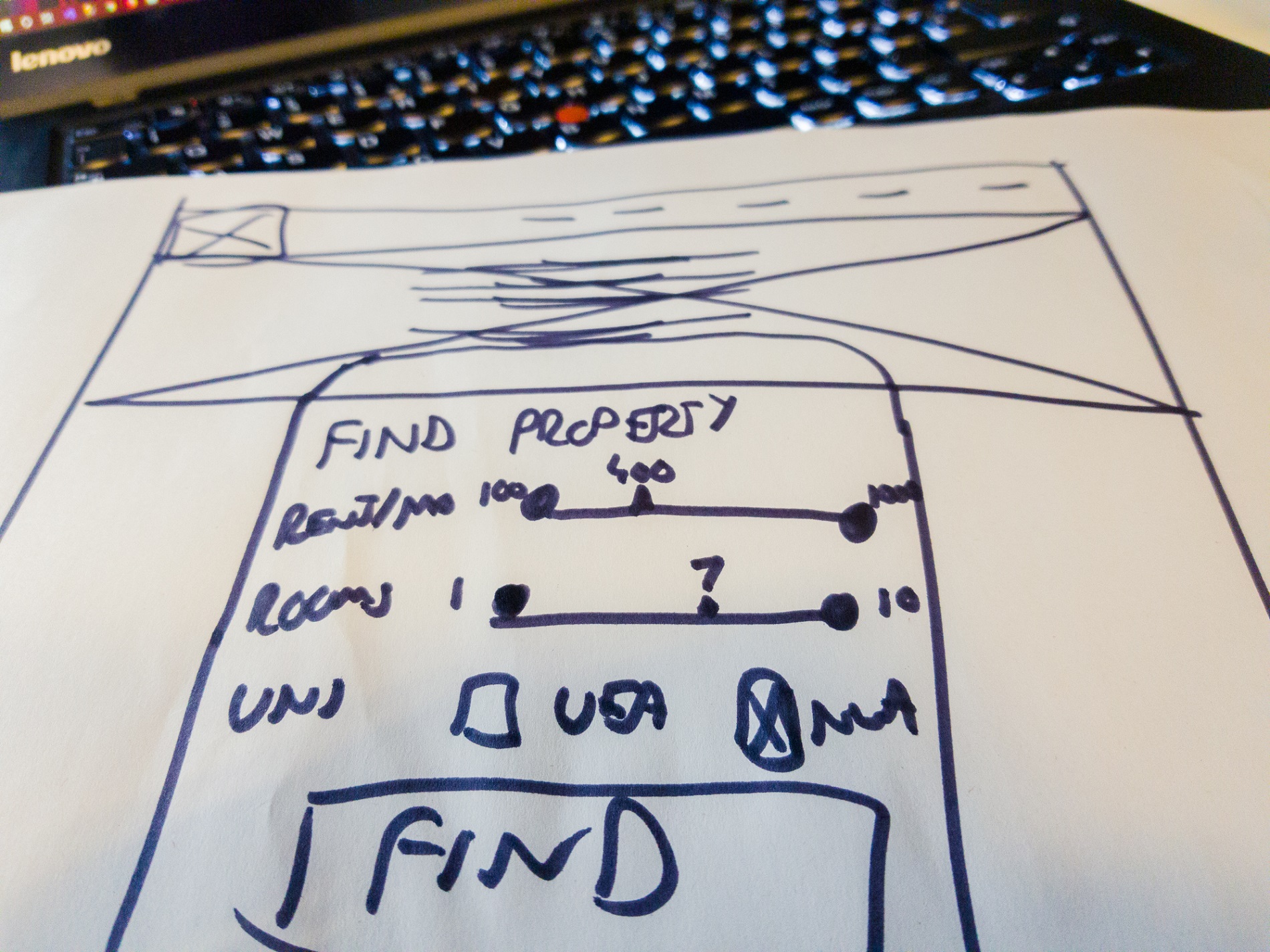
With this considered, I drew an initial wireframe sketch which you can see a scan of below.

Wireframe sketch
Property websites tend to have large hero images of an example of a property type that they sell in the hero image and the company slogan and mission statement in the hero image. This means that it is hopefully immediately obvious to the user what the site is about before they’ve even taken the time to properly look at the page. Menu bar options tend to be sparse asides from the traditional home and contact us or about us buttons and are conventionally located in the upper-right corner of the page.
I designed the search filtering to be both usable on a desktop computer and on a tablet or phone. I decided that sliders would be good to use for the user to specify price and bedroom ranges to save having lots of check boxes or a long list of items in a list – the sliders also allow the user to specify their own unique ranges and are easy to use with a mouse and also by touching and dragging. For selecting a university, a simple checkbox works fine as both options are visible and there are not so many options that a list has to be used.
Axure wireframe
I took my wireframe sketch and firstly looked at UI patterns online to see if I had gotten the right idea in regards to elements to use for the desired actions. UI patterns help us to determine whether we are using common and conventional elements in our designs. On my wireframe:
- The menu is horizontal and located in the common upper-right corner
- The sliders are a typical component and suited to specifying ranges
- The checkboxes are ideal for questions where there are only a few options to choose from
Therefore, it appears that the sketch conforms to basic UI patterns and design principles and can be made into a wireframe using Axure RP, which is my preferred software for creating wireframes and software prototypes at the time of writing.
The Axure wireframe adds to the basic paper wireframe by adding more content to the homepage such as a grid of images of the types of properties available for sale – it is envisaged that the user will initially go to the site and complete the three questions to find a property. There is also the option to show more options where the user can look at what property types are available and look through those. Beneath that are featured properties which are properties selected based upon the user’s browsing habits. There are buttons for these sections at the top of the page in the header, but I feel that the main feature of the site is the simple search function. These listings are quite image heavy and feature buttons to find out more about the property or connect straight to the landlord or estate agent to complete a contract.

If I were to redesign this I’d maybe make the featured properties more prominent, but I’m not sure that I’d necessarily put them above the search. Maybe they could be called ‘suggested properties’ or similar instead and placed as smaller images beneath the search facility to catch the user’s eyes as they use the search facility to find a property.
1 Comment on “Designing an estate agent homepage for student lets”
Comments are closed.